Lovelace: Button card

image

I have been using the button card with this config for the past little wile and now want to add an extra aspect to it but im having trouble figuring it out. I was hoping someone here can help me out.

How do i add a custom field in the top right corner that would display the state_attr(‘light.oven_light’, ‘brightness’) ? i would like it to look like the pic below.

see current code as well

image

size: 25%
aspect_ratio: 1/1
show_state: true
color_type: card
state:
  - value: 'on'
    color: rgb(65, 82, 118)
    styles:
      card:
        - border: 1px solid rgb(36,46,66)
      icon:
        - color: Yellow
styles:
  card:
    - color: rgb(235,235,235)
    - background: rgb(43,55,78)
    - box-shadow: none
    - border-radius: 12px
  img_cell:
    - justify-content: start
    - align-items: start
  icon:
    - padding: 10px 10px
    - height: 50%
  name:
    - justify-self: start
    - padding: 5px 0 0 10px
    - font-weight: bold
    - font-size: 13px
  label:
    - justify-self: start
    - padding: 0 10px 5px
    - font-size: 11px
  state:
    - justify-self: start
    - padding: 0 10px 5px
    - font-size: 11px

In yaml mode, none.
In GUI mode, none should… Maybe list everything that you are using and I might be able to tell you.

You need to use `text ${jscode}` to achieve what you want.

if (states["input_number.input_color"].state <= 16.6)
   return `rgb(255, ${states["input_number.input_color"].state / 16.6 * 255}, 0)`;
else if  (states["input_number.input_color"].state <= 33.2)
   return `rgb(${255 - (states["input_number.input_color"].state - 16.6)/16.6*255}, 255, 0)`;
else if  (states["input_number.input_color"].state <= 49.8)
   return `rgb(0, 255, ${(states["input_number.input_color"].state - 33.2) / 16.6 * 255})`;
else if  (states["input_number.input_color"].state <= 66.4)
   return `rgb(0, ${255 - (states["input_number.input_color"].state - 49.8) / 16.6 * 255}, 255)`;
else if  (states["input_number.input_color"].state <= 83)
   return `rgb(${(states["input_number.input_color"].state - 49.8) / 16.6 * 255}, 0, 255)`;
else
  return `rgb(255, 0, ${255 - (states["input_number.input_color"].state - 83) / 16.6 * 255})`;

You have an example here: Lovelace: Button card - #5395 by Mariusthvdb

@RomRider Thank you so much. This did the trick for changing the icon colour. Now I’m wondering if I could create a variable that I can use multiple times. If so, can you please advise how this would look like ?

Bit of a cross post with my question here, but I figured this thread might be a better place to ask since I’m using button card at the moment.

As per the question posed in the link - is there any way to shrink a button to ‘icon only’ for mobile view - but have icon + text for tablet/desktop widths ?

Hello guys,

Is there the possibility to COLOR a png entity_picture? I need it to be “var(–primary-background-color)”.

Thank you!

Please give us 2-3 examples of COLORED images.

Hello Community,

I am stuck. I would like to embed the mm2-clock.carc (GitHub - shbatm/mm2-clock-card: A Simple Digital/Analog Clock Card for Home Assistant Lovelace) into a a custom button-card.

I´ve tried so many different versions of the code but I cannot seem to find the right way. Could some one point me in the right direction? Maybe there is an even simpler solution which by now I haven´t found.

My main dashboard shows only active devices in my home, all in their own button-card field. all fields are the same size (280x170px).
I would like to show a clock (hour:minute AND counting seconds) plus date and shown weekday.

This is the code generating the date and time:

  - platform: time_date
    display_options:
      - "time"
      - "date"
  - platform: template
    sensors:
      startseitenuhr_zeit_und_tag:
        value_template: >
          {% set x = states('sensor.time') %}
          {% set tag = ["Sonntag", "Montag", "Dienstag", "Mittwoch", "Donnerstag", "Freitag", "Samstag"] %}
          {{ tag[now().isoweekday()] + now().strftime(", %H:%M")}}
        friendly_name: "Aktuelle Zeit"

I will spare you my button-card code :).

Please tell me if my wish is doable.

Thank you.
Greetings from Austria

Chris

EDIT: Typos…

Could someone help me with a extremely simple template that just takes the current temperature from a entity, and places it in the middle of a custom card button, please.

(I know. And I’ve tried to Google and read up on it, but it’s kinda messy with the yaml code and stuff).

Best regards

Hi everyone,

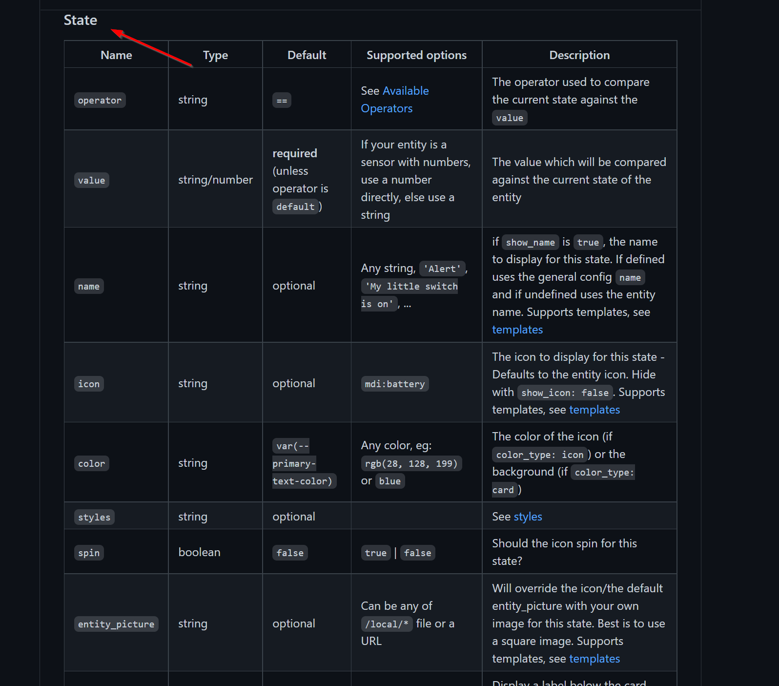
is it possible to define or call up the attributes via state?
I want to change the icon when the roller blind is at 50%.
Or how can I best implement this?


:wave: Hi everyone, I had a lot of fun with this component. If you want to see more details here is my post :
HA

6 Likes

because of `Thomas’ post above, I re-visited my search to find a way for a back button…

  - type: custom:button-card
    template: button_shortcut_menu
    tooltip: Back
    icon: mdi:arrow-left
    tap_action:
      action: navigate
      navigation_path: history.back(-1)

to give you an idea, and "Go Back" Button | CSS-Tricks being the source for that.

looks fine:


but of course it is not functional… though at first click it did take me to buy homepage, so I cheered. On closer inspection it does that wherever I am, and does so because it simply isnt correct syntax…

@RomRider , would you know of a way to accomplish this ‘back’-button, truly navigating the Lovelace browser history? How can we implement the ‘history.back(-1)’

Would hope it to be doable, since entering it in the inspector command line does exactly that, go back in history 1 step

1 Like

never noticed before, probably because I have my border-radius set to 0 by default, but on these new ‘chips’ I notice a squared pop up background border upon tap:

Jul-20-2021 13-38-28

can I make those use the same border-radius as the chip itself? what would be the correct css option for that please? this is my chip config:

  styles:
    img_cell:
      - width: 24px
    card:
      - border-radius: 30px
      - box-shadow: var(--ha-card-box-shadow)
      - height: 36px
      - width: auto
      - padding-left: 6px
      - padding-right: 6px
    grid:
      - grid-template-areas: '"l"'
    label:
      - justify-self: center
      - padding: 0px 6px
      - font-weight: bold
      - font-size: 14px

Edit the image with gimp or photoshop and remove the background and make it transparent. Then you won’t need to manipulate the image.

This is not possible. Nothing will count seconds in the UI.

you don’t need a template. Just follow the docs and use a temperature sensor as the entity for the card. It will display the state without any crazy template. The regular built in button card does this too.

please can you explain how to have this visualization? copy your code ?

I’m trying to have this, without success.

Well that code is over 2 years old, so that will probably no longer work. And I have to be honest, I wouldn’t really know how I did that. However you can check out my current project and install that instead.

You can find it here: GitHub - jimz011/homekit-infused: Homekit Infused v4.0.0rc

Anyone know if the button card can be used to launch the ‘media browser’ popup dialog for HA ?
(I’m talking about the one that you see if you click the browse button on the spotify player lovelace card for example)

I’ve been searching a while, but have not managed to find out if it’s possible to open this popup dialog directly… i’d like to get the custom button on my dashboard to browse the spotify source.

Hi, anyone know a way to create a color ‘dot’ that matches the actual color of a light entity? I have seen something like this, but I can’t find it anywhere. Kinda like this:

    custom_fields:
      notification:
        - background-color: >
            [[[
              if (states['input_number.test'].state == 0)
                return "green";
              return "red";
            ]]]

But then it should return the color of the entity it’s put in (using button-card templates). Anyone has an idea?

use var(--button-card-light-color) or --button-card-light-color-no-temperature ?

1 Like