- This is not related to mini-graph-card. This is about bar-card & auto-entities. Please move this discussion to any of these dedicated threads.
- There are settings in bar-card for colors.
- Since you are using auto-entities - you will need to specify colors for each row automatically. It is only possible by using a “template” option for auto-entities.
sorry for ff topic but is their any documentation how to use templates for multiple bars in auto entities…i need different colors for each bar if i need single i can use global values in template but as im using 5 bars how to make template for that?
Go to auto-entities thread please and post a question there.
1 Like
Hello, I would like to show the last bar as the text value. I have an accumulating water meter sensor. Mini graph gives me daily values using the delta aggregate function, but the value at the top shows the total number of litres through the system. I would like to show today’s value, ie. the last bar which is 416l
Is there a way to do this please? Thanks.
type: custom:mini-graph-card
icon: mdi:water
unit: Litres
entities:
  - entity: sensor.emoncms_rainwater_acc
    color: var(--primary-color
    show_state: true
name: Rain Water consumption
hours_to_show: 168
group_by: date
aggregate_func: delta
color_thresholds:
  - value: 200
    color: var(--primary-color)
  - value: 300
    color: var(--accent-color)
  - value: 400
    color: var(--primary-color)
animate: true
show:
  graph: bar

Maybe parameter ‘attribute’ from entities object will be useful for you.
Earlier we discussed why this style does not work in Safari:

card_mod:
  style: |
    .fill {
      opacity: 1 !important;
    }
Having analysed a source code (mini-graph-card/src/style.js), I found a reason.
The opacity initially comes from “revealing animation” - it sets opacity to some value<1.
And due to unknown reasons it is not possible to override the opacity in Safari.
So there are 2 alternatives for Safari:
– either replace the animation with a new one with “opacity: 1”;
– or disable animation.
Here they are:
  - type: custom:mini-graph-card
    entities:
      - entity: sensor.xiaomi_cg_1_pm25
        show_points: false
        color: red
    show:
      fill: true
    points_per_hour: 60
    hours_to_show: 1
    card_mod:
      style: |
        .fill {
          animation: reveal_solid .25s cubic-bezier(0.215, 0.61, 0.355, 1) forwards !important;
        }
        @keyframes reveal_solid {
          0% { opacity: 0; }
          100% { opacity: 1; }
        }
  - type: custom:mini-graph-card
    entities:
      - entity: sensor.xiaomi_cg_1_pm25
        show_points: false
        color: red
    show:
      fill: true
    points_per_hour: 60
    hours_to_show: 1
    card_mod:
      style: |
        .fill {
          animation: none !important;
          opacity: 1 !important;
        }
and the original version (not for Safari):
  - type: custom:mini-graph-card
    entities:
      - entity: sensor.xiaomi_cg_1_pm25
        show_points: false
        color: red
    show:
      fill: true
    points_per_hour: 60
    hours_to_show: 1
    card_mod:
      style: |
        .fill {
          opacity: 1 !important;
        }
Works now in Chrome (Win), Safari (Mac OS 10.x), iPad (iOS 15.x).
2 Likes
wow - thanks!
Found a glitch when using the card in Safari & iOS Companion App.
Occurs when the card is placed inside “custom:decluttering-card”.

Hi,
is it possible to not show the time in the graph? only want to see the values of min / avrg / max

What can i do here?

Have that card, but why is the blue line at around 10% when 0,45€ is nearly the half of 0,89€?
type: custom:mini-graph-card
name: Strombezug heute
height: 90
icon: mdi:currency-eur
aggregate_func: sum
show:
  labels: false
  name_adaptive_color: true
  icon_adaptive_color: true
hour24: true
logarithmic: true
hours_to_show: 12
points_per_hour: 4
decimals: 2
entities:
  - entity: sensor.daily_energy_cost
    name: Gesamt
    color: '#fbbc05'
    unit: €
    show_points: false
  - entity: sensor.easee_draussen_cost_daily
    name: Wallbox
    color: '#4285f4'
    unit: €
    show_state: true
    show_points: false
line_width: 5
Can someone help me to make the blue line at the half?
The Yellow one is the total fund for power consumption. The Blue one is one usage of it. But the graph doesnt look like 0,45€ of 0,89€
Because of this:
and because of absence of “lower_bound” defined.
Using mini-graph-card inside state-switch:
The problem described on GitHub:
Turning on transition hides the state-switch-card completely if using mini-graph-cards
      type: custom:state-switch
      entity: input_select.test_value
      transition: flip
      transition_time: 500
      states:
        one:
          type: custom:mini-graph-card
          entities:
            - entity: sensor.memory_free
        two:
          type: entities
          entities:
            - sun.sun
Solution - add CSS style:
    type: custom:mod-card
    card_mod:
      style:
        state-switch $: |
          div#root .visible mini-graph-card {
            transform: none;
          }
    card:
      type: custom:state-switch
      entity: input_select.test_value
      transition: flip
      transition_time: 500
      states:
        one:
          type: custom:mini-graph-card
          entities:
            - entity: sensor.memory_free
        two:
          type: entities
          entities:
            - sun.sun
1 Like
Ah cool, it works, thanks

Why haven’t you closed the issue then?
Placing a UoM before a state’s value:

Code
type: custom:mini-graph-card
entities:
  - entity: sensor.xiaomi_cg_1_co2
    unit: €
icon: mdi:currency-eur
card_mod:
  style: |
    .states .state {
      flex-direction: row-reverse;
    }

1 Like
I’ve tried to graph the sun’s elevation, but can’t seem to get it to work. Here’s my code, here’s the result. What exactly am I doing wrong here?
type: custom:mini-graph-card
entities:
  - entity: sun.sun
    name: sun elevation
    attribute: elevation
    hours_to_show: 48
    points_per_hour: 0.25
    update_interval: 60
    show:
      graph: line
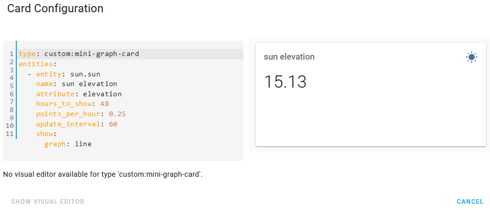
Wrong indentation.
Hi all, I have made a bar graph for the daily consumption of one device. The code is below
Unfortunately, I can’t do the same for monthly consumption, I imagine that one bar will always be one month.
Can someone please advise me, is it even possible to do it?
type: custom:mini-graph-card
name: Dryer
entities:
  - entity: sensor.susicka_consumption_daily
icon: mdi:flash-circle
color_thresholds:
  - color: '#0da035'
    value: 0
  - color: '#039BE5'
    value: 1
  - color: '#e0b400'
    value: 2
  - color: '#e45e65'
    value: 3
group_by: date
hours_to_show: 240
aggregate_func: max
show:
  graph: bar
  group_by: date
  labels: true
hour24: true

Is it possible if using “color_thresholds” to change the color of the state? So that detect better a bad value?
As sample for dust concentration:

thresholds are set to “45” here - but because last bar show the average it is still green (2h to show in bar) - even if value is “55” or more.
Same could be interesting for temperature…
Would be nice to have the same option for the state color as for line/bar color (with same limits)
Thanks!