Because of this:
and because of absence of “lower_bound” defined.
Using mini-graph-card inside state-switch:
The problem described on GitHub:
Turning on transition hides the state-switch-card completely if using mini-graph-cards
      type: custom:state-switch
      entity: input_select.test_value
      transition: flip
      transition_time: 500
      states:
        one:
          type: custom:mini-graph-card
          entities:
            - entity: sensor.memory_free
        two:
          type: entities
          entities:
            - sun.sun
Solution - add CSS style:
    type: custom:mod-card
    card_mod:
      style:
        state-switch $: |
          div#root .visible mini-graph-card {
            transform: none;
          }
    card:
      type: custom:state-switch
      entity: input_select.test_value
      transition: flip
      transition_time: 500
      states:
        one:
          type: custom:mini-graph-card
          entities:
            - entity: sensor.memory_free
        two:
          type: entities
          entities:
            - sun.sun
Ah cool, it works, thanks

Why haven’t you closed the issue then?
Placing a UoM before a state’s value:

Code
type: custom:mini-graph-card
entities:
  - entity: sensor.xiaomi_cg_1_co2
    unit: €
icon: mdi:currency-eur
card_mod:
  style: |
    .states .state {
      flex-direction: row-reverse;
    }

I’ve tried to graph the sun’s elevation, but can’t seem to get it to work. Here’s my code, here’s the result. What exactly am I doing wrong here?
type: custom:mini-graph-card
entities:
  - entity: sun.sun
    name: sun elevation
    attribute: elevation
    hours_to_show: 48
    points_per_hour: 0.25
    update_interval: 60
    show:
      graph: line
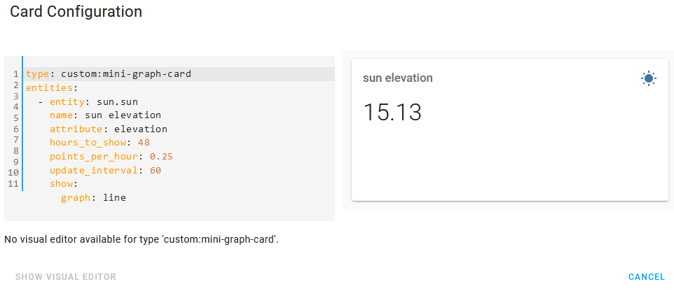
Wrong indentation.
Hi all, I have made a bar graph for the daily consumption of one device. The code is below
Unfortunately, I can’t do the same for monthly consumption, I imagine that one bar will always be one month.
Can someone please advise me, is it even possible to do it?
type: custom:mini-graph-card
name: Dryer
entities:
  - entity: sensor.susicka_consumption_daily
icon: mdi:flash-circle
color_thresholds:
  - color: '#0da035'
    value: 0
  - color: '#039BE5'
    value: 1
  - color: '#e0b400'
    value: 2
  - color: '#e45e65'
    value: 3
group_by: date
hours_to_show: 240
aggregate_func: max
show:
  graph: bar
  group_by: date
  labels: true
hour24: true

Is it possible if using “color_thresholds” to change the color of the state? So that detect better a bad value?
As sample for dust concentration:

thresholds are set to “45” here - but because last bar show the average it is still green (2h to show in bar) - even if value is “55” or more.
Same could be interesting for temperature…
Would be nice to have the same option for the state color as for line/bar color (with same limits)
Thanks!
Try using state_adaptive_color (never used it myself, so untested).
THANKS - it is working as expected!
LINE WIDTH - Different line widths of same graph?
Can you create mini-graph-card graphs with multiple lines/ entities each with different line widths?
In the following I want the blue/red line to be thick and the gray line to be thin.
In the code I have line_width= 10 and 1 respectively but the lines look the same width to me.
(I’ve tried line_widith=10,40,100 but it does not seem to change.

I’ve looked at a lot of peoples lovely/ amazing charts but the lines always seem to be the same width?
PS: I’m not sure every line in the following/ works/ is required, its been a bit of a journey and I’m not finish yet so I’ve not cleaned up yet,
  - type: custom:mini-graph-card
    hours_to_show: 6
    points_per_hour: 24
    font_size: 85
    entities:
      - entity: sensor.metered_current_consumption
        name: From Grid
        labels: true
        **line_width: 10**
      - entity: sun.sun
        color: gray
        name: Night
        show_fill: fade
        show_line: false
        show_legend: false
        show_points: false
        y_axis: secondary
      - entity: binary_sensor.electricityisoffpeak
        color: green
        name: Night
        show_fill: true
        show_line: false
        show_legend: false
        show_points: false
        y_axis: secondary
      - entity: input_number.zero
        color: gray
        **line_width: 1**
        show_fill: false
    state_map:
      - value: above_horizon
        label: 0
      - value: below_horizon
        label: 1
    color_thresholds_transition: hard
    color_thresholds:
      - value: -5000
        color: green
      - value: 0
        color: blue
      - value: 3000
        color: red
    show:
      legend: false
      points: false
      labels: false
      icon: false
      name: false
      name_adaptive_color: true
Having looked at the mini-graph-card docs again whilst writing this post, line_width is listed as a card option and not an entity (ie the line) option, so I guess I’m busted unless anyone has a clever trick I’ve missed.
PS: What I’m trying to do is use the grey line or similar to show zero as my energy consumption goes negative when the solar panels kick in. (You’ll see the line becomes green [thresholds])
Please start using formatting when posting a code.
Sorry, done/fixed
Yes, below is your answer:
Is there a way to display the “raw” sensor data instead of interpolated, smoothed, etc graphs? More like the standard history-card does?
You cannot display raw data, but can reduce interpolation:
aggregate_func: last
points_per_hour: equal to a real scan_interval
smoothing: false
And surely this is not for bar graph.
Hello…
i have a question…

-
I’d like to have just the max value on every day… Is this possible?
-
I’d like to format the displayed extrema values. No need for time and date. Possible to remove this?
Thanks so far 
Use search here for “card-mod” keyword.