Thanks mate was trying to work that out
FYI with a few days testing when using 0/100 aggregate_func: last
has no affect.
upper_bound_secondary: 100
and lower_bound_secondary: 0
is what is required.
Only for your case since you use secondary Y-axis for physical values & binary values.
Needed for 0/1 & may be not for 0/100.
Besides, even for ANY values I see no need to use other values than “last”.
I appreciate the conversation and the many posts you have put up here to help others. Thanks.
Can you explain what the aggregate function is actually acting on?
It has many possible values & algorithm is complex, better to check a code. Just consider this simplest example:
Assume there are 60 readings (records in DB) within an hour; points_per_hour=6. Means - you do not need all 60 values for a graph, it will use only 6 values. Now how to convert each 10 real values into 1? Average, min, max, last? If you need only 6 values - then probably “average” is your choice. But if you have points_per_hour=60? 120? 240? These greater values are needed sometimes to show a “steplined” graph. In these cases an additional calculation to get “average” = not needed. Besides, for 0/1 graphs sometimes it shows 0 where it must be 1 - if you set aggregate_func wrongly.
LINK TO THE FINAL CARD WITH UPDATED CODE
With what you have noted above and me re-reading the docs have explained the behavior I am seeing in the below graphs. With some commentary.
Aggregate functions
Recorded values are grouped in time buckets which are determined by
group_by
,points_per_hour
configuration. These buckets are converted later to single point/bar on the graph. Aggregate function defines the methods of that conversion.
Name Since Description avg
v0.8.0 Average median
v0.11.0 Median min
v0.8.0 Minimum - lowest value max
v0.8.0 Maximum - largest value first
v0.9.0 last
v0.9.0 sum
v0.9.2 delta
v0.9.4 Calculates difference between max and min value diff
v0.11.0 Calculates difference between first and last value
Name Type Default Since Description group boolean false v0.2.0 Disable paddings and box-shadow, useful when nesting the card. #Not to be confused for group_by points_per_hour number 0.5 v0.2.0 Specify amount of data points the graph should display for each hour, (basically the detail/accuracy/smoothing of the graph). aggregate_func string avg v0.8.0 Specify aggregate function used to calculate point/bar in the graph. group_by string interval v0.8.0 Specify type of grouping of data, dynamic interval, date or hour.
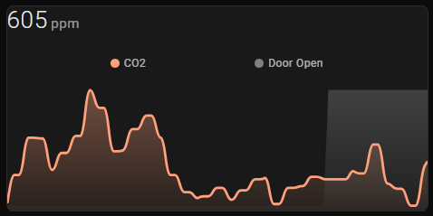
With 0/100- Setting no aggregate_function:
for the entity.
- The door open shows the short duration event at half the range.
- (Must be some sort of default average?)
With 0/100- Setting aggregate_function: avg
for the entity.
- The door open shows the short duration event at half the range.
- Showing the average of readings in the time bucket.
With 0/100 - Setting aggregate_function: last
for the entity.
- The door open does not show the short duration event unless it is last in the time bucket.
With 0/100 - Setting aggregate_function:min
for the entity.
- The door open only shows the minimum reading within each time bucket.
- Short duration events won’t register unless there is a high point per hour count or short group_by time.
With 0/100 - Setting aggregate_function: max
for the entity.
- The door open only shows the maximum reading within each time bucket.
- The door open uses the full range of graph, even for short duration events.
Hi all there,
I’m diabetic, and I would to share what I obtained after many hours of fiddling…
This is a graph from my CGM dexcom G6 linked to HA with dexcom integration.
I have achieved, with the help of some previous messages + an advice from ildar170975 to change dynamically the icon with the trend information of the dexcom integration, and to colorize the sate information accordingly to the value read. So visually i know immediately if all is OK or if something goes wrong !
I must just find a way for the 2 extreme trends states (rising-quickly and falling-quickly) to show a double arrow (up ⇈ or down ⇊ ) that indicates visually that the BG is changing very quickly and that I must make something about that… The double arrow is used on my pump and on the dexcom app, so it’s a known signal.
If someone has an idea to load an custom svg via card-mod, or show a second icon in that case…
Here is the YAML of my card :
type: custom:mini-graph-card
entities:
- sensor.xxxxxxx_glucose_value
hours_to_show: 12
name: Glycémie Christophe
icon: mdi:wifi
align_state: center
points_per_hour: 12
hour24: true
decimals: 0
lower_bound: 40
height: 200
font_size: 150
color_thresholds:
- value: 0
color: "#ff0000"
- value: 60
color: "#ff0000"
- value: 100
color: "#0077ff"
- value: 110
color: "#00ff00"
- value: 160
color: "#00ff00"
- value: 190
color: "#ff7700"
card_mod:
style: |
ha-card .state__value {
font-weight: bold;
font-size: 350%;
margin-right: 10px;
{% set VALUE = states('sensor.xxxxxx_glucose_value') %}
{% if (VALUE | int >= 180) %}
color: #ff7700;
{% elif (VALUE | int >= 100) %}
color: #00ff77;
{% elif (VALUE | int >= 70) %}
color: #00aaff;
{% elif (VALUE | int <= 69) %}
color: #ff5050;
{% endif %}
}
ha-card .state__uom {
font-weight: normal;
font-size: 100%;
position: relative;
top: -25px;
}
ha-card .header.flex .icon {
color: white;
--mdc-icon-size: 55px;
position: relative;
top: 10px
}
ha-card .header.flex, ha-card .states.flex {
padding-bottom: 0;
}
ha-card.flex {
padding-top: 0;
{% set TREND = states('sensor.xxxxxx_glucose_trend') %}
{% if (TREND == 'rising_quickly') %}
--card-mod-icon: mdi:arrow-up-bold-box;
{% elif (TREND == 'rising') %}
--card-mod-icon: mdi:arrow-up-bold;
{% elif (TREND == 'rising_slightly') %}
--card-mod-icon: mdi:arrow-top-right-thick;
{% elif (TREND == 'steady') %}
--card-mod-icon: mdi:arrow-right-bold;
{% elif (TREND == 'falling_slightly') %}
--card-mod-icon: mdi:arrow-bottom-right-thick;
{% elif (TREND == 'falling') %}
--card-mod-icon: mdi:arrow-down-bold;
{% elif (TREND == 'falling_quickly') %}
--card-mod-icon: mdi:arrow-down-bold-box;
{% endif %}
}
Divide it to
ha-card.flex {
padding-top: 0;
}
ha-card {
{% set TREND = states('sensor.xxxxxx_glucose_trend') -%}
{%- set mapper = {
'rising_quickly': 'mdi:arrow-up-bold-box',
'rising': 'mdi:arrow-up-bold',
'rising_slightly': 'mdi:arrow-top-right-thick',
'steady': 'mdi:arrow-right-bold',
'falling_slightly':'mdi:arrow-bottom-right-thick',
'falling': 'mdi:arrow-down-bold',
'falling_quickly': 'mdi:arrow-down-bold-box'
} -%}
{%- set ICON = mapper[TREND] if TREND in mapper else 'mdi:help' -%}
--card-mod-icon: {{ICON}};
}
Also, all these “ha-card .header.flex”, “ha-card abc” may be replaced by “abc” (of course if “abc” does not exist in several levels of DOM).
Currently you are using “-box” icons for these extrema states.
We can colorize the icon for these states (make it blinking, for example).
If it helps, this can be more concisely written as
{{ iif( states( "binary_sensor.middle_floor_sensor_group" ),1, 0 ) }}
I am using “binary_sensor → 0/1” template in many places - so just made a macro for it. Reusing a code drastically reduces a probability of error.
If this template is only used for template sensors - then a possible way could be using a blueprint for template sensor (it currently does not work for trigger-based sensors only).
Yeah, waiting eagerly for the template sensor blueprints to get fixed so I can use a template sensor - mines also in a macro - I hate writing stuff more than once - no need to maintain multiple lines of code
HTML Arrow Symbol, Arrow Entity and ASCII Arrow Character Code Reference
I use code similar to Ildar’s for my Son’s Dexcom, but with the UTF8 arrows (all of which have an HTML entity equivalent, same as you inserted into your post )
They cover all of the various Dexcom states
It is possible to add any character to mini-graph-card.
But imho an icon is more visible.
Of course these unicode chars helps when we do not have appropriate icons…
Thanks mate, always looking for ways to reduce lines. I assume if rather than iif.
No, it acually is Immediate if (iif) - A common case is to conditionally return a value based on another value. For example, return a “Yes” or “No” when the light is on or off.
Note that using “iif” can cause issues due to a sequence of calculations.
True: I guess this would be more robust…
{{ states("binary_sensor.middle_floor_sensor_group") | bool | int }}
Thank you for the idea ! I managed to add the arrows as a webfont, with using a nice fat SVG arrow that I have rotated or doubled, just after the unit of mesure.
Here is the result with the 3 types of arrows. :
I’m very pleased by the result !
I would simply use
{% if is_state(xxx,'off') -%}
0
{%- else -%}
1
{%- endif %}
and in some cases (dependently on a nature of a binary_sensor) it is needed to have a “reverted” logic:
{% if is_state(xxx,'on') -%}
0
{%- else -%}
1
{%- endif %}
Very nice, please share the final code with an svg thing for posterity))