Lovelace: mini graph card

For those who really wants this:

type: custom:mini-graph-card
entities:
  - entity: sensor.cleargrass_1_co2
    name: Temp
    show_state: true
    color: red
    state_adaptive_color: true
  - entity: sensor.cleargrass_2_co2
    name: CO2
    show_state: true
    color: green
    state_adaptive_color: true
show:
  name: false
  icon: false
card_mod:
  style: |
    .states.flex {
      flex-direction: column;
    }
    .states--secondary {
      margin-left: 0px !important;
      margin-top: 12px;
    }

image
image

Works nice only for two entities maximum.

Unfortunately, it is better to disable the “show points” option since the top state label is used not only for displaying the 1st entity’s state but also for displaying a value for the selected point of ANY graph.
Look at the picture: the bottom label contains a current state of the 2nd entity, the top label contains a state for the selected point of the same 2nd entity:
image
So, this mod should be used w/o the “show points” option.


More card-mod examples.

1 Like

Displaying states as a part of the legend:

type: custom:mini-graph-card
entities:
  - entity: sensor.cleargrass_1_co2
    name: Temp
    color: red
  - entity: sensor.cleargrass_2_co2
    name: CO2
    color: green
show:
  name: false
  points: false
  icon: false
  state: false
card_mod:
  style: |
    .graph__legend__item:nth-of-type(1) .ellipsis:after {
      content: ": {{states('sensor.cleargrass_1_co2')}} ppm";
    }
    .graph__legend__item:nth-of-type(2) .ellipsis:after {
      content: ": {{states('sensor.cleargrass_2_co2')}} ppm";
    }

image

Only if you are not interested in “show points = true”.


More card-mod examples.

1 Like

Can you show me your code please?

Combining history-graph & mini-graph-card:
изображение

type: custom:stack-in-card
card_mod:
  style: |
    ha-card {
      overflow: visible !important;
    }
cards:
  - type: custom:mini-graph-card
    entities:
      - entity: sensor.cleargrass_1_co2
        name: CO2
    hours_to_show: 48
    points_per_hour: 60
    line_width: 1
  - type: history-graph
    entities:
      - entity: sun.sun
        name: Sun
    hours_to_show: 48
    refresh_interval: 0
    card_mod:
      style: |
        .content {
          padding-left: 0px !important;
          padding-right: 0px !important;
          padding-top: 0px !important;
        }
        ha-card {
          margin-top: -4px;
        }

Surely one binary sensor may be added as a background card - you need to “convert” this binary_sensor into sensor (0,1) and “attach” it to secondary y-axis:
изображение


Update 24.06.22:
Due to changes in HA 2022.6 in part of history-graph, this style should be revised:

type: custom:stack-in-card
keep:
  outer_padding: true
...
  - type: history-graph
    entities:
      - entity: sun.sun
        name: ' '
...
        ha-card {
          margin-top: -10px;
          margin-right: -5px;
          margin-left: -10px;
        }

image
And result is unstable…

3 Likes

not sure if you ever received a reply on this, but I just found your post, and hadn’t read @Ildar_Gabdullin 's remark above it… so I tried it and it still works (on dev 2022.2.0) :wink: very nice suggestion and addition indeed

Thanks for your feedback, Marius. I totally forgot about this when I upgraded at the time (and hence thank you for the reminder too), but luckily remained working (I’m on 2021.12.7).

How can i get the “mbit/s” under the actual state? (i want it to be in a double row)
grafik

1 Like
type: custom:mini-graph-card
entities:
  - sensor.cleargrass_1_temperature
style: |
  ha-card .states.flex .state {
    display: grid;
  }

image
image


More card-mod examples.

3 Likes

That’s a very nice mod of the mini graph card. Thank you! Is it possible to change the font size of the legend?

See here
image

1 Like

Greetings. I trying out two graph cards with basic configs:

 type: custom:mini-graph-card
 hour24: true
 line_width: 2
 entities:
   - entity: sensor.processor_use_percent
   - entity: sensor.memory_use_percent
   - entity: sensor.disk_use_percent
   - entity: sensor.swap_use_percent
   - entity: sensor.last_boot

and

type: custom:plotly-graph
entities:
  - entity: sensor.processor_use_percent
  - entity: sensor.memory_use_percent
  - entity: sensor.disk_use_percent
  - entity: sensor.swap_use_percent
  - entity: sensor.last_boot
hours_to_show: 24
refresh_interval: 10

HA returns this:

Why mini-graph-card shows straight lines where plotly does actually build graphs, what do I do wrong?

1 Like

Specify points_per_hour for the mini-graph-card according to actual scan_interval of your sensors.

1 Like

How do I make the “0” graph bars disappear. Only want positive number bars displayed?

animate: true
entities:
  - entity: sensor.pool_filling
    aggregate_func: sum
    smoothing: true
hours_to_show: 24
name: Pentiar Pool Filing - Hourly
type: custom:mini-graph-card
show:
  graph: bar
group_by: hour
fixed_value: true
color_thresholds:
  - value: 20
    color: '#f39c12'
  - value: 1
    color: '#d35400'
  - value: 250
    color: '#c0392b'
labels: true

Hi,
Can you assign transparency level to graph line?

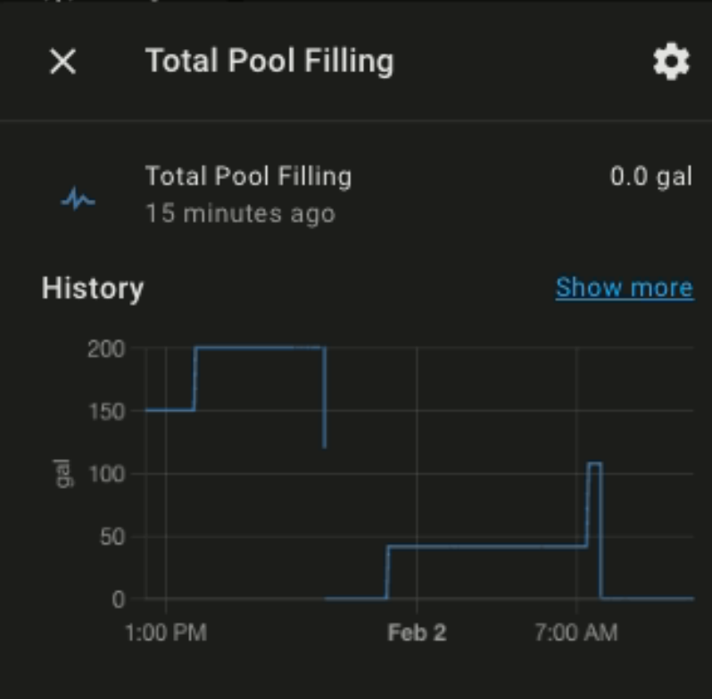
Need some help with graphing hourly totals. The hourly aggregate: sum do not seem to correlate to the hourly changes for the sensor. For instance the total Pool Filling value goes from 42 to 105 from 7:06 to 7:22 am however the hourly bar chart only record 22 gallons from 8:00 am to 8:59 am. Why is it different and why 1 hour off?

align_state: center
animate: true
entities:
  - entity: sensor.pool_filling
    aggregate_func: sum
    smoothing: false
hours_to_show: 24
name: Pentiar Pool Filing - Hourly
type: custom:mini-graph-card
show:
  graph: bar
group_by: hour

Screen Shot 2022-02-02 at 12.07.57 PM

Hey!! Im loving this graph! So beautiful and simple.
I did have a question though, can it shrink height wise? Like how can I adjust the padding on the graph? I think theres too much empty space at the top, I get how to adjust the graph at the bottom but I’m looking to shrink the negative space up top.

Thank you!!

type: custom:mini-graph-card
entities:
  - entity: sensor.livingroom_humidity
    name: Livingroom
    color: '#ff8400'
  - entity: sensor.bedroom_humidity
    name: Bedroom
    color: '#ba7600'
show:
  labels: false
line_width: 4
font_size: 75
height: 75
hours_to_show: 120
points_per_hour: 3
name: Humidity

G’day,

is there an option to only display values for “today” as in from 00:00 to 23:59, instead of the past x amount of hours

Thanks

2 Likes

Hi,
I added my sensor to HA one month ago. I want to see graph from beginning, when sensor is adeed to HA. My card have the following settings:

hours_to_show: 744
points_per_hour: 0.04

which shows data for month. But after few days, graph will not display data which are older than one month. I could change parameters but this is not good solution.

Is it possible to display graph from beginning of data and only from beginning? Some kind of dynamic x axis range…, perhaps new option to set beginning date instead of hours_to_show?

  1. Does the Recorder keep data for a period you need?

  2. As for dynamically changing hours_to_show:

  • put the card inside a config-template-card;
  • use a template for hours_to_show - kind of “increase the value by 24 every day”.

The side effect is that the whole graph will have to redraw itself on every sensor’s update since it is placed inside config-template-card. But if your sensor is updated rarely then this is not a problem.

Alternatively - wait for native templates support in the mini-graph-card.

1 Like

Can you please share the code you are using to generate the daily kWh bar chart? I’ve been trying to figure that out for over 1 month. I have a Sonoff S31 plug with power monitoring but I get only the watts. I know I can convert watts to kWh using Riemann Sum or Utility Meter, but then I don’t understand how to go from there and generate the bar chart where each bar is a day.