šŸŒ» Lovelace UI ā€¢ Minimalist

That was on a chip card.

Tried it right now on a light card, but couldnā€™t get it to work. But it did work on the person card.

I guess it depends on how the template it set up, if the icon is used in the ā€œstandardā€ way or if it is nested inside custom_fields, e.g.,

# Below is taken from card_light.yaml
show_icon: false
custom_fields:
  item1:
    card:
      type: "custom:button-card"
      custom_fields:
        item1:
          card:
            type: "custom:button-card"
            entity: "[[[ return entity.entity_id ]]]"
            icon: "[[[ return variables.ulm_card_light_icon ]]]"

Maybe there is a way to target a nested icon, but I havenā€™t succeeded. Yet.

I figured it out. @vikreh @nerdybynature
Yeah it depends on the template, itā€™s a nesting problem.
You have to check the template and find where the icon is defined.

For the light card I solved this way:

- type: "custom:button-card"
    template: card_light
    entity: switch.fan
    variables:
      ulm_card_light_force_background_color: true
      ulm_card_light_icon: mdi:fan
    custom_fields:
      item1:
        card:
          custom_fields:
            item1:
              card:
                styles:
                  icon:
                    - animation: >
                        [[[
                            if (entity.state == "on"){
                              return 'rotating 2s linear infinite';
                            }
                        ]]]

Maybe there is a prettier method, but hey, it works.

2 Likes

Ah, just override the styles. Neat!

Nice work!

Just updated, was a few versions behind. The behaviour of generic_card_swap which I use quite a lot seems to have changedā€¦ custom icon needs to be specified as a variable now (easy fix) but the icon size doesnā€™t seem to be affected by e.g. size: 200% any more. What am I missing?

Where do I need to adjust the minimalist-mobile-tapbar theme , if I would like to have the elements displayed in the nav bar centered and spread across the width of the page?

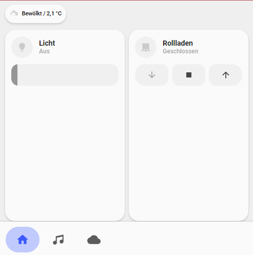
Does anyone know how to make this part foldable. I would like to have the part in a red rectangle unfoldable when some button is pushed. Exactly like fold-entity-row works.

The theme is so great! Thanks for all the work.
I wanted to change some color-variables in the theme files, like I did in previous themes.
Unfortunately after a restart of my pi the theme-files are set back to the original state. Is this supposed to happen? If so, is there any way to change the accent-colors (like google-red etc.)? Im not sure if this is a bug in my installation or if the theme resets the files after a restart.

Thanks for any feedback!

I am trying to add last_changed as a part of the label. I would like to achieve something like in the screenshot

here is a part of my code.

I would highly appreciated any help!
thanks.

custom_card_light_group:
  template:
    - "ulm_language_variables"
  variables:
    card_filter_area: "Your filter Area"
    card_filter_domain: "Your Filter Domain"
    card_filter_state: "Your Filter State"    
    
    card_light_group_entity: "Your Light Group Entity"
    card_light_group_name: "Your Light Group Name"
    card_light_group_icon: "Your Light Group Icon" 
    ulm_card_light_enable_popup: true
    
  show_icon: false  
  show_name: false
  show_label: true
  show_last_changed: true
 
  triggers_update: "all"
 
  styles:  
    grid:
      - display: "block"
      - flex-flow: "column"
      - justify-self: "start"
      - grid-template-areas: "'header' 'autofill'"  
    card:    
      - padding: "0px 0px 0px 0px"  
      - margin-top: "0px"
      - padding-bottom: "0px"
      - margin-bottom: "0px"      
      - background-blend-mode: "soft-light"          
      - background-size: "cover"
      - background-repeat: "no-repeat"
      - background-position: "center" 
      - background-color: >-
          [[[
            let state = entity.attributes.brightness;
            let brightness = state / 255;
            let value = brightness.toFixed(2)
            if(entity.state !="on"){
              return 'rgb(var(--color-grey))'
            }
            else if (entity.state =="on" && brightness >= -0.1){
                return 'rgba(199, 167, 125,' + value + ')';
            } else {
              return 'rgba(var(--color-grey),' + value + ')';
            }
          ]]]
      - background-image: >
          [[[
            return 'linear-gradient(to bottom, rgba(199, 167, 125, 1) 0%,rgba(199, 167, 125, 1) 100%)'
          ]]]

  custom_fields:
##### top bar #####   
    header:
      card:
        type: "custom:button-card"
        styles:
          grid:
            - display: "flex"   
            - justify-content: "space-between"
          card:
            - box-shadow: "none"
            - padding: "0px"
            - background-color: "rgba(255, 255, 255, 0.0)" 
        custom_fields:
          item1: ##header title
            card:
              type: "custom:button-card"
              template:
                - "icon_more_info"
              styles:
                card:
                  - background-color: "rgba(255, 255, 255, 0.0)"
                  - padding: "12px"  
                  - width: "150%" 
              custom_fields:
                item1: ##header icon, display set to none!!
                  card:
                    type: "custom:button-card"
                    entity: "[[[ return entity.entity_id ]]]"
                    show_icon: none
                    icon: "[[[ return variables.card_light_group_icon ]]]"
                    tap_action:
                      action: >
                        [[[
                            if (variables.ulm_card_light_enable_popup){
                              return 'fire-dom-event'
                            }
                            else{
                              return 'more-info'
                            }
                        ]]]
                      browser_mod:
                        service: browser_mod.popup
                        data:
                          title: "[[[ return variables.card_light_group_name ]]]"
                          icon: "[[[ return variables.card_light_group_icon ]]]"
                          content:
                            type: entities
                            entities:
                              - light.hanging_lamp_bedroom_1
                              - light.standing_lamp_bedroom_1

                          card_mod:
                            style:
                              ha-dialog$: |
                                div.mdc-dialog div.mdc-dialog__scrim {
                                  background: rgba(0, 0, 0, 0.7);
                                }

                    styles:
                      card:
                        - background-color: "rgba(var(--color-theme),0.0)"   
                        - border-radius: "0px" 
                        - display: "none"                                                  
                      icon: 
                        - color: "white"  
                        - width: "32px"   
                      img_cell:
                       - background-color: "rgba(var(--color-theme),0.0)"  
                item2: ##header title text
                  card:
                    type: "custom:button-card"
                    entity: "[[[ return entity.entity_id ]]]"
                    name: "[[[ return variables.card_filter_area ]]]"

                    styles:
                      card:
                        - color: "rgba(255, 255, 255, 1.0)"
                        - border-radius: "0px"  
                      name: 
                        - margin-left: "9px" 
                        - font-size: "18px"                    
                      label: 
                        - filter: "opacity(70%)"
                        - margin-left: "9px" 
                        - font-size: "14px"                         
                    label: >-
                      [[[
                        if (entity.state !="unavailable"){
                          if (entity.state =="off"){
                            return "off" + " | " + variables.card_light_group_name;
                          } else if (entity.state == "on"){
                            if (entity.attributes.brightness != null){
                              var bri = Math.round(entity.attributes.brightness / 2.55);
                              return  '<ha-icon icon="mdi:lightbulb-on" style="width: 16px; height: 16px; margin-top: -3px;"></ha-icon>' + (bri ? bri : "0") + "%" + " | " + variables.card_light_group_name ;
                            } else {
                              return variables.card_light_group_name;
                            }
                          }
                        } else {
                          return variables.card_light_group_name + " | " + variables.ulm_unavailable + " | " + relative_time(states[entity_id].last_changed);
                        }
                      ]]]

Hi :wave:
Thanks for your beautiful custom cards.
Could you also share the ā€œsolar panelā€ card? i didnā€™t find it in the custom cards

Hello, iā€™m still having this issue of border even if i had the specific line in my theme.yaml

here is the file :

---
minimalist-desktop:
  # Journal
  state-icon-color: "rgb(var(--color-theme))"
  border-radius: "20px"
  ha-card-border-radius: "var(--border-radius)"
  # fix added border-lines in 2022.11
  ha-card-border-width: "0px"
  error-color: "var(--google-red)"
  warning-color: "var(--google-yellow)"
  success-color: "var(--google-green)"
  info-color: "var(--google-blue)"
  divider-color: "rgba(var(--color-theme),.12)"
  accent-color: "var(--google-yellow)"
  ha-dialog-border-radius: "10px"

  card-mod-theme: "minimalist-desktop"
  card-mod-view-yaml: |
    "*:first-child$": |
      #columns .column > * {
        padding-left: 5px;
        padding-right: 5px;
        padding-bottom: 5px;
      }
..........

I tested on 2 web browser : Firefox & Safari with the same result.

Capture dā€™eĢcran 2022-11-22 aĢ€ 10.49.54

1 Like

Perhaps double check if you actually have that theme selected on your profile?

after 2 restarts, itā€™s ok.
I donā€™t know why, but it seems to be solved now.

Were you able to figure this out? Iā€™m getting the same ā€œCustom element doesnā€™t exist: button-card.ā€ error.

Iā€™ve double checked my entities and cleared cache for the UI page.

I am trying to customise the Minimalist UI Light and Cover card to my usage in order to fit the space of the NS Panel Pro nicely. For it I have copied the code of the light card into a custom_card_light.yaml file.
I started to inspect the code.
Eventually I would like to go from here:
Orig
to here:
Mock-Up

First off I tried to identify the slider figuring out how it is introduced into the standard card.
I found it to be a custom:my-slider card listed under item2:
Checking the documentation of the slider card on GitHub I noticed that the my-slider does not support a vertical slider element. Instead, custom:my-slider-v2 would need to be used with vertical: true.
However simply replacing the custom:my-slider with custom:my-slider-v2 makes the slider vanish completly. What am I missing?

Follow on question would then be regarding repositioning the elements within the card. But probably I should take it step by step.

A further question I have already raised: How can I ammend the minimalist-mobile-tapbar theme to align the navigation pages to the center of the screen/bar?

1 Like

Is there a simple way to change cover color on card_room based on position (0-100)?
I can change color of lights and fan without ptoblem (color_on/off), but I am unable to find command for cover.

Make custom colors, with a value template. But use operators to definie value ranges.

And if you donā€™t like the implementation like me you can. Setup your custom templates In proper directories like me too instead of all dumped into custom_cards

1 Like

Is it possible to make animated cards somehow similarly to what the mushroom cards are doing?

Yes, the button-card allows overriding all of the styles. For example if you wanted the cog animation: image

Your yaml would look like:

          - type: 'custom:button-card'
            template: chip_mdi_icon_state
            variables:
              ulm_chip_mdi_icon_state_icon: 'mdi:cog'
              ulm_chip_mdi_icon_state_entity: sensor.spinning_cog
            styles:
              icon:
                - animation:
                  - "spin 1.5s steps(5) infinite"

You can use any normal css animation in you styles override.

Thank you. Does it only work for the button card?

All ui-lovelace-minimalist cards are button cards, so it should work with any standard or custom card.