How can I adjust the background color for tile cards (or all cards) when using Material You.
And how can I add a border to cards?
The same way you would with any theme - change --ha-card-background in either in the card using card-mod, theme, or using a custom style sheet.
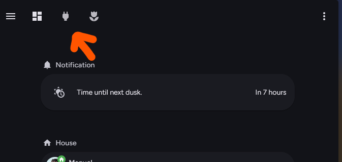
how can i see the navbar also on my hidden (sub)pages?
thanks
You can’t. Home Assistant does not show the view tabs on subpages. It used to just be hidden, but now it’s no longer rendered on subpages.
You could use Navbar card instead. The theme companion module has a toggle to completely hide the default navigation bar so people can use that or other alternative methods.
1 Like
I cleared cache, double checked config files, reinstalled, rebooted… All mutliple times. The navbar in the dashboard is still at the top on mobile and desktop! How can I fix this?
Can I set the nav bar on top since I already use bubble horizontal cards?
Troubleshooting thread for reference. Last week I ran into an issue where my phone would not load the latest version. I finally got it unstuck by installing an older version, doing the whole clear cache on phone thing and seeing that the old version loaded, and then re-installing the latest version and thoroughly clearing cache again.
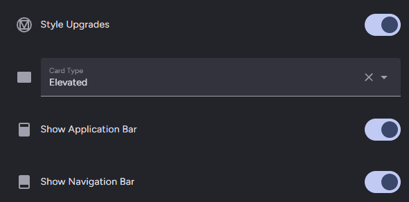
No, you cannot restore the original view tabs without completely disabling style upgrades. You can hide the navigation bar entirely and use a different navigation solution (they will still be visible in edit mode).
As of a few patches ago, you can also hide the app bar / header, which is great for tablet displays.
This is a super basic question but the solution is eluding me at the moment!
I’m trying to create a single-press button that has the layout/design of the ones in the picture (from your theme github page). The button just needs to perform an action to press a button entity but for whatever reason I can’t remember how to create a button that looks like the one in the image. Any pointers or advice?
tap_action:
  action: perform-action
  perform_action: wiser.boost_heating
  target:
    entity_id: climate.wiser_living_room
It’s using Material Home Components, but it looks like you’ve already posted the question in that thread.
1 Like
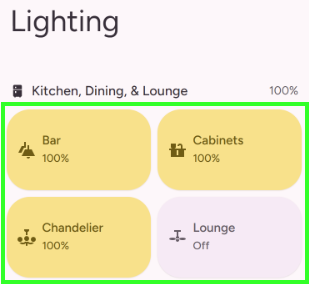
This is probably a really stupid question. I am a n00b. Some of my cards are not adjusting to the theme. They are a different shade of gray, and some have a drop shadow and others don’t. I am sure it is just something I am doing wrong. For instance, I am using the Material Slider card, and that show one way, but if I impliment the Weather forecast card and select Material You theme for that card it doesn’t have the same shade background color. Is there some thing else I need to do? I have Material You Theme, Material Symbols, Material You Utilities, and Material Home Componenets all installed if that helps…
The Material Home cards do not use the same card background color tokens as default and most custom cards. Theirs are based on Google Home’s components, which do not use exactly the same colors but do use the color tokens from this theme.
Can I change the color backgrounds on the default cards, with card mod?
Yeah, the same way you’d do it without this theme.
card_mod:
  style: |
    :host {
      --ha-card-background: red;
    }
You can also use card-mod to add a class to cards to use one of the alternate Material You card variants.
card-mod:
  class: filled
Thank you! I appreciate the help.
I know how to code some CSS and HTML. I used Inspect via Chrome and I can’t for the life of me figure out how to get rid of the bottom “shadow” that is on the non material you cards. Is it possible to remove those bottom shadows effect that is showing? Thanks again.
These are the four CSS custom properties used for Material You card variants:
--ha-card-background
--ha-card-box-shadow
--ha-card-border-width
--ha-card-border-color
There’s also a couple of other custom properties that are constant or unused by this theme:
--ha-card-border-radius
--ha-card-backdrop-filter
Set --ha-card-box-shadow to none. You can also set an alternate card variant using the companion module, or change this globally by providing a CSS file with the following contents to the companion module CSS Path/URL field.
:host {
  --ha-card-box-shadow: none;
}
Hi @Nerwyn
I would like to add a custom font, specifically Elms Sans or Outfit from Google Fonts.
I wanted to ask:
Is it possible to use a custom font with this theme?
If so, what is the correct way to integrate this font (Elms Sans or Outfit) into the theme?
The font I would like to use are:
https://fonts.googleapis.com/css2?family=Elms+Sans:ital,wght@0,100..900;1,100..900&display=swap
https://fonts.googleapis.com/css2?family=Outfit:[email protected]&display=swap
Thanks in advance for any suggestions!
Also
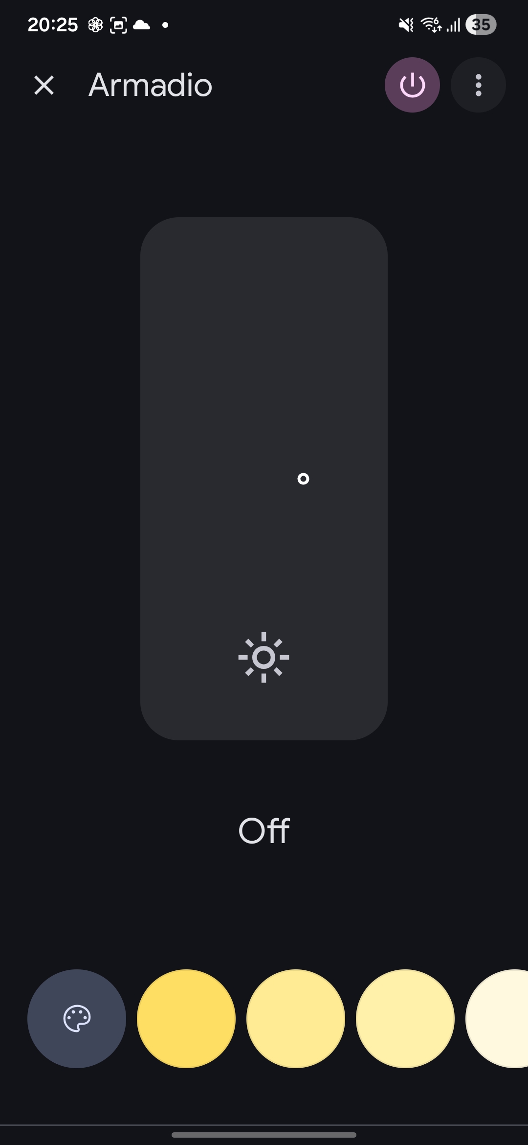
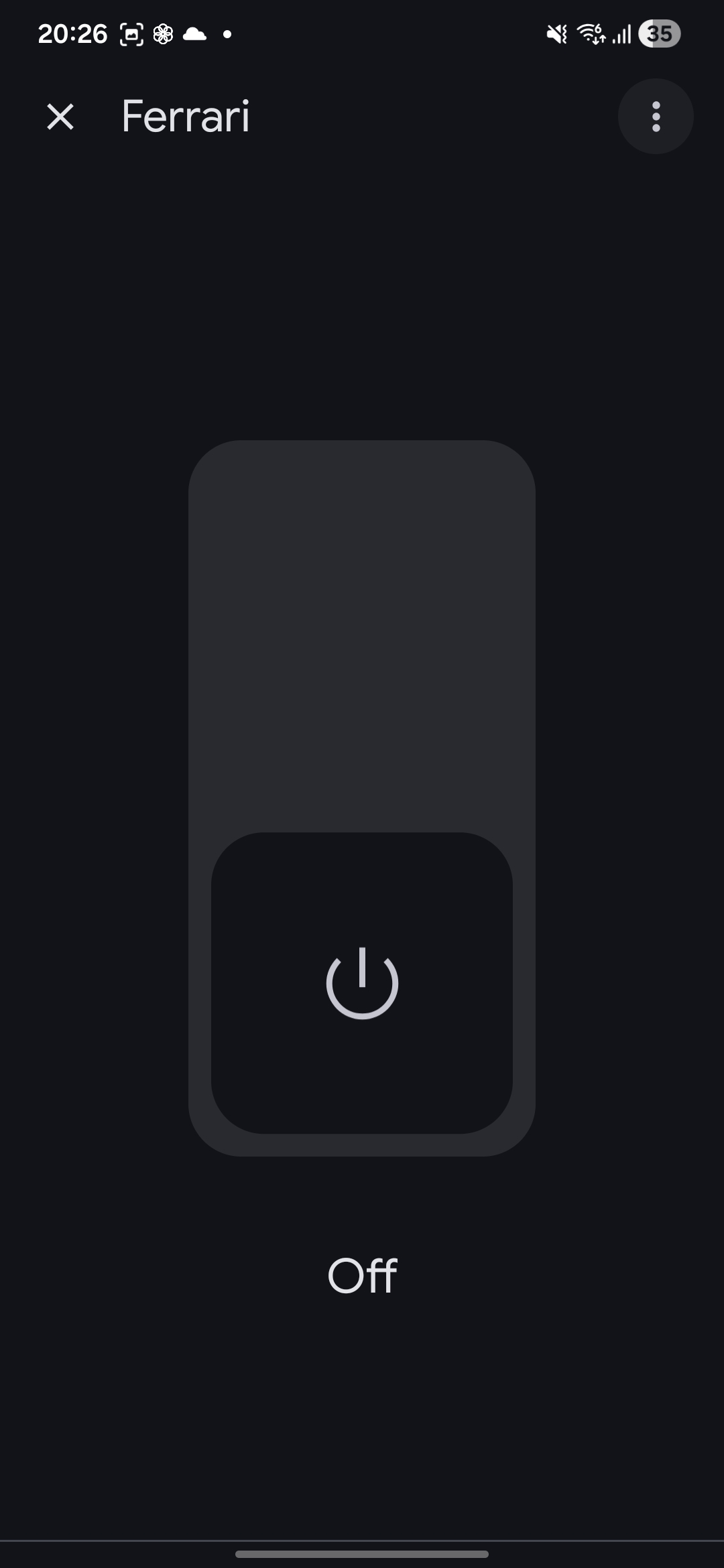
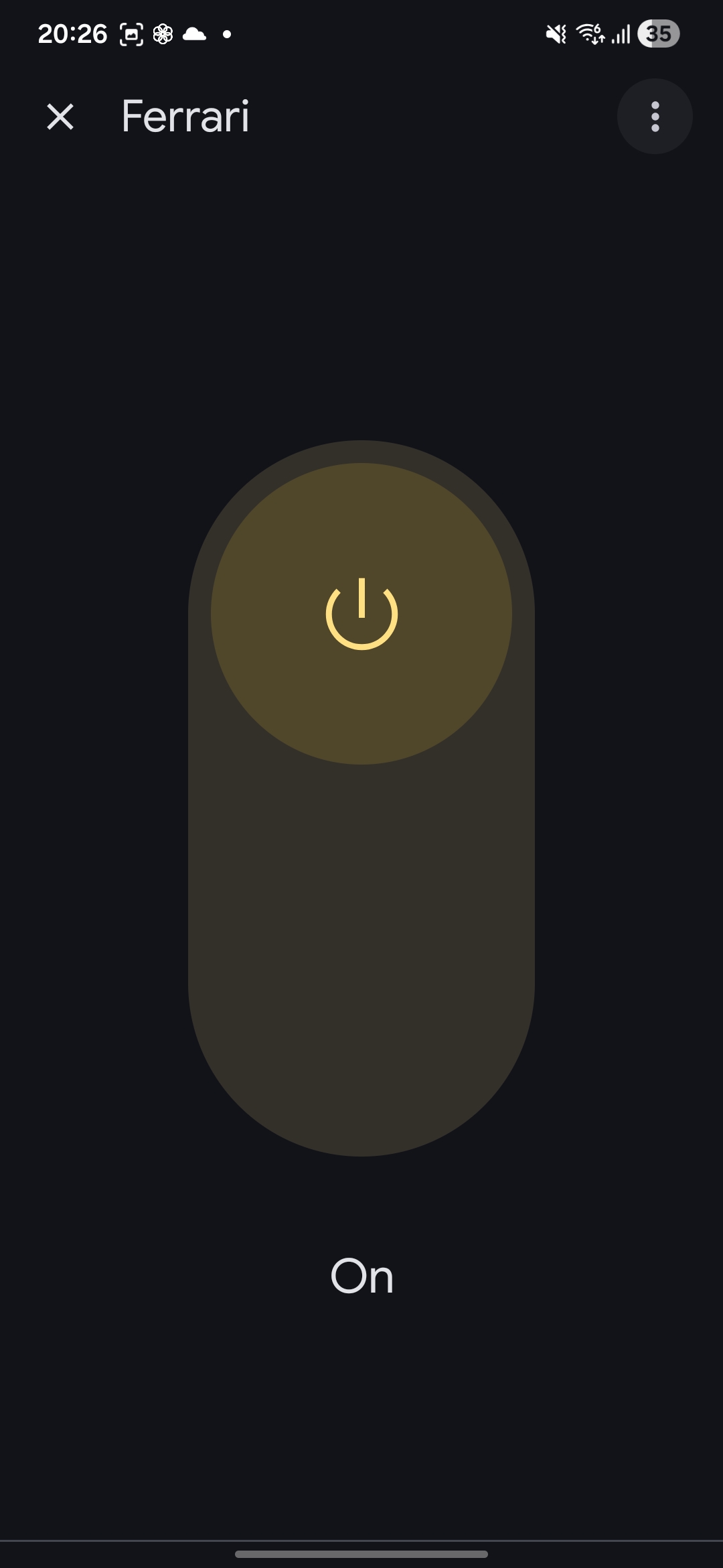
 Is it possible to have the new Google-style graphics for lights and switch in the more-info panel of Home Assistant?
I was trying to do in into the Material Component but i’m facing with a lot of issue.
Light
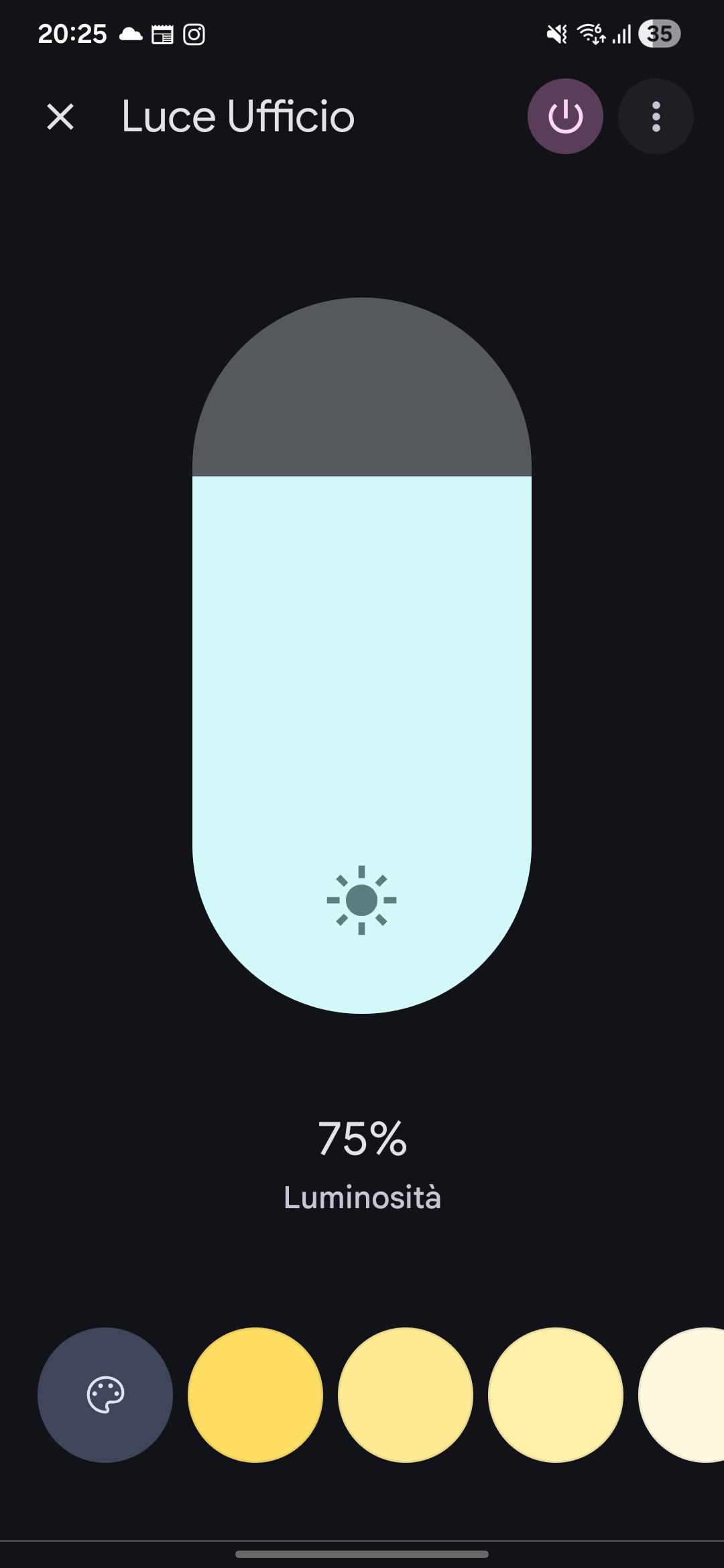
Switch
1 Like
Font family is defined in the theme here. Currently it prioritizes (and I recommend) Figtree but you can modify this list with your own fonts and then add them as frontend resources as described here.
It is possibly to modify the more-info dialogs using the companion module. I do not plan to do so as the Home Assistant ones for most entities are pretty modern as is.
2 Likes
FYI: Google has released an open source version of their proprietary font - Google Sans Flex. As of the latest theme patch version it is the recommended font for this theme. Here is the font family priority list:
"Google Sans Flex", Figtree, "Roboto Flex", Roboto, Noto, sans-serif
And here is the resource URL for Google Sans Font: https://fonts.googleapis.com/css2?family=Google+Sans+Flex:opsz,[email protected],1..1000&display=swap
1 Like
