You also added class: elevated, which is includes it’s own box shadow and is overwriting the box shadow from style. You have to remove that. You could also try changing the selector to :host(.elevated) and adding !important after none - making it more specific may allow it to overwrite the elevated card styles.
1 Like
Perfect! Thank you for all of your help with this. I am able to get the cards looking how I want now.
One more question: Is there anyway to add similar styling to a badge? From what I have read is that card_mod is not useable in the badges section.
card_mod:
  style: |
    :host {
      --ha-card-box-shadow: none !important;
      --ha-card-background: #eeeaed !important;
    }
AFAIK no. That’s a question for the card-mod thread, outside of the scope of this theme.
Card Mod v4 supports styling badges.
1 Like
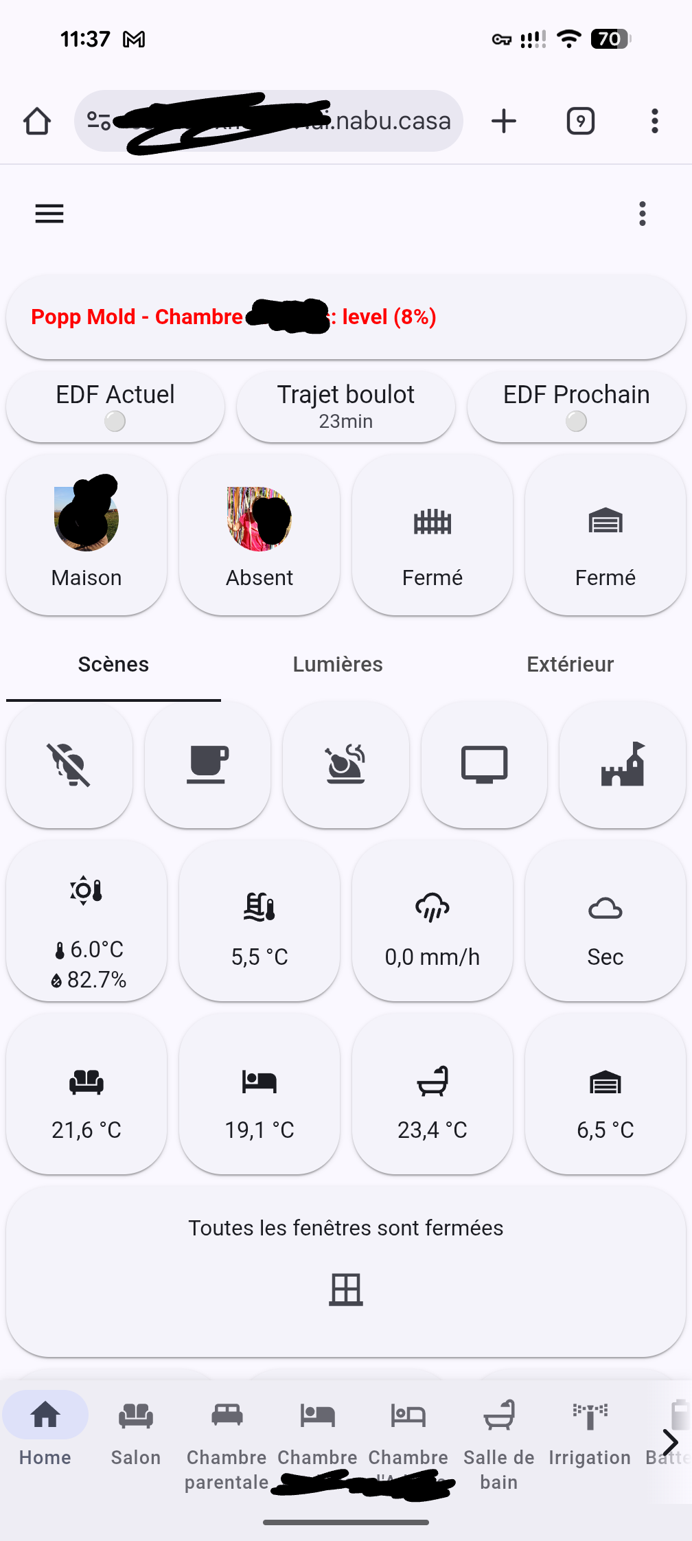
I discovered this really nice theme, I’m configuring it as default on my HA environment.
I have one question, I customized my previous theme to change the colors of the different tariff in the energy dashboard to be aligned with the Tempo option from French’s supplier EDF, splitting the consumption in 6 shifts with high/low cost on “blue, white, red” days. I used these lines in my custom theme:
      # Energy Dashboard Tempo
      energy-grid-consumption-color-0: "#009cff"
      energy-grid-consumption-color-1: "#0053ff"
      energy-grid-consumption-color-2: "#c9c9c9"
      energy-grid-consumption-color-3: "#a0a0a0"
      energy-grid-consumption-color-4: "#ff4949"
      energy-grid-consumption-color-5: "#FF0000"
Is there a way to apply this again to your theme without having to modify the files? Maybe by using your modding tool with CSS?
Thanks for your help
This part of the README describes how to use separate CSS files to define custom properties. Create a CSS file with the following contents in the /config/www/ folder and then reference it using the CSS Path/URL option in the companion module. To reference locally hosted files in that folder use the URL path /local/filename.css.
:host, html, body {
  --energy-grid-consumption-color-0: #009cff;
  --energy-grid-consumption-color-1: #0053ff;
  --energy-grid-consumption-color-2: #c9c9c9;
  --energy-grid-consumption-color-3: #a0a0a0;
  --energy-grid-consumption-color-4: #ff4949;
  --energy-grid-consumption-color-5: #FF0000;
}
Yes, I figured this while looking at other discussions on GitHub. The readme could be a little bit clearer with a short example and mentioning the file path should be /local/my_filename.css to point to the file being physically in /config/www/my_filename.css
Other question, is it possible to either move the sidebar button and dots menu from top to bottom of the screen with the navigation bar or to move the navigation bar back on top?
There is wasted space on top of my screen now, reducing the useful area for my cards.
No, the header and footer cannot be moved. You can hide them using the options in the companion module.
Big fan of your work, much thanks from me.
Just wondering what the latest state of play was with using Material You Theme and Utilities with card_mod theme-level classes and styling. Is it unadvised? Unsupported? Expected to produce unpredictable results?
Thought I’d check before I go too far down this path.
Glad you like my work!
It should be fully supported, as card-mod styles should load after Material You Utilities styles. You may have to add !important to CSS properties to overwrite Material You and default styles. The companion module actually uses card-mod classes for setting alternate card variants at the card level.
1 Like
Loving the work, thanks
I have a question, that probably has an obvious answer…
I have created my own theme . css file, and it’s stored in /config/www/css/
I have defined the theme path in the utility companion.
When I edit a card, the theme is applied, when I define the colours, e.g. var(--md-sys-color-secondary)
But when I go back to my dashboard, it is not applying?
I have reloaded resources, and cleared the app cache.
Anything else I can do?
Can you use browser dev tools to see where those cards are deriving their colors from? Colors set using CSS files applied using the companion module are supposed to override those set by the theme.
Are we able to define custom colours for both light and dark modes of the theme using this approach? How would the CSS be formatted for that (if it would work).
Would something like this be appropriate?
:host, html, body {
  color-scheme: light dark;
}

:host, html, body {
  --energy-grid-consumption-color-0: light-dark(#009cff, #66c2ff);
  --energy-grid-consumption-color-1: light-dark(#0053ff, #4d8aff);
  --energy-grid-consumption-color-2: light-dark(#c9c9c9, #4a4a4a);
  --energy-grid-consumption-color-3: light-dark(#a0a0a0, #6e6e6e);
  --energy-grid-consumption-color-4: light-dark(#ff4949, #ff7b7b);
  --energy-grid-consumption-color-5: light-dark(#FF0000, #ff4d4d);
}
I have had a look, and its not 100% clear to me, so i will paste what I think is relevant, hope it helps:
element.style {
    color: rgb(28, 28, 28);
    background-color: var(--md-sys-color-secondary);
    height: 115px;
    width: 115px;
    border-radius: 30px;
    box-shadow: none;
}
ha-card.button-card-main {
    padding: 4% 0px;
    text-transform: none;
    font-weight: 400;
    font-size: 1.2rem;
    align-items: center;
    text-align: center;
    letter-spacing: normal;
    width: 100%;
}
EDIT:
Seems to be happening on other cards to
ha-card.material-button {
    cursor: pointer;
    display: flex;
    align-items: center;
    padding: 12px;
    border-radius: var(--bsc-border-radius, 28px);
    background: var(--bsc-background);
    background-image: initial;
    background-position-x: initial;
    background-position-y: initial;
    background-size: initial;
    background-repeat: initial;
    background-attachment: initial;
    background-origin: initial;
    background-clip: initial;
    background-color: rgb(217, 227, 249);
    transition: background-color 0.3s, color 0.3s;
    height: var(--bsc-height);
    overflow: hidden;
    box-shadow: rgba(0, 0, 0, 0.05) 0px 0.5px 1px, rgba(0, 0, 0, 0.07) 0px 0.5px 1.5px;
    -webkit-tap-highlight-color: transparent;
}
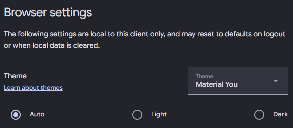
That should work if the browser is set to the proper light/dark mode and Home Assistant follows that. Make sure theme mode is set to auto.
You need to click on the hyperlinked --md-sys-color-secondary and see where it is deriving it from. It should be your styles but it sounds like it’s being overwritten by something else.
Does this help any?
style attribute {
    color: rgb(28, 28, 28);
    background-color: var(--md-sys-color-secondary);
    height: 115px;
    width: 115px;
    border-radius: 30px;
    box-shadow: none;
}
--md-sys-color-secondary: var(--md-sys-color-secondary-light, #595e72);
Other material button cards on my dash are a light green, as per my custom css file.
For example, here is a material-button card, that seems to follow the theme:
ha-card.material-button {
    cursor: pointer;
    display: flex;
    align-items: center;
    padding: 12px;
    border-radius: var(--bsc-border-radius, 28px);
    background: var(--bsc-background);
    transition: background-color 0.3s, color 0.3s;
    height: var(--bsc-height);
    overflow: hidden;
    box-shadow: rgba(0, 0, 0, 0.05) 0px 0.5px 1px, rgba(0, 0, 0, 0.07) 0px 0.5px 1.5px;
    -webkit-tap-highlight-color: transparent;
}
--bsc-background: var(--md-sys-color-secondary-container, #d8e3f7);
I have just noticed, when i navigate to the page with the ‘wrong’ theming, it very briefly flashes a darker shade of green
Can you take a screenshot of the dev tools styles instead? What you’ve shared does seem to show that it is using the theme value rather than the one you’ve defined. --bsc-background is using --md-sys-color-secondary-container, not --md-sys-color-secondary which you said you redefined.
Hi! I’m using the Material You theme and it looks amazing. However, I’m having trouble getting the correct color accents. I’d like to use colors like Google yellow, red, blue, or green, but none of the combinations I try seem to match Google’s colors properly. Right now I’m using in custom: button-card:
- color: var (--yellow-color)
Any suggestion on what to use?