selvalt7
October 24, 2024, 1:03pm
1
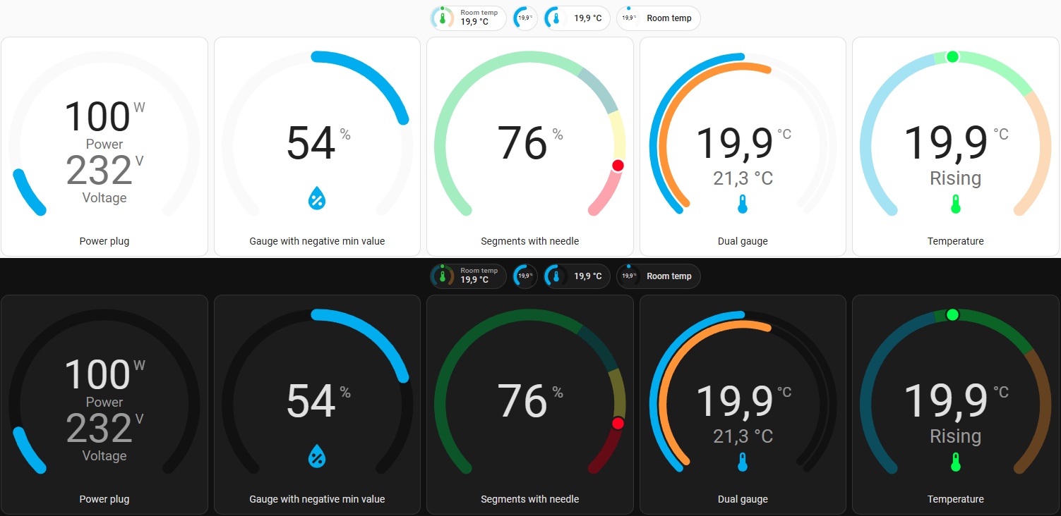
Modern circular gauge card for Home Assistant
Modern take on Home Assistant gauge. This card has mostly the same config as the gauge included in HASS with few additions like template support and badge.
Card and badge gauge
Secondary info under the state with two size options
Sections support
Needle
Template support for min, max, entity, icon and secondary (YAML only)
Color segments with gradient
Dual gauge
Dual value representing as a dot on the same gauge
Visual editor
17 Likes
somansch
November 29, 2024, 12:23pm
3
@selvalt7 , great work! Many thanks for this card.
Is it bug or feature? I get a view with a decimal. Is there an option to change this behaviour?
The default view inside the entity is without a decimal:
selvalt7
November 29, 2024, 12:30pm
4
Thanks,dev branch, so hopefully soon it will be available in the main branch.
1 Like
It would be great if you could provide few yaml examples!
selvalt7
December 10, 2024, 8:59am
6
I’ve added few examples in the repository readme file on the dev branch.
1 Like
Jm71570
January 13, 2025, 10:55am
7
Bonjour
selvalt7
January 13, 2025, 8:50pm
8
Could you be more specific which part of gauge?
Rooverz
February 9, 2025, 8:58am
9
Hi,
Is it possible to change the thickness of the line and scale the text? It’s an layout of my pv panels but the graphic layout is a bit too small.
Mar1us
April 29, 2025, 8:36am
10
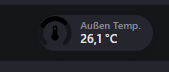
is there a way to use theme varibales for the color segements like var(–red-color) etc.?
selvalt7
April 29, 2025, 8:59am
11
Yes, here’s a code and image how it looks
segments:
  - from: 0
    color: var(--orange-color)
  - from: 80
    color: var(--green-color)
  - from: 160
    color: var(--red-color)
1 Like
Mar1us
April 29, 2025, 11:24am
12
tried this but it goes black:
type: custom:modern-circular-gauge-badge
entity: sensor.temperatur_aussen
min: -20
max: 50
show_name: true
show_state: true
show_icon: true
smooth_segments: true
segments:
  - color: var(--red-color)
    from: -20
  - color: var(--green-color)
    from: 0
  - color: var(--blue-color)
    from: 10
  - color: var(--red-color)
    from: 30
name: Außen Temp.
Mar1us
April 29, 2025, 11:29am
13
ok had to remove smooth_segments: true
selvalt7
April 29, 2025, 2:29pm
14
Because It seems that I forgot to implement css variables handling inside color interpolation function, so variables does not work with smooth_segments for now.
1 Like
elRadix
April 29, 2025, 6:09pm
15
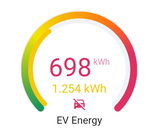
Nice card, I’m using the following config
type: custom:modern-circular-gauge
entity: sensor.alfen_monthly_energy
name: EV Energy
height: 200
header_position: bottom
min: 0
max: 650
decimals: 0
unit: kWh
needle: false
show_icon: true
show_unit: true
show_header: true
show_state: true
smooth_segments: true
adaptive_state_color: true
adaptive_icon_color: true
icon: |-
  {% if is_state('sensor.alfen_active_power_total_socket_1', '0') %}
    mdi:car-off
  {% else %}
    mdi:car-electric
  {% endif %}
gauge_foreground_style:
  color: adaptive
  width: 6
gauge_background_style:
  width: 8
  color: rgba(200,200,200,0.3)
segments:
  - from: 0
    color:
      - 18
      - 147
      - 94
  - from: 200
    color:
      - 244
      - 228
      - 0
  - from: 400
    color:
      - 255
      - 117
      - 20
  - from: 500
    color:
      - 222
      - 49
      - 99
secondary:
  entity: sensor.alfen_yearly_energy
  unit: kWh
  min: 0
  max: 3500
  show_gauge: inner
  state_size: small
  needle: false
  segments:
    - from: 0
      color:
        - 18
        - 147
        - 94
    - from: 1000
      color:
        - 244
        - 228
        - 0
    - from: 2000
      color:
        - 255
        - 117
        - 20
    - from: 2800
      color:
        - 222
        - 49
        - 99
  adaptive_state_color: true
animation_speed: 500
style: |
  ha-card {
    margin: 5px;
    border-radius: 12px;
    background: var(--card-background-color);
  }
1 Like
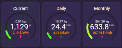
This is nice @elRadix !! Just built a couple of gauges yesterday and I really love how compact they can be and still show a ton of data.
Used my Sense energy monitor data and some sensor templates to give me kWh Cost and personal CO2 Emission (Carbon Footprint):
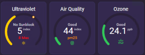
Outdoor UVI and Air Quality using WAQI and OpenUV integrations:
4 Likes
Mar1us
May 13, 2025, 12:18pm
17
can you share the code for the UV gauge?
Greg.o
July 9, 2025, 9:23pm
18
Hello,
Tjx for your work !
I tried to implement a card for my tmp and humidity sensors. It seems to work well, excepted for a detail:
cards:
      - type: custom:modern-circular-gauge
        entity: sensor.temp_hum_1_temperature
        name: Salon
        label: température
        unit: °C
        min: 10
        max: 30
        icon: mdi:thermometer
        needle: true
        smooth_segments: true
        segments:
          - from: 10
            color:
              - 255
              - 245
              - 200
          - from: 19
            color:
              - 255
              - 200
              - 100
          - from: 24
            color:
              - 220
              - 70
              - 20
        secondary:
          entity: sensor.temp_hum_1_humidity
          label: humidité
          unit: '%'
          show_gauge: inner
          segements:
            - from: 0
              color:
                - 153
                - 204
                - 255
        layout: vertical
I tried to make a difference between the temperature and the humidity : blue for humidity and 3 segments of “red” for temperature. But, here is the result :
Can you explain me why the colour for the secondary sensor is not (153; 204; 255) ?
By the way, thx for the job !
selvalt7
July 9, 2025, 9:38pm
19
You’ve mistyped segments in the secondary.
1 Like
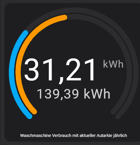
Really like the appearance of this card. But I am struggeling with the combined gauge feature which was integrated in the latest release. Cann somebody give me a hint?
type: custom:modern-circular-gauge
gauge_type: full
entity: sensor.waschmaschine_verbrauch_mit_aktueller_autarkie_jahrlich
secondary:
  entity: sensor.jahrlicher_stromverbrauch_waschmaschine_autark
  show_gauge: inner
  max: 300
  start_from_zero: true
  adaptive_state_color: false
show_icon: false
icon: mdi:washing-machine
unit: kWh
show_state: true
show_unit: true
combine_gauges: true
start_from_zero: true
tertiary: {}