Hello Everyone,
I have been researching for a long time how we can display the data from my health devices on Home Assistant.
I have a smart scale and a smart blood pressure monitor.
- My smart blood pressure monitor is the Omron M7 Intelli IT. I’ve searched the forums extensively, but I haven’t seen anyone integrate this device with HA. If anyone can help, please let me know in the comments. (Healthsync.app didn’t work. I was able to transfer data to the Samsung Health App, but Samsung Health doesn’t have HA integration.)
- My smart scale is the Arzum Smartfit AR 5031. This is where FeelFit, the phone app used by this device, comes in. (Many thanks to everyone involved with FeelFit integration by @StefanGiu).
While I was thinking about how to display the data from the FeelFit integration on my dashboard, I decided to replicate the interface on my phone. Later, I decided to ditch the tabs and just put them all under each other.
And here’s how I use it:
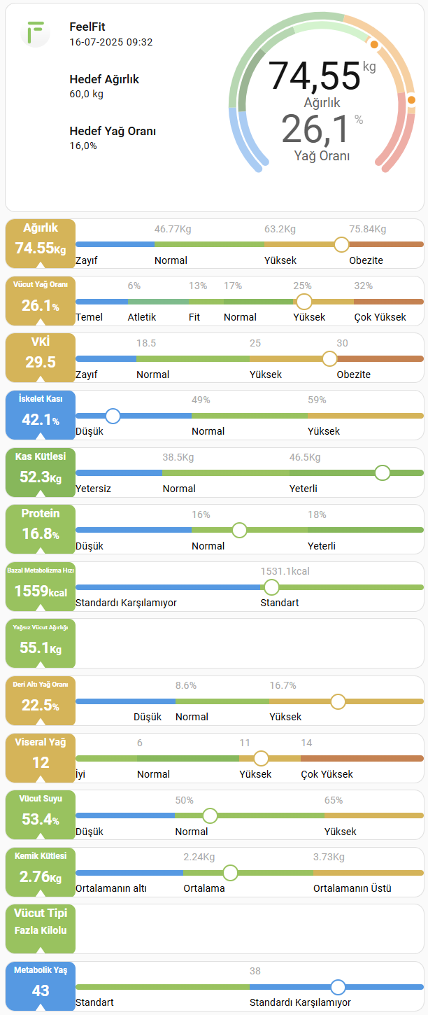
We have two main cards here. The first is the section I call “General Information” at the top. The second is the cards that display the data.
Here are the cards I used:
- Stack In Card (To keep it all together)
- Layout Card (To adjust grid distances)
- Mushroom Cards: template-card
- Mushroom Cards: entity-card
- Modern Circular Gauge Card
- Card Mod (for a little touch)
- Canary (You can find it in HACS) (I only use this card to remove the remaining borders on stack in card. For some reason, the borders aren’t removing on me.)
- and this picture:

(Thanks to the authors of all the cards mentioned)
Full code here:
type: custom:stack-in-card
mode: vertical
cards:
- type: custom:layout-card
layout_type: custom:grid-layout
layout:
grid-template-columns: 12% 40% 48%
grid-template-rows: min-content
grid-template-areas: |
"logo goals gauge"
cards:
- type: custom:stack-in-card
mode: horizontal
no_card: true
cards:
- type: custom:mushroom-template-card
icon_type: none
picture: /local/uspics/feelfit.png
no_card: true
view_layout:
grid-area: logo
- type: custom:stack-in-card
mode: vertical
no_card: true
cards:
- type: custom:mushroom-template-card
primary: FeelFit
icon_type: none
secondary: >-
{{ as_timestamp(states.sensor.ugur_sezgin_timestamp.state) |
timestamp_custom('%d-%m-%Y %H:%M') }}
no_card: true
- type: custom:mushroom-entity-card
entity: sensor.ugur_sezgin_goal_weight
name: Hedef Ağırlık
icon_type: none
no_card: true
- type: custom:mushroom-entity-card
entity: sensor.ugur_sezgin_goal_bodyfat
name: Hedef Yağ Oranı
icon_type: none
no_card: true
view_layout:
grid-area: goals
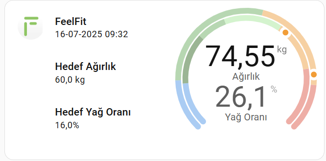
- type: custom:modern-circular-gauge
entity: sensor.ugur_sezgin_weight
name: " "
label: Ağırlık
state_font_size: 20
min: 40
max: 82
needle: true
show_unit: true
show_icon: false
show_name: false
adaptive_state_color: false
smooth_segments: false
segments:
- from: 40
color: blue
- from: 46.77
color: green
- from: 63.2
color: orange
- from: 75.84
color: red
secondary:
entity: sensor.ugur_sezgin_bodyfat
state_size: big
show_gauge: inner
label: Yağ Oranı
state_font_size: 20
min: 0
max: 40
needle: true
adaptive_state_color: false
smooth_segments: false
segments:
- from: 0
color: blue
- from: 6
color: darkgreen
- from: 13
color: green
- from: 17
color: lightgreen
- from: 25
color: orange
- from: 32
color: red
tertiary: {}
card_mod:
style: |
ha-card {
padding: 0 !important;
}
no_card: true
view_layout:
grid-area: gauge
Let’s move on to our other card:
- The most commonly used form;
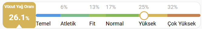
variables:
  show_bar: true
  show_value: true
  show_value_text: false
- The bar section on the right is hidden
variables:
  show_bar: false
  show_value: true
  show_value_text: false
- On the left side there is text instead of values.

variables:
  show_bar: false
  show_value: true
  show_value_text: true
- The left side is hidden (I had created this feature for tabbed menus. But I didn’t change it to that. I just wanted the infrastructure ready.)
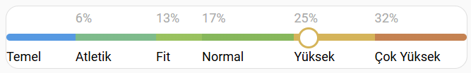
variables:
  show_bar: true
  show_value: false
I used Button Card to make this card. I love Button Card, they mold into any shape, just like play dough. (Let’s send a thank you to the maker of this card from here.)
Full code here:
type: custom:button-card
show_name: false
show_icon: false
show_state: false
entity: sensor.ugur_sezgin_bodyfat
variables:
  show_bar: true
  show_value: true
  show_value_text: false
  friendly: Vücut Yağ Oranı
  fontsize: 9
  unit: "%"
  min: 0
  max: 40
  segs:
    - from: 0
      color: rgb(58, 155, 232)
      label: Temel
    - from: 6
      color: rgb(106, 189, 135)
      label: Atletik
    - from: 13
      color: rgb(142, 195, 79)
      label: Fit
    - from: 17
      color: rgb(120, 185, 77)
      label: Normal
    - from: 25
      color: rgb(219, 178, 71)
      label: Yüksek
    - from: 32
      color: rgb(208, 126, 71)
      label: Çok Yüksek
  pct: |
    (x, min, max) => Math.max(0, Math.min(100, ((x - min) / (max - min) * 100)))
styles:
  grid:
    - grid-template-areas: |
        "value numbers"
        "value bar_dot"
        "value comment"
    - grid-template-columns: |
        [[[
          return (!variables.show_value) ? "0fr 5fr" : "1fr 5fr";
        ]]]
    - grid-template-rows: 1.5fr 1fr 1.5fr
  card:
    - padding: 0px
    - height: 60px
  custom_fields:
    value:
      - display: grid
      - grid-template-areas: |
          "title"
          "state"
          "triangle"
      - grid-template-columns: 1fr
      - grid-template-rows: 1.5fr 2fr 1fr
      - place-self: stretch
      - place-items: center
      - background: |
          [[[
            let dot_entity = Number(entity.state);
            let value_color = "rgb(200,200,200)"; // default renk
            for (let i = 0; i < variables.segs.length; i++) {
              const next = (i + 1 < variables.segs.length) ? variables.segs[i+1].from : variables.max+1;
              if (dot_entity >= variables.segs[i].from && dot_entity < next) {
                value_color = variables.segs[i].color;
                break;
              }
            }
            return value_color;
          ]]]
      - color: rgb(255, 255, 255)
      - border-radius: 8px
      - height: 60px
    numbers:
      - place-self: stretch
      - position: relative
    bar_dot:
      - place-self: stretch
      - overflow: visible
      - border-radius: 6px
      - background: |
          [[[
            const pct = eval(variables.pct);
            let stops = [];
            for(let i=0;i<variables.segs.length;i++){
              const start = pct(variables.segs[i].from, variables.min, variables.max);
              const end = (i+1<variables.segs.length) ? pct(variables.segs[i+1].from, variables.min, variables.max) : 100;
              stops.push(`${variables.segs[i].color} ${start}% ${end}%`);
            }
            return 'linear-gradient(to right, ' + stops.join(', ') + ')';
          ]]]
      - margin: 4px 0 4px 0
    comment:
      - place-self: stretch
      - position: relative
custom_fields:
  value: |
    [[[
      if (variables.show_value) {
        let rtn = ""
        rtn += `<div style="
          grid-area: title;
          font-size: ${variables.fontsize}px;
          font-weight: bold;
          white-space: normal;
          height: 20px;
          align-content: center;
          ">${variables.friendly}</div>
        `;
        let value_text = "";
        if (variables.show_value_text) {
          let dot_entity = Number(entity.state);
          for (let i = 0; i < variables.segs.length; i++) {
            const next = (i + 1 < variables.segs.length) ? variables.segs[i+1].from : variables.max+1;
            if (dot_entity >= variables.segs[i].from && dot_entity < next) {
              value_text = variables.segs[i].label;
              break;
            }
          }
        }
        rtn += `<div style="
          grid-area: state;
          font-size: 18px;
          font-weight: bold;
          height: 20px;
          ">`;
          rtn += (!variables.show_value_text) ? `${entity.state}<span style="font-size: 12px;">${variables.unit}</span>` : `<div style="font-size: 12px;">${value_text}</div>`
          rtn += `</div>`;
        rtn += `<div style="
          grid-area: triangle;
          width: 0;
          height: 0;
          transform: translateY(20%);
          border-left: 8px solid transparent;
          border-right: 8px solid transparent;
          border-bottom: 11px solid rgb(255,255,255);
          "></div>
        `;
        return rtn;
      }
    ]]]
  numbers: |
    [[[
    if (variables.show_bar) {
      const pct = eval(variables.pct);
      let rtn = "";
      for (let i = 1; i < variables.segs.length; i++) {
        rtn += `<div style='
        color: rgb(170, 170, 170);
        position: absolute;
        left: ${pct(variables.segs[i].from, variables.min, variables.max)}%;
        top: 50%;
        transform: translate(0%,-50%);
        font-size: 12px;
        white-space: nowrap;
      '>${variables.segs[i].from}${variables.unit}</div>`;
      }
      return rtn;
    }
    ]]]
  bar_dot: |
    [[[
      if (variables.show_bar) {
        let dot_entity = isNaN(Number(entity.state)) ? variables.min : Number(entity.state);
        let dot_border_color = variables.segs[0].color;
        for (let i=0;i<variables.segs.length;i++){
          const next = (i+1<variables.segs.length) ? variables.segs[i+1].from : variables.max+1;
          if (dot_entity >= variables.segs[i].from && dot_entity < next) {
            dot_border_color = variables.segs[i].color;
            break;
          }
        }
        let dot_position = ((dot_entity - variables.min) / (variables.max - variables.min)) * 100;
        if (dot_position < 0) dot_position = 0; if (dot_position > 100) dot_position = 100;
        let rtn = "";
        rtn += '<div style="position:relative;width:100%;height:100%;">';
        rtn += `<div style="
          position:absolute;
          top: -6px;
          left: calc(${dot_position}% - 8px);
          width: 16px;
          height: 16px;
          border-radius: 50%;
          background: white;
          border: 2px solid ${dot_border_color};
          white-space:nowrap;
          overflow: inherit;
          "></div>`;
        rtn += '</div>';
        return rtn;
      }
    ]]]
  comment: |
    [[[
      if (variables.show_bar) {
        const pct = eval(variables.pct);
        let rtn = "";
        for (let i = 0; i < variables.segs.length; i++) {
          rtn += `<div style='
          color: rgb(0, 0, 0);
          position: absolute;
          left: ${pct(variables.segs[i].from, variables.min, variables.max)}%;
          top: 50%;
          transform: translate(0%,-50%);
          font-size: 12px;
          white-space: nowrap;
          '>${variables.segs[i].label}</div>`;
        }
        rtn += '</div>';
        return rtn;
      }
    ]]]
When using these codes, simply change the “entity” and “variables” sections. (Except for pct.)
For the segments, you can type in the values from your phone. These values vary depending on a person’s weight, age, and height, so I didn’t do that much because I’d need to pull data from a table containing these values.
All of this coding could have been done more concisely. For example, the section above could have been done with two cards, like Button Card and Modern Circular Gauge Card. But it works as is.
Who knows? Maybe a volunteer will design a card that does all this automatically.
I wish you days full of coding.
 , it owns all of them. Actually, the code I provided with the button-card is valid for all of them. I’m just changing the entity and variables sections.
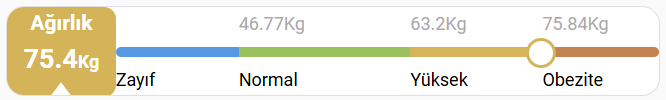