Mushroom Cards - Build a beautiful dashboard easily 🍄 (Part 1)

Is it possible to combine two styles like this?

Style element 1 with “ha-card” element:

- type: custom:mushroom-person-card
            entity: person.bob
            icon_type: entity-picture
            card_mod:
              style: |
                ha-card {
                  box-shadow: none;
                  margin-left: 0px !important;
                  margin-right: 0px !important;
                  margin-bottom: 0px !important;
                  #width: 75%;
                }

Style element 2 with “mushroom-state-info$” element:

 - type: custom:mushroom-entity-card
            entity: sensor.bob_iphone_address
            layout: horizontal
            fill_container: false
            primary_info: none
            icon: ''
            card_mod:
              style:
                mushroom-state-info$: |
                  * {
                    white-space: normal !important;
                    #width: 250px;
                    overflow: visible !important;
                  }

into something like this?

          - type: custom:mushroom-entity-card
            entity: sensor.bob_iphone_address
            layout: horizontal
            fill_container: false
            primary_info: none
            icon: ''
            card_mod:
              style:
                mushroom-state-info$: |
                  * {
                    white-space: normal !important;
                    #width: 250px;
                    overflow: visible !important;
                  }
                ha-card: |
                 {
                    box-shadow: none;
                    margin-left: -0px !important;
                    margin-right: 0px !important;
                    margin-bottom: 0px !important;
                    #width: 75%;
                  }

Unfortunately I am doing it wrong. The “ha-card” element is not being considered.
Any ideas?

You would do it like this, but I didn’t verify your mushroom code.

I did add a red background so you could verify the ha-card was working.

type: custom:mushroom-entity-card
layout: horizontal
fill_container: false
primary_info: none
icon: ''
entity: automation.alert_detached_garage_door
card_mod:
  style:
    mushroom-state-info$: |
      * {
        white-space: normal !important;
        #width: 250px;
        overflow: visible !important;
      }
    .: |
      ha-card {
        background: red;
        box-shadow: none;
        margin-left: -0px !important;
        margin-right: 0px !important;
        margin-bottom: 0px !important;
        #width: 75%;
      }

I think you want this…

card_mod:
  style:
    mushroom-state-info$: |
      .container {
        white-space: normal !important;
        #width: 250px;
        overflow: visible !important;
      }
    .: |
      ha-card {
        box-shadow: none;
        margin-left: -0px !important;
        margin-right: 0px !important;
        margin-bottom: 0px !important;
        #width: 75%;
      }
1 Like

It’s working perfectly.
Thank you very much!

sorry to bring this up again but is this really not possible?
seems like a trivial modification :confused:

Hi there, is it normal that Mushroom cards are lacking if hover/tap feedback?
The original HA are changing it‘s background on hover or tap snd when I click or tap the Icon of a tile card, it has a zoom effect.

The mushroom cards do nothing, so for me as a user there is little to no feedback.

Somebody were able to add those effects back to the mushroom cards?
Or don‘t you bother if there happens nothing when you tap/click/hover on the cards?

Thats something that is keeping me from switchtig back an forth between mushroom cards and original HA cards.

Its not too difficult, but chips are a bit harder in general.
image

We need to remove the margin from the icon which you cant access through the chip directly, so hence why we need to different card mod sections:

type: custom:mushroom-chips-card
chips:
  - type: entity
    entity: person.dimitri_landerloos
    card_mod:
      style: |
        .content {
          flex-direction: column !important;
        }
card_mod:
  style:
    mushroom-entity-chip:nth-child(1)$: |
      ha-state-icon {
        margin-right: 0px;
      }

keep in mind you need to change the chip type in the second card mod bit to the type of chip and the number that you are targetting.

1 Like

There are ways to kinda add it back with card mod, but they are all a bit janky anyway and dont register well with taps on mobile devices.

if thats a concern of yours i would stick with just the HA tile cards.

thank you kindly! for two entities it now looks like this.

now i only have to figure out a way to remove/resize the white borders and have the icons move closer together.

type: custom:mushroom-chips-card
chips:
  - type: template
    entity: switch.tasmota6_2
    icon_color: '{{ ''#FFC207'' if states(''switch.tasmota6_2'') == ''on'' else ''#3D73A2'' }}'
    icon: mdi:power-socket-de
    content: LEDs
    card_mod:
      style: |
        .content {
          flex-direction: column !important;
        }
        ha-card {
          justify-content: center;
          --chip-icon-size: 44px;
          --chip-height: 44px;
        }
card_mod:
  style:
    mushroom-entity-chip:nth-child(1)$: |
      ha-state-icon {
        margin-right: 0px;
      }

Anybody experiencing Mushroom card mdi icons not showing on mobile? They work fine on desktop, but certain cards like vacuum or entity do not show icons on my mobile version?

1 Like

clear your apps cache.

Like i said, you need to adjust the second bit of card mod at the bottom. thats why your icons arent alligned vertically nicely. like this:

type: custom:mushroom-chips-card
chips:
  - type: template
    entity: switch.tasmota6_2
    icon_color: '{{ ''#FFC207'' if states(''switch.tasmota6_2'') == ''on'' else ''#3D73A2'' }}'
    icon: mdi:power-socket-de
    content: LEDs
    card_mod:
      style: |
        .content {
          flex-direction: column !important;
        }
        ha-card {
          justify-content: center;
          --chip-icon-size: 44px;
          --chip-height: 44px;
        }
  - type: template
    entity: switch.tasmota6_2
    icon_color: '{{ ''#FFC207'' if states(''switch.tasmota6_2'') == ''on'' else ''#3D73A2'' }}'
    icon: mdi:power-socket-de
    content: LEDs
    card_mod:
      style: |
        .content {
          flex-direction: column !important;
        }
        ha-card {
          justify-content: center;
          --chip-icon-size: 44px;
          --chip-height: 44px;
        }
card_mod:
  style:
    mushroom-template-chip:nth-child(1)$: |
      ha-state-icon {
        margin-right: 0px;
      }
    mushroom-template-chip:nth-child(2)$: |
      ha-state-icon {
        margin-right: 0px;
      }

to remove borders just add the below to your ha-card:

ha-card {
  border: none !important;
}
1 Like

Hmm, but I really like some features of Mushroom cards… :frowning:

Hi guys,
anyone maybe knows how to change the purple color of the cover popup window?
Thank you

Please make a seperate post. this question is not related to mushroom cards.

3 Likes

thanks again! you have helped me heaps! apparently i misunderstood the child(x) part but it’s fixed now.

i have but one question left. the

justify-content: center;

does not seem to work, i.e. it does not align the chips centered. i can verify this by changing “center” to anything like “space-evenly” , “flex-end” or whatever. the chips’ alignment does not change :confused:
if i haven’t overstayed my welcome already i’d appreciate if you/anybody could help
thanks!

1 Like

No need to change chip alignment with card mod.

You can use the built in:

type: custom:mushroom-chips-card
alignment: center
chips:
  - type: template
    icon: mdi:test-tube
  - type: template
    icon: mdi:test-tube
2 Likes

perfect! i have learned a lot here thanks to you :slight_smile:

1 Like

Whew, I’ve spent the last two weeks reading through this entire thread and trying to learn. I’ve also been through the awesome guides that @dimitri.landerloos put together. Thank you for all your contributions.

I have a functional card outside of mushroom…that worked, but the styling wasn’t great. I’ve been trying to reproduce in mushroom using snippets I’ve gathered along the way, but can’t quite get it.

I use pihole on my network. Occasionally, pihole will block something that it shouldn’t and I need to disable pihole network wide. I have the disable portion working through helpers, automations etc. I want to be able to push a button which disables pihole, but also initiates a timer (this automation is already sorted), but I want to view the countdown on the card. But I also want a slider where I can select the amount of time for the disable (this is also working, but I can’t get the formatting).

Here is my working card (outside of mushroom):
Screenshot 2024-02-18 121039
Screenshot 2024-02-18 121052

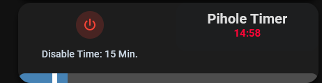
and here is the code for that card:

type: custom:stack-in-card
cards:
  - square: false
    type: grid
    columns: 1
    cards:
      - square: false
        type: grid
        columns: 2
        cards:
          - type: custom:mushroom-template-card
            entity: input_boolean.pi_hole_timer
            primary: >-
              Disable Time: {{ states('input_number.pi_hole_timer')|round|int }}
              Min.
            secondary: ''
            icon: mdi:power
            icon_color: |
              {% set state=states('input_boolean.pi_hole_timer') %}
              {% if state=='on' %}red
              {% elif state=='off' %}green
              {% endif %}
            card_mod:
              style: |
                ha-card {
                  --ha-card-border-width: 0;
                }
            layout: vertical
          - type: custom:button-card
            entity: timer.pi_hole_timer
            show_state: true
            show_label: false
            show_icon: false
            height: 40px
            styles:
              img_cell:
                - background-color: rgba(var(--color-theme),0,05)
                - border-radius: 50%
                - place-self: center
                - width: 42px
                - height: 42px
              card:
                - background-color: '#3d5afe02'
                - border: none
                - border-radius: 14px
                - font-size: 15px
                - font-weight: bold
                - height: 70px
                - color: |
                    [[[
                      if(states['input_boolean.pi_hole_timer'].state == 'on') return 'rgb(245,6,54)'
                      else return 'gray';
                    ]]] 
                - align_self: middle
              name:
                - font-size: 20px
                - color: '#DDDDDD'
                - font-weight: bold
      - type: custom:my-slider
        entity: input_number.pi_hole_timer
        step: '5'
        height: 20px
        radius: 10px
        mainSliderColor: steelblue
        thumbHorizontalPadding: 15px
        styles:
          card:
            - border: none

In my attempt to convert to mushroom, I’ve had varying success but can’t quite get it.

Here is just a number card (I haven’t added the toggle on the icon yet)
Screenshot 2024-02-18 121430

code is here:

type: custom:mushroom-number-card
entity: input_number.pi_hole_timer
layout: horizontal
display_mode: slider
card_mod:
  style:
    mushroom-number-value-control$:
      mushroom-slider$: |
        .slider {
          position: absolute !important;
          width: calc(100% - 76px) !important;
          right: 12px;
          height: 42px !important;
        }
    mushroom-state-info$: |
      .container {
        flex-direction: row !important;
        position: absolute;
        width: 79%;
        top: 17px;
        align-items: baseline;
      }
      .primary {
        color: transparent !important;
        position: relative;
        width: max-content !important;
        flex-shrink: 1;
        flex-grow: 1;
      }
      .primary:after {
        content: '{{states('input_boolean.pi_hole_timer')}}';
        position: absolute;
        color: var(--primary-text-color);
        left: 0px;
        width: max-content !important;
      }
      .secondary {
        color: transparent !important;
        position: relative;
        flex-shrink: 1;
        flex-grow: 0;
      }
      .secondary:after {
        content: '{{states('input_boolean.pi_hole_timer') | round(0)}}';
        position: absolute;
        color: var(--secondary-text-color);
        left: 0px;
      }
    .: |
      mushroom-state-info {
        padding-left: 6px;
        width: max-content;
        pointer-events: none;
        z-index: 1;
        display: flex;
      }

But this one doesn’t have the time remaining countdown as I’d like

I have this one also:
Screenshot 2024-02-18 122604

The formatting of the primary info is weird and although I was able to get the secondary info in the “tail” of the slider…it doesn’t change to countdown.

code:

type: custom:mushroom-number-card
entity: input_number.pi_hole_timer
layout: horizontal
display_mode: slider
card_mod:
  style:
    mushroom-number-value-control$:
      mushroom-slider$: |
        .slider {
          position: absolute !important;
          width: calc(100% - 76px) !important;
          right: 12px;
          height: 42px !important;
          border: gray !important;
          --bg-colr: #1d1d1d !important;
        }
    mushroom-state-info$: |
      .container {
        flex-direction: row !important;
        position: absolute;
        width: 79%;
        top: 17px;
        align-items: baseline;
      }
      .primary {
        color: transparent !important;
        position: relative;
        width: max-content !important;
        flex-shrink: 1;
        flex-grow: 1;
      }
      .primary:after {
        content: '{{states('input_number.pi_hole_timer')}}';
        position: absolute;
        color: var(--primary-text-color);
        left: 5px;
        width: max-content !important;
      }
      .secondary {
        color: transparent !important;
        position: relative;
        flex-shrink: 1;
        flex-grow: 0;
        
      }
      .secondary:after {
        content: '{{states('timer.pi_hole_timer')}}';
        position: absolute;
        color: var(--secondary-text-color);
        right: 0px;
        padding-right: 10px;
      }
    .: |
      mushroom-state-info {
        padding-left: 15px;
        pointer-events: none;
        z-index: 1;
        display: flex;
      }
      mushroom-shape-icon {
        --icon-size: 34px;
        position: relative;
        top: 4px;
      }
      ha-card {
        height: 58px !important;
      }

There is probably a lot of unnecessary stuff in my code(s) also because I have been “playing” with different options.

Any help is greatly appreciated. Sorry for the long post.

3 Likes

First thanks a lot for all the awesome ressources in this thread, it’s absolutely stunning what all you guys did.

Then comes my problem, i’m trying to make the icon of a mushroom chip rotate. Search for a way to do it all day but didn’t manage to make it work. The dumb idea was that :

type: custom:mushroom-chips-card
chips:
  - type: entity
    entity: sensor.pinas_fan_speed
    icon: mdi:fan
    icon_color: blue
    card-mod:
      style: |
        ha-state-icon {
          animation: spin 1s linear infinite;
        }
alignment: end

Obviously it doesn’t work, if you guys have any idea, that would be awesome

This would be the simplest way.

type: custom:mushroom-chips-card
chips:
  - type: template
    entity: fan.bedroom_fan
    icon: mdi:fan
    icon_color: blue
    card_mod:
      style: |
        .content {
          animation: spin 1s linear infinite;
         }

read through this for additional information page 7726

specifically this section

1 Like