To further explain this, ‘red’ is mush-rgb-red and ‘disabled’ is mush-rgb-disabled.
It is because you are overlaying one card over another. You could change the layering order with z-index, but it starts getting awfully messy.
Hi there.
Is there a way to include something? I want the same list of chips in a row as kind of a navigation on every view without editing all the views when doing a change.

I tried it with an include like this - !include …/includes/navigation.yaml but an yaml exception occurs when saving the raw configuration. Can I temporarly use the yaml mode for mushroom? Or how do you solve this?
Thank you for any kind of help 
Yeah I can see how that can start to get quite messy. I did fiddle around with z-index and managed to get what I wanted, I don’t plan to add anymore to this card so hopefully it’ll stay tidy enough like this.

type: custom:stack-in-card
cards:
  - type: custom:mushroom-template-card
    primary: Living Room
    secondary: '{{ states(''sensor.thermostat_1_current_temperature'') }} °C'
    icon: mdi:sofa
    entity: light.living_room_lights
    icon_color: |-
      {% if is_state('light.living_room_lights', 'on') %}
        orange
      {% endif %}
    hold_action:
      action: toggle
    tap_action:
      action: navigate
      navigation_path: livingroom
    badge_icon: |-
      {% if is_state('sensor.count_living_room_lights_on', '0') %}
      {% elif is_state('sensor.count_living_room_lights_on', '1') %}
        mdi:numeric-1
      {% elif is_state('sensor.count_living_room_lights_on', '2') %}
        mdi:numeric-2
      {% elif is_state('sensor.count_living_room_lights_on', '3') %}
        mdi:numeric-3
      {% elif is_state('sensor.count_living_room_lights_on', '4') %}
        mdi:numeric-4
      {% elif is_state('sensor.count_living_room_lights_on', '5') %}
        mdi:numeric-5
      {% elif is_state('sensor.count_living_room_lights_on', '6') %}
        mdi:numeric-6
      {% elif is_state('sensor.count_living_room_lights_on', '7') %}
        mdi:numeric-7
      {% elif is_state('sensor.count_living_room_lights_on', '8') %}
        mdi:numeric-8
      {% elif is_state('sensor.count_living_room_lights_on', '9') %}
        mdi:numeric-9
      {% else %}
        mdi:numeric-9-plus
      {% endif %}
    badge_color: orange
    fill_container: true
    layout: horizontal
    multiline_secondary: false
    card_mod:
      style: |
        :host {
          z-index: 1;
        }
  - type: custom:mushroom-chips-card
    chips:
      - type: conditional
        conditions:
          - entity: binary_sensor.living_room_motion_sensor_occupancy
            state: 'on'
        chip:
          type: template
          icon_color: green
          icon: mdi:window-open-variant
      - type: conditional
        conditions:
          - entity: binary_sensor.living_room_window
            state: 'on'
        chip:
          type: template
          icon_color: red
          icon: mdi:motion-sensor
    alignment: end
    card_mod:
      style: |
        ha-card {
          --chip-box-shadow: none;
          --chip-background: none;
          --chip-spacing: 0;
          top: -36px;
          z-index: 0;
        }
card_mod:
  style: |
    ha-card {
      height: 66px;
    }
Thanks for your help!
You can change it using theme variables : https://github.com/piitaya/lovelace-mushroom-themes
mush-rgb-yellow: 255, 235, 59
mush-rgb-state-cover-open: var(--mush-rgb-yellow)
Here is another combo card with an entities drop-down that may be useful. I wanted something that would still work as a half width card on my phone.

type: custom:stack-in-card
cards:
  - type: custom:layout-card
    layout_type: custom:grid-layout
    layout:
      grid-template-columns: auto 33px
      margin: '-4px -4px -8px -4px;'
    cards:
      - type: custom:mushroom-template-card
        primary: Amplifiers
        secondary: |-
          {% if is_state(entity, 'on') %}
            {{ states('sensor.lounge_amp_front_power') | round(0) +
            states('sensor.lounge_amp_center_power') | round(0) +
            states('sensor.lounge_amp_left_surround_power') | round(0) +
            states('sensor.lounge_amp_right_surround_power') | round(0) }} W
          {% else %}
            Off
          {% endif %}
        icon: mdi:audio-video
        entity: group.lounge_amps
        icon_color: '{{ ''blue'' if is_state(entity, ''on'') else ''disabled'' }}'
        fill_container: false
        multiline_secondary: false
        card_mod:
          style: |
            ha-card {
              background: none;
              --ha-card-box-shadow: 0px;
            }
      - type: custom:mushroom-template-card
        entity: input_boolean.amps_dropdown
        primary: ''
        secondary: ''
        icon: >-
          {{ 'mdi:chevron-up' if is_state(entity, 'on') else 'mdi:chevron-down'
          }}
        icon_color: disabled
        hold_action:
          action: none
        card_mod:
          style: |
            ha-card {
              align-items: flex-end;
              background: none;
              --ha-card-box-shadow: 0px;
            }
            mushroom-shape-icon {
              --shape-color: none !important;
            }
  - type: conditional
    conditions:
      - entity: input_boolean.amps_dropdown
        state: 'on'
    card:
      type: entities
      entities:
        - entity: switch.lounge_amp_front
          secondary_info: null
          name: LR
        - entity: switch.lounge_amp_center
          name: C
        - entity: switch.lounge_amp_left_surround
          name: LS
        - entity: switch.lounge_amp_right_surround
          name: RS
      state_color: true
      show_header_toggle: false
      card_mod:
        style: |
          ha-card {
            box-shadow: none !important;
            --paper-item-icon-active-color: #2196f3;
            --paper-item-icon-color: #6f6f6f;
          }
The hue bulb is on a regular dumb wall switch. The switch gets used more than the light card on my phone. So when there’s no power going to it hole assistant can’t detect the entity. It makes sense and it should say unavailable cause it is. I’m trying to find a way to change the word unavailable to off and get rid of the unavailable icon badge so ot looks better. So ot looks available even when it’s not .
Template was my first option, but I don’t think I can put the light slider in template card . Correct me if I’m wrong
Have you considered
a. removing the switch and wiring it to always on
b. putting tape over the switch or using a cover
or c. getting a smart switch to replace it?
But seriously, you could probably do something like this with a conditional card, showing a template card when it’s unavailable and the light card when not. However I don’t see any benefit to having it show as “off”; it’ll only be more confusing when you want to turn it on.
My girlfriend will dissaprove of messing with that switch, it’s in her office lol
But YES I already have the conditional card set up with exactly what you said…However. I dont know how to make the template card look like the light card. Is there a way to code in the light slider color temp controls that a hue bulb has?
It wont be confusing to me. It will help my OCD of seeing the word unavialble and that litle ugly orange badge icon lol
Then why is your smart bulb in there lol
Maybe you could do something with card-mod for the light card?
because i have all recessed lighting and I needed a spot for a 50 dollar light bulb that came with my kit other than the kitchen drawer lol
I actually was able to use card mod to put badge size at 0px. that part worked. I guess I can live with the word unavailable.
Mushroom 2.0 came so close to answer my prayers with the primary and secondary on each card. but I cant customize what secondary says, or else it woudl be perfect. Certiantly not a first world problem. Ill survive lol thanks for the help
Honestly this seems like a great candidate for a generic Mushroom battery card. UI-Minimalist has a dedicated battery card, and it would be nice to add this to Mushroom.
I’m sure this has been answered and I did search (unfornatetly trying to search the page was specific text keeps bringing up the HA website search)
I want to change the font size of one card, not all cards. Is there a way to do that from the code editor?
See the entity on the right, you cant see the entire title. I want that text smaller

type: horizontal-stack
cards:
  - type: custom:mushroom-entity-card
    entity: switch.linktap
    secondary_info: none
    name: Water Plants
    icon: mdi:sprout-outline
    icon_color: light-green
    fill_container: true
    use_entity_picture: false
    layout: vertical
    double_tap_action:
      action: toggle
    tap_action:
      action: none
    primary_info: name
  - type: custom:mushroom-entity-card
    entity: switch.outdoor_plug
    secondary_info: none
    name: Birdbath
    icon: mdi:bird
    icon_color: light-blue
    layout: vertical
    fill_container: true
    double_tap_action:
      action: toggle
    tap_action:
      action: none
  - type: custom:mushroom-entity-card
    entity: input_boolean.disable_backyard_soakers
    secondary_info: none
    fill_container: true
    layout: vertical
Many thanks for this fantastic implementation. I love it. When did you plan the implementation for the climate card? I can’t really wait  . Any way … fantastic work!
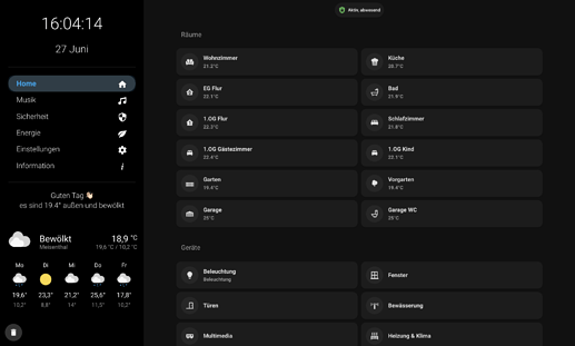
Following a few Screen’s of my Tab Dashboard created with Mushroom
hej, where can I find this room card as well as the last used entities?
this looks great!
Just wanted to add my title card code as I’ve been going round in circles and figured it out after playing with some stuff at work today, something clicked!
It will say hello to the logged in user, give you the number of lights on, how many doors are open and the temperature of whatever sensor you need or add more.
type: custom:mushroom-title-card
title: Hello {{ user }} ^_^
subtitle: >-
  Currently  {{ states.light | selectattr('state','eq','on') | list | count }}
  lights are on,  {{ states.binary_sensor | selectattr("entity_id", "search",
  ".magnet*") |selectattr('state','eq','on') | list | count }} doors are open!
  and your bedroom is {{ states("sensor.weather_temperature_masterbedroom") }}°C
I’m look for a way to color (text and background), I have the card-mod installed…
…one of these, and red when it’s todays date or yellow when it’s one day before this date.
I’m currently not getting there (this is color for the text anyhow):
{% if is_state(“sensor.oneofthese”, “timestamp.now”) %}
red
{% elif is_state(“sensor.oneofthese”, “timestamp.now minus one day”) %}
yellow
{%else%}{%endif%}
Also it has to be something for the background like this:
card_mod:
style: |
ha-card {
height: 102px;
{% if is_state(“sensor.oneofthese”, “timestamp.now”) %}
background: rgba(255, 152, 0, 0.1);
{% endif %}
}
I don’t know lol that was my question to the op. I posted it for reference to what I was asking for.
    style: |
      ha-card {
      --card-primary-font-size: 10px;
      }
Is it possible to make template card toggle a switch, but change states (colored vs not) based on a binary sensor?
I have a DIY garage opener using a Shelly1 to activate the door, and a magnetic reed switch to see if its open or close.
So for the button, I would want it to toggle ‘switch.garage’, but then the actual visual I would want it to be not colored if ‘binary_sensor.garage’ was OFF, and colored if it was on. Is that even possible?


