Mushroom Cards - Build a beautiful dashboard easily šŸ„ (Part 1)

Wow @rhysb you are a machine! Just want to thank you for your help in this group. Iā€™ve been using HASS for +5 years and mushroom + your tips have changed my look and feel tremendously!

Would you have a solution (or alternative route) for my Q posted here?

1 Like

This is an example I did a while ago. It should get you started.

type: custom:stack-in-card
mode: horizontal
cards:
  - type: custom:mushroom-template-card
    primary: >-
      {{ state_attr(entity, 'temperature') | round(1) }} Ā°C
    secondary: '{{ states(entity) | title }}'
    icon: none
    entity: weather.weatherflow_hourly_based_forecast
    picture: >-
      {% set condition = states(entity) %} {% if condition == 'partlycloudy' and
      is_state('sun.sun', 'below_horizon') %}
        {% set condition = condition + '-night' %}
      {% endif %} /local/weather_icons/anim/{{ condition }}.svg
    card_mod:
      style: |
        ha-card {
          --icon-border-radius: 0;
        }
1 Like

You can do it like this.

Mushroom Title Single Line:

type: custom:mod-card
card:
  type: custom:mushroom-title-card
  title: Bathroom
  subtitle: >-
    {{ states('sensor.bathroom_sensor_temperature') | round(1) }}Ā°C / {{
    states('sensor.bathroom_sensor_humidity') | round(1) }}%
card_mod:
  style:
    mushroom-title-card$: |
      .header {
        display: table !important;
      }
      .subtitle {
        display: table-cell;
        text-align: right;
        width: 100%;
      }
7 Likes

Et Voila! That worked. Thanks

1 Like

What is the best way to add a second row to the left of the double right row? (see photo)

Also I wonder; How do you add the content to make it all be in one row? I made a huge vertical and horiziontal card, that start to look quite messy now (see photo) Is it any easier way to do it, and still keep the row properly?


@rhysb jumped the gun a bit. Main title starts to wrap pretty quickly, especially on mobile but also on dekstop. See screenshot. Played around with the width % n above code but could not get if fixed. Suggestions?

I think I have the same type of layout. See this post.

My code (filling the gaps):
type: vertical-stack
cards:
  - type: custom:mod-card
    card:
      type: custom:mushroom-title-card
      title: Bedroom Robin
      subtitle: '{{ states(''sensor.04_038521_temperature'') | round(1) }}Ā°C'
    card_mod:
      style:
        mushroom-title-card$: |
          .header {
            display: table !important;
          }
          .subtitle {
            display: table-cell;
            text-align: right;
            width: 65%;
          }
  - type: horizontal-stack
    cards:
      - type: custom:mushroom-light-card
        entity: light.led_strip_robin
        use_light_color: true
        show_brightness_control: true
        show_color_control: true
        show_color_temp_control: false
        fill_container: false
        collapsible_controls: false
        icon: mdi:led-strip-variant
      - type: custom:mushroom-light-card
        entity: switch.ikea_switch_lampjes_robin
        fill_container: true
        name: Robin Nightlight
        icon: mdi:lightbulb
  - type: horizontal-stack
    cards:
      - type: custom:mushroom-light-card
        entity: light.slaapkamer_gitte_111
        show_brightness_control: true
        collapsible_controls: false
        use_light_color: false
      - entity: climate.robin
        type: custom:mushroom-climate-card
        hvac_modes:
          - heat_cool
        show_temperature_control: true
        tap_action:
          action: more-info
1 Like

I dont suppose anyone has a mushroom conditional card that shows when any of the Thermostats or TRVs are calling for heat ?

I can get a conditional card to work with just 1 main entity but I want the overall status to show me the source calling it in a mushroom card.

This is the code that give me the friendly name of the climate entity and lists them vertically

    {{
    states.climate|selectattr('state','eq','heat')|map(attribute='attributes.friendly_name')|list|join('\n')
    }}

I have 5 sources it could be, so if we can get into 2 columns to not have to expand the card, that would be amazing too.

This conditional card is not working as will only show on 1 condition and doesnt work with OR

image

Thanks in advance

Martyn

Iā€™m trying to change the icon color (not the circle around it) to a permanent color in the theme. I can change it by adding:

mushroom-shape-icon$: |
      ha-icon {
       --icon-color: white!important;
      }  

on the card itself, but how can I add it with card-mod into the theme as a default?
`

EDIT:

  card-mod-card: |
    mushroom-shape-icon {
      --icon-color: white!important;
    }  

Vacuum part :slight_smile:

Home Assistant air conditioner button

image

  • icon picture changes depending on the state of the air conditioner.
type: custom:mushroom-template-card
secondary: '{{ states(''sensor.hue_motion_temp_yatak_odasi'')  }} Ā°C'
primary: Midea
entity: input_boolean.notify_home3
icon: mdi:weather-partly-cloud
fill_container: false
multiline_secondary: false
tap_action:
  action: navigate
  navigation_path: klima
layout: vertical
picture: |
  {% if is_state('climate.146235046506144_climate', 'off') %}
    /local/icons/klima.png
  {% elif is_state('climate.146235046506144_climate', 'cool') %}
    /local/png/klimablue.PNG
  {% elif is_state('climate.146235046506144_climate', 'heat') %}
    /local/png/klimared.PNG
  {% else %}
    /local/icons/klima.png
  {% endif %}
style: |
  mushroom-card {
    background-size: 42px 42px;
  }
  mushroom-shape-icon {
    --shape-color: none !important;
  }  
    ha-card { 
      background: #1a1a2a;, 1.25);
      margin-top: 10px;
      margin-left: auto;
      margin-right: auto;
      margin-bottom: 20px;
    }
card_mode:
  style: |
    :host {
      background: rgba(var(--rgb-primary-background-color), 0.5);
      border-radius: 50px;!important
    } 
line_width: 8
line_color: '#FF6384'

icon pictures :

klima :

klima red:

klima blue :

Current beahviour of the button navigates to air conditoner page but you can change it with editing tap_action part. For example this code directly turns on and off the airconditioner instead of navigating to the page.

type: custom:mushroom-template-card
secondary: '{{ states(''sensor.hue_motion_temp_yatak_odasi'')  }} Ā°C'
primary: Midea
icon: mdi:weather-partly-cloud
fill_container: false
multiline_secondary: false
tap_action:
  action: toggle
entity: climate.146235046506144_climate
layout: vertical
picture: |
  {% if is_state('climate.146235046506144_climate', 'off') %}
    /local/icons/klima.png
  {% elif is_state('climate.146235046506144_climate', 'cool') %}
    /local/png/klimablue.PNG
  {% elif is_state('climate.146235046506144_climate', 'heat') %}
    /local/png/klimared.PNG
  {% else %}
    /local/icons/klima.png
  {% endif %}
style: |
  mushroom-card {
    background-size: 42px 42px;
  }
  mushroom-shape-icon {
    --shape-color: none !important;
  }  
    ha-card { 
      background: #1a1a2a;, 1.25);
      margin-top: 10px;
      margin-left: auto;
      margin-right: auto;
      margin-bottom: 20px;
    }
card_mode:
  style: |
    :host {
      background: rgba(var(--rgb-primary-background-color), 0.5);
      border-radius: 50px;!important
    } 
line_width: 8
line_color: '#FF6384'

6 Likes

Hi Rhys, is it possible to change the font-size of the target temperature? Iā€™ve been trying with no success (in #container .span ) :

        card_mod:
          style:
            mushroom-climate-temperature-control$:
              mushroom-input-number$: |
                #container {
                  padding: 0px;
                }
                #container .button {
                  height: 100%;
                  width: 30%;
                }
                #container .span {
                  font-size: 40px;
                }
                #container .button:nth-child(1) {
                  background: rgba(var(--rgb-blue), 0.2);
                }
                #container .button:nth-child(3) {
                  background: rgba(var(--rgb-red), 0.2);
                }
          .: |
            host {
              --mush-icon-size: 40px;
              --mush-card-primary-font-size: 28px;
              --mush-card-secondary-font-size: 22px;
            }

Thank you!

Working on my dashboard and I canā€™t seem to get the person card to show a mdi:car when the status is state is set to driving (or Driving). It shows the Home badge when the state is set to driving. all other badges seem to reference zones that I have configured in home assistant. Any way to get the badge to show a car when the person is driving?

Screen Shot 2022-12-07 at 10.09.56 AM

- type: custom:mushroom-person-card
  entity: person.ally
  use_entity_picture: true
  layout: vertical
  hide_name: true
  hide_state: false
  badge_icon: |-
      {% if is_state('person.ally', 'Driving') %}
      mdi:car
      {% endif %}
   card_mod:
      style: |
         ha-card {
         --badge-icon-size: 1.0em;
            }
         :host {
         --mush-icon-size: 84px;
         --mush-badge-size: 33px;
         height: 110px;
         margin-left: -18px !important;
             }
1 Like

Thanks, been having a play with this today and it seems to work but only if I hold the buttonā€¦ if I just click it the animation stops playing as soon as the mouse button is released.
Is there any way to force it to finish up the animation ?

Here is what I have so far;

          - type: custom:mushroom-template-card
            primary: ''
            secondary: Leave
            icon: mdi:hand-wave-outline
            layout: vertical
            icon_color: green
            tap_action:
              action: call-service
              service: scene.turn_on
              service_data:
                entity_id: scene.leave
            card_mod:
              style: |
                ha-card:active mushroom-shape-icon {
                    display: flex;
                    animation: wave 2.5s;
                }
                @keyframes wave {
                  0% { transform: rotate( 0.0deg); }
                  10% { transform: rotate(14.0deg); }  /* The following five values can be played with to make the waving more or less extreme */
                  20% { transform: rotate(-8.0deg); }
                  30% { transform: rotate(14.0deg); }
                  40% { transform: rotate(-4.0deg); }
                  50% { transform: rotate(10.0deg); }
                  60% { transform: rotate( 0.0deg); }  /* Reset for the last half to pause */
                  100% { transform: rotate( 0.0deg); }
                } 
                ha-card {
                  background: var(--card-background-color);
                  box-shadow: 0 0 4px 0px lightgrey !important;  
                  width: auto;
                  border-radius: 10px;
                  margin-bottom: 2px;
                } 

Also, I seem to be having issues with some animations since the above applies it to the entire shape not just the iconā€¦ so when I try to do clipping I get white blank partsā€¦ canā€™t for the life of me figure out the right syntax though that will still allow me to use ha-card:active and the normal ha-card styling, along with selecting the ha-icon too.

I had a similar problem when I was setting up my person cards, although I used the template card. The issue I had was that I couldnā€™t compare some attributes from Life360 tracking. They just simply wouldnā€™t work. Even though in your example, you clearly have ā€œDrivingā€ shown, I couldnā€™t compare that against any state_attrā€™s.

I resolved the issue by setting up template senors and comparing those, that then worked ie:

  - platform: template
    sensors:
      my_mobile_charging:
        friendly_name: "My Mobile Charging State"
        value_template: "{{ state_attr('device_tracker.me', 'battery_charging') }}"

The using that template sensor in the card

            icon: |-
              {% if states('sensor.my_mobile_charging') == "True" %}
                mdi:power-plug
              {% else %}
                mdi:power-plug-off
              {% endif %}
            icon_color: >-
              {% if states('sensor.my_mobile_charging') == "True" %}                
                green
              {% else %}
                grey
              {% endif %}

Mush and UI gurus,

I am a bit puzzled by the alignment of Mushroom Light Cards, as they do not align as I expected.

In below screenshot you see 2 horizontal stacks:

  • Upper stack with 1 Mush Light Card: taking up the full space of the horizontal stack
  • Lower stack with 4 Mush Light Cards: leaving space at the right hand side (green arrow)

What I want is to achieve is

  • the uttermost left Light card to be aligned to the left edge of the horizontal stack
  • the uttermost right Light card to be aligned to the right edge of the horizontal stack
  • the remaining Light cards to be distributed evenly in the remaining space

Is this possible ?

Screenshot 2022-12-07 at 17.33.01

Is it possible for the primary text of a card to be 2 lines?

Iā€™m trying to make ā€œDownstairs Bathroomā€ display as:
Downstairs
Bathroom

Itā€™s too long on a single line and ends up overlapping with my chip cards. I donā€™t want to put Bathroom as secondary because Iā€™m displaying other information as secondary.

EDIT: Found it

    card_mod:
      style:
        mushroom-state-info$: |
          .primary {
            white-space: normal !important;
          }

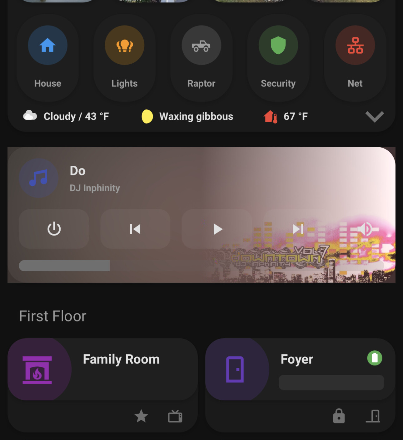
Absolutely amazing, this has got to be your best media player card yet!! Four questions:

  1. The only downside is that, when the media player is turned off, it is a giant empty card. You could resize it to normal when the state is off (like the Apple TV in screenshot) but then the layout could shift too much on a tablet layout. Maybe the best is to not show the card at all in that case? Any ideas?

  2. For some reason the blurred background goes beyond the rounded corners of the card? Itā€™s almost not noticeable though. See screenshot from iPad.

  3. Left/right margins seem to be unequal? Possibly because my whole vertical stack has a smaller width?

  4. On my Android phone, the album art does not show and the whole ha-card:before part collapses to a few pixels height :sweat_smile: The album art does show correctly in your other media player cards.

6 Likes

Hey @ArenaCloser ,

  1. You could put it in a conditional so that it doesnā€™t show when off. A better solution might be to have a generic image when the player is off. If you find any suitable ones let me know and I can add it.

  2. Yes, I have seen that, but @theandouz was not seeing the same behaviour on his. It may depend on your version of Safari or iOS. Perhaps others could comment and we can see if there is a pattern.

  3. Does it correct if you widen the column? The aspect-ratio should adjust correctly, perhaps another iOS quirk. You could try playing with margin: 4px 4px 16px; to see if you can correct.

  4. Perhaps your browser does not support aspect-ratio. Make sure you are on the latest Chrome and WebView. CSS property: aspect-ratio | Can I use... Support tables for HTML5, CSS3, etc

1 Like

I also have the corner issue on iOS