Fair! Ill take a look to see if i can come up with a simpler explanation 
1 Like
yes, and even with a great explanation, one has to admit it is not the simplest thing we do in the Frontend… it just isnt. (not ashamed to admit to need help at times myself…)
it’s an advanced tool, and requires advanced study of the inner workings of cards and views in HA (and, lately, config dashboards and strategies even  ) and outside HA.
the latter at times being even more complex, because not abiding HA’s frontend conventions.
What I am really saying is: the effort of explaining is probably as far as we can go to make it simpler, the requirement for the effort of learning needs to be stressed even more.
2 Likes
I can’t change the icon-size of the element “custom:mushroom-template-card”. I tried any combinations posted here in this thread but the size of the icon is not changing in any way.
I’m using Homassistant 12.4, Mushroom 5.0.8 and Cardmod 4.1.0
type: custom:mushroom-template-card
primary: Klima
secondary: ""
icon: mdi:sun-thermometer-outline
multiline_secondary: true
tap_action:
  action: navigate
  navigation_path: /dashboard-wohnung/klima
badge_icon: mdi:air-conditioner
grid_options:
  columns: 4
  rows: 2
badge_color: orange
hold_action:
  action: none
double_tap_action:
  action: none
color: none
features_position: bottom
vertical: true
card_mod:
  style: |
    ha-state-icon {
      color: green;
      --icon-symbol-size: 35px;
    }
1 Like
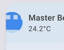
Found the solution:
card_mod:
  prepend: true
  style: |
    ha-tile-icon {
      --mdc-icon-size: 50px;
      --tile-icon-size: 60px;
    }
Now, I would like to increase the size of the badge:
    ha-tile-badge {
      --mdc-icon-size: 40px;
    }
This makes the icon larger but not the circle underneath. Can anyone help me with this?
Anyone? I can’t change the circle.
It might be helpful if you post a screen shot so that people know which element you are referring to.
This is my current Template Card:
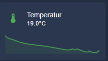
type: custom:mushroom-template-card
primary: Temperatur
secondary: >
  {{ states('sensor.aqara_multisensor_wsdcgq11lm_0xe3a7_temperature') | round(1)
  }}°C
icon: mdi:thermometer
tap_action:
  action: more-info
entity: sensor.aqara_multisensor_wsdcgq11lm_0xe3a7_temperature
color: green
features_position: bottom
area: kuche
multiline_secondary: false
features:
  - type: trend-graph
is it possible to let it use the full width like the HA Sensor Card:
1 Like
Yes, using card_mod you can.
card_mod:
  style: |
    .content {
      padding: 0;
    }
    hui-card-features {
      padding: 0;
    }
Did you try something like:
grid_options:
  columns: 12
  rows: 2
Not sure why but it seems whatever I try its not working out. I use the mushroom light card with dimmable option but I dont want the slider as my dashboard has many many different light switches. So I stacked the dim function behind the long press with an pop up solution which works fine for me.
But somehow the title is getting hidden by the overflow in the primary css and I cant seem to override it. Found many suggestions about line height but that relates to scaling issues in the vertical side of the text mine issue is in the horizontal one.

type: custom:mushroom-light-card
entity: light.verlichting_makerspace
show_brightness_control: true
name: Technische Ruimte
icon: mdi:lightbulb-on
icon_color: light-blue
fill_container: false
show_color_temp_control: false
show_color_control: false
collapsible_controls: false
grid_options:
  columns: 12
  rows: 1
use_light_color: true
layout: horizontal
tap_action:
  action: toggle
hold_action:
  action: more-info
card_mod:
  style:
    mushroom-shape-icon$: |
      .shape {
        {# ========== USER CONFIG ========== #}
        {% set state_entity    = 'light.bedroom_lamp_local' %}
        {% set active_value    = 'on' %}

        {# ====== TRIGGER ====== #}
          {% set trigger_active = (states(state_entity) == active_value) %}

        {% if trigger_active %}
          --shape-animation: lamp-glow 1.4s ease-in-out infinite;
          opacity: 1;
        {% else %}
          --shape-animation: none;
          opacity: 0.5;
        {% endif %}
      }
    .: |
      mushroom-shape-icon {
        --icon-size: 65px;
        display: flex;
        margin: -22px 0px 0px -22px !important;
        padding-right: 10px;
      }
      ha-card {
        clip-path: inset(0 0 0 0 round var(--ha-card-border-radius, 12px));
        overflow: visible !important;
      }
    mushroom-light-brightness-control$:
      mushroom-slider$: |
        .slider {
          width: 0px !important;
        }
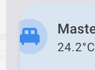
Anyone can help me with this? I have a template card that I wanted to change the icon size as well as the circle underneath, like screenshot. I found the following code that if i adjust the size of --mdc-icon-size, it will only change the icon inside. Anyone know how to change the circle size underneath?
        card_mod:
          prepend: true
          style: |
            ha-tile-icon {
              --mdc-icon-size: 30px;
              --tile-icon-size: 60px;
            }

            :host([dark-mode]) {
              background: rgba(var(--rgb-primary-background-color), 0.2);
            }

            :host {
              height: 66px;
              margin-left: -18px !important;
            }

            ha-card {
              width: 240px;
              overflow: visible !important;
            }
I have the same issue
Hi
I’m using a mushroom light card with the color temperature control and color control enabled.
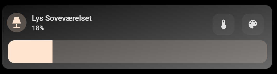
I’ve been trying to move the 2 control buttons up to the top row, and yaml is not my strongest skill. With a bit of reading the guides made in the top of this post and a bit of chatting with AI, this is what i came up with. Not even sure this is the right way to do it, but at least this moved up the buttons, but also moved the name and state of the entity 1 row up and outside the card.
Also i cannot expand the brightness slider to fill the card.
type: custom:mushroom-light-card
entity: light.philips_hue_lys_sovevaerelset
name: Lys Soveværelset
use_light_color: true
show_brightness_control: true
show_color_control: true
show_color_temp_control: true
collapsible_controls: false
grid_options:
  rows: 2
  columns: full
fill_container: false
card_mod:
  style: |
    mushroom-button:nth-child(2) {
      margin-bottom: 100px !important;
    }
    mushroom-button:nth-child(3) {
      margin-bottom: 100px !important;
    }
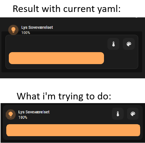
Hope this is possible and someone with more yaml knowledge can help me with.
This is a start you can work with…
type: custom:mushroom-light-card
entity: light.philips_hue_lys_sovevaerelset
name: Lys Soveværelset
use_light_color: true
show_brightness_control: true
show_color_control: true
show_color_temp_control: true
collapsible_controls: false
fill_container: false
card_mod:
  style:
    mushroom-button:nth-child(n)$: |
      .button {
        width: 40px !important;
        height: 40px !important;
        margin: -50px -2px !important;
        position: absolute;
         }
    mushroom-light-brightness-control$:
      mushroom-slider$: |
        .container {
          width: 130% !important;
          }
grid_options:
  columns: 12
  rows: 2
The dashboard type and your layout may alter the provided example!
For example…The color and temp sliders still need width adjustments
Something like this…
card_mod:
  style:
    mushroom-button:nth-child(n)$: |
      .button {
        width: 40px !important;
        height: 40px !important;
        margin: -50px -2px !important;
        position: absolute;
         }
    mushroom-light-brightness-control$:
      mushroom-slider$: |
        .container {
          width: 130% !important;
          }
    mushroom-light-color-temp-control$:
      mushroom-slider$: |
        .container {
          width: 130% !important;
               }
    mushroom-light-color-control$:
      mushroom-slider$: |
        .container {
          width: 130% !important;
               }
2 Likes
Thanks so much. Works like a charm!
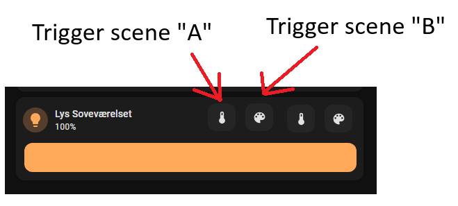
Do you (or any1 else) know if its possible to add additional icons for custom functions? Like have a 3rd and 4th icon added that triggers a preset scene or run a script on click?
Neither do I… I tried as well any combination, including the Grok AI… It seems it didn’t find a good solution, trying everything…
I’m using HAOS 16.3 Core 2025.12.5 Supervisor 2025.12.3
Mushroom from HACS v5.0.9
Card-mod from HACS v4.1.0
My code:
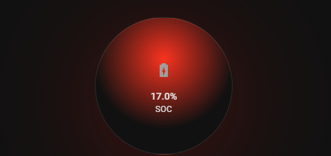
- type: custom:mushroom-template-card
    entity: sensor.victron_mqtt_battery_290_battery_soc
    primary: |
      {% set soc = states(entity)|float(0) %}  {{ soc|round(1) }}%
    secondary: SOC
    icon: mdi:battery-charging
    vertical: true
    card_mod:
      style: |
        ha-card {
          border-radius: 50% !important;
          width: 200px !important;
          height: 200px !important;
          margin: 0 auto;
          position: relative;
          overflow: hidden;
          background:
            radial-gradient(circle at 50% 30%,
              {% set soc = states('sensor.victron_mqtt_battery_290_battery_soc')|float(0) %}
              {% if soc >= 70 %} #00DB09
              {% elif soc >= 60 %} #3EDB00
              {% elif soc >= 50 %} #87BA36
              {% elif soc >= 40 %} #B2BA36
              {% elif soc >= 30 %} #FFCD4F
              {% elif soc >= 20 %} #ff9800
              {% else %} #FF2A1C {% endif %} 0%,
              transparent 60%);
          box-shadow: 0 20px 160px rgba(220,0,0,0.3);
          backdrop-filter: blur(2px);
        }
        ha-tile-icon $:
          .container {
            width: 140px !important;
            height: 140px !important;
            border-radius: 50% !important;
            margin: 0 auto !important;
          }
        ha-tile-icon $ ha-state-icon ha-icon:
          --mdc-icon-size: 110px !important;
displays like this:
Edit
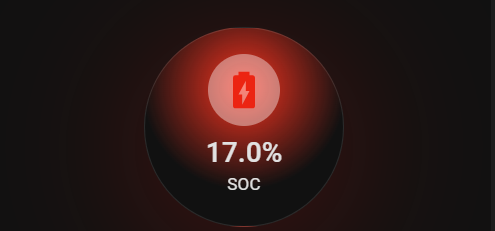
I found the solution… it sais in one thread about some breaking changes:
- type: custom:mushroom-template-card
    entity: sensor.victron_mqtt_battery_290_battery_soc
    primary: |
      {% set soc = states(entity)|float(0) %}  {{ soc|round(1) }}%
    secondary: SOC
    icon: mdi:battery-charging
    icon_color: "{{ states('sensor.battery_soc_color') }}"
    vertical: true
    card_mod:
      style: |
        ha-card {
          border-radius: 50% !important;
          width: 200px !important;
          height: 200px !important;
          margin: 0 auto;
          position: relative;
          overflow: hidden;
          background:
            radial-gradient(circle at 50% 30%,
              {% set soc = states('sensor.victron_mqtt_battery_290_battery_soc')|float(0) %}
              {% if soc >= 70 %} #00DB09
              {% elif soc >= 60 %} #3EDB00
              {% elif soc >= 50 %} #87BA36
              {% elif soc >= 40 %} #B2BA36
              {% elif soc >= 30 %} #FFCD4F
              {% elif soc >= 20 %} #ff9800
              {% else %} #FF2A1C {% endif %} 0%,
              transparent 60%);
          box-shadow: 0 20px 160px rgba(220,0,0,0.3);
          backdrop-filter: blur(2px);
        }
        ha-tile-icon {
          background-color: rgba(255, 255, 255, 0.4) !important;
          border-radius: 50%;
          --mdc-icon-size: 44px;
          --tile-icon-size: 60px;
        }
        ha-tile-info {
          --tile-info-primary-font-size: 2em;
          --tile-info-secondary-font-size: 1.2em;
        }
and looks like this now:
You could also use this:
    ha-state-icon {
      color: green;
      scale: 171% !important;
    }
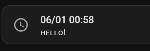
Hi I am trying to style this simple card but having issues. Can somebody help me, please? All I want to do is change the text to small caps. Thank you
title: Home

views:
  - title: Home
    path: home
    cards:
      - type: grid
        columns: 3
        square: false
        cards:
          - type: vertical-stack
            cards:
              - type: custom:mushroom-template-card
                primary: >-
                  {{ as_timestamp(now()) | timestamp_custom('%d/%m %H:%M') }}
                secondary: |-
                  {% set time = now().hour %}
                  {% if time >= 21 %}
                    Good Night!
                  {% elif time >= 17 %}
                    Good Evening!
                  {% elif time >= 12 %}
                    Good Afternoon!
                  {% elif time >= 6 %}
                    Good Morning!
                  {% else %}
                    Hello!
                  {% endif %}
                icon: mdi:clock-outline
                multiline_secondary: true
                vertical: true
                tap_action:
                  action: none
                hold_action:
                  action: none
                double_tap_action:
                  action: none
                card_mod:
                  style: |
                    ha-card {
                      font-variant: small-caps;
                    }

          - type: vertical-stack
            cards:
              - type: markdown
                content: |
                  Center column

          - type: vertical-stack
            cards:
              - type: markdown
                content: |
                  Right column
May be wrong… but " | lower " without the quotes after the timestamp custom bit??? I use the titlecase one a lot with templates…
Like this? Don’t use caps when defining the Secondary text.
type: custom:mushroom-template-card
primary: "{{ as_timestamp(now()) | timestamp_custom('%d/%m %H:%M') }}"
secondary: |-
  {% set time = now().hour %}
  {% if time >= 21 %}
    good night!
  {% elif time >= 17 %}
    good evening!
  {% elif time >= 12 %}
    good afternoon!
  {% elif time >= 6 %}
    good morning!
  {% else %}
    hello!
  {% endif %}
icon: mdi:clock-outline
multiline_secondary: true
features_position: bottom
card_mod:
  style: |
    ha-card {
      font-variant: small-caps;
    }