From my knowledge, you would have to stack cards
type: custom:vertical-stack-in-card
cards:
  - type: custom:mushroom-light-card
    entity: light.night_stand
    name: Lys Soveværelset
    use_light_color: true
    show_brightness_control: true
    show_color_control: true
    show_color_temp_control: true
    fill_container: false
    tap_action:
      action: more-info
    card_mod:
      style:
        mushroom-button:nth-child(3)$: |
          .button {
            width: 40px !important;
            height: 40px !important;
            margin: -50px -20px !important;
            position: absolute;
              }
        mushroom-button:nth-child(2)$: |
          .button {
            width: 40px !important;
            height: 40px !important;
            margin: -50px -10px !important;
            position: absolute;
              }
        mushroom-light-brightness-control$:
          mushroom-slider$: |
            .container {
              width: 130% !important;
              }
        mushroom-light-color-temp-control$:
          mushroom-slider$: |
            .container {
              width: 130% !important;
                   }
        mushroom-light-color-control$:
          mushroom-slider$: |
            .container {
              width: 130% !important;
                   }
  - type: custom:mushroom-template-card
    entity: light.night_stand
    icon: mdi:clock
    color: blue
    features_position: bottom
    card_mod:
      style: |
        ha-card {
         top: -110px;
         left: 280px;
         background: none;
         height: 0px !important;
          }
        ha-tile-icon {
         --tile-icon-border-radius: 11px;
          }
  - type: custom:mushroom-template-card
    entity: light.night_stand
    icon: mdi:phone
    color: red
    tap_action:
      action: toggle
    card_mod:
      style: |
        ha-card {
          background: none;
          height: 0px !important;
           }
        ha-tile-icon {
          --tile-icon-border-radius: 11px;
          top: -110px;
          left: 320px;
           }
iona
January 6, 2026, 4:04pm
1645
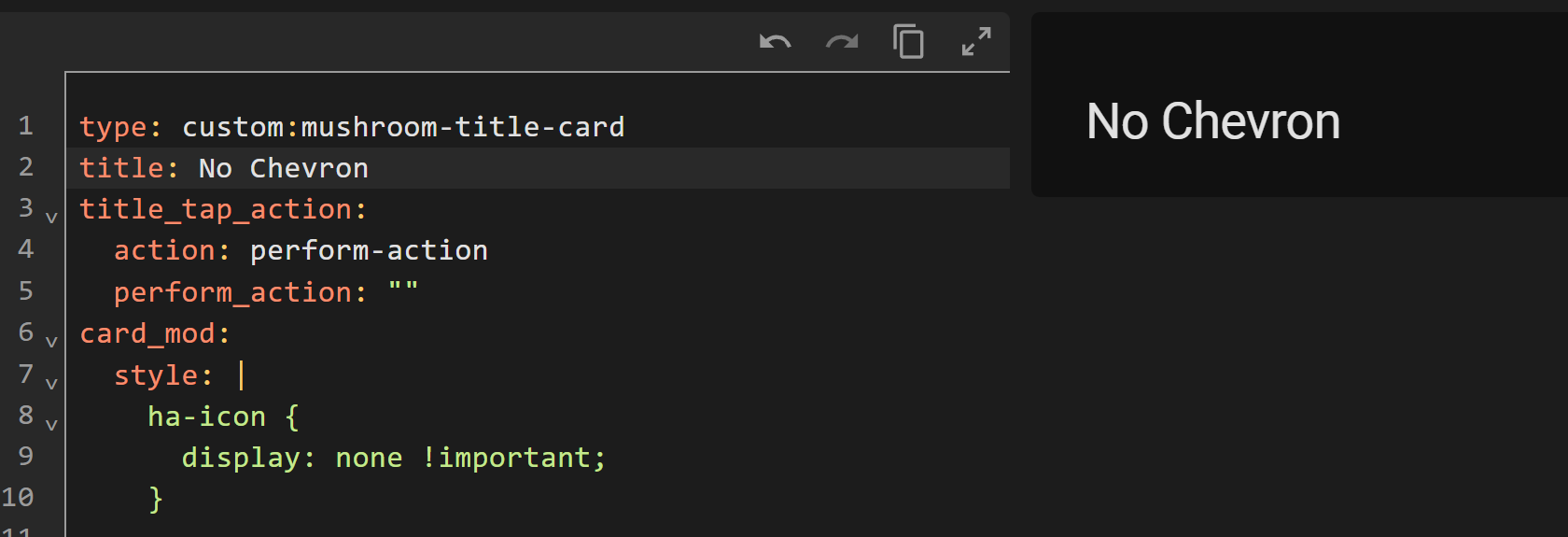
How do I target the title_tap_action chevron icon for the Title card ? I want to get rid of it, but can’t find a way. I believe it’s --mdc-icon, or is it based on the Tile card variable?
Thanks
dcapslock
January 6, 2026, 9:41pm
1646
type: custom:mushroom-title-card
title: Hello, {{ user }} !
title_tap_action:
  action: perform-action
  perform_action: ""
card_mod:
  style: |
    .actionable ha-icon {
      display: none;
    }
1 Like
iona
January 8, 2026, 12:30am
1647
Thanks, but it’s not applying for some reason?
dcapslock
January 8, 2026, 12:55am
1648
What code are you trying?
iona
January 8, 2026, 4:06am
1649
I tried my code and your example, but neither work.
Try
card_mod:
  style: |
    ha-icon {
      display: none !important;
    }
This works as well…
card_mod:
  style: |
    .actionable ha-icon {
      display: none !important;
    }
1 Like
dcapslock
January 8, 2026, 6:12am
1651
As per @LiQuid_cOOled , try adding ‘!important’. I keep forgetting that some Browsers treat same CSS specificity differently (i.e. which CSS wins). I find I have to add ‘important’ less than others, mainly those on Safari.
1 Like
@LiQuid_cOOled
Amazing. I’m gonna play around with that a bit. Thanks alot!
1 Like
froschhomes
January 12, 2026, 7:41pm
1653
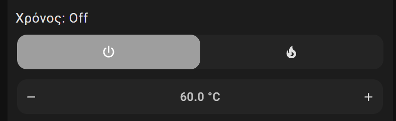
I am using a climate card and when I run an script that enables/disables the HVAC the view goes from temp select to mode select. This is fine when it is turned off but when i turn it out it would be good to go to temp selection view.
Here is an example of the views:
Is there anyway to force it back to the first view after running my script?
OUARZA
January 21, 2026, 8:58pm
1654
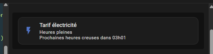
Hello,
type: custom:mushroom-template-card
primary: Tarif électricité
secondary: >
  {% if is_state('binary_sensor.heures_creuses','on') %}
    Heures creuses
  {% else %}
    Heures pleines
  Prochaines heures creuses dans {{ states('sensor.prochaine_heure_creuse') }}
  {% endif %}
icon: >
  {% if is_state('binary_sensor.heures_creuses','on') %}
    mdi:leaf
  {% else %}
    mdi:flash
  {% endif %}
multiline_secondary: true
entity: binary_sensor.heures_creuses
color: >
  {% if is_state('binary_sensor.heures_creuses','on') %}
    #00b050
  {% else %}
    #4472c4
  {% endif %}
features_position: bottom
grid_options:
  columns: 12
  rows: auto
card_mod:
  style:
    mushroom-state-info$: |
      .container {
       --card-secondary-font-size: 200px;
       --card-primary-font-size: 200px;
      }
dcapslock
January 22, 2026, 1:01am
1655
mushroom-state-info is no longer used in v5. It is now ha-tile-info. Also you don’t need to go to shadowRoot if using CSS vars as they pierce the shadow DOM.
So it is as simple as…
card_mod:
  style: |
    :host {
      --ha-tile-info-primary-font-size: 24px;
      --ha-tile-info-secondary-font-size: 16px;
    }
OUARZA
January 22, 2026, 11:36am
1656
Thank you so much, it works perfectly
1 Like
rolael
January 24, 2026, 11:58am
1657
I’m probably stupid, but I use the mushroom alarm control card. I want if it’s diarmed a green icon, when armed_way , a red one… Can’t seem to find it. And my friend chatgpt doesn’t give me a correct solution. Anyone? pls
Something like this. Defining the alarm states matters!
type: custom:mushroom-alarm-control-panel-card
entity: alarm_control_panel.home_alarm
card_mod:
  style:
    mushroom-shape-icon$: |
      .shape {
       --border-state: {% if is_state(config.entity,'disarmed') %} red {% else %} lime {% endif %};
       border: 1px solid var(--border-state);
       --shape-color: black;
        }
    .: |
      ha-state-icon {
       color: var(--border-state);
      }
1 Like
dhess83
February 1, 2026, 7:16pm
1660
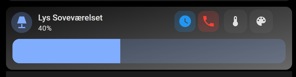
Is it possible to have a Mushroom Lighting card styled like this:
That is, label, brightness slider, off button, on button?
Sourcer63
February 2, 2026, 2:34pm
1661
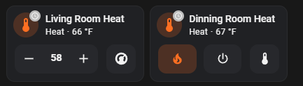
Hi,
How did you get the badge into the climate card? I’ve been looking for this and everything I read says it’s not possible.
How do I change the badge icon color, this code doesn’t work…
card_mod:
  style: |
    mushroom-badge-icon {
      --icon-color: orange;
    }
PskNorz
February 23, 2026, 12:10am
1663
Hello, how can i move secondary info a little bit to he right?
