VaReTaS
October 14, 2021, 10:36pm
1
Hi,
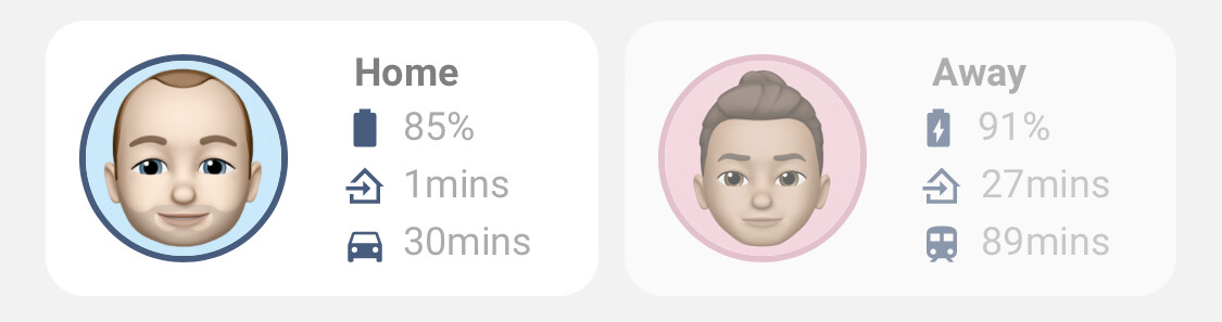
I have been struggling for sometime to get a “person card” in a way that was looking nice and that would provide the information that I was expecting to see in a glance.
After many interactions and backs-and-forths, with Button-Card, I believe that I got it right for what I had in mind.
Anyhow, would love to see how your current approach looks and maybe get some more ideas.
Mine now looks like this:
Home
Away
Work
Others
Some features that I got working:
Zone dependent color border on the image
Zone dependent icon and zone name
Wifi Connection details
Phone battery status (icon changing when charging) (red status when below 50%)
Proximity to home sensor
I am adding the code to this post, for ease of reference:
type: custom:button-card
entity: person.xxx
aspect_ratio: 1/1
name: Person
show_entity_picture: true
show_name: false
hold_action:
  action: none
state:
  - value: home
    styles:
      custom_fields:
        icon:
          - border-color: '#77c66e'
  - value: not_home
    styles:
      card:
        - background-color: '#dedede'
      custom_fields:
        icon:
          - border-color: '#EF4F1A'
  - value: Work
    styles:
      custom_fields:
        icon:
          - border-color: deepskyblue
styles:
  card:
    - background-color: white
    - border-radius: 5%
    - padding: 5%
    - color: gray
    - font-size: 10px
    - text-shadow: 0px 0px 0px black
    - text-transform: capitalize
    - justify-self: end
    - align-self: middle
  grid:
    - grid-template-areas: '"icon status" "n n" "battery proximity" "wifi ss" "sd sd"'
    - grid-template-columns: 2fr 1fr
    - grid-template-rows: 1fr min-content min-content min-content min-content
  name:
    - font-size: 15px
    - align-self: middle
    - justify-self: start
    - padding-bottom: 10px
  custom_fields:
    icon:
      - clip-path: circle()
      - width: 80%
      - pointer-events: none
      - display: grid
      - border: 5px solid
      - border-color: gray
      - border-radius: 500px
      - margin: 0 +10% 0 0
      - justify-self: end
      - opacity: 1
    status:
      - align-self: start
      - justify-self: end
      - color: gray
    proximity:
      - padding: 0.5em 0px
      - align-self: middle
      - justify-self: start
      - color: gray
    wifi:
      - padding: 0.5em 0px
      - align-self: middle
      - justify-self: start
      - color: gray
      - '--text-wifi-color-sensor': >-
          [[[ if (states["sensor.mobile_wifi_connection"].state == '<not
          connected>') return "#aaaaaa"; ]]]
    battery:
      - padding: 0.5em 0px
      - align-self: middle
      - justify-self: start
      - color: gray
      - '--text-color-sensor': >-
          [[[ if (states["sensor.mobile_battery_level"].state < 50) return
          "#EF4F1A"; ]]]
custom_fields:
  icon: >
    [[[ return entity === undefined ? null : `<img
    src="${states[entity.entity_id].attributes.entity_picture}" width="100%">`;
    ]]]
  status: |
    [[[
      if (states['person.xxx'].state =='not_home') {
      return `<ha-icon icon="mdi:home-export-outline"
        style="width: 20px; height: 20px; color: '#888888';">
        </ha-icon><span> Away</span>`;
      }
      if (states['person.xxx'].state =='home') {
      return `<ha-icon
        icon="mdi:home"
        style="width: 20px; height: 20px; color: 888888;">
        </ha-icon><span> ${entity.state}</span>`;
      } else {
      return `<ha-icon
        icon="mdi:map-marker-radius"
        style="width: 20px; height: 20px; color: 888888;">
        </ha-icon><span> ${entity.state}</span>`;
      }
    ]]]
  proximity: |
    [[[
      return `<ha-icon
        icon="mdi:map-marker-distance"
        style="width: 20px; height: 20px; color: #888888;">
        </ha-icon>  <span>\<span style="color: var(--text-color-sensor);">${states['proximity.ad_home'].state} Kms</span></span>`
    ]]]
  battery: |
    [[[
      if (states['sensor.mobile_battery_state'].state =='charging') {
        return `<ha-icon
        icon="mdi:battery-charging"
        style="width: 20px; height: 20px; color: #888888;">
        </ha-icon> <span><span style="color: var(--text-color-sensor);">${states['sensor.ad_s9_aim_battery_level'].state}% battery</span></span>`;
      } else {
        return `<ha-icon
        icon="mdi:battery"
        style="width: 20px; height: 20px; color: #888888;">
        </ha-icon> <span><span style="color: var(--text-color-sensor);">${states['sensor.mobile_battery_level'].state}% battery</span></span>`;
      }
    ]]]
  wifi: |
    [[[
      if (states['sensor.mobile_wifi_connection'].state =='<not connected>') {
        return `<ha-icon
        icon="mdi:wifi"
        style="width: 20px; height: 20px; color: var(--text-wifi-color-sensor);">
        </ha-icon> <span><span style="color: var(--text-wifi-color-sensor);">Disconnected</span></span>`;
      } else {
        return `<ha-icon
        icon="mdi:wifi"
        style="width: 20px; height: 20px; color: #888888;">
        </ha-icon> <span><span style="color: var(--text-color-sensor);">${states['sensor.mobile_wifi_connection'].state}</span></span>`;
      }
    ]]]
On the Raw Editor I also have this CSS for button-card-templates, although it doesn’t matter much.
button_card_templates:
  header:
    styles:
      card:
        - background-color: '#FFFFFF'
        - box-shadow: none
        - border-radius: 0%
        - padding: 0%
        - color: white
        - font-size: 10px
        - text-shadow: 0px 0px 0px black
        - text-transform: capitalize
      icon:
        - width: 15%
        - margin-top: 0%
        - margin-left: 0%
        - color: white
      name:
        - font-size: 16px
        - color: '#253B56'
        - text-transform: capitalize
        - justify-self: start
        - margin-left: 1%
  standard_button:
    styles:
      card:
        - font-size: 10px
      icon:
        - width: 30%
      name:
        - font-size: 12px
        - color: '#E0E0E0'
      state:
        - justify-self: start
        - font-size: 10px
        - padding: 0px 5px
        - color: '#E0E0E0'
Hoping to see (loads of) your “person” cards
33 Likes
benm7
October 14, 2021, 10:56pm
2
Here are mine for mobile, pretty similar
8 Likes
Can you share the code and the card used?
I’m also interested in the code. Please share.
benm7
October 15, 2021, 4:39am
6
Sure thing, I use decluttering templates for this FYI.
card code
          - type: custom:decluttering-card
            template: person_card_new
            variables:
              - entity: person.ben
              - name: Ben
              - battery: device_tracker.life360_ben
              - work_sensor: sensor.ben_to_work_waze
              - home_sensor: sensor.ben_to_home_waze
              - work_icon: mdi:car
              - entity_picture: /local/ben6.png
              - show_entity_picture: true
              - tap_action:
                  action: more-info
                  haptic: light
template (note I use custom theme variables identified as var(–severity-1) through to var(–severity-5) as the picture entity outline based on state, which you will need to change to suit your theme/color variables):
person_card_new:
  default:
    - size: 60%
    - color: auto
    - background_color: var(--primary-background-color)
    - variable: spin
    - spin: false
    - show_name: false
    - show_state: true
    - show_label: false
    - show_icon: true
    - show_last_changed: false
    - show_entity_picture: false
    - tap_action:
        action: more-info
        haptic: light
    - aspect_ratio: 2/1
    - margin-right: 20px
    - label: ' '
    - off_icon_color: gray
    - off_name_color: gray
    - off_state_color: gray
  card:
    type: custom:button-card
    battery: '[[battery]]'
    home_sensor: '[[home_sensor]]'
    work_sensor: '[[work_sensor]]'
    work_icon: '[[work_icon]]'
    name: '[[name]]'
    icon: 'mdi:[[icon]]'
    size: '[[size]]'
    color: '[[color]]'
    aspect_ratio: '[[aspect_ratio]]'
    entity: '[[entity]]'
    label: '[[label]]'
    show_name: '[[show_name]]'
    show_icon: '[[show_icon]]'
    show_state: '[[show_state]]'
    show_label: '[[show_label]]'
    show_last_changed: '[[show_last_changed]]'
    tap_action: '[[tap_action]]'
    hold_action: '[[hold_action]]'
    entity_picture: '[[entity_picture]]'
    show_entity_picture: '[[show_entity_picture]]'
    styles:
      card:
        - border-radius: 12px
        - --card-background-color: '[[background_color]]'
      icon:
        - grid-column: 1
        - grid-row: 1 / 4
      label:
        - color: gray
        - font-size: 11px
#        - font-family: Helvetica
        - padding: 0px 10px
        - justify-self: start
      state:
        - font-size: 12px
#        - font-family: Helvetica
        - padding: 0px 10px
        - justify-self: start
        - text-transform: capitalize
        - font-weight: bold
        - padding-left: 10px
        - color: var(--primary-text-color)
      grid:
        - grid-template-areas: '"i s" "i battery" "i home" "i work"'
        - grid-template-columns: 50% 50%
        - grid-template-rows: 25% 25% 25% 25%
      img_cell:
        - align-self: start
        - text-align: start
#        - margin-right: '[[margin-right]]'
      name:
        - justify-self: start
        - padding-left: 10px
        - font-weight: bold
#        - font-family: Helvetica
        - font-size: 13px
      entity_picture:
        - height: 60px
        - width: 60px
        - border-radius: 100%
      custom_fields:
        battery:
          - align-self: start
          - justify-self: start
          - font-size: 12px
          - color: var(--secondary-text-color)
        home:
          - align-self: start
          - justify-self: start
          - font-size: 12px
          - color: var(--secondary-text-color)
        work:
          - align-self: start
          - justify-self: start
          - font-size: 12px
          - color: var(--secondary-text-color)
    custom_fields:
          battery: >
              [[[
                if (states['[[battery]]'].attributes.battery_charging === false)
                  return `<ha-icon
                    icon="mdi:battery"
                    style="; --mdc-icon-size: 14px; padding-left: 6px; padding-right: 5px; color: var(--primary-color);">
                    </ha-icon><span>${states['[[battery]]'].attributes.battery}%</span>`
                else return `<ha-icon
                  icon="mdi:battery-charging"
                  style="; --mdc-icon-size: 14px; padding-left: 5px; padding-right: 5px; color: var(--primary-color);">
                  </ha-icon><span>${states['[[battery]]'].attributes.battery}%</span>`
              ]]]
          home: >
              [[[
                return `<ha-icon
                  icon="mdi:home-import-outline"
                  style="; --mdc-icon-size: 14px; padding-left: 6px; padding-right: 5px; color: var(--primary-color);">
                  </ha-icon><span>${states['[[home_sensor]]'].state}mins</span>`
              ]]]
          work: >
              [[[
                return `<ha-icon
                  icon="[[work_icon]]"
                  style="; --mdc-icon-size: 14px; padding-left: 6px; padding-right: 5px; color: var(--primary-color);">
                  </ha-icon><span>${states['[[work_sensor]]'].state}mins</span>`
              ]]]
    state:
      - value: "not_home"
        styles:
          card:
            - opacity: 0.6
          entity_picture:
            - border: 2px solid var(--severity-1)
      - value: "home"
        styles:
          entity_picture:
            - border: 2px solid var(--severity-5)
      - value: "Ben Work"
        styles:
          entity_picture:
            - border: 2px solid var(--severity-4)
      - value: "Jess Work"
        styles:
          entity_picture:
            - border: 2px solid var(--severity-4)
      - value: "Poppy Home"
        styles:
          entity_picture:
            - border: 2px solid var(--severity-3)
      - value: "Lola Home"
        styles:
          entity_picture:
            - border: 2px solid var(--severity-3)
      - value: "GPa and GMa Home"
        styles:
          entity_picture:
            - border: 2px solid var(--severity-3)
12 Likes
benm7
October 15, 2021, 4:45am
7
Without wanting to hijack this thread as I’d love to see what everyone else has done (and steal their ideas
It shows the location of keys and the car itself (all tracked through separate Tiles) and petrol prices nearest to the location of the car and for up to 3 selected petrol stations, so you can work out whether the petrol station you are nearest to is close to the cheapest around.
14 Likes
k8gg
October 15, 2021, 8:37am
8
Care to share the codes and/or elaborate a bit on your setup?
Sure. I was meant to do it on the initial post, but it was late already. I will leave it here and add it to the first post.
I am sure that there is a lot of coding that could be improved/optimized, but it was the way I could make it work.
My setup does not go with yaml Lovelace, so I am not using templates.
type: custom:button-card
entity: person.xxx
aspect_ratio: 1/1
name: Person
show_entity_picture: true
show_name: false
hold_action:
  action: none
state:
  - value: home
    styles:
      custom_fields:
        icon:
          - border-color: '#77c66e'
  - value: not_home
    styles:
      card:
        - background-color: '#dedede'
      custom_fields:
        icon:
          - border-color: '#EF4F1A'
  - value: Work
    styles:
      custom_fields:
        icon:
          - border-color: deepskyblue
styles:
  card:
    - background-color: white
    - border-radius: 5%
    - padding: 5%
    - color: gray
    - font-size: 10px
    - text-shadow: 0px 0px 0px black
    - text-transform: capitalize
    - justify-self: end
    - align-self: middle
  grid:
    - grid-template-areas: '"icon status" "n n" "battery proximity" "wifi ss" "sd sd"'
    - grid-template-columns: 2fr 1fr
    - grid-template-rows: 1fr min-content min-content min-content min-content
  name:
    - font-size: 15px
    - align-self: middle
    - justify-self: start
    - padding-bottom: 10px
  custom_fields:
    icon:
      - clip-path: circle()
      - width: 80%
      - pointer-events: none
      - display: grid
      - border: 5px solid
      - border-color: gray
      - border-radius: 500px
      - margin: 0 +10% 0 0
      - justify-self: end
      - opacity: 1
    status:
      - align-self: start
      - justify-self: end
      - color: gray
    proximity:
      - padding: 0.5em 0px
      - align-self: middle
      - justify-self: start
      - color: gray
    wifi:
      - padding: 0.5em 0px
      - align-self: middle
      - justify-self: start
      - color: gray
      - '--text-wifi-color-sensor': >-
          [[[ if (states["sensor.mobile_wifi_connection"].state == '<not
          connected>') return "#aaaaaa"; ]]]
    battery:
      - padding: 0.5em 0px
      - align-self: middle
      - justify-self: start
      - color: gray
      - '--text-color-sensor': >-
          [[[ if (states["sensor.mobile_battery_level"].state < 50) return
          "#EF4F1A"; ]]]
custom_fields:
  icon: >
    [[[ return entity === undefined ? null : `<img
    src="${states[entity.entity_id].attributes.entity_picture}" width="100%">`;
    ]]]
  status: |
    [[[
      if (states['person.xxx'].state =='not_home') {
      return `<ha-icon icon="mdi:home-export-outline"
        style="width: 20px; height: 20px; color: '#888888';">
        </ha-icon><span> Away</span>`;
      }
      if (states['person.xxx'].state =='home') {
      return `<ha-icon
        icon="mdi:home"
        style="width: 20px; height: 20px; color: 888888;">
        </ha-icon><span> ${entity.state}</span>`;
      } else {
      return `<ha-icon
        icon="mdi:map-marker-radius"
        style="width: 20px; height: 20px; color: 888888;">
        </ha-icon><span> ${entity.state}</span>`;
      }
    ]]]
  proximity: |
    [[[
      return `<ha-icon
        icon="mdi:map-marker-distance"
        style="width: 20px; height: 20px; color: #888888;">
        </ha-icon>  <span>\<span style="color: var(--text-color-sensor);">${states['proximity.ad_home'].state} Kms</span></span>`
    ]]]
  battery: |
    [[[
      if (states['sensor.mobile_battery_state'].state =='charging') {
        return `<ha-icon
        icon="mdi:battery-charging"
        style="width: 20px; height: 20px; color: #888888;">
        </ha-icon> <span><span style="color: var(--text-color-sensor);">${states['sensor.ad_s9_aim_battery_level'].state}% battery</span></span>`;
      } else {
        return `<ha-icon
        icon="mdi:battery"
        style="width: 20px; height: 20px; color: #888888;">
        </ha-icon> <span><span style="color: var(--text-color-sensor);">${states['sensor.mobile_battery_level'].state}% battery</span></span>`;
      }
    ]]]
  wifi: |
    [[[
      if (states['sensor.mobile_wifi_connection'].state =='<not connected>') {
        return `<ha-icon
        icon="mdi:wifi"
        style="width: 20px; height: 20px; color: var(--text-wifi-color-sensor);">
        </ha-icon> <span><span style="color: var(--text-wifi-color-sensor);">Disconnected</span></span>`;
      } else {
        return `<ha-icon
        icon="mdi:wifi"
        style="width: 20px; height: 20px; color: #888888;">
        </ha-icon> <span><span style="color: var(--text-color-sensor);">${states['sensor.mobile_wifi_connection'].state}</span></span>`;
      }
    ]]]
On the Raw Editor I also have this CSS for button-card-templates, although it doesn’t matter much.
button_card_templates:
  header:
    styles:
      card:
        - background-color: '#FFFFFF'
        - box-shadow: none
        - border-radius: 0%
        - padding: 0%
        - color: white
        - font-size: 10px
        - text-shadow: 0px 0px 0px black
        - text-transform: capitalize
      icon:
        - width: 15%
        - margin-top: 0%
        - margin-left: 0%
        - color: white
      name:
        - font-size: 16px
        - color: '#253B56'
        - text-transform: capitalize
        - justify-self: start
        - margin-left: 1%
  standard_button:
    styles:
      card:
        - font-size: 10px
      icon:
        - width: 30%
      name:
        - font-size: 12px
        - color: '#E0E0E0'
      state:
        - justify-self: start
        - font-size: 10px
        - padding: 0px 5px
        - color: '#E0E0E0'
Hope this helps
1 Like
s4rsteve
October 15, 2021, 9:09am
10
Mines pretty simple picture elements. Clicking on status opens up the person map.
24 Likes
VaReTaS
October 15, 2021, 9:13am
11
To complete the code posted above, I am using:
benm7
October 15, 2021, 9:51am
12
Love the pictures, very cool!
2 Likes
haibienbac
October 23, 2021, 6:32am
13
can you share it to me, i love your lovelace
1 Like
s4rsteve
October 25, 2021, 2:10am
14
Here’s the code for the picture elements with button cards on top:
        - type: horizontal-stack
          cards:
            - type: picture-elements
              image: /local/bebe2.jpg
              border-radius: 20px
              elements:
                - entity: person.bebe
                  style:
                    background-color: rgba(0, 0, 0, 0.5)
                    bottom: 0
                    color: white
                    font-size: 12px
                    left: 0
                    line-height: 100%
                    padding: 0 0px
                    transform: initial
                    width: 100%
                  type: state-label
                - type: custom:button-card
                  entity: sensor.sm_g965f_battery_level
                  template: phone
                  style:
                    top: 3%
                    left: 5%
                    transform: initial
                - type: custom:button-card
                  entity: proximity.kim_home
                  template: phone
                  style:
                    top: 15%
                    left: 5%
                    font-size: 12px
                    transform: initial
            - type: picture-elements
              elements:
                - entity: person.steve
                  style:
                    background-color: rgba(0, 0, 0, 0.5)
                    bottom: 0
                    color: white
                    font-size: 12px
                    text-align: right
                    left: 0
                    line-height: 100%
                    padding: 0 0
                    transform: initial
                    width: 100%
                  type: state-label
                - type: custom:button-card
                  entity: sensor.steve_s21_battery_level
                  template: phone
                  style:
                    top: 3%
                    right: 5%
                    transform: initial
                - type: custom:button-card
                  entity: proximity.steve_home
                  template: phone
                  style:
                    top: 15%
                    right: 5%
                    transform: initial
              image: /local/spidey2.jpg
The button card template code:
phone:
    show_state: true
    show_name: false
    show_icon: true
    layout: icon_state
    tap_action:
      action: more-info
    styles:
      card:
        - width: 60px
        - font-size: 12px
        - background-color: rgba(0,0,0,0.2)
        - border-radius: 5px
      state:
        - font-size: 12px
        - opacity: 1
duceduc
November 28, 2021, 9:46pm
16
Hi. Can you explain or show code sample how this works? Thanks.
(note I use custom theme variables identified as var(–severity-1) through to var(–severity-5)
pimp1310
January 3, 2022, 11:58am
17
hello,
where must i add the template ?
i tried it in the raw editor, no luck, i tried configuration.yaml file, no luck
decluttering_templates:
  person_card_new:
  default:
  - size: 60%
  - color: auto
  - background_color: var(--primary-background-color)
  - variable: spin
  - spin: false
  - show_name: false
  - show_state: true
  - show_label: false
  - show_icon: true
  - show_last_changed: false
  - show_entity_picture: false
  - tap_action:
      action: more-info
      haptic: light
  - aspect_ratio: 2/1
  - margin-right: 20px
  - label: ' '
  - off_icon_color: gray
  - off_name_color: gray
  - off_state_color: gray
card:
  type: custom:button-card
  battery: '[[battery]]'
  home_sensor: '[[home_sensor]]'
  work_sensor: '[[work_sensor]]'
  work_icon: '[[work_icon]]'
  name: '[[name]]'
  icon: mdi:[[icon]]
  size: '[[size]]'
  color: '[[color]]'
  aspect_ratio: '[[aspect_ratio]]'
  entity: '[[entity]]'
  label: '[[label]]'
  show_name: '[[show_name]]'
  show_icon: '[[show_icon]]'
  show_state: '[[show_state]]'
  show_label: '[[show_label]]'
  show_last_changed: '[[show_last_changed]]'
  tap_action: '[[tap_action]]'
  hold_action: '[[hold_action]]'
  entity_picture: '[[entity_picture]]'
  show_entity_picture: '[[show_entity_picture]]'
  styles:
    card:
      - border-radius: 12px
      - '--card-background-color': '[[background_color]]'
    icon:
      - grid-column: 1
      - grid-row: 1 / 4
    label:
      - color: gray
      - font-size: 11px
      - padding: 0px 10px
      - justify-self: start
    state:
      - font-size: 12px
      - padding: 0px 10px
      - justify-self: start
      - text-transform: capitalize
      - font-weight: bold
      - padding-left: 10px
      - color: var(--primary-text-color)
    grid:
      - grid-template-areas: '"i s" "i battery" "i home" "i work"'
      - grid-template-columns: 50% 50%
      - grid-template-rows: 25% 25% 25% 25%
    img_cell:
      - align-self: start
      - text-align: start
    name:
      - justify-self: start
      - padding-left: 10px
      - font-weight: bold
      - font-size: 13px
    entity_picture:
      - height: 60px
      - width: 60px
      - border-radius: 100%
    custom_fields:
      battery:
        - align-self: start
        - justify-self: start
        - font-size: 12px
        - color: var(--secondary-text-color)
      home:
        - align-self: start
        - justify-self: start
        - font-size: 12px
        - color: var(--secondary-text-color)
      work:
        - align-self: start
        - justify-self: start
        - font-size: 12px
        - color: var(--secondary-text-color)
  custom_fields:
    battery: |
      [[[
        if (states['[[battery]]'].attributes.battery_charging === false)
          return `<ha-icon
            icon="mdi:battery"
            style="; --mdc-icon-size: 14px; padding-left: 6px; padding-right: 5px; color: var(--primary-color);">
            </ha-icon><span>${states['[[battery]]'].attributes.battery}%</span>`
        else return `<ha-icon
          icon="mdi:battery-charging"
          style="; --mdc-icon-size: 14px; padding-left: 5px; padding-right: 5px; color: var(--primary-color);">
          </ha-icon><span>${states['[[battery]]'].attributes.battery}%</span>`
      ]]]
    home: |
      [[[
        return `<ha-icon
          icon="mdi:home-import-outline"
          style="; --mdc-icon-size: 14px; padding-left: 6px; padding-right: 5px; color: var(--primary-color);">
          </ha-icon><span>${states['[[home_sensor]]'].state}mins</span>`
      ]]]
    work: |
      [[[
        return `<ha-icon
          icon="[[work_icon]]"
          style="; --mdc-icon-size: 14px; padding-left: 6px; padding-right: 5px; color: var(--primary-color);">
          </ha-icon><span>${states['[[work_sensor]]'].state}mins</span>`
      ]]]
  state:
    - value: not_home
      styles:
        card:
          - opacity: 0.6
        entity_picture:
          - border: 2px solid var(--severity-1)
    - value: home
      styles:
        entity_picture:
          - border: 2px solid var(--severity-5)
    - value: Ben Work
      styles:
        entity_picture:
          - border: 2px solid var(--severity-4)
    - value: Jess Work
      styles:
        entity_picture:
          - border: 2px solid var(--severity-4)
    - value: Poppy Home
      styles:
        entity_picture:
          - border: 2px solid var(--severity-3)
    - value: Lola Home
      styles:
        entity_picture:
          - border: 2px solid var(--severity-3)
    - value: GPa and GMa Home
      styles:
        entity_picture:
          - border: 2px solid var(--severity-3)
Thank You
benm7
January 3, 2022, 11:16pm
18
Heya,
You need to use this card to make the templates work:
Hey,
I’ve created a new card that helps you declutter your LL config if you use multiple times the same block of cards with small differences (like an entity for example) to display things in LL.
Visit github for installation instructions, up to date documentation and troubleshooting guide
[GitHub Release] [GitHub Activity] [custom_updater] [Project Maintenance]
decluttering-card
This card is for Lovelace on Home Assistant .
We all use multiple times the same block of configuration acros…
Follow the instructions to install and let me know if you have issues after that
1 Like
tymcio
January 4, 2022, 12:42pm
19
Looks great. But is it responsive?
VaReTaS
January 17, 2022, 10:15pm
20
Mine? Yes, they are responsive.
tymcio
January 21, 2022, 11:50am
21
can you show me mobile version?


