Thanks @dcapslock for helping @hampenpampen. That should work if the objective is to make the dot outline disappear. If instead the dot outline should be transparent, replace none with the background colour of the card you are using.
I’m aware that - if people are using non-standard tile background colours - the dot outline currently looks bad. Issue #16 will address this problem.
Hi @scw2wi - thanks so much for sharing your example - looks great! At the moment, there is not an option for colourising the value, rather than the icon - it’s an interesting idea; I’ll give it some thought.
As for changing font size - as per earlier discussion, this is not something I’m keen to do to - opening font size config can lead to a ton of complexity.
Hi @nanomonster - glad you like it! Click behaviour is work in progress - there are some undocumented possibilities, but they are incomplete. More info in issue #10 and earlier in this thread.
I have code that makes the card background transparent and also have a background picture setup for the dashboard with transparency.
This is the corresponding code:
My idea about fontsize was something like font = big | medium | small,
but if opening font size is too complex, maybe there is a simpler solution.
At the moment the card has 2 different behaviours regarding value + unit.
In case of short units, value + unit is being shown in 1 line,
in case of long units, unit is being shown below value.
Would it be possible to implement a switch to enforce the 2nd behaviour also for short units?
My workaround at the moment is to show short units as icon above.
That has mixing of selectors (straight CSS and yaml) so that won’t work. However, easy card_mod is shown below setting –card-background-color at card level.
Yes as the end result is to set the variable that tike card uses for svg fill. So using the variable means no need for more complex card-mod with shadown root. It was easier to demonstrate this way than explain why the card_mod syntax was wrong.
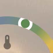
Thanks! but it actually already does what I want … I checked better and when using a climate entity, the thermostat control card pops up when clicking the ring, which is what I want. The history shows up only when it’s a sensor type entity, which is fine as far as I’m concerned. (my bad for mixing them up!)
Hey - glad to hear it @nanomonster. As it happens, I also use ring-tile card with thermostats, so had quietly made sure that case works!
Thanks for the extra context @scw2wi. You make a good point about the handling of short and long units. It’s a bit magic, which can be frustrating, so I tend to agree it should be possible to have control over this behaviour. I’ve created an issue to fix this (#40).
Looks like your problem is under control @hampenpampen. With the additional context you provided, I can confirm that the fix I have in mind will sort this (when finally I get to it…)
Thanks for the extra context - sounds reasonable. As noted previously, template support is a long way off. My current preference is to avoid the additional complexity and instead point to card_mod as the way to do customisations for more advanced users. For your use case, the following should work:
This will adjust the hue of the marker between blue when windspeed is 0 km/h and red when it is 100 km/h, transitioning via green. You can mess with the hue endpoints (0° to 210°) and the speed limit (100 km/h) as it suits you. I’ve set saturation / lightness to keep the overall look consistent with the HA colour palette.
Hi @zigomatic - sorry to say ring-tile card does not yet support *_action config. It’s on my list. There are a few basic and undocumented capabilities set up, but nothing fancy. Stay tuned.
It works fine for brightness values from 1 to 255,
but if the light is OFF, the brightness is not 0 but empty (that’s clear so far).
In this case the ring is shown correct but the bulb is blue instead of grey.
For value 3 (1% brightness) both ring and icon shows correctly as grey.
For state OFF only ring shows correctly as grey but icon shows a blue colour (like for value 5).
As a workaround I could create a template sensor to fake a brightness of 0 in case of OFF,
but maybe there is a much easier solution for this.
Please note, that I have set the transition from grey to blue on purpose between 3 (1%) and 5 (2%) to show, that the bulb switches correctly to grey for the lowest value. My expectation would have been that bulb color and ring color is always in sync, also in OFF.
colorize_icon is intended to work with attributes, so that’s a good pick up. It would be sensible that an empty attribute value is considered equivalent to zero - I’ll need to add something to my code to handle that case (#41).
I have another (hopefully small) issue when trying to stack the Ring-Tile-Card into a grid.
Since I like it that much I’m trying to replace many existing solutions now,
and for this solution I need to stack it into a more complex grid.
Stacking it vertically with vertical-stack card works fine.
Stacking it horizontally with horizontal-stack card also works fine.
But stacking it with custom:layout-card or custom:button-card (both are supporting grids) does not hide background and border.
The border for the gauge-card-pro can be hidden in 2 ways.
hide_background: true
or via card_mod
Both ways are working fine for the gauge-card.
For the ring-tile card I tried with the same card_mod code but it seems that this card is not using ha-card in the same way.
Maybe I just need to modify the card_mod to make it work but my CSS knowledge is not sufficient for that.
The easiest solution for users like me would be to have also a hide_background parameter, but this would probably be too much coding effort, if a card-mod solution is available.
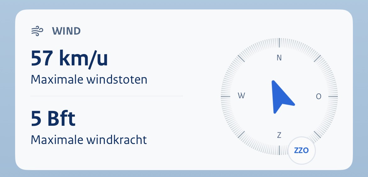
dont think I ever saw it being mentioned, and now that I installed the Dutch KNMI app, I see what Ive been missing, but didnt know… a central wind direction arrow.
Would that be an option you’d be willing to consider (aware that the wind speed is at that spot now, but maybe some smart reordering could be done in case of arrow center?)
I can reproduce the problem you’re having, but I can’t suggest a workaround. I don’t use custom:layout-card, so don’t have much experience with it. I suspect this is an issue with card_mod.
Having said that, I’m working on exposing more control by way of CSS variables (#12), which I think will fix your issue.
Edit: one additional thought. Are you using the new in-built sections view? I’ve found it plays very nicely with tile (and ring-tile) cards and gives me more than enough control over layout, meaning that I haven’t had to use a custom card to control layout for some time. The advantage of this is that transparency will work using something like:
I see the appeal - that’s a great looking card. I’ll have to give it some thought - I need to figure out whether I can think of something consistent with the ring-tile aesthetic.
As a general note… I had hoped to work on some of these issues this weekend, but the Samsung NVME drive in my HA server has started reporting SMART errors, so it’s HA server rebuild for me this weekend… fun.
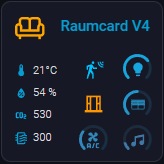
yes, I am using sections, but for some usecases I need additional stacking.
For example my new Room-Card is created as grid with the custom:button-card.
 … I checked better and when using a climate entity, the thermostat control card pops up when clicking the ring, which is what I want. The history shows up only when it’s a sensor type entity, which is fine as far as I’m concerned. (my bad for mixing them up!)
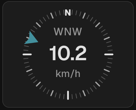

