Thank you. After another try adding card-mod, it looks like I can change the background, margin, padding of the card but not width nor length. Am I missing something ?
Hard to say since you deleted your post  . But I recommend you to take a look in the card-mod thread. Most likely there already has been code shared regarding this. If not, some amazing people there can help.
I’m already on that track, but also looking at layout card. I think the latter, should be the way forward based on what i’ve seen.
My intent is to have a small card where you can change the colour, Brightness of the light without opening the card itself. The size should be as the other cards.
      - type: "custom:stack-in-card"
        title: My Stack In Card
        keep:
          background: true
          outer_padding: true
          margin: true
        modus: vertical
        card_mod:
          style: |
            ha-card {
              --ha-card-background: teal;
            }
        cards:
          - type: entities
            entities:
              - type: "custom:slider-entity-row"
                entity: input_number.input_color
                full_row: true
                hide_state: true
                attribute: hue
            style: |
              ha-card {
                background: linear-gradient(to right, rgb(255,0,0) 0%, rgb(255,255,0) 16.6%, rgb(0,255,0) 33.2%, rgb(0,255,255) 49.8%, rgb(0,0,255) 66.4%, rgb(255,0,255) 83%, rgb(255,0,0) 100%);
              }
          - type: entities
            entities:
              - type: "custom:slider-entity-row"
                entity: input_number.input_color_temp
                full_row: true
                hide_state: true
                attribute: hue
            style: |
              ha-card {
                background: linear-gradient(to right, rgb(195, 209, 255) 0%, rgb(255,255,255) 50%, rgb(255, 169, 87) 100%);
              }
@ASNNetworks I’ve been able to progress. I got the card to the size I wanted but now within the card, I want to change the size of each card which seems to be impossible. Any ideas ?
code
cards:
  - type: horizontal-stack
    cards:
      - type: "custom:stack-in-card"
        keep:
          background: true
          outer_padding: true
          margin: true
        modus: vertical
        triggers_update:
            - sun.sun
        card_mod:
          style: |
            ha-card {
              height: 100px;
              background-color: var(--primary-background-color)
              box-shadow: >
                [[[
                  if (states['sun.sun'].state == "below_horizon")
                    return '-5px -5px 15px #2c2c2c, 5px 5px 15px #191919';
                  else if (states['sun.sun'].state == "above_horizon")
                    return '-5px -5px 15px #ffffff, 5px 5px 15px #ebebeb';
                ]]]
            }
        cards:
          - type: entities
            entities:
              - type: "custom:slider-entity-row"
                entity: input_number.input_color
                full_row: false
                hide_state: true
                attribute: hue
            style: |
              ha-card {
                background: linear-gradient(to right, rgb(255,0,0) 0%, rgb(255,255,0) 16.6%, rgb(0,255,0) 33.2%, rgb(0,255,255) 49.8%, rgb(0,0,255) 66.4%, rgb(255,0,255) 83%, rgb(255,0,0) 100%);
              }
          - type: entities
            entities:
              - type: "custom:slider-entity-row"
                entity: input_number.input_color_temp
                full_row: true
                hide_state: true
                attribute: hue
            style: |
              ha-card {
                background: linear-gradient(to right, rgb(195, 209, 255) 0%, rgb(255,255,255) 50%, rgb(255, 169, 87) 100%);
              }
      - type: "custom:button-card"
        entity: light.master_colour_spots
        icon: "mdi:led-strip"
@RomRider I’ve been trying card-mod, mod-card, layout-card, etc in multiple scenarios without success, and I’m ready to call it a day. Can you please let me know if you can actually change the height of the cards within the stack-in-card ? Or use layout cards within this card ?

Does margin work, because the card isn’t moving up. It’s just the icon that is clipping out of the card.
  - type: custom:button-card
    tap_action:
      action: call-service
      service: script.fernseher_ok
    icon: mdi:circle-outline
    show_name: false
    icon_height: 50px
    styles:
      card:
        - margin-top: '-20px'
        - border-radius: 0px
        - border: 2px
        - padding: 0
        - box-shadow: none
this is inside a custom:stack-in-card ass you can see
hello,
i tried your code but i get another output:

have you perhaps a idea?
@RomRider sorry for direct address, but can you have a look at these issues?
Using the card gives erratic results…
Was observed in 2021.12.
1 Like
on a regular base, I see the spaces between button-cards in this horizontal stack-in-card reappear. refreshing the page a few times then makes it ok again, concatenating the buttons as they should:

this is a set of button cards in:
  - type: custom:stack-in-card
    mode: horizontal
    keep:
      background: true
    cards:

    #history.back(-1)
      - type: custom:button-card
I believe the stack-in-card sets ‘outer-padding’ to 0, but, and here comes the question, if I do that in a core horizontal-stack, nothing happens, and I see all separated buttons.
  - type: horizontal-stack
    cards:

    #history.back(-1)
      - type: custom:button-card
        template: button_shortcut_menu

given the fact these all use a button_shortcut_menu template, I was wondering if I could set a card styles: option for the outer-padding (obviously tried that)
    card:
      - box-shadow: none
      - background: >
          [[[ return variables.view === variables.path
              ? 'var(--secondary-background-color)' : 'var(--background-color-off)'; ]]]
      - padding-top: 10px
      - padding-bottom: 10px
      - outer-padding: 0 #<--- no functional, but to show what I am looking for
but it doesnt work… so, please help me out if I can set anything css option here, to get the same result and make the buttons touch?
thanks!
See if it is related:
not sure, I dont have keep: margin: false set, only keep background: true 
and it’s not always, it comes and goes. Bam, as we type:

somehow the default card-background-color of my current theme peeps through… (this is the stack-in-card, not the horizontal stack)
added the margin: false to see if that improves things.
update
no that doesnt seem to make a difference. Would be surprising too, because ‘false’ is the default value.
what does seem to help, is changing to:
  - type: custom:stack-in-card
    mode: horizontal
    keep:
      background: true
    card_mod:
      style: |
        ha-card {
          background-color: var(--background-color-off);
        }
so, if it peeps through, its the same as the default button background might be considered a hack…
Would still love to learn which variable sets the space between cards in core Lovelace though…
Seems that the repository is not maintained for a long time.
One of the most critical issue is this:
The custom:stack-in-card is incompatible with the new Material Web Components’ dropdown list control.
Surely this issue (and some others) may be fixed by card-mod.
how can i put a border around the two cards
multirow + horizontal?

similar

my code is
type: custom:stack-in-card
title: titolo
keep:
  box_shadow: true/false
  margin: true/false
  border_radius: true/false
  background: true/false
  outer_padding: true/false
cards:
  - entity: input_boolean.irrigazione_flag_zona1_ciclo3
    type: custom:multiple-entity-row
    name: Pippo
    state_color: false
    state_header: 3
    toggle: false
    show_state: false
    entities:
      - entity: input_select.irrigazione_tipo_zona1
        name: false
      - entity: input_select.irrigazione_tipo_zona1
        name: false
  - type: horizontal-stack
    cards:
      - type: custom:button-card
        entity: input_boolean.irrigazione_zona1_lun
        name: Lun
        show_icon: false
      - type: custom:button-card
        entity: input_boolean.irrigazione_zona1_mar
        name: Mar
        show_icon: false
      - type: custom:button-card
        entity: input_boolean.irrigazione_zona1_mer
        name: Mer
        show_icon: false
      - type: custom:button-card
        entity: input_boolean.irrigazione_zona1_gio
        name: Gio
        show_icon: false
      - type: custom:button-card
        entity: input_boolean.irrigazione_zona1_ven
        name: Ven
        show_icon: false
      - type: custom:button-card
        entity: input_boolean.irrigazione_zona1_sab
        name: Sab
        show_icon: false
      - type: custom:button-card
        entity: input_boolean.irrigazione_zona1_dom
        name: Dom
        show_icon: false
Is there any way to have the cards within the stack occupy min-content rather than 1/x of the stack?
Seems to be a job for card-mod.
Experiment.
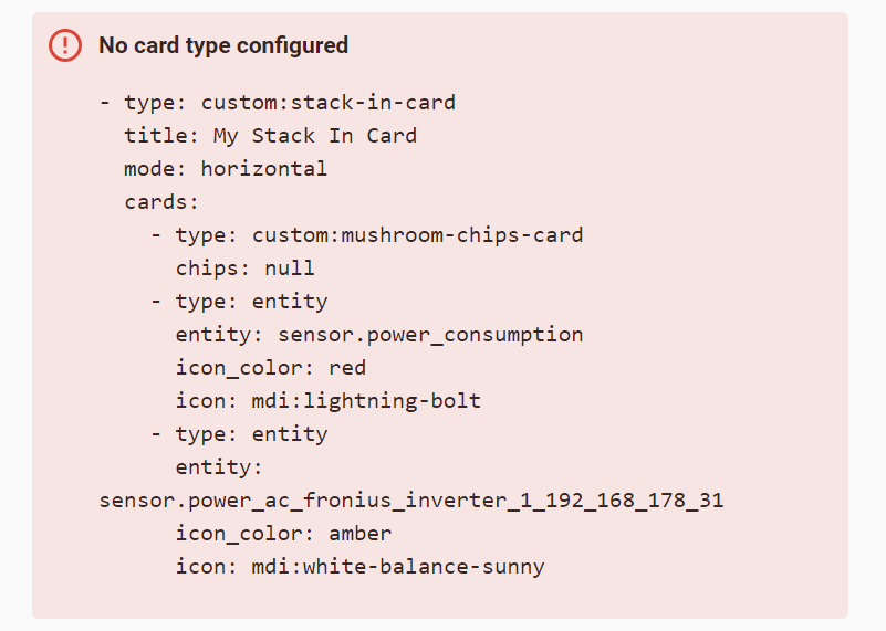
I added Stack-In-Card via hacs frontend integration. I restarted Home assistant but Sick-In-card is not showing when I try to add a card in Lovelace dashboard UI.
What am I doing wrong ? Kindly guide. I am on Home-assistant ver 2022.8.7
Do you mean “I do not see any UI to add a new card of stack-in-card type”?
If yes - check this scenario:
- Add a card of ANY type.
- Edit the added card in yaml mode.
- Rewrite this card to stack-in-card.