New update
Full Language Support
New update
Full Language Support
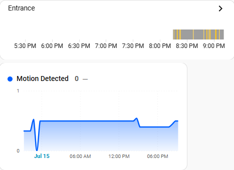
Problem: Motion sensor boolean data graph includes Y values 0.4 and 0.5!
I like the look of the standard card “history-graph” for motion sensor data..
however it lacks “show_interval_picker” buttons for 1H 24H 7D etc.
So trying to convert it to use “statistics-graph-chart-card”, however it seems to struggle with boolean data.
type: custom:statistics-graph-chart-card
title: Entrance Occupancy
time_frame:
  hours: 24
chart_type: state_timeline
entities:
  - entity: binary_sensor.sensor1_occupancy
    name: Motion Detected
    color: "#005FFF"
    state_map:
      - value: "off"
        label: "0"
      - value: "on"
        label: "1"
Home Assistant Core 2026.7.1
SLZB-06U SMLIGHT Zigbee2MQTT coordinator PoE
Motion sensor ZG-204Z
Statistics Graph Chart Card v3.24
zigbee2mqtt/MotionEntrance logs say {“occupancy”:true} and {“occupancy”:false}.
I have tried setting state_map values to true/false.
ChatGPT suggestion:
This appears to be a limitation in Statistics Graph Chart Card. With a binary_sensor, the card is using Home Assistant’s long-term statistics instead of the raw binary state, so fractional values are expected and state_map cannot override them.
Hi,
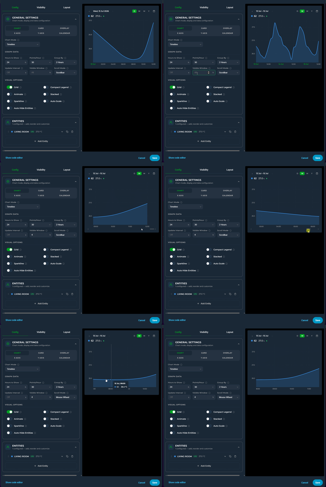
Actually you don’t need to set hours_to_show larger than 24 because Date Picker is dominant and overrides hours_to_show
Just simply activate Date Picker, then select for example Week, then set visible windows to 4 hour: You will see 4 hours frame and scroll horizontally depending on your choice: Mouse Wheel or Scrollbar
Hi,
If you need state-timeline mode you need to use chart_mode parameter, not chart_type.
type: custom:statistics-graph-chart-card
tooltip_match_axis: false
tooltip_order: default
height: auto
x_grid_style: dashed
y_grid_style: dashed
chart_mode: state_timeline
entities:
  - entity: binary_sensor.alarm_zone_5
    name: Motion Detected
    color: "#005FFF"
    state_map:
      - value: "off"
        label: "0"
      - value: "on"
        label: "1"
annotations: []
title: Entrance Occupancy
time_frame:
  hours: 24
but if you need timeline mode then please use last, first etc as aggreation instead of avg
type: custom:statistics-graph-chart-card
points_per_hour: 60
tooltip_match_axis: false
tooltip_order: default
height: auto
x_grid_style: dashed
y_grid_style: dashed
entities:
  - entity: binary_sensor.alarm_zone_5
    name: Motion Detected
    color: "#005FFF"
    state_map:
      - value: "off"
        label: "0"
      - value: "on"
        label: "1"
    aggregate_func: first
annotations: []
title: Entrance Occupancy
time_frame:
  hours: 24
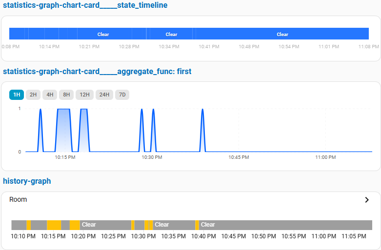
Fantastic, I’m seeing boolean graph values now. Thanks very much!
state_timeline
I really like the compact low height profile, and that the event lines are vertical, but I find these thin white lines are hard to see.
Is there a way to make the graph mostly white, with just blue event lines (vertical and short height).
And get rid of the “clear” labels inside the graph?
And if since we are only showing 60 points over 1 hour, could those vertical event lines be wider in line with 1/60th of the entire width?
type: custom:statistics-graph-chart-card
hours_to_show: 1
points_per_hour: 60
tooltip_match_axis: false
height: auto
state_timeline_corner_radius: 0
chart_mode: state_timeline
entities:
  - entity: binary_sensor.sensor1_occupancy
    name: ""
    color: "#005FFF"
    state_map:
      - value: "off"
        label: ""
      - value: "on"
        label: ""
    show_state: false
annotations: []
title: Entrance Occupancy
time_frame:
  hours: 24
You can add color parameter to state map
type: custom:statistics-graph-chart-card
hours_to_show: 1
points_per_hour: 12
tooltip_match_axis: false
height: 50
state_timeline_corner_radius: 0
x_axis_font_opacity: 0
chart_mode: state_timeline
entities:
  - entity: binary_sensor.alarm_zone_5
    name: " "
    state_map:
      - value: "off"
        label: ""
        color: green
      - value: "on"
        label: ""
        color: white
    show_state: false
    graph_type: step
    aggregate_func: first
annotations: []
title: Entrance Occupancy
grid_options:
  rows: 2
  columns: 12
I couldnt reproduce the issue for thin white event lines. There is no difference between history graph card for my entity.
At present we cant remove State label (Clear)
Also I am not recommend Timeline mode for this kind of data but If you want to use anyway I can recommend graph_type: step instead of graph_type: line
Finally if you have still issue with white thin lines please open bug on github repo because I need your entitys history data file in order to reproduce the issue.
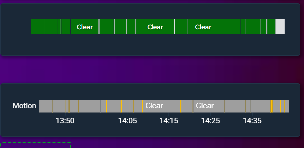
That worked, thank you very much.
type: custom:statistics-graph-chart-card
show_interval_picker: true
hours_to_show: 1
points_per_hour: 12
tooltip_match_axis: false
height: 50
state_timeline_corner_radius: 0
x_axis_font_opacity: 5
chart_mode: state_timeline
entities:
  - entity: binary_sensor.sensor1_occupancy
    name: " "
    state_map:
      - value: "off"
        label: " "
        color: gray
      - value: "on"
        label: " "
        color: orange
    show_state: false
    graph_type: step
grid_options:
  rows: auto
  columns: 24
nice!
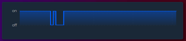
On the next update you can use group_by: raw for step type graph. It will make step graph more accurate for state mapped entities but not as much as state timeline
State timeline is always better for this kind of entities.
type: custom:statistics-graph-chart-card
hours_to_show: 1
points_per_hour: 60
tooltip_match_axis: false
tooltip_order: default
group_by: raw
height: 50
x_axis_font_opacity: 0
x_grid_style: dashed
y_grid_style: dashed
entities:
  - entity: binary_sensor.alarm_zone_5
    name: null
    state_map:
      - value: "off"
        label: ""
        color: green
      - value: "on"
        label: ""
        color: white
    show_state: false
    graph_type: step
    aggregate_func: first
annotations: []
title: Entrance Occupancy
grid_options:
  rows: 2
  columns: 12
New Comprehensive Update
Period Comparison, PNG & CSV export, Price Entity, Weeks start on your day, Templates for show/hide toggles and more
That’s even better thanks.
Also with Timeline it is easier to hover mouse and see data points values, compared with
State Timeline.
New Features
Thanks for your detailed response! Unfortunately this means a user has to view at a scale other than the timeframe they am selecting via the date picker. If I pick 7D, for example, I want to scroll between the current 7D period and previous week, but at the 7D scale I’m already looking at. If I pick 24H, I want to be able to scroll backwards in time to see, for example, how temperature changed from yesterday afternoon to this morning, but I don’t want to zoom in or out/change the visible window.
Is it possible to auto-scale per entity? I love that we can do it in general, but I’m trying to combine my temperature and rainfall plots. I aggregate my precipitation bar plot when the x-axis scale gets too large (i.e., showing hourly data when viewing data for <3 days, daily totals up to 45 days, and monthly totals after that. But if I add temperature to my plot, it seems to aggregate/average that to the daily scale also. Ideally, I’d aggregate the precip data but keep the daily temp line as is. Is this possible?
New update is ready
@cataseven thanks for the great card and responsiveness on fixing reported issues and adding features. Truly impressive 
This is a very impressive statistics card - well done cataseven!
Trying to create a couple of cards and just wanted to check if there is a way to get a bar chart like this to show live data? The graph below shows my electric phases at home in real time. Is it possible to make the gauges show the live value? As I understand it there is a delay since the card reads historical data?
Hi everyone,
I wanted to share a Home Assistant integration I’ve been developing called Advanced History.
It provides a Home Assistant-style History panel, but uses the excellent Statistics Graph Chart Card for graph rendering. The aim is to retain the familiar Home Assistant experience while providing the much more powerful chart configuration and visualisation options available in this card.
Some of the features currently included are:
Statistics Graph Chart Card remains a separate required dependency and is loaded at runtime—the integration does not bundle or redistribute it.
A very special thank you to cataseven for creating Statistics Graph Chart Card and for allowing and supporting its use in this project.
You can find screenshots, installation instructions and further information in my Home Assistant Community post:
Feedback and testing are very welcome. The project is still under active development, so I’d particularly appreciate hearing about unusual entity types, large history ranges or chart configurations.
A couple of feature requests to this amazing card, hope that is okay 
Would be nice to be able to set a opacity/transparency for the gradient in a chart. That would make it possible to have a much softer/lighter gradient.
Nice if the annotation label followed the annotations opacity. Now the annotation line is very transparent but the text is not (example below)
The legend is very nice to show but I’m missing the possibility to show the actual value in the legend.
Slimmer margins/padding around the graphs as seen below.
Thank you
New Update: 
ref_entity — plot the difference of two entities, no need for template sensor anymore