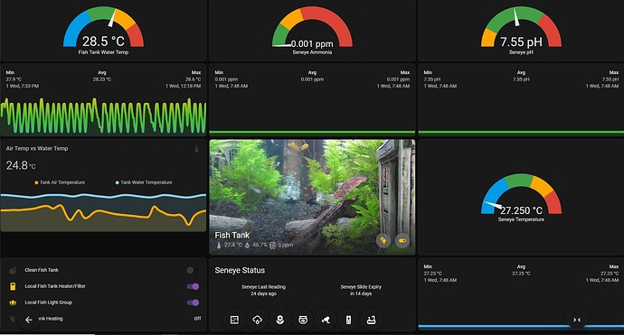
This Sticky Floating Menu works on all devices. Youtube Link Here
FULL CODE FOR CARDS AND THEMES AVAILABLE HERE
- Mobile and Small Tablets in Portrait
Resizes and uses Mobile Navigation Action
No Back Button - Use Back Button On Device - Full Size Tablet, Portrait and Landscape
Resizes and uses Navigation Action
No Back Button - Use Back Button On Device - Larger Displays
Resizes and uses Navigation Action
Has Back Button - Nest Hub, Nest Hub Max & Pixel Tablet Hub, While Casting
Resizes and uses TAP ACTION to use Cast Scripts
Setup cast to all Nest Hubs in home simultaneously.
No Back Button - Not required and won’t work - Pixel Tablet Hub - Using Home Assistant App
Resizes and uses HOLD ACTION to use Navigate Action - Edit Mode
Resize the window just right and the Mushroom Chips Card menu will go back to where you placed it on the dashboard.
The width is set just right to access the edit button at the bottom right of the screen.
I got inspiration from this video.
Create a Sticky Bottom Navigation Bar in Home Assistant
Full credit to https://mysmarthome.gumroad.com/ I would not have figured out where to start without watching the video.
Below images are on a
Portrait uPerfect Unify-y 15.6 Vertical Monitor
| device-width in px: 1080px | device-height in px: >1500px (1920px)
| resoloution in dppx: 1dppx | resolution in dpi: 96dpi
Below images are on a
Portrait Oppo Phone
| device-width in px: 360px | device-height in px: 800px
| resoloution in dppx: 2dppx | resolution in dpi: 192dpi
Below image is on a
Landscape Google Nest Hub Max
| device-width in px: 1280px | device-height in px: 800px
| resoloution in dppx: 2dppx | resolution in dpi: 192dpi
Also very similar to
Landscape Google Nest Hub
| device-width in px: 1024px | device-height in px: 600px
| resoloution in dppx: 2dppx | resolution in dpi: 192dpi
Landscape Lenovo Yoga Tab 11" YT-J706F
| device-width in px: 1334px | device-height in px: 800px
| resoloution in dppx: 1.5dppx | resolution in dpi: 144dpi
CSS @media queries, where the magic happens
- USE Media Queries Test to determine your screen size, either open link on your device or set your device in Chrome DevTools and open the website.
- Setting your screen dimensions in Chrome DevTools will work for testing.
- Chrome DevTools
These are the media queries in the card, you will note each media query is nested, watch your indenting for each subsequent query. The Card Mod is level indenting with the start of the card, therefore applying to the whole card.
            card_mod:
              style: |
# Phones / Small Tablets - NAVIGATE (HYPERLINK)
# Portrait Oppo Phone | device-width in px: 360px | device-height in px: 800px | resoloution in dppx: 2dppx | resolution in dpi: 192dpi
                @media (orientation: portrait) and (max-width: 768px)  {
                  ha-card {
                    z-index:1;
                    position: fixed;
                    bottom: 5px;
                    left: 5px;
                    width: calc(100% - 10px);
                    background-color: transparent !important;
                    border-radius: 100px;
                    padding: 10px;
                    --chip-box-shadow: 0px 2px 5px 0px rgba(0,0,0,0.8) !important;
                 }
                 }
# Portrait Monitors / Portrait Tablets - NAVIGATE (HYPERLINK)
# Portrait uPerfect Unify-y 15.6 Vertical Monitor | device-width in px: 1080px | device-height in px: >1500px (1920px)  | resoloution in dppx: 1dppx | resolution in dpi: 96dpi
# Portrait Lenovo Yoga Tab 11" YT-J706F | device-width in px: 800px | device-height in px: 1334px  | resoloution in dppx: 1.5dppx | resolution in dpi: 144dpi
                 @media (orientation: portrait) and (min-width: 769px)  {
                   ha-card {
                     z-index:1;
                     position: fixed;
                     bottom: 10px;
                     left: 50px;
                     width: calc(100% - 100px);
                     background-color: transparent !important;
                     border-radius: 100px;
                     padding: 10px;
                     --chip-box-shadow: 0px 2px 5px 0px rgba(0,0,0,0.8) !important;
                     --chip-height: 60px;
                     --chip-border-radius: 50%;
                     --chip-icon-size: 30px;
                   }
                   }
# Portrait Monitors / Portrait Tablets - NAVIGATE (HYPERLINK)
# Landscape HP 22" Monitor | device-width in px: 1920px | device-height in px: 1080px  | resoloution in dppx: 1dppx | resolution in dpi: 96dpi
# Landscape Lenovo Yoga Tab 11" YT-J706F | device-width in px: 1334px | device-height in px: 800px  | resoloution in dppx: 1.5dppx | resolution in dpi: 144dpi
                   @media (orientation: landscape) and (min-width: 1281px)  {
                     ha-card {
                       z-index:1;
                       position: fixed;
                       bottom: 5px;
                       left: 100px;
                       width: calc(100% - 200px);
                       background-color: transparent !important;
                       border-radius: 100px;
                       padding: 10px;
                       --chip-box-shadow: 0px 2px 5px 0px rgba(0,0,0,0.8) !important;
                       --chip-height: 55px;
                       --chip-border-radius: 50%;
                       --chip-icon-size: 30px;
                     }
                     }
# GOOGLE NEST DISPLAY ONLY - CALL SERVICE (SCRIPT-GOOGLE CAST)
# Landscape Google Nest Hub | device-width in px: 1024px | device-height in px: 600px  | resoloution in dppx: 2dppx | resolution in dpi: 192dpi
# Landscape Google Nest Hub Max | device-width in px: 1280px | device-height in px: 800px  | resoloution in dppx: 2dppx | resolution in dpi: 192dpi
# GOOGLE PIXEL TABLET HUB - HOLD ACTION - NAVIGATE
# Landscape Google Pixel Tablet Hub | device-width in px: 1280px | device-height in px: 800px  | resoloution in dppx: 2dppx | resolution in dpi: 192dpi
                     @media (orientation: landscape) and (min-height: 600px) and (max-height: 800px) and
                     (max-width: 1280px)  {
                       ha-card {
                         z-index: 1;
                         position: fixed;
                         bottom: 5px;
                         left: 50px;
                         width: calc(100% - 100px);
                         background-color: transparent !important;
                         border-radius: 100px;
                         padding: 10px;
                         --chip-box-shadow: 0px 2px 5px 0px rgba(0,0,0,0.8) !important;
                         --chip-height: 55px;
                         --chip-border-radius: 50%;
                         --chip-icon-size: 30px;
                       }
                       }
How to make the same button do different things on different devices?
- Multiple buttons with separate media queries applied.
- You will note that I have a different weather icon for each set, this was for testing purposes and knowing the right menu set was up.
- Any button that does not have a duplicate is shared across all screens.
Example of the Purple Weather Menu Button - Shows on the Desktop Displays and Portrait Monitor
- Uses Navigation Action
- Chip Border Set to 2px, on 1dppx screens.
              - type: conditional
                conditions:
                  - condition: state
                    entity: input_boolean.chips_menu_toggle
                    state: 'on'
                  - condition: and
                    conditions:
                      - condition: or
                        conditions:
                          - condition: screen
                            media_query: '(orientation: landscape) and (min-width: 1281px)'
                          - condition: screen
                            media_query: '(orientation: portrait) and (min-width: 769px)'
                chip:
                  type: template
                  tap_action:
                    action: navigate
                    navigation_path: /lovelace-custom/weather-all-devices
                  icon: mdi:weather-rainy
                  entity: null
                  icon_color: white
                  card_mod:
                    style: |
                      ha-card {
                        border: 2px solid white !important;
                        --chip-background: linear-gradient(45deg, rgba(60,0,103,1) 0%, rgba(138,43,226,1) 100%);
                      }
Example of the Purple Weather Menu Button - Shows on Phone Screens and Small Tablets
- Uses Navigation Action
- Chip Border Set to 1px, on 2dppx screens.
              - type: conditional
                conditions:
                  - condition: screen
                    media_query: '(orientation: portrait) and (max-width: 768px)'
                  - condition: state
                    entity: input_boolean.chips_menu_toggle
                    state: 'on'
                chip:
                  type: template
                  tap_action:
                    action: navigate
                    navigation_path: /lovelace-custom/weather-all-devices
                  icon: mdi:weather-lightning
                  entity: null
                  icon_color: white
                  card_mod:
                    style: |
                      ha-card {
                        border: 1px solid white !important;
                        --chip-background: linear-gradient(45deg, rgba(60,0,103,1) 0%, rgba(138,43,226,1) 100%);
                      }
Example of the Purple Weather Menu Button - Nest Hub, Nest Hub Max & Pixel Tablet Hub
- TAP ACTION uses Toggle Call Script Service - When in Casting Mode
- HOLD ACTION uses Navigate Action - When in Home Assistant App
- Chip Border Set to 1px, on 2dppx screens.
              - type: conditional
                conditions:
                  - condition: screen
                    media_query: >-
                      (orientation: landscape) and (max-height: 800px) and
                      (max-width: 1280px)
                  - condition: state
                    entity: input_boolean.chips_menu_toggle
                    state: 'on'
                chip:
                  type: template
                  tap_action:
                    action: toggle
                  entity: script.weather_page
                  hold_action:
                    action: navigate
                    navigation_path: /lovelace-custom/weather-all-devices
                  icon: mdi:weather-lightning-rainy
                  card_mod:
                    style: |
                      ha-card {
                        border: 1.0px solid gray !important;
                        --chip-background: linear-gradient(45deg, rgba(60,0,103,1) 0%, rgba(138,43,226,1) 100%);
                      }
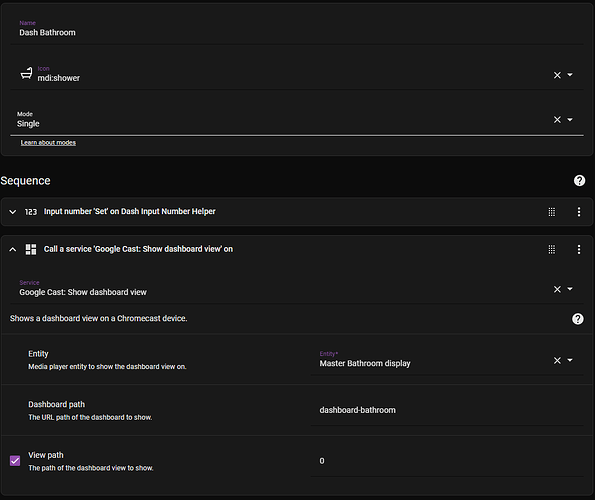
Example Script to Cast Dash Board
Kiosk Mode Toggle
Watch this video from Smart Home Junkie for details on how to setup Kiosk Mode in Home Assistant – How To – The Right Way!
Once the toggle and helpers are setup this is the code to paste into the top of every dashboard page, use {} Raw configuration editor.
kiosk_mode:
  admin_settings:
    ignore_entity_settings: true
  mobile_settings:
    ignore_entity_settings: false
    custom_width: 1335
  entity_settings:
    - entity:
        input_boolean.kiosk_mode_toggle: 'on'
      hide_sidebar: true
      hide_header: true
    - entity:
        input_boolean.kiosk_mode_toggle: 'off'
      hide_sidebar: false
      hide_header: false


