Styling custom cards inside the Picture elements card:
Example 1 - toggle-entity row:

type: picture-elements
card_mod:
  style: |
    ha-card {
      height: 250px !important;
    }
elements:
  - type: custom:hui-element
    row_type: toggle-entity
    entity: input_boolean.test_boolean
    name: Some toggle (default style)
    style:
      top: 0%
      left: 0%
      transform: translate(0,0)
  - type: custom:hui-element
    row_type: toggle-entity
    entity: input_boolean.test_boolean
    name: Some toggle
    style:
      top: 14%
      left: 0%
      transform: translate(0,0)
      width: 250px
      '--paper-item-icon-color': magenta
      color: cyan
  - type: custom:hui-element
    row_type: toggle-entity
    entity: input_boolean.test_boolean
    name: Some toggle
    style:
      top: 21%
      left: 0%
      transform: translate(0,0)
      width: 250px
      '--paper-item-icon-color': green
      color: orange
  - type: custom:hui-element
    row_type: toggle-entity
    entity: input_boolean.test_boolean
    name: Some toggle
    style:
      top: 28%
      left: 0%
      transform: translate(0,0)
      width: 250px
      '--paper-item-icon-color': red
      color: magenta
      '--switch-unchecked-track-color': lightgreen
      '--switch-checked-track-color': cyan
      '--switch-unchecked-button-color': red
      '--switch-checked-button-color': green
image: /local/images/white.jpg
Example 2 - Glance card:

type: picture-elements
card_mod:
  style: |
    ha-card {
      height: 450px !important;
    }
elements:
  - type: custom:hui-element
    card_type: glance
    entities:
      - entity: sensor.cleargrass_1_co2
      - entity: sensor.cleargrass_1_co2
    name: Some toggle (default style)
    style:
      top: 10%
      left: 10%
      transform: translate(0,0)
      '--paper-item-icon-color': red
      '--ha-card-background': rgba(0,100,0,0.8)
      '--ha-card-border-radius': 14px
  - type: custom:hui-element
    card_type: glance
    entities:
      - entity: sensor.cleargrass_1_co2
      - entity: sensor.cleargrass_1_co2
    name: Some toggle (default style)
    style:
      top: 60%
      left: 10%
      transform: translate(0,0)
      '--paper-item-icon-color': red
      '--ha-card-background': rgba(0,0,0,0)
      background-image: url("/local/images/blue_low_2.jpg")
      background-size: 100% 100%
image: /local/images/pink.jpg
Example 3 - Entities card:
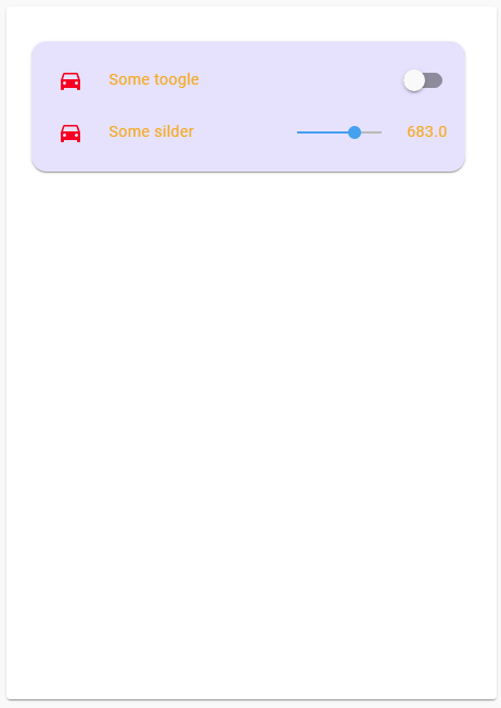
type: picture-elements
card_mod:
  style: |
    ha-card {
      height: 250px !important;
    }
elements:
  - type: custom:hui-element
    card_type: entities
    entities:
      - entity: input_boolean.test_boolean
        name: Some toogle
      - entity: input_number.test_number
        name: Some silder
    style:
      top: 5%
      left: 5%
      transform: translate(0,0)
      '--paper-item-icon-color': red
      '--ha-card-background': rgba(0,0,255,0.1)
      '--ha-card-border-radius': 14px
      width: 400px
      --primary-text-color: orange
image: /local/images/white.jpg