ApexCharts card - A highly customizable graph card

Does anyone know is data_generator is supported with chart_type: pie?

The help says:

You’ll need to write a javascript function which returns a [timestamp, value][] :

( GitHub - RomRider/apexcharts-card: 📈 A Lovelace card to display advanced graphs and charts based on ApexChartsJS for Home Assistant )

And as timestamp is not a valid option for a pie chart, it seems likely
If you have data_generator working for a pie. do you have an example you could share, please?

I’m still lost in this. How can it be that for a day overview it works just fine??

The day view uses an hourly utility meter sensor, so an hourly total_increasing with ApexCharts configured with:

graph_span: 24h
span: 
   start: day

The month view uses the same type of utility meter sensor, only on a daily basis with ApexCharts configured with:

graph_span: 1month
span: 
   end: month

The daily overview has no future datapoints. So if I look at this right now, at 11AM, there are no datapoints up until 12PM tonight. But the graph gets stretched out over the whole day and creates perfect graphs. As soon as I got to the monthly overview, the graph isn’t stretched out properly and gets squished together. I’ve scrolled through the whole topic, I can’t seriously be the only and first one to run into this issue…

Daily overview, with no future data points, but it scales perfectly over the whole day:

Monthly overview, which scales perfectly, but we’re looking at the previous month:

Monthly overview, which scales like BS, should essentially be the exact same as daily overview where the graph would just start at the most left point and not having a spacing issue where it centers the bars:

Looks to me all is correct. November has 30 days, December 31.

BTW, your daily is actually a hourly and your monthly a daily :blush:

You could however change the x-axis labels by doing:

apex_config:
  xaxis:
    labels:
      format: ddd

Tinus

Does any one have an example of how to use three series on two axis, so that two series uses one axis and the third series a second axis. Just can’t get it to work so an example would be highly appreciated, thanks.

Hi!
Why isn’t the red and green colum in line?
Skärmavbild 2022-12-05 kl. 21.00.33

type: custom:vertical-stack-in-card
cards:
  - type: markdown
    content: <font size="3"><b>Elöversikt</b></font>
  - type: custom:apexcharts-card
    graph_span: 1d
    span:
      start: day
    update_interval: 300s
    apex_config:
      chart:
        height: 300px
      legend:
        show: true
    experimental:
      color_threshold: true
      brush: true
    brush:
      selection_span: 1d
    header:
      show: false
      title: Elöversikt
      show_states: true
      colorize_states: true
    yaxis:
      - id: second
        opposite: true
        decimals: 0
        apex_config:
          tickAmount: 1
    series:
      - entity: sensor.lgf5e360_power_instant_active_positive
        name: Köpt el
        yaxis_id: second
        stroke_width: 2
        show:
          legend_value: false
        color: red
        type: column
        group_by:
          func: avg
          duration: 60min
      - entity: sensor.lgf5e360_power_instant_active_positive
        type: line
        float_precision: 2
        stroke_width: 2
        yaxis_id: second
        name: Köpt el
        offset: '-24h'
        unit: kWh
        show:
          in_header: false
          legend_value: false
          extremas: false
        color: grey
        group_by:
          func: avg
          duration: 60min
      - entity: sensor.lgf5e360_power_instant_active_positive
        invert: true
        type: column
        float_precision: 2
        stroke_width: 1
        yaxis_id: second
        name: Såld el
        unit: kWh
        color: green
        show:
          in_header: false
          legend_value: false
          extremas: false
        group_by:
          func: avg
          duration: 60min
      - entity: sensor.lgf5e360_power_instant_active_positive
        type: line
        invert: true
        float_precision: 2
        stroke_width: 2
        yaxis_id: second
        name: Såld el
        offset: '-24h'
        unit: kWh
        show:
          in_header: false
          legend_value: false
          extremas: false
        color: grey
        group_by:
          func: avg
          duration: 60min

I don’t have a three series example, this is from a two series but it seems to me you just need:
yaxis_id: right
or
yaxis_id: left
(And to define your axis)

yaxis:
  - id: right
    decimals: 0
    apex_config:
      tickAmount: 4
  - id: left
    opposite: true
    decimals: 3
    apex_config:
      tickAmount: 4
  - id: left
    opposite: true
    decimals: 3
    apex_config:
      tickAmount: 4
series:
  - entity: sensor.solaredge_current_power
    yaxis_id: right
    stroke_width: 1
    name: Output
  - entity: sensor.metered_export_reading
    name: 30mins
    yaxis_id: left

Thank you for your reply! Your code was almost identical to mine but even with your code I can’t get it to work. I want the orange series below to belong to the left yaxis, but now it somehow has it’s own yaxis since the highest value in the orange series is 2 and that doesn’t match any of the axis.

So the way I want it too look is that the highest orange column corresponds to yaxis=2 since that is the highest value for the orange series.

Lunkobelix might be easier if you post the code (the yaml/ config) of your card and then we could understand what you are doing a little more.

Absolutely, sorry :slight_smile:

Here we go:

type: custom:apexcharts-card
header:
  title: ''
  show: false
  show_states: true
  colorize_states: false
graph_span: 120h
apex_config:
  tooltip:
    enabled: true
    x:
      format: hh:mm
  annotations:
    position: back
    yaxis:
      - 'y': 0
        strokeDashArray: 0
        borderColor: '#BBBBBB'
        borderWidth: 1
  yaxis:
    - id: left
      decimalsInFloat: 0
      opposite: false
      labels:
        style:
          fontSize: 10px
          fontFamily: Segoe UI Light
    - id: right
      decimalsInFloat: 0
      opposite: true
      labels:
        style:
          fontSize: 10px
          fontFamily: Segoe UI Light
  xaxis:
    axisBorder:
      show: false
    labels:
      style:
        fontSize: 10px
        fontFamily: Segoe UI Light
    tooltip:
      enabled: false
  legend:
    show: false
  chart:
    height: 225
  grid:
    show: true
    borderColor: '#EDEDED'
    strokeDashArray: 4
    position: back
  dataLabels:
    enabled: false
  stroke:
    width: 1
series:
  - entity: sensor.nordpool_kwh_se3_sek_2_10_025
    name: Elpris
    yaxis_id: left
    type: line
    color: 3ca358
    float_precision: 1
    show:
      extremas: false
  - entity: sensor.nibe_105703_43136
    name: Kompressor
    time_delta: '-0m'
    yaxis_id: right
    type: column
    color: b0e4ff
    float_precision: 0
    fill_raw: last
    group_by:
      func: last
      duration: 50min
  - entity: sensor.nibe_105703_43084
    name: Eltillsats
    yaxis_id: left
    type: column
    color: orange
    show:
      in_chart: true
      in_header: false
      extremas: false
    group_by:
      func: avg
      duration: 50min

Hey, I was just looking at one of my own pages and found I have a three entity, two axis graph:
(I’ll try and look at yours later on a pc), hope it helps

type: custom:apexcharts-card
header:
  show: true
  title: Setpoint (8 hours)
  show_states: true
  colorize_states: true
graph_span: 8hours
yaxis:
  - id: first
    min: ~0
    max: ~25
    decimals: 0
    apex_config:
      tickAmount: 6
      forceNiceScale: 'yes'
  - id: RHS
    opposite: true
    min: 0
    max: 10
    apex_config:
      tickAmount: 4
      forceNiceScale: 'yes'
all_series_config:
  stroke_width: 2
apex_config:
  legend:
    show: false
    position: top
series:
  - entity: sensor.ashp_leaving_temp
    name: LeavingT
    color: blue
    yaxis_id: first
  - entity: sensor.ashp_exp_h_p_outlet_setpoint
    name: Setpoint
    color: orange
    yaxis_id: first
  - entity: sensor.ashp_deltat
    yaxis_id: RHS

Gives (on a good say when the heating sensors are working …)
image

@ Lunkobelix You have your yaxis definition tabbed in, are you trying to create them within the Apex_config?

If you look at my yaxis (next post) they are defined on the same level as the graph_span

1 Like

I just went here to let you know that moving the yaxis outside of apex_config solved it for me :slight_smile: Maybe just me but I really struggle with the hierarchy of all the configs. Thanks a million for taking your time to help me out!

1 Like

I have a strange offset in this chart. The columns should be one day to the left (so the lowest temp matches the highest gas consumption. I have not configured any offset. Anybody understand why it shows this way and how I can fix?

Code:
type: custom:stack-in-card
title: 14D Gas
cards:
  - type: custom:apexcharts-card
    graph_span: 14d
    update_interval: 10min
    apex_config:
      chart:
        height: 150px
        fontFamily: Raleway,sans-serif
      legend:
        show: false
      stroke:
        width: 2
      plotOptions:
        bar:
          columnWidth: 100%
      grid:
        show: true
        borderColor: '#00000030'
        strokeDashArray: 4
        position: back
    experimental:
      color_threshold: true
    header:
      show: false
      show_states: false
      colorize_states: true
    yaxis:
      - id: first
        decimals: 1
        apex_config:
          tickAmount: 2
      - id: second
        opposite: true
        decimals: 1
        apex_config:
          tickAmount: 2
    series:
      - entity: sensor.dailygas
        name: Gas
        yaxis_id: first
        show:
          legend_value: false
        type: column
        group_by:
          func: max
          duration: 24h
        color_threshold:
          - value: 6
            color: '#228B22'
          - value: 8
            color: '#d35400'
          - value: 10
            color: '#c0392b'
      - entity: sensor.aeon_labs_zw100_multisensor_6_temperature_2
        name: Temp
        yaxis_id: second
        type: line
        curve: smooth
        extend_to: false
        opacity: 0.6
        color: '#00bb33'
        show:
          legend_value: false
        group_by:
          func: avg
          duration: 24h

Hi,

it is possible to have one yaxis with gradient style and on without? I have this and want to have the line without gradient:

Screen_20221207-171809

     - type: custom:apexcharts-card
        update_interval: 24h
        graph_span: 169h
        cache: true
        span:
          end: day
          offset: +1minute
        header:
          show: false
          show_states: false
          colorize_states: false
        show:
          loading: true
        yaxis:
          - id: speed
            show: false
            align_to: 100
            apex_config:
              border: false
              forceNiceScale: true
          - id: ping
            show: false
            align_to: 1
            apex_config:
              border: false
              forceNiceScale: true
        apex_config:
          chart:
            type: bar
            height: 120
            offsetY: -15
            offsetX: 5
            width: 95%
          plotOptions:
            bar:
              borderRadius: 5
              dataLabels:
                position: top
          tooltip:
            enabled: false
          legend:
            show: false
          dataLabels:
            enabled: true
            offsetY: -20
            style:
              fontSize: 10px
              fontWeight: lighter
              colors:
                - '#9B9B9B'
          stroke:
            show: true
            width: 2
            curve: smooth
          grid:
            show: false
          xaxis:
            show: false
            border: false
            labels:
              format: ddd.
              style:
                fontSize: 12px
                fontWeight: lighter
                colors: '#9B9B9B'
          fill:
            type: gradient
            gradient:
              type: vertical
              shadeIntensity: 0.1
              inverseColors: true
              opacityFrom: 0.2
              opacityTo: 0.8
        series:
          - entity: sensor.speedtest_download
            yaxis_id: speed
            type: column
            group_by:
              func: avg
              duration: 1d
            fill_raw: zero
            float_precision: 0
            color: '#e06666'
            show:
              datalabels: true
          - entity: sensor.speedtest_upload
            yaxis_id: speed
            type: column
            group_by:
              func: avg
              duration: 1d
            fill_raw: zero
            float_precision: 0
            color: '#2196F3'
            show:
              datalabels: true
          - entity: sensor.speedtest_ping
            yaxis_id: ping
            type: line
            group_by:
              func: avg
              duration: 1d
            fill_raw: last
            float_precision: 0
            color: '#4CAF50'

Thank you.

Is there a way to make the color really that color? Not influenced by other overlaping entities colors’ (e.g. when multiple areas overlap)? Making use somehow of z-index instead of combining the colors in the overlaping parts.

Hello,

I am quite new with ApexChart but this looks amazing. Just one thing that keeps annoying me. I am building a weekly graph of the current week (running week) from Monday to Sunday for energy consumption.
When running my graph I obtain the following
2022-12-07 23_29_54-Window

i.e. a graph which does not fit nicely on the x-axis. It seems all compressed to the center. Important to note, this graph was taken on Wed. evening thus the rest of the values do not exist yet.

If I run the same graph on last week with the correct offset this is a lot nicer and fills in the whole x-axis.

So there seem to be a problem when running on the current week.

My config is:

type: custom:apexcharts-card
apex_config:
  chart:
    stacked: true
  xaxis:
    show: false
    border: false
    labels:
      format: ddd
  yaxis:
    decimals: 2
    apex_config:
      tickAmount: 4
  tooltip:
    x:
      format: ddd
  plotOptions:
    bar:
      borderRadius: 5
    enabled: false
  legend:
    show: false
graph_span: 7d
span:
  end: isoWeek
  offset: -7d
header:
  show: true
  title: Coût Journalier (€)
  show_states: false
  colorize_states: false
series:
  - entity: sensor.energy_total_usage_daily_hc
    transform: return x * 0.1841;
    type: column
    name: Heure Creuses
    color: slateblue
    unit: €
    group_by:
      func: last
      duration: 1d
    fill_raw: zero
    float_precision: 0
  - entity: sensor.energy_total_usage_daily_hp
    transform: return x * 0.147;
    type: column
    color: orangered
    name: Heure Pleines
    unit: €
    group_by:
      func: last
      duration: 1d
    fill_raw: zero
    float_precision: 0

[details="Summary"]
This text will be hidden
[/details]

Thanks a lot in advance for your precious help,
Christophe

This is something I also would like to know! Looks really bad when the columns are gradient and the line gets gradient too, hard to even see the lines sometimes. Defining the gradient settings per series would be awesome.
Please let me know if you or someone else find a solution.

1 Like

This is the exact same I’m running into with my month view. You can scroll a couple of messages up and you’ll see the same issue for me.

I have two sensors that calculate the average price for electricity for today and tomorrow. And I have a 48 hour bar graph that shows the hourly prices for today and tomorrow. How can I get the average for today shown as a line on top of the first 24 hours and the average for tomorrow for the last 24 hours?

Also, is there a way to keep the ’now’ pointer in place for an hour in the middle of each bar instead of it moving smoothly?

Dear all,

Props to @RomRider for this awesome ApexCharts Card project! And to @DCSBL for helping to bring HomeWizard Energy P1 meter to Home Assistant!

I’ve been inspired by the many people trying to show HomeWizard style utility graphs in Home Assistant, including this work by @hreedijk: HomeWizard Energy (Wi-Fi P1 meter, kWh meter, Energy Socket and Water Meter) - #122 by hreedijk, amongst others!

@Mariusthvdb was asking how to replicate these graphs (How to re-create HomeWizard 3-phase graphs in (core or custom) graph card), so I also wanted to share what I have managed to do so far. It’s work in progress, with inspiration from many, please share your suggestions/forks?

Best wishes,
Menno

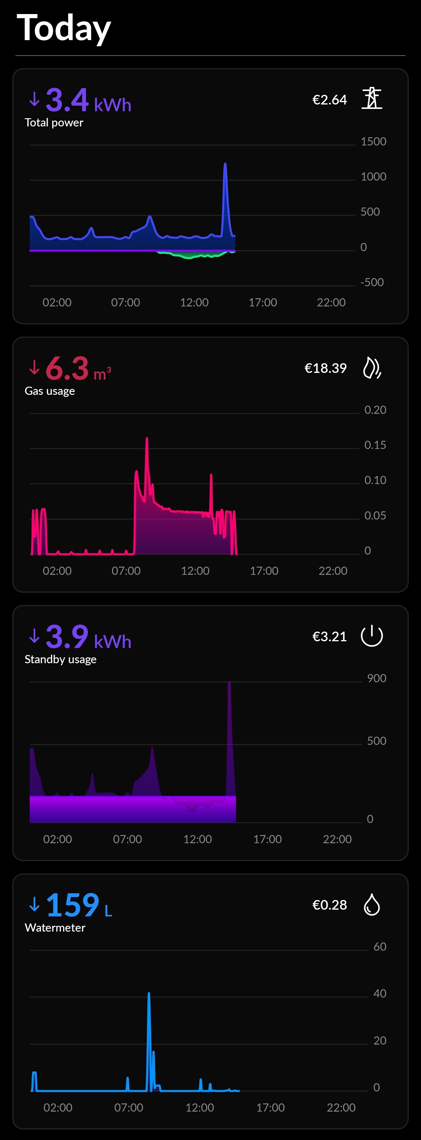
Screenshot HomeWizard Energy:

Screenshot Home Assistant with ApexChart cards stylized like HomeWizard Energy:

Code:

type: vertical-stack

# Electricity
type: custom:apexcharts-card
experimental:
  color_threshold: true
  brush: true
header:
  show: true
  title: Electricity
  show_states: true
  colorize_states: true
apex_config:
  legend:
    show: false
  grid:
    strokeDashArray: 0
    borderColor: rgb(52,52,52)
  xaxis:
    axisBorder:
      show: false
      color: rgb(52,52,52)
    tickAmount: 1
    axisTicks:
      show: false
    labels:
      style:
        colors: rgb(128,128,128)
  yaxis:
    decimalsInFloat: 0
    min: -2000
    max: 3000
    tickAmount: 5
    labels:
      style:
        colors: rgb(128,128,128)
all_series_config:
  type: area
  curve: smooth
  stroke_width: 2
  group_by:
    func: avg
    duration: 5min
  color_threshold:
    - value: 0
      opacity: 0.2
    - value: 1000
      opacity: 0.7
    - value: -1000
      opacity: 0.7
series:
  - entity: sensor.p1_meter_5c2faf000fd8_active_power_l3
    name: Grid
    color: rgb(66,73,241)
    float_precision: 0
  - entity: sensor.p1_meter_5c2faf000fd8_active_power_l2
    name: Solar
    color: rgb(30,227,137)
    float_precision: 0

# Gas
type: custom:apexcharts-card
experimental:
  color_threshold: true
  brush: true
header:
  show: true
  title: Gas
  show_states: true
  colorize_states: true
apex_config:
  legend:
    show: false
  grid:
    strokeDashArray: 0
    borderColor: rgb(52, 52, 52)
  xaxis:
    axisBorder:
      show: false
      color: rgb(52, 52, 52)
    tickAmount: 1
    axisTicks:
      show: false
    labels:
      style:
        colors: rgb(128,128,128)
  yaxis:
    decimalsInFloat: 3
    min: 0
    max: 0.04
    tickAmount: 4
    labels:
      style:
        colors: rgb(128,128,128)
all_series_config:
  show:
    legend_value: false
  type: area
  curve: smooth
  stroke_width: 2
  group_by:
    func: avg
    duration: 5min
  color_threshold:
    - value: 0
      opacity: 0.2
    - value: 0.02
      opacity: 0.7
series:
  - entity: sensor.gas_meter_per_min
    name: Gas
    color: rgb(254, 0, 144)
    float_precision: 3

# Water
type: custom:apexcharts-card
experimental:
  color_threshold: true
  brush: true
header:
  show: true
  title: Water
  show_states: true
  colorize_states: true
apex_config:
  legend:
    show: false
  grid:
    strokeDashArray: 0
    borderColor: rgb(52, 52, 52)
  xaxis:
    axisBorder:
      show: false
      color: rgb(52, 52, 52)
    tickAmount: 1
    axisTicks:
      show: false
    labels:
      style:
        colors: rgb(128,128,128)
  yaxis:
    decimalsInFloat: 0
    min: 0
    max: 30
    tickAmount: 3
    labels:
      style:
        colors: rgb(128,128,128)
all_series_config:
  show:
    legend_value: false
  type: area
  curve: smooth
  stroke_width: 2
  group_by:
    func: avg
    duration: 5min
  color_threshold:
    - value: 0
      opacity: 0.2
    - value: 10
      opacity: 0.7
series:
  - entity: sensor.watermeter_3c39e72f57ca_active_water_usage
    name: Water
    color: rgb(30, 144, 255)

Sensor to convert “total gas” (m3) meter reading to “gas usage” (m3/min):

#Gas meter
sensor:
  - platform: derivative
    source: sensor.p1_meter_5c2faf000fd8_total_gas
    name: gas_meter_per_min
    round: 3
    unit_time: min
    unit: 'm³/min'
    time_window: "00:01:00"
8 Likes