Lovelace: Button card

could you help me create the correct form for the template in JS, I need for a button please. I posted here, but maybe should have done in this thread (which is already so long…)

bottom line:
all of my counter sensors have an entity_id like this: sensor.count_input_selects, sensor.count_groups, sensor.count_input_booleans etc etc.

I need a name template which splits at the first _ and show the rest (which might include yet another _):

so when entity_id is sensor.count_input_booleans, it shows input_booleans

I’ve tried this, which obviously doesnt work as desired showing only input :

      - type: custom:button-card
        template: button_body_no_action
        entity: sensor.count_input_selects
        name: >
          [[[ return entity.entity_id.split('_')[1] ]]]

but completely forgot how to split but not leave the second section after a second _ out…

using a hard_coded way now (split at ‘.’ and cut-off 6 characters, but thats not really elegant)

    [[[
    function capitalizeFirstLetter(string) {
    return string.charAt(0).toUpperCase() + string.slice(1).toLowerCase();
    }
    var id = entity.entity_id.split('.')[1].slice(6).replace('_',' ');
    return capitalizeFirstLetter(id);
    ]]]

thanks for having a look!

trying to make a button-card like this one

but that shows sensor.current_version and sensor.latest_version

since i can´t even figure out the shown card (even after checking the code shown on github for an hour) i have a really hard time doing it. could someone help me out?

you mean something like this:

01

or do you want both sensors on 1 button. The button you show has many more fields to fill, so might not be the most adequate option for your purpose?

i tought about both sensors in 1 button

well suppose you could just take out all the the custom_fields but 2, and use these for the sensors you want. Take out the styles for these fields also, and you could be set :wink:

Don’t even need a main config entity id, and leave out the styles based on that also.

Having said that, you could use the updater for the main entity, and have the card color based on update available or not.

start with this:

type: custom:button-card
entity: 'binary_sensor.updater'
icon: 'mdi:home-assistant'
aspect_ratio: 1/1
name: Hassio
styles:
  card:
    - background-color: ivory
    - border-radius: 6%
    - padding: 10%
    - color: grey
    - font-size: 10px
#        - text-shadow: 0px 0px 5px black
    - text-transform: capitalize
    - box-shadow: 0 4px 8px 0 rgba(0, 0, 0, 0.2), 0 6px 20px 0 rgba(0, 0, 0, 0.19)

  grid:
    - grid-template-areas: '"i i" "n n" "current current" "local local" '
    - grid-template-columns: 1fr 1fr
    - grid-template-rows: 1fr min-content min-content min-content min-content
  name:
    - font-weight: bold
    - font-size: 13px
    - color: grey
    - align-self: middle
    - justify-self: start
    - padding-bottom: 4px
  img_cell:
    - justify-content: start
    - align-items: start
    - margin: none
  icon:
    - color: >
        [[[
          if (entity.state == 'on') return 'red';
          return 'grey';
        ]]]
    - width: 70%
    - margin-top: -10%
  custom_fields:
    current:
      - align-self: start
      - justify-self: end
    local:
      - padding-bottom: 2px
      - align-self: middle
      - justify-self: start
      - --text-color-sensor: >
          [[[ if (states['sensor.processor_use'].state > 80) return 'red'; ]]]
custom_fields:
  current: >
    [[[
      return `<ha-icon
        icon='mdi:home-assistant'
        style='width: 12px; height: 12px; color: deepskyblue;'>
        </ha-icon><span>Current: <span style='color: var(--text-color-sensor);'>${states['sensor.ha_current_version'].state}</span></span>`
    ]]]
  local: >
    [[[
      return `<ha-icon
        icon='mdi:home-assistant'
        style='width: 12px; height: 12px; color: deepskyblue;'>
        </ha-icon><span>Local: <span style='color: var(--text-color-sensor);'>${states['sensor.ha_local_version'].state}</span></span>`
    ]]]

needs more effort to place the sensors (custom_fields) correctly, but this was just a quick fix to see if you could get this working. Fill in your own sensors…

update
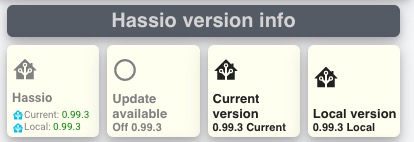
edited it a bit, and now looks like this (left button):

29

New code is below, and I leave the code above for you so you can see the changes I made, hope it is of help for you:

type: custom:button-card
entity: 'binary_sensor.updater'
icon: 'mdi:home-assistant'
aspect_ratio: 1/1
name: Hassio

styles:
  card:
    - background-color: ivory
    - border-radius: 6%
    - padding-left: 5px
    - color: grey
    - font-size: 10px
#        - text-shadow: 0px 0px 5px black
    - text-transform: capitalize
    - box-shadow: 0 4px 8px 0 rgba(0, 0, 0, 0.2), 0 6px 20px 0 rgba(0, 0, 0, 0.19)

  grid:
    - grid-template-areas: '"i i" "n n" "current current" "local local" '
    - grid-template-columns: 1fr
    - grid-template-rows: 1fr min-content min-content
  name:
    - font-weight: bold
    - font-size: 13px
#    - color: grey
    - align-self: middle
    - justify-self: start
    - padding-bottom: 4px
  img_cell:
    - justify-content: start
    - align-items: start
  icon:
    - color: >
        [[[
          if (entity.state == 'on') return 'red';
          return 'grey';
        ]]]
    - width: 30%
#    - margin-top: -10%
  custom_fields:
    current:
      - align-self: start
      - justify-self: start
      - --text-color-sensor: >
          [[[ if (entity.state == 'on') return 'red'; return 'green'; ]]]
    local:
#      - padding-bottom: 2px
      - align-self: start
      - justify-self: start
custom_fields:
  current: >
    [[[
      return `<ha-icon
        icon='mdi:home-assistant'
        style='width: 12px; height: 12px; color: deepskyblue;'>
        </ha-icon><span>Current: <span style='color: var(--text-color-sensor);'>${states['sensor.ha_current_version'].state}</span></span>`
    ]]]
  local: >
    [[[
      return `<ha-icon
        icon='mdi:home-assistant'
        style='width: 12px; height: 12px; color: deepskyblue;'>
        </ha-icon><span>Local: <span style='color: green;'>${states['sensor.ha_local_version'].state}</span></span>`
    ]]]
3 Likes

If it works why even change it? :slight_smile:

That’s how I’d do it:

var id = entity.entity_id.split('count_')[1].replace('_', ' ');
1 Like

changing an icon based on a value doesn´t work for groups?

thank you very much, that works alright. Could you explain why my other effort doesn’t work and doesn’t show the second word after a second _ ?

not sure what you’re asking here, please be a bit more precise ?

so i got 9 window covers that hassio grouped into group.all_covers.
i made 3 buttons to set them to a position:

open: position: 100, middle: position: 50 and close: position: 0

this is the code of one of them:

type: custom:button-card
entity: group.all_covers
icon: 'mdi:arrow-up-box'
name: Oben
show_state: false
tap_action:
  action: call-service
  haptic: success
  service: cover.set_cover_position
  service_data:
    position: 100

i´d like to change icon-color or change icon to see in what state the covers are.
so, if they are open change the icon/iconcolor of the “open” button.

if i only use one cover (entity: cover.pc) i can use entity.attributes.current_position, but that doesn´t work for a group, right?

Try it with the Cover Group.

you can use this on any entity you declare to be the entity for the button.
You can use @VDRainer s suggestion indeed, if you want the button to use that group for entity.

Otherwise (if you want an other entity to set the color) you can use a syntax in the icon color style like

[[[ if (states['domain.name'].state == 'open') return 'red'; return 'grey'; ]]]

this is nice indeed, but it has an anomaly: it leaves out the leading 0:

24

id like it to show 08:21 and 08:09 .

I know we can trim the 0 in Jinja using the -, but dont know how to keep the leading 0 in JS …could you have a look how to?

Hi @RomRider

please let me ask if we can template the action field, obviously I tried it but without luck

action: >
  [[[ if (entity.domain in ['automation','light','switch']) return 'call-service'; return 'more-info']]]

might not be full JS here (…) but hope you see what I am trying to do.

i´m fully lost. just can´t figure out what i have to do :smiley:

what i try: if cover is set to position 100 it should show mdi:arrow-up-box, if it´s lower that 100 it should show mdi:arrow-left

i´m sure that i´m far away from what i´m trying to get

what i have right now:

type: custom:button-card
entity: cover.balkon
icon: 'mdi:arrow-up-box'
name: Oben
show_state: false
state:
  - operator: '<'
    value: '100'
    icon: >
      [[[
        if (entity.attributes.current_position == 100) return "mdi:arrow-left"
      ]]]
tap_action:
  action: call-service
  haptic: success
  service: cover.set_cover_position
  service_data:
    position: 100

you’re using 2 techniques in 1…
either use a template with operator: template, or use state, with the operator <.

nope, i don´t get it. i guess i have to give up on that one.
thanks for your help tho!

try:

state:
  - operator: template
    icon: >
      [[[
        if (entity.attributes.current_position == 100) return "mdi:arrow-left"; return "mdi:other-icon";
      ]]]

name another icon for the else clause

thanks for your help! sadly it doesn´t work for me.

is there any mistake in the code?

type: 'custom:button-card'
entity: cover.balkon
name: Oben
icon: 'mdi:arrow-up'
show_state: false
state:
  - operator: template
    icon: >
      [[[
        if (entity.attributes.current_position == 100) return "mdi:arrow-left"; return "mdi:arrow-right";
      ]]]
tap_action:
  action: call-service
  haptic: success
  service: cover.set_cover_position
  service_data:
    position: 100

Are you trying to do something similar to me; have a different tap-action, or none at all, based on what entity it is?