Lovelace: Button card

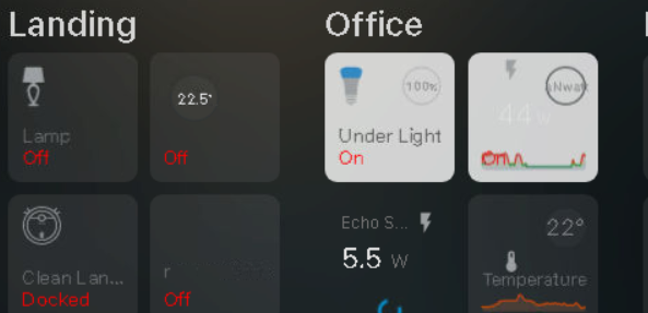
ok so i changed it to

    styles:
      name: [top: 57%, left: 0%, width: 100%, position: absolute, color: red]
      custom_fields:
        graph: [bottom: 0%, left: 0%, width: 100%, position: absolute]
        circle:
          - display: initial

which didnt change

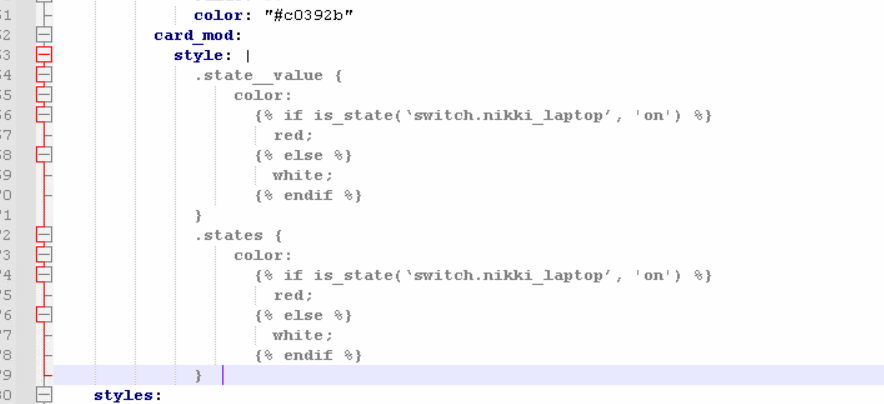
the base template code is here


  #################################################
  #                                               #
  #                     BASE                      #
  #                                               #
  #################################################

  base:
    template:
      - settings
      - tilt
      - extra_styles
    variables:
      state_on: >
        [[[ return ['on', 'home', 'cool', 'fan_only', 'playing'].indexOf(entity === undefined || entity.state) !== -1; ]]]
      state: >
        [[[ return entity === undefined || entity.state; ]]]
      entity_id: >
        [[[ return entity === undefined || entity.entity_id; ]]]
      media_on: >
        [[[ return entity === undefined || ['playing', 'paused'].indexOf(entity.state) !== -1; ]]]
      media_off: >
        [[[ return entity === undefined || ['off', 'idle', 'standby', 'unknown', 'unavailable'].indexOf(entity.state) !== -1; ]]]
      entity_picture: >
        [[[ return entity === undefined || entity.attributes.entity_picture; ]]]
      timeout: >
        [[[ return entity === undefined || Date.now() - Date.parse(entity.last_changed); ]]]
      tilt_options: >
        [[[
          let options = {
            max: 5,
            scale: 1.06,
            glare: true,
            'max-glare': 0.15,
            perspective: 800,
            speed: 800,
            parallax: '25px'
          }
          if (this._config.template.includes('conditional_media')) {
            options.scale = options.scale % parseInt(options.scale) / 2 + parseInt(options.scale);
            options.perspective = options.perspective * 2;
            return options;
          }
          return options;
        ]]]
    aspect_ratio: 1/1
    show_state: true
    show_icon: false
    state_display: >
      [[[ if (variables.state === true) return variables.translate_unknown; ]]]
    tap_action:
      ui_sound_tablet: |
        [[[
          let screensaver = states[variables.entity_tablet] === undefined || 
            states[variables.entity_tablet].state;

          if (variables.state === 'off' && screensaver === 'off') {
            hass.callService('media_player', 'play_media', {
              entity_id: variables.entity_browser_mod,
              media_content_id: '/local/sound/on.m4a',
              media_content_type: 'music'
            });
          }
          if (variables.state_on && screensaver === 'off') {
            hass.callService('media_player', 'play_media', {
              entity_id: variables.entity_browser_mod,
              media_content_id: '/local/sound/off.m4a',
              media_content_type: 'music'
            });
          }
        ]]]
      action: toggle
      haptic: medium
    hold_action:
      haptic: success
    styles:
      grid:
        - grid-template-areas: |
            "icon  circle"
            "n     n"
            "s     s"
        - grid-template-columns: repeat(2, 1fr)
        - grid-template-rows: auto repeat(2, min-content)
        - gap: 1.3%
        - align-items: start
      name:
        - justify-self: start
        - line-height: 121%
      state:
        - justify-self: start
        - line-height: 115%
      card:
        - border-radius: var(--custom-button-card-border-radius)
        - -webkit-tap-highlight-color: rgba(0,0,0,0)
        - transition: none
        - padding: 11.5% 10.5% 10.5% 11.5%
        - --mdc-ripple-color: >
            [[[
              return variables.state_on
                ? 'rgb(0, 0, 0)'
                : 'rgba(255, 255, 255, 0.3)';
            ]]]
        - color: >
            [[[
              return variables.state_on
                ? 'rgba(0, 0, 0, 0.6)'
                : 'rgba(255, 255, 255, 0.3)';
            ]]]
        - background-color: >
            [[[
              return variables.state_on
                ? 'rgba(255, 255, 255, 0.8)'
                : 'rgba(115, 115, 115, 0.2)';
            ]]]

  extra_styles:
    extra_styles: >
      [[[
        if (entity) {
          let hs = entity.attributes.hs_color === undefined,
            h = hs || entity.attributes.hs_color[0],
            s = hs || entity.attributes.hs_color[1],
            l_min = 28,
            l_max = 48,
            l_calc = entity.attributes.brightness / 2.54 * (l_max - l_min) / 100 + l_min;
          var light_color = entity.attributes.color_mode === 'color_temp' || entity.attributes.color_mode === 'brightness'
            ? `hsl(204, 58%, ${l_calc}%);`
            : `hsl(${h}, ${s}%, ${l_calc}%);`;
        }

        return `
          svg {
            --light-color:
            ${ variables.state_on && entity.attributes.brightness !== undefined
                ? light_color
                : variables.state_on && entity.attributes.brightness === undefined
                  ? 'var(--state-icon-active-color);'
                  : 'var(--state-icon-color);'
            }
          }
          #container {
            text-align: left !important;
          }
          #name, #state {
            font-size: 1.32vw;
            letter-spacing: -0.02vw;
          }
          #state::first-letter {
            text-transform: uppercase;
          }
          /* portrait */
          @media screen and (max-width: 1200px) {
            #name, #state {
              font-size: 2vw;
            }
          }
          /* phone */
          @media screen and (max-width: 800px) {
            #name, #state {
              font-size: 3vw;
            }
          }

          /* tilt */
          #ripple, .js-tilt-glare {
            clip-path: inset(0 round var(--custom-button-card-border-radius));
            overflow: hidden;
          }
          .js-tilt-glare {
            z-index: 1;
          }
          .js-tilt-glare-inner {
            background-color: rgba(0,0,0,0.9);
          }
          #container {
            transform: translateZ(${variables.tilt_options.parallax});
          }
          #card {
            transform-style: preserve-3d;
            overflow: visible;
          }

          ${this._config.template.includes('conditional_media') ? `
            :host {
              --blur-intensity: blur(4.5px) brightness(0.8);
            }
            /* phone */
            @media screen and (max-width: 800px) {
              :host {
                --blur-intensity: blur(2.5px) brightness(0.8);
              }
            }
            #ripple, .js-tilt-glare {
              clip-path: inset(0 round calc(var(--custom-button-card-border-radius) / 2));
            }
            #container {
              overflow: hidden;
            }
            .marquee {
              animation: marquee 20s linear infinite;
            }
            @keyframes marquee {
              from {
                transform: translateX(0%);
              }
              to {
                transform: translateX(-50%);
              }
            }
          `:''}

          ${this._config.template.includes('footer') ? `
            :host {
              --name-font-size: 1.22vw;
              --name-icon-size: 1.5vw;
              --notify-font-size: 0.9vw;
              --notify-box-size: 1.8vw;
              --name-padding-v: 0.7vw;
              --name-padding-h: 1.1vw;
              --card-border-radius: 0.6vw;
            }
            #ripple, .js-tilt-glare {
              border-radius: calc(var(--card-border-radius) - 0.1vw);
              clip-path: inset(0 round calc( var(--custom-button-card-border-radius) - 0.1vw ));
            }
            #name {
              font-size: var(--name-font-size);
              padding: var(--name-padding-v) var(--name-padding-h);
              letter-spacing: 0.012vw;
            }
            ha-icon {
              width: var(--name-icon-size);
              vertical-align: 7%;
              padding-right: 0.1vw;
              opacity: 0.4;
            }
            #card {
              border-radius: var(--card-border-radius);
              background: rgba(115, 115, 115, 0.04);
            }
            #notify {
              font-size: var(--notify-font-size);
              width: var(--notify-box-size);
              height: var(--notify-box-size);
              line-height: var(--notify-box-size);
              padding-right: 0.5px;
              padding-top: 0.5px;
            }
            /* portrait */
            @media screen and (max-width: 1200px) {
              #name {
                font-size: calc(var(--name-font-size) * 1.4);
                padding: calc(var(--name-padding-v) * 1.4) calc(var(--name-padding-h) * 1.4);
              }
              ha-icon {
                width: calc(var(--name-icon-size) * 1.4);
              }
              #card {
                border-radius: calc(var(--card-border-radius) * 1.4);
                margin: 0 0.5vw;
              }
              #notify {
                font-size: calc(var(--notify-font-size) * 1.4);
                width: calc(var(--notify-box-size) * 1.4);
                height: calc(var(--notify-box-size) * 1.4);
                line-height: calc(var(--notify-box-size) * 1.4);
              }
            }
            /* phone */
            @media screen and (max-width: 800px) {
              #name {
                font-size: calc(var(--name-font-size) * 2.7);
                padding: calc(var(--name-padding-v) * 2.7) calc(var(--name-padding-h) * 2.7);
                letter-spacing: 0.12vw;
              }
              ha-icon {
                width: calc(var(--name-icon-size) * 2.7);
              }
              #card {
                border-radius: calc(var(--card-border-radius) * 2.7);
                background: rgba(115, 115, 115, 0.08);
                margin: 0 0.5vw;
              }
              #notify {
                font-size: calc(var(--notify-font-size) * 2.7);
                width: calc(var(--notify-box-size) * 2.7);
                height: calc(var(--notify-box-size) * 2.7);
                line-height: calc(var(--notify-box-size) * 2.7);
                padding: 0;
              }
            }
          `:''}
        `
      ]]]

The part you want to change is most likely the state of the entity. However, I have no idea if this is in the button-card part itself or in one of the other templates or custom_fields (like graph).

You could try adding color to the state (under styles part) in the base template, if it’s indeed the state part of button-card, add color there. Make sure you save the yaml and also save the main lovelace yaml and reload the dasboard, so it loads up the template.

      state:
        - justify-self: start
        - line-height: 115%
        - color: red

This is a very complex card (as in it uses many different templates). As you can see the base template on it’s own uses 3 other templates as well. Who created this button? It looks a lot like Mattias’s design. If so, you should just ask for help in that topic if above doesn’t work. Or use inspect_element in your browser window to easily see what the part you want to change is from.

im trying

    styles:
      name: [top: 57%, left: 0%, width: 100%, position: absolute, color: red]
        state:
         - justify-self: start
         - line-height: 115%
         - color: red
      custom_fields:
        graph: [bottom: 0%, left: 0%, width: 100%, position: absolute]
        circle:
          - display: initial
          - width: 90%
          - letter-spacing: 0.03vw
          - margin: -6% -6% 0 0
          - justify-self: end
          - opacity: 1
        icon:
          - width: 67%
          - fill: "#9da0a2"

but get

must have missed a space somewhere?

Because you added state yourself under name (you indented it which caused it to be part of name, which is not correct and not what I meant. Please revert all your code to what it was and only add color to the BASE template where you already have state under style.

If this doesn’t work, please use inspect element to figure out what that state is part of. You are using many templates and stylings, which makes it very hard to guess what part that is. Or ask the one who you copied this from.

you mean like this?

stilll errors when trying to load


  #################################################
  #                                               #
  #                  POWER                        #
  #                                               #
  #################################################

  power:
    template:
      - base
    show_state: true
    custom_fields:
      circle: >
        [[[ {
        const temperature = Math.round(entity.state);
        return `<svg viewBox="0 0 50 50"><circle cx="25" cy="25" r="20.5" stroke="#313638" stroke-width="1.5" fill="#FFFFFF08" style="
        transform: rotate(-90deg); transform-origin: 50% 50%;" />
        <text x="50%" y="54%" fill="#8d8e90" font-size="14" text-anchor="middle" alignment-baseline="middle" dominant-baseline="middle" dominant-baseline="middle">${temperature}watts</text></svg>`; } ]]]
      graph:
        card:
          type: "custom:mini-graph-card"
          hours_to_show: 24
          points_per_hour: 4
          line_width: 8
          font_size: 75
          decimals: 0
          show:
            name: false
            icon: true
            state: true
            legend: false
            labels: false
            points: false
          color_thresholds:
            - value: 0
              color: "#276696"
            - value: 19
              color: "#228C22"
            - value: 22
              color: "#d35400"
            - value: 25
              color: "#c0392b"
              
    styles:
      name:
        - justify-self: start
        - line-height: 115%
         state:      
        - color: red
      custom_fields:
        graph: [bottom: 0%, left: 0%, width: 100%, position: absolute]
        circle:
          - display: initial
          - width: 90%
          - letter-spacing: 0.03vw
          - margin: -6% -6% 0 0
          - justify-self: end
          - opacity: 1
        icon:
          - width: 67%
          - fill: "#9da0a2" 

original author told me to come here

it was taken from

matt8707/hass-config: A different take on designing a Lovelace UI (github.com)

No, that’s not what I wrote. You need to add it to you BASE template. You keep adding it to you power template. I posted a screenshot where I highlighted where to add it. You can see it’s not the same code and I made sure you saw your own comment at the top in that screenshot. All you need to do is add - color: red under state of your BASE template code:

The code under your own comment, which says BASE.

    styles:
      grid:
        - grid-template-areas: |
            "icon  circle"
            "n     n"
            "s     s"
        - grid-template-columns: repeat(2, 1fr)
        - grid-template-rows: auto repeat(2, min-content)
        - gap: 1.3%
        - align-items: start
      name:
        - justify-self: start
        - line-height: 121%
      state:
        - justify-self: start
        - line-height: 115%
        - color: red #<< ADD IT HERE LIKE IN THE SCREENSHOT!!!

I’m hoping someone can help me out here. Probably doing something stupid but I just can’t figure it out. I have a button that specifies a hold_action and I want to template the title and entity fields. This works in Firefox, Chrome and Safari and in the Android app, but not in the iOS app:

hold_action:
  action: fire-dom-event
  haptic: success
  browser_mod:
    command: popup
    title: "[[[ return 'test text' ]]]"
    card:
      type: entity
      entity: '[[[ return entity.entity_id ]]]'

This works as expected in the browsers and the Android app (popup header shows “test text” and the card controls the light). But in the iOS app the header shows “[[[ return ‘test text’ ]]]” (without the outer double quotes) and the entity card complains that ‘[[[ return entity.entity_id ]]]’ is not a valid entity.

So it appears that in the iOS app the templates aren’t being evaluated.

What am I doing wrong here?

sorry too many beers!!!

i changed it to red and now shows…

image

as you can see the 44w is still in white :frowning:

1 Like

Then most likely it’s the custom_field that actually uses the mini graph card. This part below part of the POWER template.

      graph:
        card:
          type: "custom:mini-graph-card"
          hours_to_show: 24
          points_per_hour: 4
          line_width: 8
          font_size: 75
          decimals: 0
          show:
            name: false
            icon: true
            state: true
            legend: false
            labels: false
            points: false
          color_thresholds:
            - value: 0
              color: "#276696"
            - value: 19
              color: "#228C22"
            - value: 22
              color: "#d35400"
            - value: 25
              color: "#c0392b"
          card_mod:
            style: |
              .state__value {
                  color: red;
              }
              .states {
                  color: red;
              }

If true, this has nothing to do with button-card, but mini-graph-card. Use the card_mod style like I added in the code above to change the state colors. If they turn red, it works. Then use your own color you want.

@tomcoleman please reload the browser, I updated my message while I saw you typing

SENDING A VIRTUAL KISS

image

Use my updated code, it will prevent issues down the road when you decide to show the name in the graph-card. The code you use now also changes the color of that variable (which you now have hidden). The updated code only changes the state color.

now heres the tricky question.

if the state is off (plug switched off) can the color be white and if the plug is on (state on) then be red?

Yes, you can use jinja2 templates with card mod for that. See this: GitHub - thomasloven/lovelace-card-mod: 🔹 Add CSS styles to (almost) any lovelace card

And here’s an example of a jinja2 template: Templating - Home Assistant

Maybe below code works (replace where it now says color: red with below, make sure all spaces/indents are correct).

          color:
            {% if is_state(‘switch.nikki_laptop’, 'on') %}
              red;
            {% else %}
              white;
            {% endif %}

I don’t use templates in card-mod myself, so for this question you should really visit card-mod so this thread doesn’t get off tracks any further. Probably there are tons of examples there you can copy the template from if you use the search.

i tried

            points: false
          color_thresholds:
            - value: 0
              color: "#276696"
            - value: 19
              color: "#228C22"
            - value: 22
              color: "#d35400"
            - value: 25
              color: "#c0392b"
          card_mod:
            style: |
              ha-card {
             color:
             {% if states(‘switch.nikki_laptop’, 'on') %}
              red;
             {% else %}
              white;
             {% endif %}

and get

while parsing a block mapping in "/config/button_card_templates.yaml", line 1463, column 13 expected <block end>, but found '<block mapping start>' in "/config/button_card_templates.yaml", line 1465, column 14

As I stated: make sure all spaces/indents are correct). You can see our codes are not the same, you messed up the indents.

Also you seem to ignore my previous post, use the updated code. This should be the complete code:

      graph:
        card:
          type: "custom:mini-graph-card"
          hours_to_show: 24
          points_per_hour: 4
          line_width: 8
          font_size: 75
          decimals: 0
          show:
            name: false
            icon: true
            state: true
            legend: false
            labels: false
            points: false
          color_thresholds:
            - value: 0
              color: "#276696"
            - value: 19
              color: "#228C22"
            - value: 22
              color: "#d35400"
            - value: 25
              color: "#c0392b"
          card_mod:
            style: |
              .state__value {
                  color:
                    {% if is_state(‘switch.nikki_laptop’, 'on') %}
                      red;
                    {% else %}
                      white;
                    {% endif %}
              }
              .states {
                  color:
                    {% if is_state(‘switch.nikki_laptop’, 'on') %}
                      red;
                    {% else %}
                      white;
                    {% endif %}
              }  

If this doesn’t work, please ask for help in card-mod, there is nothing else I can do.

ok the above code allows the homepage to reload but color is back to being white.

image

@tomcoleman according to this post, below code should be the correct (and shorter) code to change the color. I tried it myself and indeed changes the state color to red, so you should use this code now.

      card_mod:
        style: |
          ha-card .states.flex {
            color: red;
          }

Why my template doesn’t work I don’t know (tested myself and indeed doesn’t work). Use the search button in the card-mod thread and look for templates, so you can use above code in a template example.

… and ha-card may be omitted.

P.S.
Some of my card-mod examples contain:

  1. A “simple DOM navigation” instead of “optimized DOM navigation” (the 1st may be more clear for beginners).
  2. A “style” keyword only instead of “card_mod / style” keywords (which are advised to be used since card-mod 3).
1 Like

Please go easy on me! This is my first attempt with the Custom Button Card (although I see the power it holds!) but I can’t figure out how to properly stack my objects?! In the example above (purely in the mockup phase), I need to have the trash can icon (circled in green) to be in front of the gauge card. My code is below. What am I doing wrong?!

type: custom:button-card
icon: mdi:delete
show_name: false
card:
  - overflow: unset
grid:
  - position: relative
styles:
  custom_fields:
    graph:
      - filter: opacity(100%)
      - overflow: unset
      - border-radius: 50%
      - background-color: '#000044'
      - position: absolute
      - left: 0px
      - top: 40px
      - height: 120px
      - width: 200px
      - font-size: 11px
  card:
    - left: 80px
    - top: 10px
    - height: 200px
    - width: 280px
  icon:
    - left: 10px
    - top: 10px
    - height: 35px
    - width: 35px
    - background-color: transparent
entity: light.switch_queen_bedroom
hold_action:
  action: info
custom_fields:
  graph:
    card:
      type: gauge
      entity: input_number.countdown_trash
      max: 7
      min: 0
      name: Trash Collection
      style: |
        ha-card {
          box-shadow: none;
          background-color: red;
        }
1 Like

I’d like to do something similar as Mark in the post above. I’d like to display a button-card inside another button card (so that I have the option to display a switch for a camera, for example).
cambutton
It seems it can be done with custom fields, but I am not a big programming expert. Can you please help me on how to do this?
This is where I got so far (switch is not displaying over the camera picture):

type: custom:button-card
entity: camera.mycam_mainstreamprofile
show_entity_picture: true
show_icon: false
custom_fields:
  camera_image: |
    [[[
      return html`
        <hui-image
          .hass=${hass}
          .cameraImage=${entity.entity_id}
          .entity=${entity.entity_id}
          .cameraView="auto"
          aspectRatio="1"
        ></hui-image>
      `;
    ]]]
  switch:
    card: 
      type: custom:button-card
      entity: switch.camswitch
size: 95%
styles:
  grid:
    - position: relative
  custom_fields:
    camera_image:
      - position: relative
      - width: 100%
      - height: 100%
      - z-index: 0
    switch:
      - position: absolute
      - left: 60%
      - top: 10%
      - height: 20px
      - width: 20px
      - font-size: 8px
      - line-height: 20px

Thank you.