Check docs, it has a description for tap_action.
I love that Gradient effect. How do I implement that?
Thought I would share a few graphs:
LINK TO THE FINAL CARD WITH UPDATED CODE
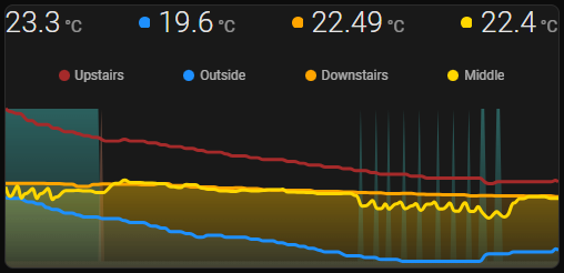
House Temperature Status
- Shows Temperatures at all three levels of my house including outdoors
- Shows Heating status of heat pump (lightsalmon block)
- Shows Cooling status of heat pump (mediumturquoise block)

type: custom:mini-graph-card
entities:
  - entity: sensor.netatmo_devonport_tas_indoor_temperature
    name: Meazzanine Temp
    color: brown
    show_state: true
    show_indicator: false
  - entity: sensor.netatmo_devonport_tas_indoor_outdoor_temperature
    name: Outside
    color: dodgerblue
    show_state: false
  - entity: sensor.air_conditioning_downstairs_temperature
    name: Down Stairs
    color: orange
    show_state: true
    show_indicator: true
  - entity: sensor.air_conditioning_temperature
    name: Middle Floor
    color: gold
    show_state: true
    show_indicator: true
  - entity: sensor.ac_cool_living
    name: AC Cool
    color: mediumturquoise
    show_legend: false
    show_line: false
    show_points: false
    y_axis: secondary
    smoothing: false
  - entity: sensor.ac_heat_living
    name: AC Heat
    color: lightsalmon
    show_legend: false
    show_line: false
    show_points: false
    y_axis: secondary
    smoothing: false
state_map:
  - label: "Off"
    value: "0"
  - label: "On"
    value: "1"
show:
  name: false
  icon: false
  legend: true
  extrema: false
  fill: fade
  labels: hover
  labels_secondary: hover
  state: true
align_state: left
hour24: true
animate: true
font_size_header: 9
group: true
hours_to_show: 6
smoothing: true
line_width: 3
points_per_hour: 15
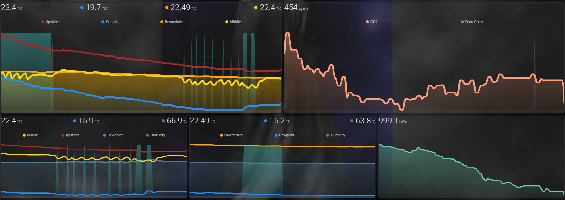
Living Room Climate Status
- Shows Temperature of Middle Floor
- Shows Humidity of Middle Floor
- Shows Dew Point of Middle Floor
- Shows Heating status of heat pump (lightsalmon block)
- Shows Cooling status of heat pump (mediumturquoise block)

type: custom:mini-graph-card
entities:
  - entity: sensor.air_conditioning_temperature
    name: Middle Floor
    color: gold
    show_state: true
    show_indicator: false
  - entity: sensor.dewpoint_living_room
    name: Dewpoint
    color: dodgerblue
    show_state: true
    show_indicator: true
  - entity: sensor.air_conditioning_humidity
    name: Humidity
    color: teal
    show_state: true
    show_indicator: true
    show_graph: true
    show_legend: true
  - entity: sensor.ac_cool_living
    name: AC Cool
    color: mediumturquoise
    show_legend: false
    show_line: false
    show_points: false
    y_axis: secondary
    smoothing: false
  - entity: sensor.ac_heat_living
    name: AC Heat
    color: lightsalmon
    show_legend: false
    show_line: false
    show_points: false
    y_axis: secondary
    smoothing: false
state_map:
  - label: "Off"
    value: "0"
  - label: "On"
    value: "1"
show:
  name: false
  icon: false
  legend: true
  extrema: false
  fill: fade
  labels: hover
  labels_secondary: hover
  state: true
align_state: left
hour24: true
animate: true
font_size_header: 9
group: true
hours_to_show: 12
smoothing: true
line_width: 3
points_per_hour: 15
Sensors required to be added to configuration.yaml
template:
  - sensor:
    # Air Conditioning sensors for Mini Graph Card
    - name: "ac_heat_living"
      unique_id: 4b0aa109-9f6b-430e-9f75-d3bc64645e70
      icon: mdi:sun-thermometer-outline
      state: >-
        {% if state_attr('climate.air_conditioning','hvac_action') == 'heating'  %}
        1
        {% else %}
        0
        {% endif %}

    - name: "ac_cool_living"
      unique_id: 463de126-9e29-46bd-b0cd-c2c4f97f8fa2
      icon: mdi:snowflake-thermometer
      state: >-
        {% if state_attr('climate.air_conditioning','hvac_action') == 'cooling'  %}
        1
        {% else %}
        0
        {% endif %}
CO2 vs Door/Window Status
- Shows CO2 levels in relation to a door and window group sensor

type: custom:mini-graph-card
entities:
  - entity: sensor.netatmo_devonport_tas_indoor_co2
    name: CO2
    color: lightsalmon
    show_state: true
    show_indicator: false
  - entity: sensor.middle_floor_sensor_status
    name: Door Open
    color: mediumturquoise
    show_legend: true
    show_line: false
    show_points: false
    y_axis: secondary
    smoothing: false
    show_state: true
state_map:
  - label: Closed
    value: "0"
  - label: Open
    value: "1"
show:
  name: false
  icon: false
  legend: true
  extrema: false
  fill: fade
  labels: hover
  labels_secondary: hover
  state: true
align_state: left
hour24: true
animate: true
font_size_header: 9
group: true
hours_to_show: 12
smoothing: true
line_width: 3
points_per_hour: 6
Sensor required for door status
template:
  - sensor:
    - name: "middle_floor_sensor_status"
      unique_id: bf540135-35df-439c-a6a7-3bd328a1fb08
      icon: mdi:door
      state: >-
        {% if states('binary_sensor.middle_floor_sensor_group') == 'on'  %}
        1
        {% else %}
        0
        {% endif %}
5 Likes
Thank you so much Andrew. So many people show the nice results of there work but don’t help other with how they did it. This save old guys like me several hours of work.
Thank you again for your work and for sharing.
1 Like
@Sawadee Everytime I work something out, I post up my results. Like you spend many hours trying to find a solution and snippets of code. When I first got home assistant 4 years ago I tried to create these exact charts. I got stuck on the template sensor to show the heat pump status. Home Assistant is a steep learning curve for those that have not coded before but might be computer literate.
4 years later and a lot more understanding of the *.yaml behind home assistant and I have finally been able to get the charts looking like I want.
I am pleased you found it useful. Also a thanks to all in this topic that I stole bits of code from.
I would suggest to get rid of state_map and use only “0/1” sensors on a secondary Y-axis. Reason - works in a more predictable way (there are issues with state_map) & no spamming warnings in console.
Similar graph (2 background 0/1 graphs):

OK no problems, I thought the state map was only there to change the lablels on the Y-axis.
Agree, with using “0/1” we have to hide labels on a secondary Y-axis.
I usually use background graphs for cases like:
– day/night (here greyish fill says “night”, so no labels are needed);
– availability (here reddish spikes or continuous fill say “unavailable” - again no labels needed);
– power on/off - similar as availability (but inverted),
and in all these cases I do not need labels.
May be in future the “state_map” option becomes per-entity which will solve that “spamming” problem.
Increase points_per_hour (will create more points → stepline graphs)
I assume this applies to the whole card not just the status value
Correct.
points-per-hour is a global option.
THIS IS THE FINAL THIRD EDIT 15/01/2024 AFTER FURTHER TESTING
12hr House Temperature Status
-
Deleted
state_map:as discussed by @Ildar_Gabdullin -
Added the following to deal with my 0/100 AC Status sensor value, sits on the Y-axis.
aggregate_func: maxon AC Status entity discussed and tested below postupper_bound_secondary: 100ensures humidity shows correctly below postlower_bound_secondary: 0
-
Show secondary labels, for humidity 0-100%
labels_secondary: true
-
Added 4-Sensor card-mod as discussed in below post
-Shows Temperatures at all three levels of my house including outdoors
-Shows Heating status of heat pump (lightsalmon block)
-Shows Cooling status of heat pump (mediumturquoise block)
type: custom:mini-graph-card
name: House Temperatures
entities:
  - entity: sensor.netatmo_devonport_tas_indoor_temperature
    name: Upstairs
    color: brown
    show_state: true
    show_indicator: false
    smoothing: true
    show_fill: false
  - entity: sensor.netatmo_devonport_tas_indoor_outdoor_temperature
    name: Outside
    color: dodgerblue
    show_state: true
    show_indicator: true
    smoothing: true
  - entity: sensor.air_conditioning_downstairs_temperature
    name: Downstairs
    color: orange
    show_state: true
    show_indicator: true
    smoothing: true
    show_fill: true
  - entity: sensor.air_conditioning_temperature
    name: Middle
    color: gold
    show_state: true
    show_indicator: true
    smoothing: true
    show_fill: true
  - entity: sensor.ac_cool_living
    name: AC Cool
    color: mediumturquoise
    show_legend: false
    show_line: false
    show_points: false
    smoothing: false
    y_axis: secondary
    aggregate_func: max
  - entity: sensor.ac_heat_living
    name: AC Heat
    color: lightsalmon
    show_legend: false
    show_line: false
    show_points: false
    smoothing: false
    y_axis: secondary
    aggregate_func: max
show:
  name: false
  icon: false
  legend: true
  extrema: false
  fill: fade
  labels: hover
  labels_secondary: false
  state: true
font_size_header: 9
align_state: center
hour24: true
animate: true
group: true
smoothing: true
line_width: 3
hours_to_show: 12
points_per_hour: 15
upper_bound_secondary: 100
lower_bound_secondary: 0
height: 150
card_mod:
  style: |
    .states {
      justify-content: normal !important;
      font-size: 11px !important;
    }
    .state {
      flex-grow: 1;
    }
    .states--secondary {
      flex-flow: row !important;
      flex-grow: 2;
      margin-left: 0px !important;
    }
    .states--secondary .state.state--small {
      font-size: unset;
      margin-bottom: unset;
      flex-grow: unset;
    }
    .states--secondary .state.state--small:nth-of-type(2) {
      margin-left: auto !important;
    }
    .states--secondary .state.state--small:nth-of-type(3) {
      margin-left: auto !important;
    }
    .ellipsis {
      font-size: 12px ;
    }
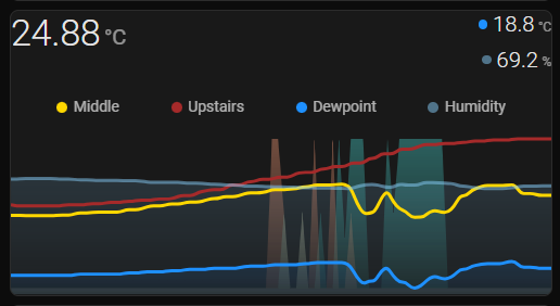
6hr Living Room Climate Status
-
Deleted
state_map:as discussed by @Ildar_Gabdullin -
Added the following to deal with my 0/100 AC Status sensor value, sits on the Y-axis.
aggregate_func: maxon AC Status entity discussed and tested below postupper_bound_secondary: 100ensures humidity shows correctly below postlower_bound_secondary: 0
-
Show secondary labels, for humidity 0-100%
labels_secondary: true
-
Added 3-Sensor card-mod as discussed in below post
-
General code layout tidy up
-Shows Temperature of Middle Floor
-Shows Temperature of Upstairs Mezzanine
-Shows Humidity of Middle Floor
-Shows Dew Point of Middle Floor
-Shows Heating status of heat pump (lightsalmon block)
-Shows Cooling status of heat pump (mediumturquoise block)

type: custom:mini-graph-card
name: Middle Floor Temperatures
entities:
  - entity: sensor.air_conditioning_temperature
    name: Middle
    color: gold
    show_state: true
    show_indicator: false
    show_fill: false
  - entity: sensor.netatmo_devonport_tas_indoor_temperature
    name: Upstairs
    color: brown
    show_state: false
    show_indicator: false
    smoothing: true
    show_fill: false
  - entity: sensor.dewpoint_living_room
    name: Dewpoint
    color: dodgerblue
    show_state: true
    show_indicator: true
    show_fill: true
  - entity: sensor.air_conditioning_humidity
    name: Humidity
    color: rgb(135,206,250,0.5)
    show_state: true
    show_indicator: true
    show_graph: true
    show_legend: true
    show_fill: true
    y_axis: secondary
  - entity: sensor.ac_cool_living
    name: AC Cool
    color: mediumturquoise
    show_legend: false
    show_line: false
    show_points: false
    smoothing: false
    y_axis: secondary
    aggregate_func: max
  - entity: sensor.ac_heat_living
    name: AC Heat
    color: lightsalmon
    show_legend: false
    show_line: false
    show_points: false
    smoothing: false
    y_axis: secondary
    aggregate_func: max
show:
  name: false
  icon: false
  legend: true
  extrema: false
  fill: fade
  labels: hover
  labels_secondary: hover
  state: true
font_size_header: 9
align_state: center
hour24: true
animate: true
group: true
smoothing: true
line_width: 3
hours_to_show: 6
points_per_hour: 15
upper_bound_secondary: 100
lower_bound_secondary: 0
height: 150
card_mod:
  style: |
    .states {
      justify-content: normal !important;
      font-size: 11px !important;
    }
    .state {
      flex-grow: 1;
    }
    .states--secondary {
      flex-flow: row !important;
      flex-grow: 1.2;
      margin-left: 0px !important;
    }
    .states--secondary .state.state--small {
      font-size: unset;
      margin-bottom: unset;
      flex-grow: unset;
    }
    .states--secondary .state.state--small:nth-of-type(2) {
      margin-left: auto !important;
    }
    .ellipsis {
      font-size: 12px ;
    }
Sensors required to be added to configuration.yaml
template:
  - sensor:
    # Air Conditioning sensors for Mini Graph Card
    - name: "ac_heat_living"
      unique_id: 4b0aa109-9f6b-430e-9f75-d3bc64645e70
      icon: mdi:sun-thermometer-outline
      state: >-
        {% if state_attr('climate.air_conditioning','hvac_action') == 'heating'  %}
        100
        {% else %}
        0
        {% endif %}

    - name: "ac_cool_living"
      unique_id: 463de126-9e29-46bd-b0cd-c2c4f97f8fa2
      icon: mdi:snowflake-thermometer
      state: >-
        {% if state_attr('climate.air_conditioning','hvac_action') == 'cooling'  %}
        100
        {% else %}
        0
        {% endif %}
12hr CO2 vs Door/Window Status
-
Deleted
state_map:as discussed by @Ildar_Gabdullin -
Added the following to deal with my 0/100 Door Status sensor value, sits on the Y-axis.
aggregate_func: maxon Door Status entity discussed and tested below postupper_bound_secondary: 100lower_bound_secondary: 0
-
Hide secondary labels, due to being a number and not a word.
labels_secondary: false
-
Added 3-Sensor card-mod as discussed in below post
-
General code layout tidy up
-Shows CO2 levels in relation to a door and window group sensor

type: custom:mini-graph-card
name: CO2 vs Door
entities:
  - entity: sensor.netatmo_devonport_tas_indoor_co2
    name: CO2
    color: lightsalmon
    show_state: true
    show_indicator: false
  - entity: sensor.middle_floor_sensor_status
    name: Door Open
    color: gray
    show_legend: true
    show_line: false
    show_points: false
    y_axis: secondary
    smoothing: false
    show_state: false
    aggregate_func: max
show:
  name: false
  icon: false
  legend: true
  extrema: false
  fill: fade
  labels: hover
  labels_secondary: hover
  state: true
font_size_header: 9
align_state: left
hour24: true
animate: true
group: true
smoothing: true
line_width: 3
hours_to_show: 12
points_per_hour: 15
upper_bound_secondary: 100
lower_bound_secondary: 0
height: 150
card_mod:
  style: |
    .states {
      justify-content: normal !important;
      font-size: 11px !important;
    }
    .state {
      flex-grow: 1;
    }
    .states--secondary {
      flex-flow: row !important;
      flex-grow: 1.2;
      margin-left: 0px !important;
    }
    .states--secondary .state.state--small {
      font-size: unset;
      margin-bottom: unset;
      flex-grow: unset;
    }
    .states--secondary .state.state--small:nth-of-type(2) {
      margin-left: auto !important;
    }
    .states--secondary .state.state--small:nth-of-type(3) {
      margin-left: auto !important;
    }
    .ellipsis {
      font-size: 12px ;
    }
Sensor required for door status
template:
  - sensor:
    - name: "middle_floor_sensor_status"
      unique_id: bf540135-35df-439c-a6a7-3bd328a1fb08
      icon: mdi:door
      state: >-
        {% if states('binary_sensor.middle_floor_sensor_group') == 'on'  %}
        100
        {% else %}
        0
        {% endif %}
FINAL LOOK ON DASHBOARD
1 Like
In my practice I use values “0/1” instead of “0/100” (if it is on/off → no need to have such a large range), also setting “upper_bound_secondary” not needed.
Also, use “aggregate_func: last” for “0/1”.
As for “smoothing: true” - it is up to you, myself do not use any smoothing, graphs are shown more natural (less interpolation).
LINK TO THE FINAL CARD WITH UPDATED CODE
I have set upper bound to 100 because I have put humidity on the Y-axis with my ON/OFF (0/100) sensor. Humidity is measured on a scale of 0-100%.
This allows me to have temperature on the X-axis which ranges from -5 to 40 degrees where I live. Not that I would see that full range in a day.
As you can see by comparing the two graphs between the posts.
- I can now see the upward or downward trend of temperature with more detail. (Not just a straight bumpy line.)
- At a glance where the humidity line sits on the graph gives me a rough approximation of percentage.
- Plus the humidity line sits lower in the graph allowing the 0/100 sensor to be seen above at all times.
- Humidity will never be 100%.
Before

After
EDIT: Example shows what happens when not setting aggregate_func: max and ‘upper_bound_secondary: 100’
Different time spans in the above pictures. But was able to add a third temperature from the mezzanine of my living room without the graph looking messy.
Then for 0/1 values you need the 3rd y-axis)).
Seriously, this case is supposed to be solved in a different way.
If the secondary-Y-axis value has a wide range, then playing with upper_bound may not help.
Consider a different approach:
- Place 2 cards in a vert stack. Make them “overlap” by card-mod (find my examples here).
- 1st card - for temperature & humidity.
- 2nd card - for 0/1 background graphs.
Your example link has not shown up. Unfortunately no 3rd Y-axis.
This is working for me, all my on off sensors are now 0/100, simple change in yaml.
I will try your “aggregate_func: last” for 0/100
google for “display: grid” here
Using my method effectively frees up the Y-axis to be used by another reading, effectively giving a second Y-axis, pushing the binary_sensor to the back which only has two possible states.
It hurts my brain to make OFF/ON = 0/100 rather than the traditional 0/1 but at the end of the day we are applying a fudge to make the graph display what we want. Using 0/100 gives some range to the Y-axis to allow it to display something else quantitative.
Also dewpoint and temperature are very close together, this gives me the ability to see the relationship better.
There is a few use cases when comparing a percentage, with a numeric value and an ON/OFF state.
- %CPU Use, CPU Temp, Fan ON/OFF state
- %Humidity, Temperature, Humidifier ON/OFF state
- %Humidity, CO2ppm, Door OPEN/CLOSED state
This method also makes all values on the grid available via mouse over. Plus less code.
Thanks for that link for display: grid, I will use the card mod to move my values where I want them.
LINK TO THE FINAL CARD WITH UPDATED CODE

4 State Mini Graph Card: Using the below card-mod I got the above style (Comments in yaml.)
type: custom:mini-graph-card
name: House Temperatures
group: true /*takes space away from top of card*/
card_mod:
  style: |
    .states {
      justify-content: normal !important;
      font-size: 11px !important; /*Adjusts state font size*/
    }
    .state {
      flex-grow: 1;
    }
    .states--secondary {
      flex-flow: row !important;
      flex-grow: 2; /*Adjusts spacing of 4 readings*/
      margin-left: 0px !important;
    }
    .states--secondary .state.state--small {
      font-size: unset;
      margin-bottom: unset;
      flex-grow: unset;
    }
    .states--secondary .state.state--small:nth-of-type(2) {
      margin-left: auto !important; /*Adjusts the 3rd state*/
    }
    .states--secondary .state.state--small:nth-of-type(3) {
      margin-left: auto !important; /*Adjusts the 4th state*/
    }
    .ellipsis {
      font-size: 12px ; /*Adjusts legend font size*/

    }

3 State Mini Graph Card: Using the below card-mod I got the above style (Comments in yaml.)
type: custom:mini-graph-card
name: Downstairs Temperatures
group: true /*takes space away from top of card*/
card_mod:
  style: |
    .states {
      justify-content: normal !important;
      font-size: 11px !important; /*Adjusts state font size*/
    }
    .state {
      flex-grow: 1;
    }
    .states--secondary {
      flex-flow: row !important;
      flex-grow: 1.2; /*Adjusts spacing of 3 readings*/
      margin-left: 0px !important;
    }
    .states--secondary .state.state--small {
      font-size: unset;
      margin-bottom: unset;
      flex-grow: unset;
    }
    .states--secondary .state.state--small:nth-of-type(2) {
      margin-left: auto !important; /*Adjusts the 3rd state*/
    }
    .states--secondary .state.state--small:nth-of-type(3) {
      margin-left: auto !important;
    }
    .ellipsis {
      font-size: 12px ; /*Adjusts legend font size*/
    }
Below example of group: false
- Enables paddings and box-shadow.

Overall result on dashboard, no more cluttered look within cards
