Plotly interactive Graph Card

demo
attributes
216764329-94b9cd7e-fee9-439b-9134-95b7be626592


215353175-97118ea7-778b-41b7-96f2-7e52c1c396d3
image

Here is my first Lovelace card, similar to the history card but leveraging plotly.js to make it interactive.

You can scroll and zoom and the missing data will be automatically fetched.

Click on the Index of examples with images in the readme

The yaml is compatible with the history card, instructions in the repo link.

I’d love your to hear feedback from the community :slight_smile:

50 Likes

wow, Thanks !

2 Likes

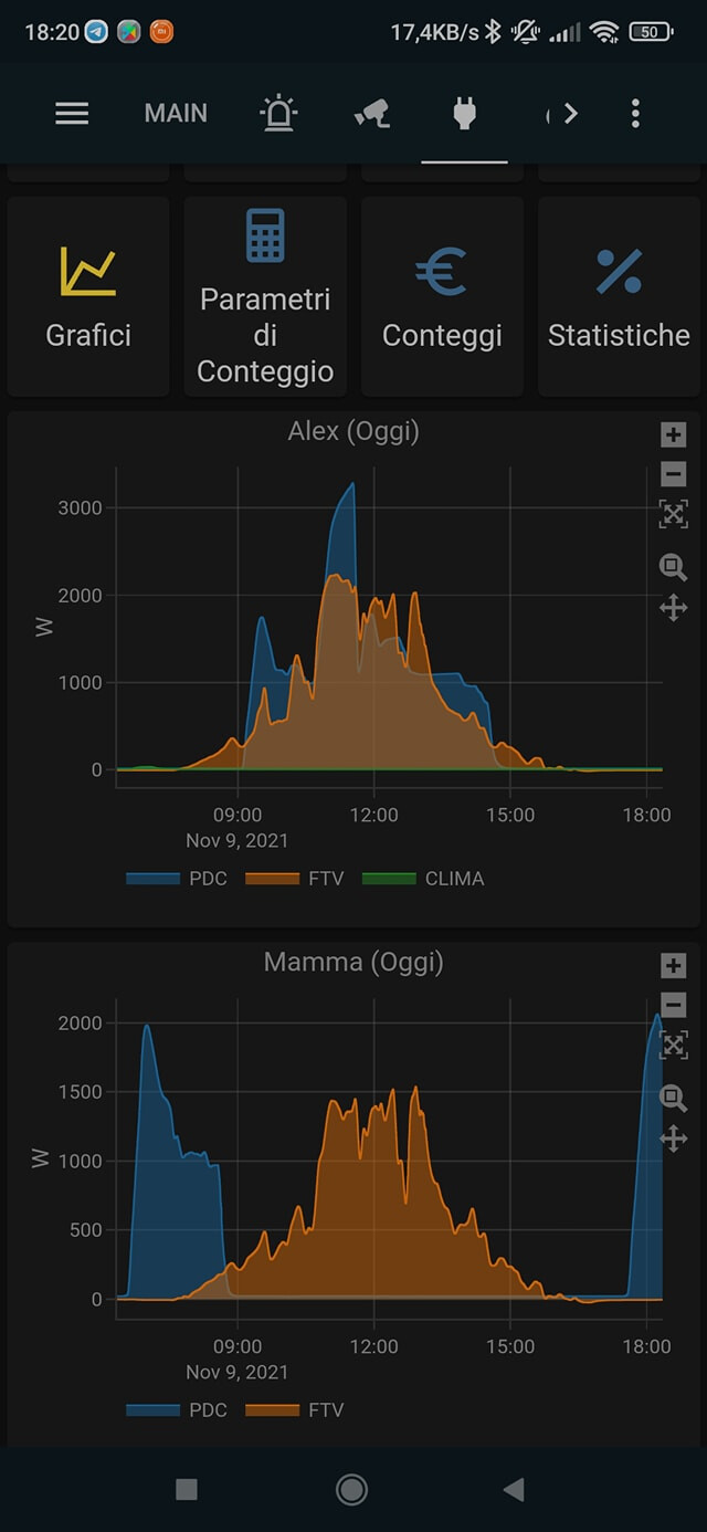
Firstly, This is excellent. I have used 2 graphs previously to track short term and long term CPU usage and this provides exactly what I was trying to achieve. Thank you.

I had a problem this morning, I am seeing this error when I edit the card:-

**Configuration errors detected:**

*** document.createElement(...).constructor.getConfigElement is not a function**

The card config which was working last night is as follows -

type: custom:plotly-graph
entities:
  - entity: sensor.load_1m
  - entity: sensor.processor_use_percent
hours_to_show: 2
refresh_interval: 10
title: CPU Load

Clearing the browser cache had no effect but a restart of HA seemed to resolve it so it could be an issue with my setup.

I will convert more of my graphs to plotly and let you know if anything else occurs.

~B

1 Like

Oh, thanks for the report @beaj ! I’ll fix this right away. I am reusing the card editor from the history chart, which is a bit of a hack so I’ll disable that when it fails.

Reinstall it and this should not happen anymore. The visual editor won’t be available but it will at least not crash. fixed

Hi. I just tried this and I really love it! It has everything that history chart was missing.
Unfortunately it worked for half an hour and now nothis is displayed anymore, both on PC and Mobile app.
Mmm… I’m trying to set it up again, it look like it doesn’t like to be put in a vertical stack card.
I created 2 charts and they are ok, if I put them in a avertical stack, no graph is displayed anymore.
By the way… great work!

1 Like

Glad to hear you like it :slight_smile:
I’ll try to reproduce & fix the bug this weekend. It is probably related with how I calculate the best size of the plot

Sure I like it!
It has very useful features and it looks really good!
Thanks

2 Likes

Oh, I see you are using filling! Power user already :slight_smile:
Feel free to request features if there’s something you are missing. Preferably through github.

1 Like

Thank you.
I never did it, should I open a “pull request”?

If you code, sure. Otherwise, just leave the description of the request (or bug) in the “issues” section.

Hey @xalex75, the vertical stack card incompatibility is fixed now.
Go to HACS and update Plotly Graph Card to get the fix.

I also added an example for the rangeselector in the main page, I hope it achieves what you needed.

Thanks for the bug report and ideas! :slight_smile:

1 Like

Thank you very much, I just tried to put back my graph in the vertical stack and they are working now!
I will try range selectors as soon as possible.
Thanks again.

Edit: I tried, it was a 10 seconds job :slight_smile:
It’s working really well, it just goes over the title if it’s too long and I use too many buttons, but that’s not an issue, I reduced the title lenght.
It looks really nice!

Hi.
I just saw the reply in issues section.
There you proposed something little different from what you realized here, buttons for shifting back he view, not just for changing hours to view.
On the screen they look the same, so probably using both at the same time could be a little confusing.
What about left and right buttons for shifting the view back or forward for the amount of hours selected?
I don’t know if this would be something that would require too much work or not, I’m just asking from the user point of view :wink:

You mean like scrolling back and forth but with buttons?
Interesting. I’ll have to try it. It shouldn’t be too hard

I was thinking also that the zoom in and zoom out buttons ( plus and minus) should only apply to the x axis

Yes, so probably less buttons with predefined amount of hours would be necessary, I think, if I can easily scroll between views.

About zoom… yes, probably zooming only x axis would be more effective, otherwise I noticed that I need to move down the graph everytime.

I noticed that on mobile and pc there’s a little difference in showing time and day, and that on pc it results cut.

PC:
image

Mobile:

It happens only in 12h view, while both 6h and 1d views are ok, and only on PC.
Probably showing the year is not necessary and can save space.

Really good idea! I’ll try it out when I have a free day soon :slight_smile:

BTW, do you mind sharing your screenshots and yaml examples here?
I’m hoping in time we’ll accumulate a collection of cool plots and inspirations for yaml configs. I’ll really appreciate it if you drop a message there (the plots you posted here for example)

Hi.
Ok, no problem, but yaml is really just the default history graph mask with my entities selected, and then edited to paste the custom code took from your examples.
You made everything so easy :wink:

1 Like

new v0.5.0 release with lambda transforms! :tada:

entities:
  - entity: sensor.temperature_in_celsius
    name: living temperature in Farenheit # Overrides the entity name
    lambda: |- # Transforms the data
      (ys) => ys.map(y => (y × 9/5) + 32)
    unit_of_measurement: °F # Overrides the unit

More examples here

new v0.6.0 release with attribute plotting & more!

entities:
   - climate.bathroom::temperature

Now this is possible:
attributes

yaml in the discussions section

2 Likes