Palm Springs Theme

Hey everyone,
I finally got my theme to a place where I feel like it’s share worthy. It’s still a work in progress… well since I am a perfectionists it will always be :).

I call it the Palm Springs theme, hope you guys like it!

Let me know if you have any questions or suggestion in how to make it even better.

/Mikael

Custom Lovelace:

Mini Media PlayerLovelace: Mini Media Player
Slider Entity RowMy Lovelace Plugins
Card ToolsMy Lovelace Plugins
Card ModderMy Lovelace Plugins
Button CardLovelace: Button card
Moment.jshttps://momentjs.com

clock-card.js:

class ClockCard extends Polymer.Element {
  
  static get template() {
    return Polymer.html`
          <style>
        :host {
          cursor: pointer;
        }
        .content {
          padding: 24px 16px;
          display:flex;
        }
        .gtlogo{
	        background-image: url("/local/images/gt-logo.png");
		    background-size: contain;
		    background-repeat: no-repeat;
		    width:92px;
        }
        .time {
          font-family: var(--paper-font-headline_-_font-family);
          -webkit-font-smoothing: var(--paper-font-headline_-_-webkit-font-smoothing);
          font-size: 3em;
          font-weight: var(--paper-font-headline_-_font-weight);
          letter-spacing: var(--paper-font-headline_-_letter-spacing);
          line-height: 1em;
          text-rendering: var(--paper-font-common-expensive-kerning_-_text-rendering);
        }
        .date {
	      color: var(--accent-color);
          font-family: var(--paper-font-headline_-_font-family);
          -webkit-font-smoothing: var(--paper-font-headline_-_-webkit-font-smoothing);
          font-size: 1.3em;
          font-weight: var(--paper-font-headline_-_font-weight);
          letter-spacing: var(--paper-font-headline_-_letter-spacing);
          line-height: var(--paper-font-headline_-_line-height);
          text-rendering: var(--paper-font-common-expensive-kerning_-_text-rendering);
        }
      </style>
      <ha-card>
        <div class="content">
	      <div class="gtlogo"></div>
	      <div class="clock">
		    <div class="time" id="time">3:45 PM</div>
		    <div class="date" id="date">Wednesday, December 3</div>
	      </div>
        </div>
      </ha-card>
     `
  }
  
  static get properties() {
    return {
      _hass: Object
    }
  }
  
  ready() {
    super.ready();
    this.time = this.$.time;
    this.date = this.$.date;
    
    this._updateTime();
    setInterval(() => this._updateTime(), 500);
  }
  
  setConfig(config) {
    this.config = config;
  }
  
  set hass(hass) {
    this._hass = hass;
  }

  _updateTime(force = false) {
    this.time.innerHTML = moment().format('h:mm A');
    this.date.innerHTML = moment().format('dddd, MMMM DD');
  }

  // The height of your card. Home Assistant uses this to automatically
  // distribute all cards over the available columns.
  getCardSize() {
    return 3;
  }
}

customElements.define('clock-card', ClockCard);

Theme:

palms:
  primary-color: "#ec9ba3"
  accent-color: "#ddadb2"
  dark-primary-color: var(--accent-color)
  light-primary-color: var(--accent-color)
  ### Text ###
  primary-text-color: "#aa8674"
  secondary-text-color: var(--accent-color)
  text-primary-color: "#ffffff"
  disabled-text-color: "#efdfd8"
  # Switches
  paper-toggle-button-checked-button-color: var(--paper-card-background-color)
  paper-toggle-button-checked-bar-color: var(--primary-color)
  paper-toggle-button-checked-ink-color: var(--primary-color)
  paper-toggle-button-unchecked-button-color: var(--paper-card-background-color)
  paper-toggle-button-unchecked-bar-color: "#e2c6c8"
  paper-toggle-button-unchecked-ink-color: "#e2c6c8"
  # Paper card
  paper-card-header-color: var(--accent-color)
  paper-card-background-color: "rgba(252,244,240,0.97)"
  paper-dialog-background-color: var(--paper-card-background-color)
  paper-item-icon-color: "#e5b3b8"
  paper-item-icon-active-color: "#af6a71"
  paper-item-icon_-_color: "red"
  paper-item-selected_-_background-color: "red"
  paper-tabs-selection-bar-color: "red"
  paper-listbox-background-color: var(--primary-background-color)
  ### Sliders ###
  paper-slider-knob-color: "#ec9ba3"
  paper-slider-knob-start-color: var(--paper-slider-knob-color)
  paper-slider-pin-color: var(--paper-slider-knob-color)
  paper-slider-active-color: var(--paper-slider-knob-color)
  paper-slider-secondary-color: "#ec9ba3"
  paper-slider-container-color: var(--disabled-text-color)
  paper-slider-disabled-active-color: var(--disabled-text-color)
  paper-slider-disabled-secondary-color: var(--disabled-text-color)

Lovelace:

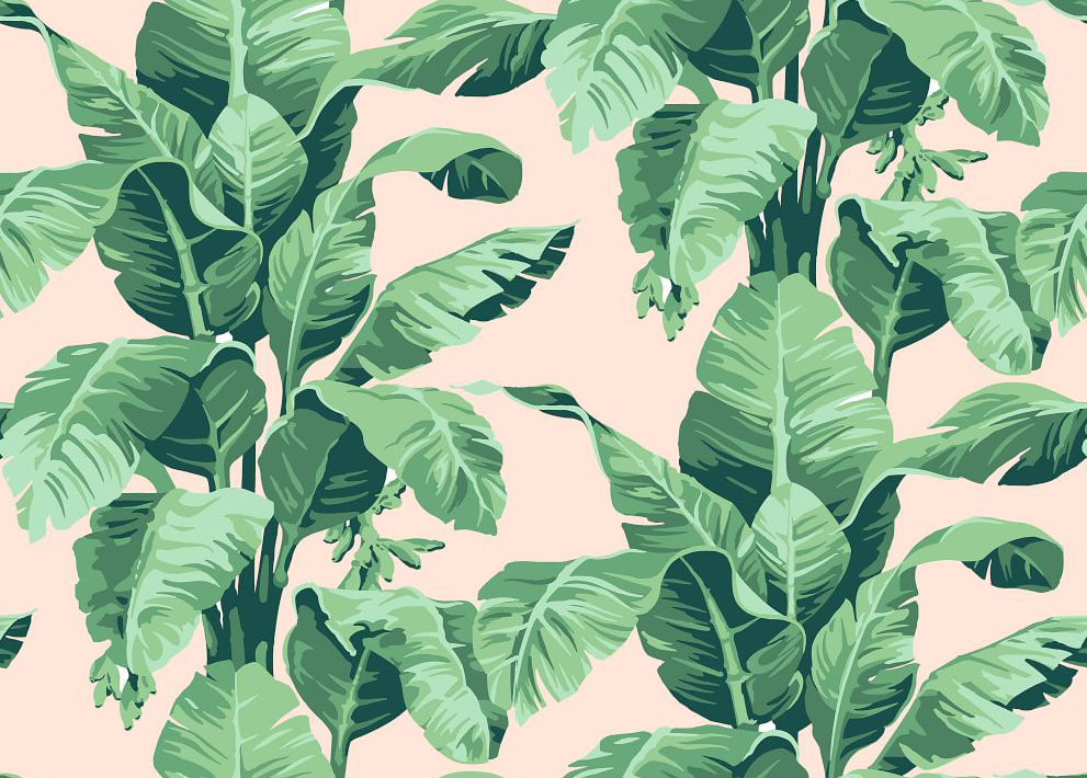
background: center / auto repeat url("/local/wallpaper/bananaleaf.png") fixed
resources:
  - type: module
    url: /local/mini-media-player-bundle.js
  - type: js
    url: /local/clock-card.js
  - type: js
    url: /local/moment.js
  - type: js
    url: /local/slider-entity-row.js
  - type: js
    url: /local/card-tools.js
  - type: js
    url: /local/card-modder.js
  - type: module
    url: /local/button-card.js
title: Guice-Tyrsen
views:
  - badges: []
    cards:
      - cards:
          - card:
              type: 'custom:clock-card'
            style:
              border-radius: 10px
              box-shadow: '0px 5px 5px rgba(0,0,0,0.3)'
            type: 'custom:card-modder'
        type: horizontal-stack
      - type: vertical-stack
        cards:
          - card:
              entity: weather.dark_sky
              type: weather-forecast
            style:
              border-radius: 10px
              box-shadow: '0px 5px 5px rgba(0,0,0,0.3)'
            type: 'custom:card-modder'
          - card:
              columns: 4
              entities:
                - entity: input_select.house_mode
                  name: Home
                - entity: lock.front_door
                  name: Front Door
                  tap_action:
                    action: toggle
                - entity: device_tracker.cdefda43_d747_4fb8_9425_d88cb46facc0
                  name: Mikael
                - entity: device_tracker.e8b57665_72f6_4c72_bdfc_e5096afd3349
                  name: Angela
              type: glance
            style:
              border-radius: 10px
              box-shadow: '0px 5px 5px rgba(0,0,0,0.3)'
            type: 'custom:card-modder'
      - cards:
          - card:
              entities:
                - entity: light.bar
                  full_row: false
                  icon: 'mdi:glass-cocktail'
                  name: Bar
                  toggle: true
                  type: 'custom:slider-entity-row'
                - entity: light.dining_table
                  full_row: false
                  icon: 'mdi:silverware'
                  name: Dining Table
                  toggle: true
                  type: 'custom:slider-entity-row'
                - entity: light.kitchen_island
                  full_row: false
                  icon: 'mdi:fridge-outline'
                  name: Kitchen Island
                  toggle: true
                  type: 'custom:slider-entity-row'
                - entity: light.living_room_ambiance
                  full_row: false
                  icon: 'mdi:white-balance-iridescent'
                  name: Ambiance
                  toggle: true
                  type: 'custom:slider-entity-row'
              show_header_toggle: false
              title: Lights
              type: entities
            style:
              border-radius: 10px
              box-shadow: '0px 5px 5px rgba(0,0,0,0.3)'
            type: 'custom:card-modder'
          - type: horizontal-stack
            cards:
              - card:
                  entity: input_boolean.living_room_candles
                  icon: 'mdi:candle'
                  name: Candles
                  color_type: icon
                  size: 50%
                  color: '#af6a71'
                  color_off: '#f1d6c8'
                  style:
                    - font-size: 14px
                  tap_action:
                    action: toggle
                  theme: palms_off_card
                  type: 'custom:button-card'
                style:
                  border-radius: 10px
                  overflow: hidden
                  box-shadow: '0px 5px 5px rgba(0,0,0,0.3)'
                type: 'custom:card-modder'
              - card:
                  entity: input_boolean.living_room_tv
                  icon: 'mdi:television'
                  name: TV
                  color_type: icon
                  size: 50%
                  color: '#af6a71'
                  color_off: '#f1d6c8'
                  style:
                    - font-size: 14px
                  tap_action:
                    action: toggle
                  type: 'custom:button-card'
                style:
                  border-radius: 10px
                  overflow: hidden
                  box-shadow: '0px 5px 5px rgba(0,0,0,0.3)'
                type: 'custom:card-modder'
          - cards:
              - card:
                  entity: script.scene_upstairs_cozy
                  icon: 'mdi:sofa'
                  name: Cozy
                  color_type: card
                  style:
                    - color: '#d8c2ac'
                    - font-size: 14px
                  color_off: 'rgb(35,80,72)'
                  size: 30%
                  tap_action:
                    action: call-service
                    service: script.turn_on
                    service_data:
                      entity_id: script.scene_upstairs_cozy
                  theme: palms_scene_card
                  type: 'custom:button-card'
                style:
                  border-radius: 10px
                  overflow: hidden
                  box-shadow: '0px 5px 5px rgba(0,0,0,0.3)'
                type: 'custom:card-modder'
              - card:
                  entity: script.scene_upstairs_movie_time
                  icon: 'mdi:television'
                  name: Movie Time
                  color_type: card
                  style:
                    - color: '#d8c2ac'
                    - font-size: 14px
                  color_off: 'rgb(35,80,72)'
                  size: 30%
                  tap_action:
                    action: call-service
                    service: script.turn_on
                    service_data:
                      entity_id: script.scene_upstairs_movie_time
                  theme: palms_scene_card
                  type: 'custom:button-card'
                style:
                  border-radius: 10px
                  overflow: hidden
                  box-shadow: '0px 5px 5px rgba(0,0,0,0.3)'
                type: 'custom:card-modder'
            type: horizontal-stack
          - cards:
              - card:
                  entity: script.scene_upstairs_cocktail_time
                  icon: 'mdi:glass-cocktail'
                  name: Cocktail Time
                  color_type: card
                  style:
                    - color: '#d8c2ac'
                    - font-size: 14px
                  color_off: 'rgb(35,80,72)'
                  size: 30%
                  tap_action:
                    action: call-service
                    service: script.turn_on
                    service_data:
                      entity_id: script.scene_upstairs_cocktail_time
                  theme: palms_scene_card
                  type: 'custom:button-card'
                style:
                  border-radius: 10px
                  overflow: hidden
                  box-shadow: '0px 5px 5px rgba(0,0,0,0.3)'
                type: 'custom:card-modder'
              - card:
                  entity: script.scene_upstairs_bright
                  icon: 'mdi:lightbulb-on'
                  name: Bright
                  color_type: card
                  style:
                    - color: '#d8c2ac'
                    - font-size: 14px
                  color_off: 'rgb(35,80,72)'
                  size: 30%
                  tap_action:
                    action: call-service
                    service: script.turn_on
                    service_data:
                      entity_id: script.scene_upstairs_bright
                  theme: palms_scene_card
                  type: 'custom:button-card'
                style:
                  border-radius: 10px
                  overflow: hidden
                  box-shadow: '0px 5px 5px rgba(0,0,0,0.3)'
                type: 'custom:card-modder'
            type: horizontal-stack
        type: vertical-stack
      - type: vertical-stack
        cards:
          - type: horizontal-stack
            cards:
              - card:
                  entity: switch.outdoor_fountain
                  icon: 'mdi:fountain'
                  name: Fountain
                  color_type: icon
                  size: 30%
                  color: '#af6a71'
                  color_off: '#f1d6c8'
                  style:
                    - font-size: 14px
                  tap_action:
                    action: toggle
                  theme: palms_off_card
                  type: 'custom:button-card'
                style:
                  border-radius: 10px
                  overflow: hidden
                  box-shadow: '0px 5px 5px rgba(0,0,0,0.3)'
                type: 'custom:card-modder'
          - type: horizontal-stack
            cards:
              - card:
                  entity: group.outdoor_lights
                  icon: 'mdi:spotlight-beam'
                  name: Garden
                  color_type: icon
                  size: 30%
                  color: '#af6a71'
                  color_off: '#f1d6c8'
                  style:
                    - font-size: 14px
                  tap_action:
                    action: toggle
                  type: 'custom:button-card'
                style:
                  border-radius: 10px
                  overflow: hidden
                  box-shadow: '0px 5px 5px rgba(0,0,0,0.3)'
                type: 'custom:card-modder'
              - card:
                  entity: switch.outdoor_patio
                  icon: 'mdi:lightbulb'
                  name: Patio
                  color_type: icon
                  size: 30%
                  color: '#af6a71'
                  color_off: '#f1d6c8'
                  style:
                    - font-size: 14px
                  tap_action:
                    action: toggle
                  theme: palms_off_card
                  type: 'custom:button-card'
                style:
                  border-radius: 10px
                  overflow: hidden
                  box-shadow: '0px 5px 5px rgba(0,0,0,0.3)'
                type: 'custom:card-modder'
              - card:
                  entity: switch.outdoor_seating_area
                  icon: 'mdi:lightbulb'
                  name: Seating
                  color_type: icon
                  size: 30%
                  color: '#af6a71'
                  color_off: '#f1d6c8'
                  style:
                    - font-size: 14px
                  tap_action:
                    action: toggle
                  theme: palms_off_card
                  type: 'custom:button-card'
                style:
                  border-radius: 10px
                  overflow: hidden
                  box-shadow: '0px 5px 5px rgba(0,0,0,0.3)'
                type: 'custom:card-modder'
          - type: 'custom:card-modder'
            style:
              border-radius: 10px
              overflow: hidden
              background-color: '#ec9ba3'
              color: white
              font-family: Avenir-Black
              letter-spacing: 10px
              font-size: 15px
              margin-bottom: '-220px'
              padding-bottom: 200px
              box-shadow: '0px 5px 5px rgba(0,0,0,0.3)'
            card:
              type: markdown
              content: <center><h2>OFFICE</h2></center>
          - type: horizontal-stack
            cards:
              - card:
                  entity: light.conference_room
                  icon: 'mdi:lamp'
                  name: Conference Room
                  color_type: icon
                  size: 30%
                  color: '#af6a71'
                  color_off: '#f1d6c8'
                  style:
                    - font-size: 14px
                  tap_action:
                    action: toggle
                  type: 'custom:button-card'
                style:
                  border-radius: 10px
                  overflow: hidden
                  margin-left: 10px
                  margin-right: 2px
                  box-shadow: '0px 5px 5px rgba(0,0,0,0.3)'
                type: 'custom:card-modder'
              - card:
                  entity: switch.nucontext_sign
                  icon: 'mdi:lightbulb'
                  name: NC Sign
                  color_type: icon
                  size: 30%
                  color: '#af6a71'
                  color_off: '#f1d6c8'
                  style:
                    - font-size: 14px
                  tap_action:
                    action: toggle
                  theme: palms_off_card
                  type: 'custom:button-card'
                style:
                  border-radius: 10px
                  overflow: hidden
                  margin-left: 2px
                  margin-right: 10px
                  box-shadow: '0px 5px 5px rgba(0,0,0,0.3)'
                type: 'custom:card-modder'
          - style:
              border-radius: 10px
              overflow: hidden
              margin-left: 10px
              margin-right: 10px
              box-shadow: '0px 5px 5px rgba(0,0,0,0.3)'
            type: 'custom:card-modder'
            card:
              type: entities
              entities:
                - input_select.office_mode
      - cards:
          - type: conditional
            conditions:
              - entity: media_player.upstairs_speakers
                state: playing
            card:
              style:
                border-radius: 10px
                box-shadow: '0px 5px 5px rgba(0,0,0,0.3)'
                overflow: hidden
              type: 'custom:card-modder'
              card:
                type: entities
                entities:
                  - card:
                      entity: media_player.spotify
                      artwork: full-cover
                      hide:
                        volume: true
                        power: true
                        source: true
                        icon: true
                        controls: true
                        info: true
                        name: true
                      type: 'custom:mini-media-player'
                    style:
                      border-radius: 10px
                      box-shadow: '0px 5px 5px rgba(0,0,0,0.3)'
                      overflow: hidden
                    type: 'custom:card-modder'
                  - type: 'custom:mini-media-player'
                    entity: media_player.upstairs_speakers
                    max_volume: 50
                    group: true
                    hide:
                      power: true
                      mute: true
                      progress: true
                      volume: true
                      icon: true
                    shortcuts:
                      columns: 1
                      buttons:
                        - id: 'spotify:album:5CvI10y16ATzPfGt7SUhFH'
                          name: Sam Cooke At The Copa
                          type: playlist
                        - id: 'spotify:album:2m0W0n7zBYmRNs1QAgoa6Z'
                          name: Frank Sinatra At The Sands
                          type: playlist
                        - id: 'spotify:user:kickr:playlist:0yu8kQRLyh8wlnDJwWkH20'
                          name: Mexico Feels
                          type: playlist
                        - id: 'spotify:user:kickr:playlist:7LeMOhUgvoF9U8U7jFRwGM'
                          name: Hollywood Chill
                          type: playlist
                        - id: 'spotify:album:1k39wDj3JzRzt80EIPUyUR'
                          name: Julie London
                          type: playlist
                  - type: 'custom:mini-media-player'
                    artwork: none
                    entity: media_player.upstairs_speakers
                    icon: 'mdi:speaker'
                    max_volume: 50
                    group: true
                    hide:
                      info: true
                      controls: true
                      power: true
                      mute: true
                      progress: true
        type: vertical-stack
      - style:
          border-radius: 10px
          box-shadow: '0px 5px 5px rgba(0,0,0,0.3)'
        type: 'custom:card-modder'
        card:
          type: shopping-list
          title: Shopping List
    icon: ''
    path: default_view
    title: Home

Background:

22 Likes

Looks very nice, love the roundings. Thanks for sharing!

Looks great, love the colors!
Great work!

Very interesting solutions and a nice look.
I especially like the highlighted lighting “card” in the middle.

Two tips.

Since Home Assistant 0.88, there’s a theme variable called ha-card-border-radius which can replace border-radius in card-modder, and in 0.89 there will be a ha-card-box-shadow, so you won’t need card moder at all for most of your cards.

An alternative way of making the “OFFICE” card is to put cards in an entities card. You do this by pretending that the card is a custom entity row with the name hui-<card name>-card (or just use the normal name if it’s a custom card), so you can do e.g.

type: entities
entities:
  - type: custom:hui-horizontal-stack-card
    cards:
      - type: custom:button-card
        ...etc...
  - type: custom:hui-entities-card
    entities:
      - input_select.office_mode
2 Likes

Thank you Thomas!

Awesome! That will help clean up my code A LOT and save me time when I edit/add new things.

Sweet, I am going to try out the new office card trick right away!

nice theme!
i’m curious about the ‘drinks’ tab :slight_smile:

Loving the theme! I did notice however that the wallpaper you’re using is a JPG with rather a lot of compression. It seems from the code you posted that you are using a PNG locally, any chance to upload that somewhere? Will make it look even better :slight_smile:

I have an iPad Pro as a remote controller that is located next to my bar, so I made a nice drink page to store all my house cocktails :slight_smile:

4 Likes

I put it on dropbox for you:

Dropbox - Error - Simplify your life

Thanks that’s awesome! I took the liberty to update the theme as per @thomasloven his suggestions since 0.89 came out today:

palms:
  # General
  primary-color: "#ec9ba3"
  accent-color: "#ddadb2"
  dark-primary-color: var(--accent-color)
  light-primary-color: var(--accent-color)
  # Cards
  ha-card-border-radius: "10px"
  ha-card-box-shadow: "0px 5px 5px rgba(0,0,0,0.3)"
  ### Text ###
  primary-text-color: "#aa8674"
  secondary-text-color: var(--accent-color)
  text-primary-color: "#ffffff"
  disabled-text-color: "#efdfd8"
  # Switches
  paper-toggle-button-checked-button-color: var(--paper-card-background-color)
  paper-toggle-button-checked-bar-color: var(--primary-color)
  paper-toggle-button-checked-ink-color: var(--primary-color)
  paper-toggle-button-unchecked-button-color: var(--paper-card-background-color)
  paper-toggle-button-unchecked-bar-color: "#e2c6c8"
  paper-toggle-button-unchecked-ink-color: "#e2c6c8"
  # Paper card
  paper-card-header-color: var(--accent-color)
  paper-card-background-color: "rgba(252,244,240,0.97)"
  paper-dialog-background-color: var(--paper-card-background-color)
  paper-item-icon-color: "#e5b3b8"
  paper-item-icon-active-color: "#af6a71"
  paper-item-icon_-_color: "red"
  paper-item-selected_-_background-color: "red"
  paper-tabs-selection-bar-color: "red"
  paper-listbox-background-color: var(--primary-background-color)
  ### Sliders ###
  paper-slider-knob-color: "#ec9ba3"
  paper-slider-knob-start-color: var(--paper-slider-knob-color)
  paper-slider-pin-color: var(--paper-slider-knob-color)
  paper-slider-active-color: var(--paper-slider-knob-color)
  paper-slider-secondary-color: "#ec9ba3"
  paper-slider-container-color: var(--disabled-text-color)
  paper-slider-disabled-active-color: var(--disabled-text-color)
  paper-slider-disabled-secondary-color: var(--disabled-text-color)

This eliminates the need for card-modder :slight_smile:

1 Like

Wow! This is a very nice theme. Good Job!!!

Hello,
I realy like your theme, so I try to using it.
I do have a problem with the clock-card code.
I have this error in the browser.
Uncaught SyntaxError: Unexpected token :
Any idea? I’m realy new with this…

Tks!

@tyrsen Great looking theme love the simplicity of your cards but the colours work really well together.

Thanks for sharing

I really like your clock card but I am having a problem getting it to show the correct date and time without refreshing the browser (F5).

This only seems to be a problem on my main tab so I wonder if there is some kind of conflict with compact-custom-header?

My error log shows:

Log Details (ERROR)
Mon Apr 01 2019 09:42:55 GMT+0100 (British Summer Time)
http://192.168.1.25:8123/customcards/lovelace_cards/clock-card.js:75:12 Uncaught ReferenceError: moment is not defined

My config is:

  # Clock card - see https://community.home-assistant.io/t/palm-springs-theme/103533
  - url: /customcards/lovelace_cards/clock-card.js
    type: js

  # moment.js - for use with Clock card - see https://momentjs.com/
  - url: /customcards/lovelace_cards/moment.js
    type: js

Any ideas?

I have noticed the same problem

any resolution to this?

Not here.
I’ve stopped using it…

replace content to
/config/www/clock-card.js

class ClockCard extends Polymer.Element {
  set hass(hass) {
    if (!this.content) {
      const card = document.createElement('ha-card');
      card.header = 'Example card';
      this.content = document.createElement('div');
      this.content.style.padding = '0 16px 16px';
      card.appendChild(this.content);
      this.appendChild(card);
    }

    //const entityId = this.config.entity;
    //const state = hass.states[entityId];
    //const stateStr = state ? state.state : 'unavailable';
    const stateTime = moment().format('h:mm A');
    const stateDate = moment().format('dddd, MMMM DD');
    this.content.innerHTML = `
          <style>
        :host {
          cursor: pointer;
        }
        .content {
          padding: 24px 16px;
          display:flex;
        }
        .gtlogo{
	        background-image: url("/local/images/gt-logo.png");
		    background-size: contain;
		    background-repeat: no-repeat;
		    width:92px;
        }
        .time {
          font-family: var(--paper-font-headline_-_font-family);
          -webkit-font-smoothing: var(--paper-font-headline_-_-webkit-font-smoothing);
          font-size: 3em;
          font-weight: var(--paper-font-headline_-_font-weight);
          letter-spacing: var(--paper-font-headline_-_letter-spacing);
          line-height: 1em;
          text-rendering: var(--paper-font-common-expensive-kerning_-_text-rendering);
        }
        .date {
	      color: var(--accent-color);
          font-family: var(--paper-font-headline_-_font-family);
          -webkit-font-smoothing: var(--paper-font-headline_-_-webkit-font-smoothing);
          font-size: 1.3em;
          font-weight: var(--paper-font-headline_-_font-weight);
          letter-spacing: var(--paper-font-headline_-_letter-spacing);
          line-height: var(--paper-font-headline_-_line-height);
          text-rendering: var(--paper-font-common-expensive-kerning_-_text-rendering);
        }
      </style>
      <ha-card>
        <div class="content">
	      <div class="gtlogo"></div>
	      <div class="clock">
		    <div class="time" id="time">${stateTime}</div>
		    <div class="date" id="date">${stateDate}</div>
	      </div>
        </div>
      </ha-card>
    `;
  }

  setConfig(config) {
    if (!config.entity) {
      throw new Error('You need to define an entity');
    }
    this.config = config;
  }

  // The height of your card. Home Assistant uses this to automatically
  // distribute all cards over the available columns.
  getCardSize() {
    return 3;
  }
}

customElements.define('clock-card', ClockCard);
1 Like

For the clock card, what do you use for an entity? I am new to custom cards and need some pointers.

I have created the clock-card.js and moment.js in their directories and call them as resources in my ui-lovelace.yaml but I get a message saying “You need to define an entity”

Thanks

Hi,

I just switched from OpenHAB to HA and it is so great how convenient HA is.

And now this theme, adding 150% WAF.

Great!

:smile: