I second this
Perfick,
Thanks for your input, I understand exactly now
Its a great card and I love the simplistic look.
Thank you
1 Like
Hi, first nice work !
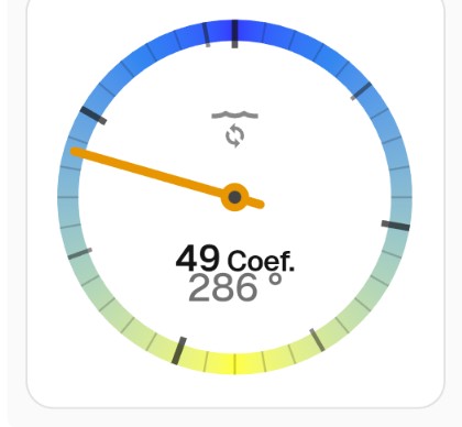
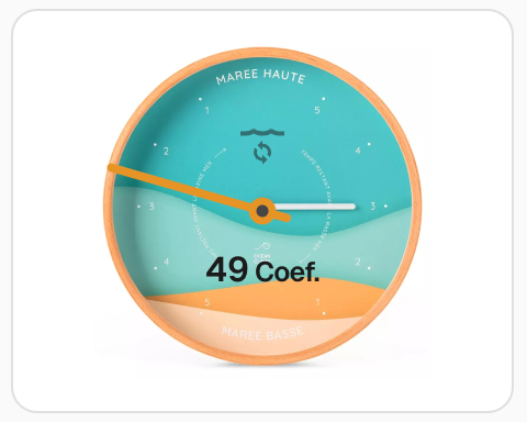
I am trying to get the card to simulate a tide clock such as
Marker is the angle 0-360 of tide (0 is high tide, 90 is decreasing tide , 180 is low tide and 270 is increasing tide).
So far I manage to get it working except the thicks : I can get them to be at 0°, 90°, 180° and 270°
type: custom:ring-tile
ring_type: closed
ring_size: 3
ring_entity: sensor.maree_position
entity: sensor.maree_tendance
indicator: pointer
max_decimals: 0
max: 360
bottom_element: ring_value_with_unit
ring_only: true
colour:
“0”: blue
“180”: yellow
“360”: blue
scale: ticks
tweaks:
rt-ring-background-opacity: 80%
Thanks @FredBaker! Hey - that’s a great use case, not one I had thought of before.
Unfortunately, I don’t have a solution to give you exactly what you’re looking for - the scale tick algorithm is trying to find the nearest 1, 2 or 5 (multiplied by nearest order of magnitude), which means its not optimised for 360°.
I can suggest a slightly hacky alternative approach that might interest you - although it’s not exactly what you’re looking for. ring_type: compass is designed for 360°, so you can use that to your advantage. But it doesn’t have the full set of options (eg scale colouring).
type: custom:ring-tile
ring_type: compass
ring_size: 3
entity: sensor.maree_tendance
ring_entity: sensor.maree_position
marker: sensor.maree_position
compass_marker: arrow_out
max_decimals: 0
top_element: icon
colour:
  0: blue
  180: yellow
  360: blue
card_mod:
  style: |
    * {
      --rt-marker-colour: var(--rt-indicated-colour);
    }

The card_mod code applies the high / low tide colouring to the marker colour.
Let me know what you think; I’ll have a think about what changes I could make to better suit your use case - open to ideas.
Thanks for your prompt response
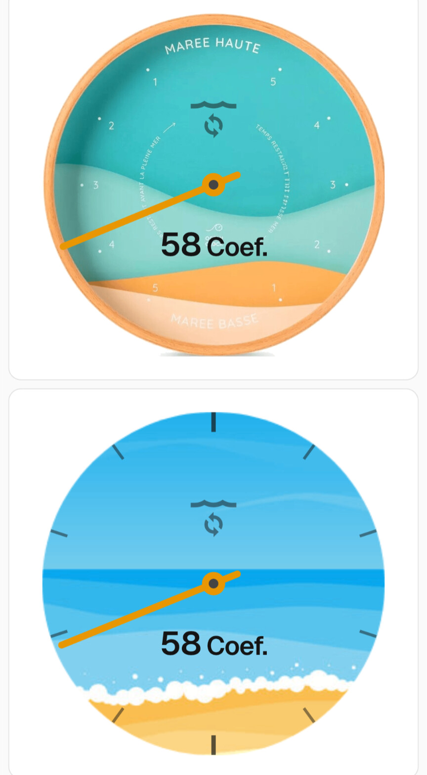
I started to use compass at the beginning, but color was one of the goal (blue : water, yellow : sand).
Otherwise I need to find a way to get a background with the colors, ticks in SVG so it will be resizable…
But before trying it, is it even possible to get a background and only use the pointer of your card (ring_type: none) ?
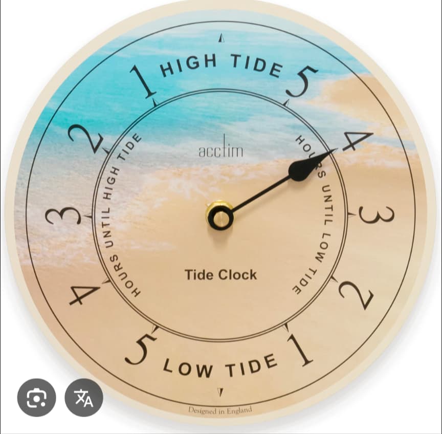
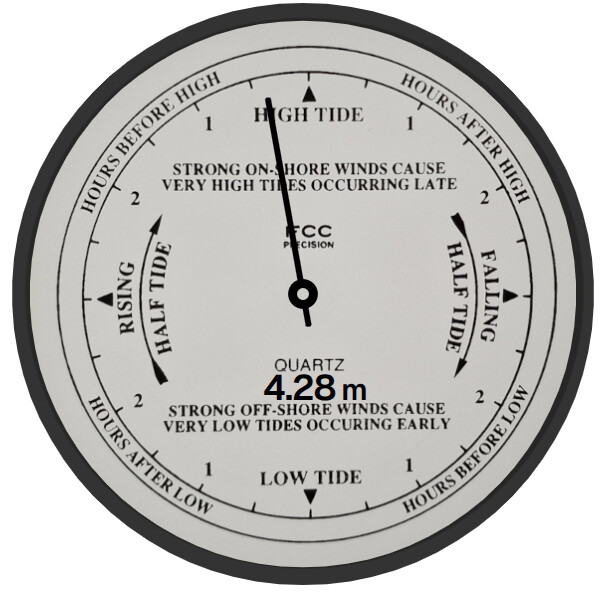
Background model based on this clock for exemple :
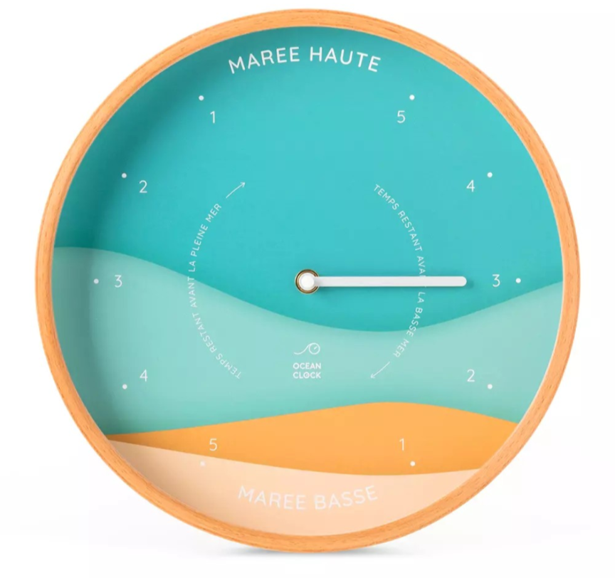
With a bit of card_mod hackery, anything is possible! Here are a couple of options. This assumes you copy your background image as tides.png to your www folder in your HA config path.
You could add an image as background behind ring-tile card by adding the following card_mod code:
...
card_mod:
  style: |
    * {
      --rt-marker-colour: var(--rt-indicated-colour);
    }
    rt-ring-svg {
      background-image: url(/local/tides.png);
      background-size: cover;
      background-position: center;
    }
Or you could strip it back to just the basics (this is harder than it needs to be because ring_type: none has a small issue I’ve just discovered):
type: custom:ring-tile
ring_type: compass
ring_size: 3
entity: sensor.maree_tendance
ring_entity: sensor.maree_position
max_decimals: 0
top_element: icon
bottom_element: none
indicator: pointer
max: 360
colour:
  "0": blue
  "180": yellow
  "360": blue
card_mod:
  style:
    '*': |
      rt-ring-svg {
        background-image: url(/local/tides.png);
        background-size: cover;
        background-position: center;
      }
    rt-ring-svg $: |
      .ring {
        visibility: hidden
      }
Lots of possibilities! I’m curious to hear what you decide to do!
3 Likes
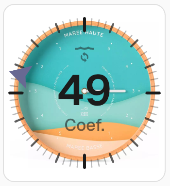
Great Thanks ! Sounds promising…
So far I failed to get it working : does the png file needs to be at a specified size ?
PS Mine does display perfectly on a simple image card.
type: picture
image:
  media_content_id: /local/Tides282.png
No size requirement - background-size: cover will scale the image to fit within the ring. Hard to guess why it’s not working for you without seeing the config.
Make sure you use a code block delimiter (three backticks ```) before and after your code when sharing.
So for those who did not realize like le, you need to install card-mod in order to work 
Thanks, I will tweak those a little more but so far I’m pleased with their renders
2 Likes
Looking good - glad you figured it out!
BTW, I’ve captured a few GitHub issues to look at how to support your use case better (#69, #70, #71). Usual disclaimer: none of this will happen quickly!
2 Likes
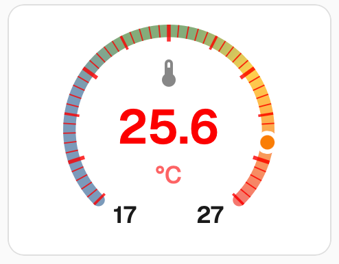
hi. is it possible to change the opacity and color of the ticks? the somewhat grey colour can sometimes wash into a coloured background.
Hi, thanks for a great card. Liked the idea from “FredBaker”, so replicated my mechanical tide clock.
type: custom:ring-tile
entity: sensor.current_tide
name: Hgt
ring_entity:
  entity: sensor.current_tide
  attribute: percentage
ring_type: closed
ring_size: 6
indicator: pointer
ring_only: false
scale: none
top_element: none
middle_element: value_with_unit
bottom_element: none
min: 0
max: 200
max_decimals: 2
card_mod:
  style:
    rt-ring-svg $: |
      * {
        --rt-pointer-colour: #000000; /* Black */
        --rt-ring-colour: #000000; /* Black */
        --rt-ring-background-opacity: 80%;
      }
      line.pointer {
        stroke-width: 1;
        transform: scale(1, 0.70);
        transform-origin: 50% 50%;
      }
      circle.pointer {
        r: 2;
      }
      circle.pointer-centre {
        r: 1;
        fill: #d0cdc8;
      }
      text.lower-middle {
        transform: translate(2px, -2.8px);
        font-size: 6px;
        color: #000000;
      }
      text.lower-middle tspan {
        font-size: 5px;
      }
      #cut-outs-ring-grad path {
        stroke-width: 3;
      }
    .: |
      rt-ring-svg {
        background-image: url(/local/tide_2_600px.png);
        background-size: cover;
        background-position: center;
      }
1 Like
Hi @kexan82, there’s nothing built in to change colour and opacity of the ticks, but if you have card_mod installed, you can do it.
type: custom:ring-tile
entity: sensor.outside_temperature
ring_size: 3
scale: ticks
card_mod:
  style:
    rt-ring-svg $: |
      .ticks path {
        stroke: red;
        stroke-opacity: 0.8;
      }
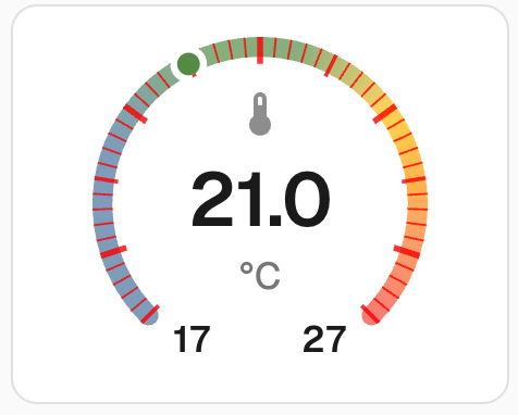
Thanks for sharing @marthepar - that looks awesome!
Thanks! What about the numbers within? How do i target them?
More card_mod. Try this:
type: custom:ring-tile
entity: sensor.outside_temperature
ring_size: 3
scale: ticks
card_mod:
  style:
    rt-ring-svg $: |
      .ticks path {
        stroke: red;
        stroke-opacity: 0.8;
      }
      text.middle {
        color: red;
      }
There’s plenty more tweability. Don’t forget to read the docs (Advanced) and poke around in your favourite browser in developer mode to discover ring_tile card’s DOM - I’ve tried to keep it reasonably easy to navigate.
1 Like
Hi, not sure if your aware, but would recommend replacing card_mod with UI eXtension.
This is a direct replacement to card_mod which is not really being supported with new updates.
Community post on UI Extension can be found here 💡 UI eXtension - Add CSS styles to (almost) any part of the Home Assistant UI
Main web site: https://uix.lf.technology/
2 Likes
I installed the Ring-Tile card and I added the reference to the hacsfiles location in my configuration.yaml, but I don’t see the Ring-Tile card in the card-selection part.
Even after several (system) restarts.
What am I doing wrong ?
Thanks for the great work on this card !
Would you consider to have more scaling options to the ring_size as the steps in size are quite big. Would love to add the five on a row similar as the buttons shown above (3 ringtiles=size 2, 6 ringtiles=size 1) but to allow for 1,2,3,4,5,6 in a section would be great.
This would greatly help showing these on wall displays.
Furthermore I second the percentage to be shown for a light.
Hi @marthepar - thanks for the tip-off. I hadn’t heard about UIX. Looks like a super cool project. I haven’t yet had a chance to investigate, but I get your point - I’ll do some testing, then shift docs from card_mod to UIX (#72). Curious in the meantime if anyone has good / bad news stories about using UIX with ring-tile card.
Sorry @Pjotr500 - it’s a bit hard to guess what might be going wrong with not much information about what you’ve done so far. All I can suggest is to carefully follow the installation docs.
Hi @GH2user - no worries and thanks!
As noted in an earlier post, I’m reluctant to add more configuration complexity - keeping things clean and simple is an important design principle for me.
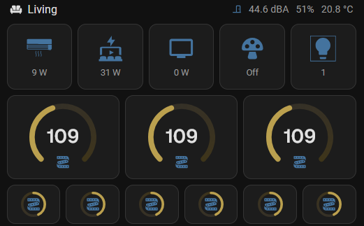
Sizing is currently based around the in-built tile card and the standard HA grid, which was introduced a couple of years ago. While this meant some of my dashboards needed updating at the time to fall into line with the standard grid, I’ve since found it works well. For example, here is my current wall display - I’ve been able to accommodate a mix of sizes by sticking with the HA grid.

Having said that, if you really do want to mess around with sizes, you have a couple of options.
Firstly, the dimensions of the tile can be manipulated by the built-in grid_options config. This config block is used by HA when you access the “Layout” tab for cards with a visual editor. grid_options has some undocumented options that are not shown in the visual editor.
grid_options:
  columns: 6
  min_columns: 3
  max_columns: 9
Also for rows. Even better, you can use fractional values (eg 2.5) to really fine tune.
Secondly, you can control the scaling of the ring itself, using an advanced ring-tile card config tweaks option.
ring_size: 3
tweaks:
  rt-ring-svg-size: 120px
Lastly - thanks everyone for your patience. I haven’t had any time for coding in the last few months. I do plan to work through the many great ideas you have given me, but my time is not looking promising for a while yet.
3 Likes
thanks for the extensive response. Thanks for the hint on the grid-card usage, should have tried that earlier.
And no rush for anything, work and personal live always have priority but good you mention it so expectations are managed.
1 Like