Some examples of using "::before", "::after" & "content":
Note: may be used with many Lovelace cards (I hope).
NOTE:
Do not forget to add a "card_mod:" keyword before "style:" (new in card-mod 3).
Prefix & suffix:
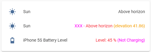
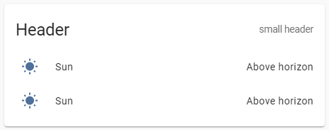
type: entities
entities:
  - entity: sun.sun
  - entity: sun.sun
    style:
      hui-generic-entity-row $: |
        .text-content:not(.info) {
          color: red;
        }
        .text-content:not(.info)::before {
          content: "XXX - ";
          color: magenta;
        }
        .text-content:not(.info)::after {
          content: " (elevation {{state_attr(config.entity,'elevation')}})";
          color: orange;
        }
  - entity: sensor.iphone_5s_battery_level
    card_mod:
      style:
        hui-generic-entity-row $: |
          .text-content:not(.info) {
            color: red;
          }
          .text-content:not(.info)::before {
            content: "Level: ";
            color: red;
          }
          .text-content:not(.info)::after {
            content: " ({{states('sensor.iphone_5s_battery_state')}})";
            color: magenta;
          }
+ undocumented feature for "secondary_info":
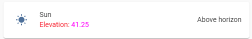
type: entities
entities:
  - entity: sun.sun
    secondary_info: true
    style:
      hui-generic-entity-row:
        $: |
          .info .secondary {
            color: red;
          }
          .info .secondary::before {
            content: "Elevation: ";
            color: red;
          }
          .info .secondary::after {
            content: "{{state_attr(config.entity,'elevation')}}";
            color: magenta;
          }
“Undocumented” means that you can use also "secondary_info: bla_bla_bla" instead of "secondary_info: true", it will create a "div" element anyway.
Math operations:

type: entities
entities:
  - entity: sensor.cleargrass_1_co2
    style:
      hui-generic-entity-row $: |
        .text-content:not(.info) {
          color: red;
        }
        .text-content:not(.info)::before {
          content: "{{states(config.entity)|int/10}} (divided), ";
          color: magenta;
        }
Replacing a value:
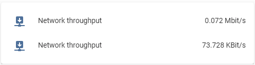
For the Entities card it is enough to set a transparent color for the element keeping the state:
type: entities
entities:
  - entity: sensor.network_throughput_in_eth0_mbits
    name: Network throughput
  - entity: sensor.network_throughput_in_eth0_mbits
    name: Network throughput
    style:
      hui-generic-entity-row $: |
        .text-content:not(.info)::after {
          content: "{{states(config.entity)|float*1024}} KBit/s";
          color: var(--primary-text-color);
        }
        .text-content:not(.info) {
          color: transparent;
        }
But for the Glance card I have to set a zero font-size:

type: glance
entities:
  - entity: sensor.network_throughput_in_eth0_mbits
    name: Network throughput
  - entity: sensor.network_throughput_in_eth0_mbits
    name: Network throughput
    style: |
      :host div:not(.name)::after {
        content: "{{states(config.entity)|float*1024}} KBit/s";
        font-size: var(--mdc-typography-body1-font-size, 1rem);
      }
      :host div:not(.name) {
        font-size: 0px;
      }
One more example for “input_boolean” entity:

type: glance
entities:
  - entity: input_boolean.test_boolean
    name: default
  - entity: input_boolean.test_boolean
    name: modded
    style: |
      :host div:not(.name)::after {
        content: "{% if is_state(config.entity,'on') -%}
                  switched ON
                  {%- else -%}
                  switched OFF
                  {%- endif %}";
        font-size: var(--mdc-typography-body1-font-size, 1rem);
      }
      :host div:not(.name) {
        font-size: 0px;
      }
For "multiple-entity-row" it is much tricky:

The original value must be transparent & placed on the next line whose height must be set to 0px:
type: entities
entities:
  - type: 'custom:multiple-entity-row'
    style: |
      .entities-row div.entity:nth-child(1) div::before {
        color: orange;
        content: {%if is_state('sun.sun','above_horizon') -%} "Rise and shine\A" {%- else -%} "Sleep well\A" {%- endif %};
        line-height: var(--mdc-typography-body1-line-height, 1.5rem);
      }
      .entities-row div.entity:nth-child(1) div {
        color: transparent;
        line-height: 0px;
      }
    entity: sun.sun
    entities:
      - entity: sun.sun
        name: xxx
        styles:
          width: 60px
      - entity: sun.sun
        name: xxx
        styles:
          width: 60px
    unit: ''
    icon: ''
    toggle: false
    show_state: false
    state_header: ''
    state_color: false
For badges inside "picture-elements" card:
This trick may be useful since there is no possibility to display any text for the entity’s name (BTW, for badges displayed on the top of views this possibility is present - a “name” property).
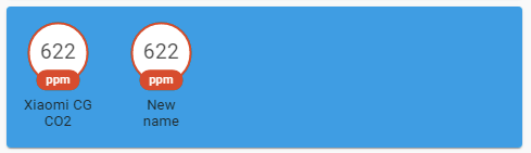
type: picture-elements
image: /local/images/blue.jpg
style: |
  ha-card { height: 130px !important; }
elements:
  - type: state-badge
    entity: sensor.cleargrass_1_co2
    style:
      top: 18%
      left: 10%
  - type: state-badge
    entity: sensor.cleargrass_1_co2
    style:
      top: 18%
      left: 30%
    card_mod:
      style:
        ha-state-label-badge:
          $:
            ha-label-badge:
              $:
                .badge-container: |
                  .title {
                    color: transparent;
                    line-height: 0px !important;
                  }
                  .title::before {
                    color: var(--primary-text-color);
                    content: "New name\A";
                    line-height: normal;
                  }
For icons inside “picture-elements” card:

Described here.
custom:multiple-entity-row:
How to display "last-changed" for items:
described here
custom:mini-graph-card:
How to display an additional info on the card:

described here
Any card with a title:
How to add a small header:
described here
More examples are described here.