Lovelace: Button card

With the release of 2022.11, cards (buttons) are now outlined rather than shadowed. All of my custom buttons now look terrible due to the stacking configuration. Extract from release notes.

The default dashboard theme has been adjusted to move a little closer to the new Material Design 3 guidelines. Borders around cards are now outlined (instead of having a shadow), and corners are a little more rounded.

I gather that Card Mod is the best solution to remove the border?

    style: |
      ha-card {
        border: none; box-shadow: none;
      }
1 Like

or add to the theme:

  ha-card-border-width: 0px
  ha-card-box-shadow: none
3 Likes

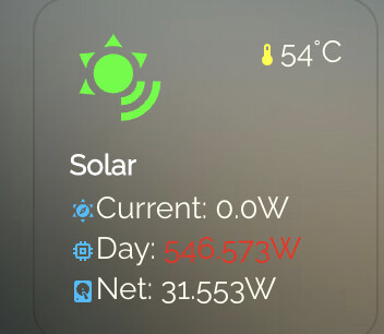
Trying to create a button that shows basic solar info. Stole a format normally used for system monitoring and adapting, but stumbling on issue with rounding. Prefer to have rounded to full watts and in some cases divide by 1000 to create KWH . How do I add this to the template? Rounding and or creating KWH from watts.

Screen Shot 2022-11-06 at 17.36.54

aspect_ratio: 1/1
custom_fields:
  solarc: |
    [[[
      return `<ha-icon
        icon="mdi:sun-compass"
        style="width: 12px; height: 12px; color: deepskyblue;">
        </ha-icon><span>Current: <span style="color: var(--text-color-sensor);">${(states['sensor.benext_solar_electric_production_w'].state) } W</span></span>`
    ]]]
  solari: |
    [[[
      return `<ha-icon
        icon="mdi:memory"
        style="width: 12px; height: 12px; color: deepskyblue;">
        </ha-icon><span>Day: <span style="color: var(--text-color-sensor);">${(states['sensor.solar_generated_new_watts'].state)} W</span></span>`
    ]]]
  solarn: |
    [[[
      return `<ha-icon
        icon="mdi:harddisk"
        style="width: 12px; height: 12px; color: deepskyblue;">
        </ha-icon><span>Net: <span style="color: var(--text-color-sensor);">${states['sensor.solar_net_combined'].state}W</span></span>`
    ]]]
  temp: |
    [[[
      return `<ha-icon
        icon="mdi:thermometer"
        style="width: 12px; height: 12px; color: yellow;">
        </ha-icon><span>${entity.state}°C</span>`
    ]]]
entity: sensor.192_168_1_36_core_0_temperature
icon: mdi:sun-wireless
name: Solar
styles:
  card:
    - background-color: var(--button-card-paper-card-background-color)
    - border-radius: 10%
    - padding: 10%
    - color: ivory
    - font-size: 14px
    - text-transform: capitalize
  custom_fields:
    solarc:
      - padding-bottom: 2px
      - align-self: middle
      - justify-self: start
      - '--text-color-sensor': >-
          [[[ if (states["sensor.benext_solar_electric_production_w"].state >
          80) return "red"; ]]]
    solari:
      - padding-bottom: 2px
      - align-self: middle
      - justify-self: start
      - '--text-color-sensor': >-
          [[[ if (states["sensor.solar_generated_new_watts"].state > 80) return
          "red"; ]]]
    solarn:
      - align-self: middle
      - justify-self: start
      - '--text-color-sensor': >-
          [[[ if (states["sensor.solar_net_combined"].state > 80) return "red";
          ]]]
    temp:
      - align-self: start
      - justify-self: end
  grid:
    - grid-template-areas: '"i temp" "n n" "solarc solarc" "solari solari" "solarn solarn"'
    - grid-template-columns: 1fr 1fr
    - grid-template-rows: 1fr min-content min-content min-content min-content
  icon:
    - color: |
        [[[
          if (entity.state < 60) return 'lime';
          if (entity.state >= 60 && entity.state < 80) return 'orange';
          else return 'red';
        ]]]
    - width: 70%
    - margin-top: '-10%'
  img_cell:
    - justify-content: start
    - align-items: start
    - margin: none
  name:
    - font-weight: bold
    - font-size: 13px
    - color: white
    - align-self: middle
    - justify-self: start
    - padding-bottom: 4px
type: custom:button-card

1 Like

Is possible in javascript template to somehow check and throw error if entity name not exist?

Hi,
with the new update to 2022.11 and its new round edges, suddenly all nested cards do now also have grey outer lines, where before they did not have any (as intended):
grafik
I am talkin about the grey boxes in the corners, those are nested custom button cards that before did not have any lines around them.
Does anyone know an easy fix (without card-mod?!) how to get the previous way of displaying it back again?

sure, check this and use the theme setting under generic to fix that.

or, just read the many posts on that, even in this thread… see eg 4 posts up. :wink:

Thx, have to admit that I missed that when scrolling through and more looking for the pictures.
- border: none
fixed it, also without card-mod

Your generic fix I do not really understand after reading it twice. This needs installation of another project, mod-card, that can change the general layout of all cards as a theme, so reverting the round edges of 2022.11?

no, the mod-card was directed to a special card setup, which after all wasnt required .

the generic fix, is adding this to your theme settings, and be done with it. Using it in the themes, this gets applied it to all cards in HA, and no more individual card settings/mods are required.

I need this more beginner-friendly :slight_smile:
So far I have not done anything with themes.
The help says, you would define themes in the configuration.yaml. with the example

# Example configuration.yaml entry
frontend:
  themes:
    happy:
      primary-color: pink
      text-primary-color: purple
      mdc-theme-primary: plum
    sad:
      primary-color: steelblue

to set up two themes happy/sad.

Would the part in your post

  <<: &generic
    card-mod-theme: theme-mods
    ha-card-border-radius: 0px
    ha-card-border-width: 0px
    ha-dialog-border-radius: var(--ha-card-border-radius)

somehow belong into there (how exactly)? Does the generic mean, that it changes the default/generic layout that is being used without being explicitley defined/selected by me anywhere?

No, you’re right . This is a so-called yaml anchor . Used to copy and paste the same yaml .

For now, just leave that out and use the lines below it, and move it 2 spaces to the left…

Also don’t use the card-mod-theme line if you don’t use those

So that would be adding this to the configuration.yaml?

# Example configuration.yaml entry
frontend:
  themes:
    generic:
      ha-card-border-radius: 0px
      ha-card-border-width: 0px
      ha-dialog-border-radius: var(--ha-card-border-radius)

To remove borders from the generic theme, which is otherwise coded into the core of HA?!

yes, that would do it, and you’d have to select the theme in the profile page, or set it through a service.

note the dialog-border-radius is specifically for the dialog panels, and now inherits the 0px. Personally, I find the new styling way to playful, not business like. So I try to take out those rounded corners everywhere.

If you dont want that, (if you do like the rounded dialogs) just leave that line out.

1 Like

is there a way to get rid of the borders from a button:

I am trying to use it as spacer :slight_smile::

type: custom:button-card
color_type: label-card
styles:
  card:
    - background-color: transparent
tap_action:
  action: null

also how can I make it double the height?

Thanks in advance

never thought it would come to this, but hey, here I am…

after some 5 years of using button-card throughout my entire config, I now see above post… using color_type: label-card

Never spotted that option before. So, naturally intrigued by new possibilities, I tried

   - type: custom:button-card
     color-type: label-card
     name: label

for starters, but cant spot anything particular. Makes me wonder where we should/would use this, as a specific card for labels.

in my config, I have a ‘title’ template taking care of all requirements I have (templated title, action/no-action, styling etc)

what does this label-card do that other options dont offer?

any thoughts why this doesnt work? It works in a standard button card.

type: custom:button-card
show_name: true
show_icon: true
tap_action:
  action: call-service
  service: media_player.media_previous_track
  target:
    entity_id: media_player.basement
icon: mdi:skip-backward
styles:
  card:
    - height: 100px

Untested, but you could try:

tap_action:
  action: call-service
  service: media_player.media_previous_track
  service_data:
    entity_id: media_player.basement

See documentation for the action key.

Hi, I really like the style of this button-card (color, icon etc). Do you have all your Home Assistant with this style? Could you post some screenshots of your dashboard and possibly the yaml code? thank you

Hi,

great work so I first try to use the buton for a liitle special function:

I have a parking heater at my car and only two entities for starting and stopping, so I create a service to start a timer and heating. With the custom button I want to let start and show the timer with this yaml:

      - type: custom:button-card
        entity: timer.timer_car_air_conditioning_30min
        layout: name_state
        show_name: false
        show_icon: true
        show_label: true
        show_state: true
        show_last_changed: false
        icon: mdi:fan
        label: Belüftung<br>Heizung
        state_display: |
          [[[ if (entity.state == "idle") return 'Start' ]]]
        state:
          - value: idle
            color: '#9E9E9EFF'
            border-color: '#9E9E9EFF'
          - value: active
            color: '#4CAF50FF'
            border-color: '#4CAF50FF'
        confirmation:
          text: >-
            [[[ if (entity.state == 'idle') return 'Belüftung bzw. Heizung
            starten?'; else return 'Belüftung bzw. Heizung stoppen?' ]]]
        tap_action:
          action: call-service
          service: script.script_car_air_conditioning_onoff
        styles:
          card:
            - left: 30%
            - top: 5%
            - height: 120px
            - width: 120px
            - line-height: 15px
            - background-color: '#343434FF'
            - border: 2px solid
            - border-radius: 50%
          label:
            - font-size: 0.8em
            - align-self: middle
            - font-weight: normal
            - padding: 10px
          state:
            - font-size: 0.8em
            - font-color: '#9E9E9EFF'
            - align-self: middle
            - font-weight: normal
            - padding: 10px

But I have some problems:

I want the button as a circle but every first start it shows a rectangle. After press the first time it shows a circle. Look here:

Screen_20221123-154018

Screen_20221123-154046

The other point is I want a color change of the border if the state is changed but the border color do not change?

The font-size of state is set to 0.8em like the label but label is 0.8em but state still is bigger and do not change?

Thansk for a little help.
Steffen

First problem is solved:

The border-color is no at styles with script and is working:

        styles:
          card:
            - left: 30%
            - top: 5%
            - height: 100px
            - width: 100px
            - line-height: 15px
            - background-color: '#343434FF'
            - border: 2px solid
            - border-radius: 50%
            - border-color: >-
                [[[ if (entity.state == 'idle') return '#9E9E9EFF'; else return '#4CAF50FF' ]]]

But I do not find a solution why the border-radius is not shown as button first inti and who I can change the font size of the state?

… and maybee there is a solution to turn arount the icon if state ios on? :wink:
Yes, spin: true made this solved too.

But here you can see my main problem. Why first is the button not a circle (play the gif):

ScreenVideo_20221123-193953

Thank you, Steffen

3 Likes

How to remove this title bar showing ( info | settings | related ) for the camera feed popup , i want only the video to show.
image

cards:
          - type: custom:button-card
            entity: camera.dahua_substream2
            show_live_stream: true
            show_name: false            
            size: 100%            
            styles:
              card:
                - height: 155px
                - padding-top: 0px
                - padding-bottom: 0px