no idea, its late, moved it to included, and removed the extra options, didnt solve it though
Already tried changing the code and moving it to each include section, still black
Try this (not checked by myself):
filter:
  include:
    - state: Medium
      options:
        style: |
          :host {
            --paper-item-icon-color: smth;
          }
    - state: Low
      options:
        style: |
          :host {
            --paper-item-icon-color: smth;
          }
    - state: High
      options:
        style: |
          :host {
            --paper-item-icon-color: smth;
          }
or you can use one "include" with "or" option and one "style" (with if & else).
Kind of this (cannot check by myself):
filter:
  include:
    - or:
        state: Medium
        state: Low
        state: High
      sort:
        method: state
        reverse: true
      options:
        style: YOUR_COMPLEX_STYLE_WITH_IF_ELSE
hi
how i make weather card bigger in height ?
type: custom:swipe-card
cards:
  - type: custom:simple-thermostat
    entity: climate.bf6d70bf6a79938e9794fu
    sensors:
      - entity: sensor.temperatura_maia
      - entity: sensor.sonoff_a480001b01_temperature
      - entity: sensor.motion_sensor_air_temperature
      - entity: sensor.sonoff_a480001b01_humidity
    decimals: '1'
    step_layout: row
    header:
      name: Termostato
      icon: mdi:thermometer-lines
    layout:
      mode:
        names: false
    step_size: '1'
    view_layout:
      mode:
        names: false
  - type: weather-forecast
    entity: weather.maia
    card_mod:
      style: |
        ha-card {
          color: red;
          height: 1000px
        }
solved
 card_mod:
      style:
        .: |
          ha-card {
            height: 292px !important;
            #background: teal;
          }
           ha-card .name-state .state {
           #color: red;
           font-size: 16px;
          }
           ha-card .name-state .name {
           #color: blue;
           font-size: 35px;
          }
Is there any way to make the slider knob appear even if it is at the top of the stack?


cards:
  - type: vertical-stack
    cards:
      - type: entities
        entities:
          - input_number.system_startup_event_delay
          - input_number.system_startup_event_delay
1 Like
May cause another issues…

type: vertical-stack
cards:
  - type: entities
    style: |
      ha-card {
        overflow: visible !important;
      }
    entities:
      - entity: input_number.test_number
      - entity: input_number.test_number
      - entity: input_number.test_number
2 Likes
Thanks.
Something for me to work with!
Styling Picture Elements card:
Intro:
Some styling may be done by using a stock "style" options available for the “Picture Elements” card.
In my opinion, the "card-mod" should be used for styling which cannot be achieved with the stock feature, for example:
- for styling of internal parts of elements which cannot be achieved by using CSS variables (like
"--label-badge-text-color"); - for animations;
- for bulk styling of many elements;
- for elements which are custom cards.
Colored background & rounded corners:

Code
type: picture-elements
title: colored background + rounded corners
style: |
  ha-card {
    height: 200px !important;
    --ha-card-background: red;
    --ha-card-border-radius: 20px;
  }
elements:
  - type: state-badge
    entity: sensor.cleargrass_1_co2
    style:
      top: 18%
      left: 10%
image: /local/images/blue.jpg
Colored title:

Method 1
      - type: picture-elements
        title: colored title (#1)
        card_mod:
          style:
            $: |
              .card-header {
                color: green !important;
              }
        elements:
          - type: state-badge
            entity: sensor.xiaomi_cg_1_co2
            style:
              top: 18%
              left: 10%
        image: /local/images/test/blue.jpg
Method 2
      - type: picture-elements
        title: colored title (#2)
        card_mod:
          style: |
            ha-card {
              --ha-card-header-color: green;
            }
        elements:
          - type: state-badge
            entity: sensor.xiaomi_cg_1_co2
            style:
              top: 18%
              left: 10%
        image: /local/images/test/blue.jpg
Styling “state-label” elements:
For some element:

Code
type: picture-elements
style: |
  ha-card {
    height: 80px !important;
  }
elements:
  - type: state-label
    entity: sensor.cleargrass_1_co2
    icon: mdi:cloud
    style:
      top: 6%
      left: 10%
  - type: state-label
    entity: sensor.cleargrass_1_co2
    icon: mdi:cloud
    style:
      top: 6%
      left: 30%
    card_mod:
      style: |
        :host {
          color: red;
        }
image: /local/images/white.jpg
For all elements:

Code
type: picture-elements
style:
  hui-state-label-element:
    $: |
      div {
        color: red;
      }
  .: |
    ha-card {
      height: 80px !important;
    }
elements:
  - type: state-label
    entity: sensor.cleargrass_1_co2
    icon: mdi:cloud
    style:
      top: 6%
      left: 10%
  - type: state-label
    entity: sensor.cleargrass_1_co2
    icon: mdi:cloud
    style:
      top: 6%
      left: 30%
image: /local/images/white.jpg
Word-wrapped long text:

Code
  - type: picture-elements
    elements:
      - type: state-label
        entity: sensor.test_text
        style:
          top: 22%
          left: 30%
          width: 100px
          border: 1px solid black
      - type: state-label
        entity: sensor.test_text
        style:
          top: 62%
          left: 30%
          width: 100px
          border: 1px solid black
        card_mod:
          style: |
            div {
              white-space: unset !important;
            }
Styling “state-icon” elements:
For some element:
Code

type: picture-elements
style: |
  ha-card {
    height: 70px !important;
  }
elements:
  - type: state-icon
    entity: sensor.cleargrass_1_co2
    style:
      top: 10%
      left: 10%
  - type: state-icon
    entity: sensor.cleargrass_1_co2
    style:
      top: 10%
      left: 40%
    card_mod:
      style: |
        :host {
          --paper-item-icon-color: red;
          --mdc-icon-size: 50px;
        }
image: /local/images/blue.jpg
For all elements:

Code
type: picture-elements
style: |
  hui-state-icon-element {
    --paper-item-icon-color: red;
    --mdc-icon-size: 50px;
  }
  ha-card  {
    height: 70px !important;
  }
elements:
  - type: state-icon
    entity: sensor.cleargrass_1_co2
    style:
      top: 10%
      left: 10%
  - type: state-icon
    entity: sensor.cleargrass_1_co2
    style:
      top: 10%
      left: 40%
image: /local/images/blue.jpg
Styling “icon” elements:
For some element:

Code
type: picture-elements
style: |
  ha-card {
    height: 70px !important;
  }
elements:
  - type: icon
    icon: mdi:car
    style:
      top: 10%
      left: 10%
  - type: icon
    icon: mdi:car
    style:
      top: 10%
      left: 40%
    card_mod:
      style: |
        :host {
          color: red;
          --mdc-icon-size: 50px;
        }
image: /local/images/blue.jpg
For all elements:

Code
type: picture-elements
style: |
  hui-icon-element {
    color: red;
    --mdc-icon-size: 50px;
  }
  ha-card  {
    height: 70px !important;
  }
elements:
  - type: icon
    icon: mdi:car
    style:
      top: 10%
      left: 10%
  - type: icon
    icon: mdi:car
    style:
      top: 10%
      left: 40%
image: /local/images/blue.jpg
Styling “state-badge” elements:
Note: possible styles for badges are listed here.
For some badges:

Code
type: picture-elements
image: /local/images/white.jpg
style: |
  ha-card {
    height: 130px !important;
  }
elements:
  - type: state-badge
    entity: sensor.cleargrass_1_co2
    style:
      top: 8%
      left: 10%
    card_mod:
      style:
        ha-state-label-badge:
          $:
            ha-label-badge:
              $: |
                .badge-container .label-badge .label span {
                  border-style: solid;
                  border-color: green;
                  color: blue;
                  background-color: magenta;
                 }
        .: |
          :host {
            color: orange;
            --label-badge-background-color: yellow;
            --label-badge-text-color: red;
            --label-badge-red: cyan;
          }
  - type: state-badge
    entity: binary_sensor.updater
    style:
      top: 8%
      left: 30%
    card_mod:
      style: |
        :host {
          color: orange;
          --label-badge-background-color: yellow;
          --label-badge-text-color: red;
          --label-badge-blue: cyan;
        }
  - type: state-badge
    entity: sensor.cleargrass_1_co2
    style:
      top: 8%
      left: 50%
  - type: state-badge
    entity: sensor.cleargrass_1_co2
    style:
      top: 8%
      left: 70%
For all badges:

Code
type: picture-elements
image: /local/images/white.jpg
style:
  hui-state-badge-element:
    $:
      ha-state-label-badge:
        $:
          ha-label-badge:
            $: |
              .badge-container .label-badge .label span {
                border-style: solid;
                border-color: green;
                color: blue;
                background-color: magenta;
               }
      .: |
        ha-state-label-badge {
          color: orange;
          --label-badge-background-color: yellow;
          --label-badge-text-color: red;
          --label-badge-red: cyan;
          --label-badge-blue: cyan;
        }
  .: |
    ha-card {
      height: 130px !important;
    }
elements:
  - type: state-badge
    entity: sensor.cleargrass_1_co2
    style:
      top: 8%
      left: 10%
  - type: state-badge
    entity: binary_sensor.updater
    style:
      top: 8%
      left: 30%
  - type: state-badge
    entity: sensor.cleargrass_1_co2
    style:
      top: 8%
      left: 50%
  - type: state-badge
    entity: sensor.cleargrass_1_co2
    style:
      top: 8%
      left: 70%
How to replace a label for a “state-badge”:
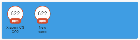
Described here.
How to hide a label for a “state-badge”:

Code
      - type: picture-elements
        image: /local/images/test/blue.jpg
        elements:
          - type: state-badge
            entity: sensor.xiaomi_cg_1_co2
            style:
              top: 18%
              left: 10%
          - type: state-badge
            entity: sensor.xiaomi_cg_1_co2
            style:
              top: 18%
              left: 30%
            card_mod:
              style:
                ha-state-label-badge $ ha-label-badge $ .badge-container: |
                  .title {
                    display: none;
                  }
Styling “service-button” elements:
For some element:

Code
type: picture-elements
style: |
  ha-card {
    height: 80px !important;
  }
elements:
  - type: service-button
    title: Button
    style:
      top: 6%
      left: 20%
    service: homeassistant.update_entity
    service_data:
      entity_id: sun.sun
    card_mod:
      style: |
        :host {
          background: orange;
          border: 1px solid black;
          border-radius: 10px;
          min-width: 100px;
          text-align: center;
          --mdc-theme-primary: red;
          --mdc-typography-button-font-size: 10px;
        }
  - type: service-button
    title: Button
    style:
      top: 6%
      left: 50%
    service: homeassistant.update_entity
    service_data:
      entity_id: sun.sun
image: /local/images/white.jpg
For all elements:

Code
type: picture-elements
style: |
  hui-service-button-element {
    background: orange;
    border: 1px solid black;
    border-radius: 10px;
    min-width: 100px;
    text-align: center;
    --mdc-theme-primary: red;
    --mdc-typography-button-font-size: 10px;
  }
  ha-card {
    height: 80px !important;
  }
elements:
  - type: service-button
    title: Button
    style:
      top: 6%
      left: 20%
    service: homeassistant.update_entity
    service_data:
      entity_id: sun.sun
  - type: service-button
    title: Button
    style:
      top: 6%
      left: 50%
    service: homeassistant.update_entity
    service_data:
      entity_id: sun.sun
image: /local/images/white.jpg
Animation:
For “state-icon”: for some & all elements:

Note: animation for “--mdc-icon-size” currently does not work in Apple; use “height" & "width`” instead.
Code
type: vertical-stack
cards:
  - type: picture-elements
    style:
      hui-state-icon-element:
        $: |
          state-badge {
            color: red;
            animation: resizing 1s linear infinite alternate;
          }
          @keyframes resizing {
            0% {
            --mdc-icon-size: 10px;
            }
            25% {
              --mdc-icon-size: 15px;
            }
            50% {
              --mdc-icon-size: 20px;
            }
            75% {
              --mdc-icon-size: 26px;
            }
            100% {
              --mdc-icon-size: 32px;
            }
          }
      .: |
        ha-card  {
          height: 70px !important;
        }
    elements:
      - type: state-icon
        entity: sensor.cleargrass_1_co2
        style:
          top: 6%
          left: 10%
      - type: state-icon
        entity: sensor.cleargrass_1_co2
        style:
          top: 6%
          left: 40%
      - type: state-icon
        entity: sensor.cleargrass_1_co2
        style:
          top: 6%
          left: 70%
    image: /local/images/white.jpg
  - type: picture-elements
    style: |
      ha-card {
        height: 70px !important;
      }
    elements:
      - type: state-icon
        entity: sensor.cleargrass_1_co2
        style:
          top: 6%
          left: 10%
      - type: state-icon
        entity: sensor.cleargrass_1_co2
        style:
          top: 6%
          left: 40%
      - type: state-icon
        entity: sensor.cleargrass_1_co2
        style:
          top: 6%
          left: 70%
        card_mod:
          style: |
            state-badge {
              color: red;
              animation: resizing 1s linear infinite alternate;
            }
            @keyframes resizing {
              0% {
                --mdc-icon-size: 10px;
              }
              25% {
                --mdc-icon-size: 15px;
              }
              50% {
                --mdc-icon-size: 20px;
              }
              75% {
                --mdc-icon-size: 26px;
              }
              100% {
                --mdc-icon-size: 32px;
              }
            }
    image: /local/images/white.jpg
For “icon”: for some & all elements:

Code
type: vertical-stack
cards:
  - type: picture-elements
    style:
      hui-icon-element:
        $:
          ha-icon:
            $: |
              ha-svg-icon {
                color: red;
                animation: rotation 0.5s linear infinite;
              }
              @keyframes rotation {
                0% {
                  transform: rotate(0deg);
                }
                100% {
                  transform: rotate(360deg);
                }
              }
      .: |
        ha-card  {
          height: 70px !important;
        }
    elements:
      - type: icon
        icon: mdi:fan
        style:
          top: 6%
          left: 10%
      - type: icon
        icon: mdi:fan
        style:
          top: 6%
          left: 40%
      - type: icon
        icon: mdi:fan
        style:
          top: 6%
          left: 70%
    image: /local/images/white.jpg
  - type: picture-elements
    style: |
      ha-card {
        height: 70px !important;
      }
    elements:
      - type: icon
        icon: mdi:car
        style:
          top: 6%
          left: 10%
      - type: icon
        icon: mdi:fan
        style:
          top: 6%
          left: 40%
        card_mod:
          style:
            ha-icon:
              $: |
                ha-svg-icon {
                  color: red;
                  animation: rotation 0.5s linear infinite;
                }
                @keyframes rotation {
                  0% {
                    transform: rotate(0deg);
                  }
                  100% {
                    transform: rotate(360deg);
                  }
                }
      - type: icon
        icon: mdi:bell
        style:
          top: 6%
          left: 70%
        card_mod:
          style:
            ha-icon:
              $: |
                ha-svg-icon {
                  color: red;
                  animation: wobbling 1s linear infinite alternate;
                }
                @keyframes wobbling {
                  0% {
                    transform: rotate(-45deg);
                  }
                  100% {
                    transform: rotate(+45deg);
                  }
                }
    image: /local/images/white.jpg
Other animation examples are provided here.
Styling conditional elements:
post
Styling custom cards:
Example 1 - Markdown card:
The Markdown could be used as a static label - i.e. a label with ANY text.
Since the Markdown card is not a custom card, we need to use a "custom:hui-element" card.
By default the Markdown card is displayed with a "box-shadow" style which may be removed by the "card-mod":

Code
type: picture-elements
style: |
  ha-card {
    height: 100px !important;
  }
elements:
  - type: custom:hui-element
    card_type: markdown
    content: |
      Static label:
      Hello, world!
    style:
      top: 8%
      left: 20%
  - type: custom:hui-element
    card_type: markdown
    content: |
      Static label:
      Hello, world!
    style:
      top: 8%
      left: 60%
    card_mod:
      style: |
        ha-card {
          box-shadow: 0px 0px 0px 0px;
          color: magenta;
        }
image: /local/images/white.jpg
Example 2 - entity rows:
In the example below the "card-mod" is used to perform a word-wrapping a long text and for coloring a text:

Code
      - type: picture-elements
        style: |
          ha-card {
            height: 400px !important;
          }
        elements:
          - type: custom:hui-element
            row_type: toggle-entity
            entity: input_boolean.test_boolean
            name: toggle-entity
            style:
              top: 0%
              left: 0%
              transform: translate(0,0)

          - type: custom:hui-element
            row_type: toggle-entity
            entity: input_boolean.test_boolean
            name: toggle-entity - long long long long long name
            style:
              top: 10%
              left: 0%
              transform: translate(0,0)

          - type: custom:hui-element
            row_type: toggle-entity
            entity: input_boolean.test_boolean
            name: toggle-entity - long long long name + card_mod
            style:
              top: 20%
              left: 0%
              transform: translate(0,0)
              width: 250px
            card_mod:
              style:
                hui-generic-entity-row:
                  $: |
                    .info {
                      text-overflow: unset !important;
                      white-space: unset !important;
                      color: red;
                    }

          - type: custom:hui-element
            row_type: sensor-entity
            entity: input_boolean.test_boolean
            name: sensor-entity - colored
            style:
              top: 30%
              left: 0%
              transform: translate(0,0)
              width: 250px
            card_mod:
              style:
                hui-generic-entity-row:
                  $: |
                    .info {
                      color: red;
                    }

          - type: custom:hui-element
            row_type: toggle-entity
            entity: input_boolean.test_boolean
            name: toggle-entity - colored (:host)
            style:
              top: 40%
              left: 0%
              transform: translate(0,0)
              width: 300px
            card_mod:
              style: |
                :host {
                  color: red;
                }
        image: /local/images/white.jpg
Displaying an additional info for elements:
This method is used.
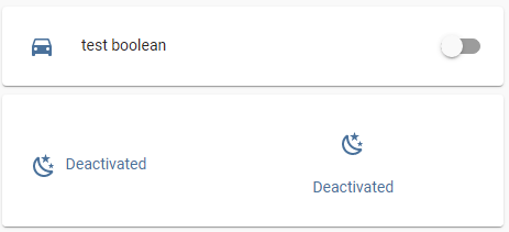
Code
  - type: vertical-stack
    title: "state-icon: additional info"
    cards:
      - type: entities
        entities:
          - input_boolean.test_boolean
      - type: picture-elements
        image: /local/images/test/white.jpg
        card_mod:
          style: |
            ha-card {
              height: 120px !important;
            }
        elements:
          - type: state-icon
            entity: sun.sun
            style:
              top: 10%
              left: 10%
            card_mod:
              style: |
                state-badge::after {
                  content: "{% if is_state('input_boolean.test_boolean','on') -%}
                            Activated
                            {%- else -%}
                            Deactivated
                            {%- endif %}";
                }
                state-badge {
                  display: flex;
                  flex-direction: row;
                  column-gap: 8px;
                }
          - type: state-icon
            entity: sun.sun
            style:
              top: 7%
              left: 70%
            card_mod:
              style: |
                state-badge::after {
                  content: "{% if is_state('input_boolean.test_boolean','on') -%}
                            Activated
                            {%- else -%}
                            Deactivated
                            {%- endif %}";
                }
                state-badge {
                  display: flex;
                  flex-direction: column;
                  align-items: center;
                }
More examples are described here.
9 Likes
Is anyone seeing this?
Started after next HA update.

Cannot save the card.
How to solve: use
"card_mod" keyword.But we MAY NOT use the
"card-mod" keyword for styling for most cases (i.e. except for styling elements inside Picture elements), yes?
Update 19.11.21: at least at 2021.11.4 do not observe this behaviour; now it is possible to save the card even w/o specifying card_mod keyword.
No, It’s good practice to always use
card_mod:
  style:
It was a mistake from my side to not have it that way from version 1.0, so now the other method is only left in for backwards compatibility.
I didn’t notice all your great examples use the old method, but I’d gladly help you update them.
1 Like
Thomas, thank you very much for the suggestion!
I will try to change them by myself (& test them just in case).
A more important thing for me - again, what about the “old notation w/o card_mod”, will it work?
Or should we just NOT TO use this old notation? (actually, not a big problem for me to rewrite my code).
It should work, except when it doesn’t. For example with cards that handle styles on their own, like custom-button-card, or as you say picture-elements.
I may have to remove it at some point, though, because it could collide with core functionality.
It’s much more unlikely that Home Assistant core will ever want to use the keyword card_mod than style…
completely missed that, now editing all style: …
do we need to change:
        - type: custom:mod-card
          style: |
            ha-card {
              margin: 0px -16px -16px -16px;
            }
too on mod-card?
I had a style which narrowed the spaces between a list of entities in a card and it doesn’t work any more.
Can anyone help? I have hidden the icon itself with the help of multiple-entity-row but need to reduce the height allocated from 40px.
entities:
  - entity: sensor.wts_ensuite_current_temp
    icon: nothing
    style: |
      :host {
        height: 17px;
        margin: -10px 0px;
      }
    type: custom:multiple-entity-row
Can I use an if statement to chose the ‘top’ and ‘left’ style? This does not work…
          - type: 'custom:button-card'
            entity: input_select.page
            style:
              top: >
                [[[
                  if (entity.state == 'Lighting') return '215px';
                  if (entity.state == 'Home') return '175px';
                  else return '500px';
                ]]]
              left: >
               [[[
                if (entity.state == 'Lighting') return '270px';
                if (entity.state == 'Home') return '175px';
                else return '500px';
               ]]]
Has anyone got it working to use card-mod with grid card to change the title attributes? For instance changing font size and padding? I believe card-mod usually does not work with cards like grid, stacks etc. Perhaps with 3.0 it’s become possible.
I see it’s under a constructed style sheet when I inspect element:
element.style {
}
And there is the code under it:
.card-header {
    color: var(--ha-card-header-color, --primary-text-color);
    font-family: var(--ha-card-header-font-family, inherit);
    font-size: var(--ha-card-header-font-size, 24px);
    font-weight: normal;
    margin-block: 0px;
    letter-spacing: -0.012em;
    line-height: 32px;
    display: block;
    padding: 24px 16px 16px;
}
Changing it in inspector works, but I can’t seem to find a way to use it in card-mod.
Maybe this is possible using the theme as well, in that case I need to ask in that topic. However I wonder if it’s possible per card as well, so you can have different font sizes and paddings per grid card.
Edit: I got the font size working per theme by using ha-card-header-font-size in theme.yaml. Padding still no go.
Could you give a simple test example of the card?
I use it inside an auto-entities card, so it might make it extra complicated. This is the code I use:
              - type: custom:auto-entities
                card:
                  type: grid
                  columns: 4
                  square: true
                  title: Kantoor
                card_param: cards
                filter:
                  include:
                    - entity_id: light.kantoor_*
                      options:
                        type: 'custom:decluttering-card'
                        template: light
                        variables:
                          - entity: this.entity_id
                          - template: light
                sort:
                  method: entity_id
                  ignore_case: true
So inside that code, I want to mod the part: title: Kantoor. The code that I got using inspect element is posted in my original post, but I can’t get it to work and don’t really know where to put is (if it’s at all possible using on grid-card).
Not sure, is it want you want?

type: custom:mod-card
card_mod:
  style: |
    ha-card {
      color: red;
      background-color: green;
    }
card:
  type: custom:auto-entities
  card:
    type: grid
    columns: 4
    square: true
    title: Kantoor
  card_param: cards
  filter:
    include:
      - entity_id: sensor.ha_count_*
        options:
          type: entity
          entity: this.entity_id
  sort:
    method: entity_id
    ignore_case: true

type: custom:mod-card
card_mod:
  style:
    hui-grid-card:
      $: |
        .card-header {
          color: red !important;
          background-color: green;
        }
card:
  type: custom:auto-entities
  card:
    type: grid
    columns: 4
    square: true
    title: Kantoor
  card_param: cards
  filter:
    include:
      - entity_id: sensor.ha_count_*
        options:
          type: entity
          entity: this.entity_id
  sort:
    method: entity_id
    ignore_case: true

type: custom:mod-card
card_mod:
  style: |
    ha-card {
      --ha-card-header-color: cyan;
      --ha-card-header-font-size: 30px;
      background-image: url(/local/images/pink.jpg);
      background-size: 100% 100%;
    }
card:
  type: custom:auto-entities
  card:
    type: grid
    columns: 4
    square: true
    title: Kantoor
  card_param: cards
  filter:
    include:
      - entity_id: sensor.ha_count_*
        options:
          type: entity
          entity: this.entity_id
  sort:
    method: entity_id
    ignore_case: true