My Lovelace Plugins

Update 2019-03-14

This post has grown out of hand.
My plugins are now listed on github

My Lovelace Plugins

Original post below


Some of you may have seen the lovelace plugins I have posted on the forums.

I realized there are some that I have not posted before, so I’ll use this topic to present them - and the old ones.

I’ll make one reply per thing, and then link them from this one.
Feel free to ask questions or discuss in this topic as well!


Instructions

Installation, upgrade and debugging instruction for plugins.

Cards

auto-entities - Automatically populate the entities: list of other cards. (Improved version of the well known monster-card)
state switch - Switch cards based on an entity state or on the logged in user
layout card - Gives you more control over how cards are placed in a view
color glance card - A glance card with a colorized background
useful markdown card - A markdown card that lets you show live entity states and attributes
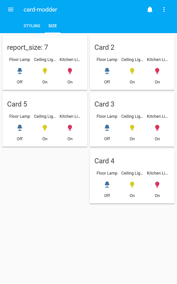
card modder - Lets you style any card using css
popup card - Replace the more-info dialog with any lovelace card
column card - Display other cards in columns even in a panel view
color-picker - Select light color without more-info

Entity rows

slider entity row - Add a slider for dimming lamps
toggle lock entity row - Avoid accidentally toggling entities
time input row - Input a time without having to open the more-info dialog
fold entity row - Group entities, and fold them away
folding group entity row - Display an entire group of entities at once, and fold it away

Picture elements

dim image element - An image whose opacity follows the brightness of a light
long press - Make any element take one action when pressed and another when pressed and held

Misc

browser-commander - Controll the browser viewing your frontend from your backend
lovelace-gen - A lovelace configuration generator with templates other conveniences
lovelace-player - Make any browser a media player
lovelace-fullykiosk - Control the screen and get motion alerts from Fully Kiosk Browser
card-tools - A library of useful tools for authors of custom cards/elements/entity rows.
hass-fontawesome - Use icons from fontawesome anywhere in Home Assistant
card-loader - A quickfix for some custom cards not being able to load other custom cards (not necessary for mine though, mine are perfect /s)


custom_updater

All my plugins are automatically added to the custom_updater and can be seen and managed by the tracker-card.
In order for that to work, you need to add a version number to the url when you import the plugins.
E.g.

resources:
  - url: /local/card-tools.js?v=0
    type: js

What comes after the v= doesn’t matter, and will be replaced as soon as you automatically update the card.
Also note that my cards don’t have version numbers as such, but instead rely on the git commit hashes, so they will look a bit different in the tracker-card:
tracker-card


Buy Me A Coffee

101 Likes

lovelace-gen

First out: Lovelace-gen
The lovelace config generator tool.

This started as a way to split the lovelace-ui.yaml file into more manageable pieces (which I later found out could be done by using the normal !include directive). Then it grew into something much more.

To use the tool, you run it in your config directory, and it will take the file lovelace/main.yaml and automatically generate lovelace-ui.yaml from it. In the most basic form it will just be a copy, but if your file contains !inclued filename the contents of the file filename will be inserted at that point.

Example from my config:

# lovelace/main.yaml
views:
  - !include view_Home.yaml
  - !include view_Lights.yaml
 ...
#lovelace/view_Home.yaml
title: Hemma
icon: mdi:home
id: home
cards:
  - type: weather-forecast
    entity: weather.dark_sky
  - !include card_presence.yaml
...

and so on…

Lovelace-gen has two other big features, the !file directive, and the ability to parse jinja2 templates.

I use the !resource directive any time I want to include a script or an image.
An example from my config:

- type: picture-entity
  entity: group.presence_thomas
  image: !file /local/images/thomas_bw.jpg
  show_name: false
  show_state: false
  state_image:
    "home": !file /local/images/thomas_clr.jpg

This replace the first !file statement with /local/lovelace/thomas_bw.jpg?1538162272.4425504. thomas_clr.jpg will be given the same treatment.

The stuff after the question mark is the timestamp at which the generator was run. This ensures that your browser will never try to load a cached version of an image or a script included this way that is older than the last time you ran the script. Insanely useful if you like playing around with plugins.

The jinja templates are useful for avoiding code duplication.
My main use is for including javascript plugins.
I make a list of them in my main.yaml file, and include them with a for-statement:

#lovelace/main.yaml
{% set resources = [
'plugins/lovelace-column-card/column-card.js',
'plugins/lovelace-fullykiosk/lovelace-fullykiosk.js',
'plugins/lovelace-player/lovelace-player.js',
] %}

resources:
  {% for res in resources %}
  - url: !resource {{res}}
    type: js
  {% endfor %}
6 Likes

DEPRECATED

This plugin is replaced entirely by layout card


On to something a bit more hands-on: column-card

It is a well known trick (mentioned in the docs to create a header on a lovelace view by using panel:true and vertical-stack.

The problem with this approach is that anything below the header is locked in position by the stack. You lose lovelaces ability to adjust for wider screens. The column card fixes this.

Here are two screenshots from my configuration, showing the same view with my phone held in portrait and landscape mode respectively:
01b54822a8fbae25d884f6ac1636cd02ecea97c4_1_281x499
766c6d2a5725a55f7a375ec2fd4fa7968304af76_1_690x387

Note how the header stretches across the entire screen, but the cards below move to either below or beside each other depending on the available space.

3 Likes

DEPRECATED!

Since version 0.80, this is built into home-assistant by default

See: Glance card documentation

This plugin will not be maintained, and no support will be given


Somewhat related is color-glance-card

It works exactly like a default glance card except the background color is the primary color of your theme.

44581913-e5181700-a79f-11e8-963c-38ed303d3dc2

This works really great with column-card in combination with the lovelace kiosk mode script by @ciotlosm

Here’s my hallway dashboard for example, with the theme switched when the alarm is armed/disarmed:

Note: This function will most likely be included in home-assistant version 0.80

4 Likes

useful-markdown-card

On the topic of slight modifications to default cards, there’s also useful-markdown-card.

Because let’s face it; the default markdown card isn’t terribly useful…

My card allows you to embed states and attributes from entities in the markdown. Besides that, it works exactly the same as the default.

      - type: custom:useful-markdown-card
        content: >
          ## Lovelace

          Starting with Home Assistant 0.72, we're experimenting with a new way of defining your interface. We're calling it the **Lovelace UI**

          Also, the current time is [[ sensor.time.state ]] [[ sensor.time.attributes.icon ]].

useful-markdown-card

And yes, it updates in real time.

11 Likes

lovelace-player

Let’s move on to lovelace-player.

This is not a card but a general plugin that lets you use any browser that’s currently viewing your lovelace interface as a media_player. This means that it can, for example, play back TTS messages.

This also requires that you add a custom component to home assistant, made by @pkozul who is my main source of inspiration for this plugin and the next one.

3 Likes

lovelace-fullykiosk

A similar type of plugin is lovelace-fullykiosk

There’s a fun app for android devices called Fully Kiosk Browser. Its main purpose is to display a single web page, without the user being able to move away from the site, or close the app. But it also gives you a degree of control over the device that iDevice users like myself could only dream of.

For example, you can get a live feed from the devices camera into home assistant, or you can get it to report movement in front of the camera like a security sensor.

All of those features are available through a REST interface and can easily be connected to home assistant. A few of them, though can benefit from this plugin.

Specifically, this plugin gives you the ability to turn on and off the screen of the device remotely, as well as check its current state. It also enables a movement sensor with shorter response time than you’d get via the REST interface. It only works while the device is setup to display your lovelace interface, though.

This plugin is inspired by ha-floorplan-kiosk by @pkozul.

5 Likes

slider-entity-row

Next are some new types of rows for the default entities card

First up is slider-entity-row

This gives you a brightness slider for any dimmable light.

slider-entity-row

You can configure it a bit, put the slider below the toggle, hide the slider when the light is turned off and so on…

This is inspired by the custom-ui project for the “old” home assistant interface.


UPDATE
The slider-entity-row now also supports media_player (volume control) and cover (position).
The customization options have been changed though. So your old config may not work with the new version.

13 Likes

toggle-lock-entity-row

Another row for the entities card

Have you ever accidentally turned a switch on or off when scrolling past on your phone?
If so, you might like toggle-lock-entity-row.

lovelace-locked-toggle

It’s simple enough. Now you have to click the toggle twice before anything happens.

As an added bonus, you can select which users have the ability to unlock the toggle.

This one’s also inspired by custom-ui.

3 Likes

time-input-row

Yet another entity row: time-input-row.

This lets you input a time to a input_datetime right in the lovelace interface, without having to open up the more-info dialog.

time_input

I made this solely for my own benefit, so it’s not documented at all, and it only support inputing times, not dates.
If you think you’d use it, let me know and I might try to add the feature.

16 Likes

DEPRECATED!

This plugin is replaced entirely by fold-entity-row


The final entity row (for now) is folding-group-entity-row.

This row works with groups.
It will take a group, and add all of the entities in it in a collapsible list to the entities card.

folding_group_demo1

This was somewhat inspired by haiku by lukiffer.

9 Likes

dim-image-element

Next up is an element for picture-elements

dim-image-element takes an image and an entity, and sets the opacity of the image to the brightness value of the entity.

I don’t really see a use case myself, but someone asked about it on discord, and I saw a way to make it happen…

The configuration would look something like:

    elements:
      - type: custom:dim-image-element
        entity: light.my_dimable_light
        image: !resource my_image.jpg
        style:
          top: 50%
          left: 50%

Besides the entity, it takes the same configuration options as the image element.

2 Likes

Deprecated

This is included in home-assistant since 0.81.0

But smoother, for more items and much prettier.

See documentation for each card.


A significantly more useful picture-elements element is long-press

This allows you to add elements to your picture that does one thing when you click them, and another - totally different - thing when you click and hold for about half a second.

A typical use case would be a light that you toggle on or off by clicking (or tapping on a touch screen), but holding the mouse button (or finger) down for a while will bring up the more-info dialog and allow you to dim the light or change its color.

But the long-press action can also be something entirely different, like calling a service or toggling a different entity.

6 Likes

card-modder

Finally, theres another card… kind of…

The card-modder allows you to take any card and inject style it.

Think of the amazing stuff people have made with picture-elements over at sharethelove.io. That’s made possible - in part - because elements can be styled with custom css. And now any normal card can as well.

It’s also a great way to produce atrocities such as:
card-modder

But I’m sure that in the hands of anyone even just a tiny bit more artistic than myself, it can be used to produce wonderful things.

A bonus feature of this card is that you can manually select which size it will report when placing in the layout. That can give some more control over which card ends up where on screen:

6 Likes

Awesome stuff mate! I am already using a lot of your cards and now found out you even have more new stuff for us :grinning:

Great stuff here!

I use the card modder personally and the card is very powerful! Can be used to completely re-design your UI.

These are some great ideas. I’ll be trying out the long-press plugin soon. Thanks!

Is there any way to change the number of columns used? Mine is showing 2 columns when 3 would be better. Goes down to 1 on my phone which is great.

Would it be as simple as changing the max column width from 500px to 300px or something like that?

Also getting an error…

https://domain.duckdns.org/local/mini-media-player.js?ver=0.8.1:592:22 NotSupportedError: Cannot define multiple custom elements with the same tag name

lovelace yaml looks like this:

  - title: TV & Movies
    icon: mdi:kodi
    panel: true
    cards:
      - type: vertical-stack
        cards:
          - type: custom:column-card
            cards:
              - type: custom:upcoming-media-card

I’m thinking it’s because I’m trying to use the upcoming-media card inside the column card? Any way to fix that?

1 Like

That would do the trick. 500px was chosen to be as close to the look-and-feel of stock lovelace as possible.

It seems to me like you are importing mini-media-player.js twice. Check that.

I am importing it twice - once for sonarr and once for radarr. Works fine until I use the column card.