Styling Entities card.
(including some special row elements - button, section, divider)
NOTE:
Do not forget to add a "card_mod:" keyword before "style:" (new in card-mod 3).
Colored background & rounded corners - can be easily achieved by using "--ha-card-background" & "--ha-card-border-radius" variables:

type: entities
title: Title
entities:
  - entity: sun.sun
style: |
  ha-card {
    --ha-card-background: orange;
    --ha-card-border-radius: 14px;
  }
Using background image:
Test image:
By default a background image is placed w/o a resizing:

type: entities
entities:
  - entity: sun.sun
title: Image clipped
style: |
  ha-card {
    background-image: url("/local/images/blue_low_2.jpg");
  }
How to fit the image to the defined card’s size:

Note: the card’s height is defined.
type: entities
entities:
  - entity: sun.sun
title: Image fitted
style: |
  ha-card {
    background-image: url("/local/images/blue_low_2.jpg");
    background-size: 100% 100%;
    height: 250px !important;
  }
For a content area only:

type: entities
entities:
  - entity: sun.sun
title: Image fitted to content
style: |
  .card-content {
    background-image: url("/local/images/blue_low_2.jpg");
    background-size: 100% 100%;
  }
  ha-card {
    overflow: hidden;
  }
For a header area only:

type: entities
entities:
  - entity: sun.sun
  - entity: sun.sun
title: Image fitted to header
style: |
  .card-header {
    background-image: url("/local/images/blue_low_2.jpg");
    background-size: 100% 100%;
  }
  ha-card {
    overflow: hidden;
  }
With a defined position:

type: entities
entities:
  - entity: sun.sun
  - entity: sun.sun
title: Image placed on header
style: |
  ha-card .card-header {
    background-image: url("/local/images/blue_low_2.jpg");
    background-size: 30% 50%;
    background-position: 95% center;
    background-repeat: no-repeat;
  }
Adding a scrollbar:

type: entities
entities:
  - sun.sun
  - sun.sun
  - sun.sun
  - sun.sun
  - sun.sun
  - sun.sun
  - sun.sun
  - sun.sun
  - sun.sun
card_mod:
  style: |
    .card-content {
      overflow-y: scroll;
      max-height: 280px;
    }
    ha-card {
      overflow: clip;
    }
Colored text: (w/o 'secondary_info')

type: entities
entities:
  - entity: sun.sun
    name: Colored text
    style: |
      :host {
        color: red;
      }
  - entity: sun.sun
    name: Colored value
    style:
      hui-generic-entity-row:
        $: |
          .text-content:not(.info) {
            color: orange;
          }
  - entity: sun.sun
    name: Colored name
    style:
      hui-generic-entity-row:
        $: |
          .info.pointer.text-content {
            color: green;
          }
  - entity: sun.sun
    name: Colored name & value
    style:
      hui-generic-entity-row:
        $: |
          .info.pointer.text-content {
            color: green;
          }
          .text-content:not(.info) {
            color: orange;
          }
Colored text: (with 'secondary_info')
If "secondary_info" is specified then the code changes - I have to use ".info.pointer" instead of ".info.pointer.text-content".
According to my tests in all the cases described above it is possible to always use ".info.pointer" - it seems to work anyway.

type: entities
entities:
  - entity: sun.sun
    name: Colored name
    style:
      hui-generic-entity-row:
        $: |
          .info.pointer {
            color: orange;
          }
  - entity: sun.sun
    name: Colored name (with secondary_info)
    secondary_info: last-changed
    style:
      hui-generic-entity-row:
        $: |
          .info.pointer {
            color: cyan;
          }
Common style: changing a color for all rows: (except 'secondary_info' )
All text (except a title):

type: entities
title: Some title
style: |
  ha-card .card-content {
    color: red;
  }
entities:
  - entity: input_boolean.test_boolean
  - entity: sun.sun
    secondary_info: last-changed
Only values:

type: entities
style:
  hui-simple-entity-row:
    $:
      hui-generic-entity-row:
        $: |
          .text-content:not(.info) {
            color: red;
          }
entities:
  - entity: sun.sun
  - entity: sun.sun
Only names:

type: entities
style:
  hui-simple-entity-row:
    $:
      hui-generic-entity-row:
        $: |
          .info.pointer.text-content {
            color: green;
          }
entities:
  - entity: sun.sun
  - entity: sun.sun
Values & names:

type: entities
style:
  hui-simple-entity-row:
    $:
      hui-generic-entity-row:
        $: |
          .info.pointer.text-content {
            color: orange;
          }
          .text-content:not(.info) {
            color: red;
          }
entities:
  - entity: sun.sun
  - entity: sun.sun
Changing a color for the whole card (i.e. including a title): (except 'secondary_info')

type: entities
title: 'Common: all text'
style: |
  ha-card {
    color: orange;
  }
entities:
  - entity: sun.sun
    secondary_info: last-changed
  - entity: sun.sun
Colored title:

type: entities
title: 'Style: colored title'
style: |
  ha-card .card-header {
      color: red;
  }
entities:
  - entity: sun.sun
Another option - using a "--ha-card-header-color" variable:
type: entities
title: 'Style: colored title'
style: |
  ha-card {
    --ha-card-header-color: red;
  }
entities:
  - entity: sun.sun
Overwriting styles:

How it is specified:
- all text is blue
- all rows’ text is red
- one row’s text is cyan
type: entities
title: 'Changed color'
style: |
  ha-card {
    color: blue;
  }
  ha-card .card-content {
    color: red;
  }
entities:
  - entity: input_boolean.test_boolean
    name: Inherited color
  - entity: sun.sun
    name: Inherited color
    secondary_info: last-changed
  - entity: sun.sun
    name: Changed color
    secondary_info: last-changed
    style: |
      :host {
       color: cyan;
      }
Other tricks with the header:

type: entities
title: Some title (+card-mod)
card_mod:
  style: |
    ha-card .card-header {
      border: 3px dotted magenta;
      padding: 0px;
      display: unset;
    }
    ha-card .card-header .name {
      color: red;
      text-align: right;
      font-weight: 1000;
      letter-spacing: 3px;
    }
entities:
  - entity: sun.sun
  - entity: sun.sun
  - entity: sun.sun
Colored secondary_info:

type: entities
entities:
  - entity: sun.sun
    secondary_info: last-changed
    style:
      hui-generic-entity-row:
        $:
          .info.pointer .secondary: |
            ha-relative-time {
              color: green !important;
            }
Note that I have to use '!important', it does not work without it - do not know why…
Colored secondaryinfo-entity-row:
Sometimes it is required to use 'custom:secondaryinfo-entity-row', here is how to style it (note that 'hui-toggle-entity-row' is added for example):

type: entities
entities:
  - type: 'custom:secondaryinfo-entity-row'
    entity: input_boolean.test_boolean
    name: secondaryinfo-entity-row
    secondary_info: some colored text
    style:
      hui-toggle-entity-row:
        $:
          hui-generic-entity-row:
            $: |
              .info.pointer .secondary {
                  color: red;
              }
It looks similarly to the standard 'secondary_info' (no 'ha-relative-time' is specified).
Common styling: changing a color for all 'secondary_info':

type: entities
title: Common styling
style:
  hui-simple-entity-row:
    $:
      hui-generic-entity-row:
        $:
          .info.pointer .secondary: |
            ha-relative-time {
              color: green !important;
            }
entities:
  - entity: sun.sun
    secondary_info: last-changed
  - entity: sun.sun
    secondary_info: last-changed
How to set different colors for a name & secondary-info:

type: entities
entities:
  - entity: sun.sun
    secondary_info: last-changed
    style:
      hui-generic-entity-row:
        $:
          .info.pointer: |
            .secondary ha-relative-time {
              color: green;
            }
          .: |
            .info.pointer {
              color: red;
            }
Additional styles for "secondary-info":
post

Colored RUN button row:
type: entities
title: Run button
entities:
  - type: button
    name: Colored text
    tap_action:
      action: none
    card_mod:
      style: |
        .flex {
          color: red;
        }
  - type: button
    name: Colored icon
    tap_action:
      action: none
    card_mod:
      style:
        ha-state-icon:
          $: |
            ha-svg-icon {
              color: green;
            }
  - type: button
    name: Colored button
    tap_action:
      action: none
    card_mod:
      style:
        .flex mwc-button:
          $: |
            .mdc-button {
              color: orange !important;
            }
  - type: section
    label: combined
  - type: button
    name: Colored icon & text
    tap_action:
      action: none
    card_mod:
      style:
        ha-state-icon:
          $: |
            ha-svg-icon {
              color: green;
            }
        .: |
          .flex {
            color: red;
          }
  - type: button
    name: Colored text & button
    tap_action:
      action: none
    card_mod:
      style:
        .flex mwc-button:
          $: |
            .mdc-button {
              color: orange !important;
            }
          .: |
            .flex {
              color: red;
            }
  - type: button
    name: Colored icon, text & button
    tap_action:
      action: none
    card_mod:
      style:
        ha-state-icon:
          $: |
            ha-svg-icon {
              color: green;
            }
        .flex mwc-button:
          $: |
            .mdc-button {
              color: orange !important;
            }
          .: |
            .flex {
              color: red;
            }
  - type: button
    name: Colored icon, text & button (express)
    tap_action:
      action: none
    card_mod:
      style: |
        :host {
          --paper-item-icon-color: green;
          color: red;
          --mdc-theme-primary: orange;
        }
  - type: section
  - type: button
    name: Styled button
    tap_action:
      action: none
    card_mod:
      style:
        .flex mwc-button:
          $: |
            .mdc-button {
              background: orange !important;
              margin-right: 10px;
              border: 1px solid black !important;
              border-radius: 10px !important;
            }
Note: when a “button” row has an “entity” option specified - there is a difference in part of styling an icon, check here.
Colored section: (including colored label, colored section’s upper line, invisible section’s upper line)
type: entities
title: Colored section
entities:
  - type: section
    label: Colored section
    style: |
      .label {
        color: magenta !important;
      }
  - entity: sun.sun
  - entity: sun.sun
  - type: section
    label: Colored section
    style: |
      .label {
        color: green !important;
      }
  - entity: sun.sun
  - entity: sun.sun
  - type: section
    label: Colored section's line
    style: |
      .divider {
        background-color: red !important;
        margin-top: 32px !important;
        height: 8px !important;
      }
  - entity: sun.sun
  - entity: sun.sun
  - type: section
    label: Invisible section's line
    style: |
      .divider {
        background-color: transparent !important;
        margin-top: 32px !important;
      }
  - entity: sun.sun
  - entity: sun.sun
Styling a section’s upper line includes:
"margin-top" - a space before the line;"height" - a line’s thickness;"background-color" - a line’s color.
Note: '!important' is specified.
Styling a divider row:
Styling should be done using native “style” option for “Entities card”.
Colored divider:

type: entities
title: Colored divider (not-card-mod)
entities:
  - entity: sun.sun
  - entity: sun.sun
  - type: divider
    style:
      background-color: red
      height: 8px
  - entity: sun.sun
  - entity: sun.sun
  - type: divider
    style:
      background-color: magenta
  - entity: sun.sun
  - entity: sun.sun
Invisible divider (may be used as a spacing between rows):

type: entities
title: Invisible divider (not-card-mod)
entities:
  - entity: sun.sun
  - entity: sun.sun
  - type: divider
    style:
      background-color: transparent
      height: 32px
  - entity: sun.sun
  - entity: sun.sun
Changing an icon’s color:
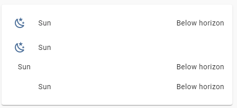
By default for entities like "sensor" (same for "device_tracker" , "person" , "zone" , …) an icon’s color does not depend on the entity’s state.
There are two methods for changing a color:
- using a
"--paper-item-icon-color" variable;
- using a
"color" CSS property.
For some row (methods #1, #2):

type: entities
entities:
  - entity: sensor.cleargrass_1_co2
    name: Colored
    style: |
      :host {
        --paper-item-icon-color: red;
      }
  - entity: sensor.cleargrass_1_co2
    name: Default color
type: entities
entities:
  - entity: sensor.cleargrass_1_co2
    name: Colored
    card_mod:
      style:
        hui-generic-entity-row:
          $: |
            state-badge {
              color: red;
            }
  - entity: sensor.cleargrass_1_co2
    name: Default color
For all rows:
Method #1 (using a "--paper-item-icon-color" variable):

Note: for the 3rd row the color was overwritten by an individual style.
type: entities
style: |
  ha-card {
    --paper-item-icon-color: red;
  }
entities:
  - entity: sensor.cleargrass_1_co2
    name: Colored
  - entity: sensor.cleargrass_1_co2
    name: Colored
  - entity: sensor.cleargrass_1_co2
    name: 'Overwritten color (:host)'
    style: |
      :host {
        --paper-item-icon-color: cyan;
      }
  - entity: sun.sun
    name: Colored
Method #2 (using a "color" CSS property):

type: entities
card_mod:
  style:
    hui-sensor-entity-row:
      $:
        hui-generic-entity-row:
          $: |
            state-badge {
              color: red;
            }
    hui-text-entity-row:
      $:
        hui-generic-entity-row:
          $: |
            state-badge {
              color: cyan;
            }
entities:
  - entity: sun.sun
    name: Colored
  - entity: sun.sun
    name: Colored
  - entity: sensor.cleargrass_1_co2
    name: Colored
  - entity: sensor.cleargrass_1_co2
    name: Colored
  - entity: input_boolean.test_boolean
    name: Default color
  - entity: sensor.cleargrass_1_co2
    name: Overwritten color (:host) - failed
    card_mod:
      style: |
        :host {
          --paper-item-icon-color: orange !important;
        }
  - entity: sensor.cleargrass_1_co2
    name: Overwritten color
    card_mod:
      style:
        hui-generic-entity-row:
          $: |
            state-badge {
              color: green !important;
            }
Notes:
1.The 6th icon was not overwritten: the common styling was done by Method #2, the individual styling - by Method #1, so the overwriting failed.
2.The 7th icon was overwritten: the common styling was done by Method #2, the individual styling - by Method #2 (with "!important").
3.The 5th icon was not colored since the "hui-sensor-entity-row" and "hui-text-entity-row" do not affect the "input_boolean" row - the "hui-toggle-entity-row" must be used instead.
By default for entities like "binary_sensor" , "sun.sun" , "switch" , "input_boolean" - an icon’s color DOES depend on the entity’s state - if the property "state_color: true" is set for the card (or for this particular row). If it is set to "false", then the color DOES NOT depend on the state - use same Methods #1, #2 as for the "sensor" (described above).
There are two methods for changing a color:
- using
"--paper-item-icon-color" and "--paper-item-icon-active-color" variables;
- using a
"color" CSS property.
Method #1 (using "--paper-item-icon-color" and "--paper-item-icon-active-color" variables):
For some row:

type: entities
state_color: true
entities:
  - entity: binary_sensor.battery_charging_cleargrass_1
    name: Colored
    style: |
      :host {
        --paper-item-icon-active-color: red;
        --paper-item-icon-color: cyan;
      }
  - entity: sun.sun
    name: Default colors
  - entity: binary_sensor.service_off_value
    name: Default colors
  - entity: binary_sensor.service_off_value
    name: Colored
    style: |
      :host {
        --paper-item-icon-active-color: red;
        --paper-item-icon-color: cyan;
      }
For all rows:

Note: for the 4th row the colors were overwritten.
type: entities
state_color: true
style: |
  ha-card {
    --paper-item-icon-active-color: red;
    --paper-item-icon-color: cyan;
  }
entities:
  - entity: binary_sensor.battery_charging_cleargrass_1
    name: Colored
  - entity: sun.sun
    name: Colored
  - entity: binary_sensor.service_off_value
    name: Colored
  - entity: binary_sensor.service_off_value
    name: Overwritten colors
    style: |
      :host {
        --paper-item-icon-active-color: green;
        --paper-item-icon-color: magenta;
      }
Method #2 (using a "color" CSS property):
For some row:

type: entities
state_color: true
entities:
  - entity: binary_sensor.battery_charging_cleargrass_1
    name: Default colors
  - entity: sun.sun
    name: Default colors
  - entity: binary_sensor.service_off_value
    name: Default colors
  - entity: binary_sensor.service_off_value
    name: Colored
    card_mod:
      style:
        hui-generic-entity-row:
          $: |
            state-badge {
              color: red;
            }
For all rows:

Notes:
state-color: false option is set;- for the 4th row the color was overwritten.
type: entities
state_color: false
card_mod:
  style:
    hui-simple-entity-row:
      $:
        hui-generic-entity-row:
          $: |
            state-badge {
              color: cyan;
            }
entities:
  - entity: binary_sensor.battery_charging_cleargrass_1
    name: Colored
  - entity: sun.sun
    name: Colored
  - entity: binary_sensor.service_off_value
    name: Colored
  - entity: binary_sensor.service_off_value
    name: Overwritten color
    card_mod:
      style:
        hui-generic-entity-row:
          $: |
            state-badge {
              color: red !important;
            }
Styling entity_picture:
By default (at least in the default stock theme) an "entity_picture" is displayed in a circle frame:

type: entities
entities:
  - entity: person.ildar
The reason of it - the "border-radius: 50%" property.
Here is how to make a square frame with round corners:

type: entities
entities:
  - entity: person.ildar
style:
  hui-simple-entity-row $ hui-generic-entity-row $: |
    state-badge {
      border-radius: 10%;
    }
Also we may apply filters to the "entity_picture":

type: entities
entities:
  - entity: person.ildar
  - entity: person.ildar
    style:
      hui-generic-entity-row$: |
        state-badge {
          filter: grayscale(80%);
        }
Wrapped text:

type: entities
entities:
  - entity: sun.sun
    name: Wrapped Wrapped Wrapped Wrapped Wrapped Wrapped Wrapped
    style:
      hui-generic-entity-row:
        $: |
          .info {
            color: red;
            text-overflow: unset !important;
            white-space: unset !important;
          }
  - entity: sun.sun
    name: Not wrapped Not wrapped Not wrapped Not wrapped
Also check here for an alternative solution:

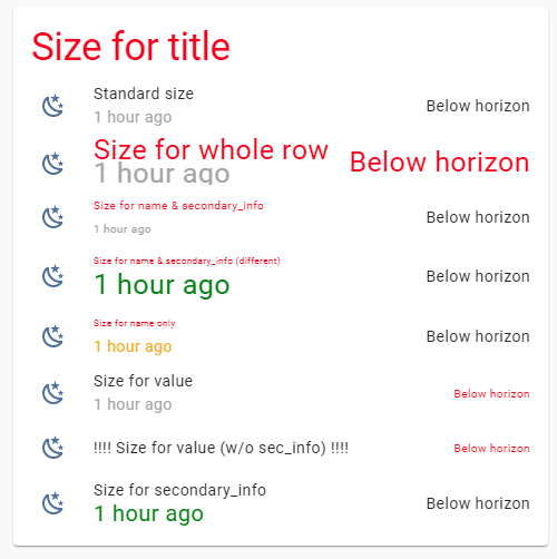
Changing a font-size:
See here
Resizing an icon:
For the whole card:

type: entities
show_header_toggle: false
entities:
  - entity: sun.sun
  - entity: sun.sun
style: |
  ha-card {
    --mdc-icon-size: 60px;
  }
For some row:

type: entities
show_header_toggle: false
entities:
  - entity: sun.sun
  - entity: sun.sun
    style: |
      :host {
        --mdc-icon-size: 60px;
      }
Resizing “entity_picture”:
There are 2 ways:
– increase a placeholder area for an image;
– increase an image with a possible overflow effect.

        type: entities
        entities:
          - entity: person.ildar
            name: default
          - entity: person.ildar
            name: height+width
            card_mod:
              style:
                hui-generic-entity-row $: |
                  state-badge {
                    height: 60px;
                    flex-basis: 60px !important;
                  }
          - entity: person.ildar
            name: default
          - entity: person.ildar
            name: scale
            card_mod:
              style:
                hui-generic-entity-row $: |
                  state-badge {
                    transform: scale(1.5);
                  }
Styling a card’s title if a main icon is specified:
The main icon - an icon in the card’s title.
type: vertical-stack
title: Card with icon
cards:
  - type: entities
    title: Colored icon & title
    icon: 'mdi:car'
    style: |
      .card-header .name {
        color: red;
      }
    entities:
      - entity: sun.sun
      - entity: sun.sun
  - type: entities
    title: Colored icon
    icon: 'mdi:car'
    style:
      .card-header .name .icon:
        $: |
          ha-svg-icon {
            color: orange;
          }
    entities:
      - entity: sun.sun
      - entity: sun.sun
  - type: entities
    title: Colored icon & title (different)
    icon: 'mdi:car'
    style:
      .card-header:
        .name .icon:
          $: |
            ha-svg-icon {
              color: orange;
            }
        .: |
          .name {
            color: red;
          }
    entities:
      - entity: sun.sun
      - entity: sun.sun
  - type: entities
    title: Colored title
    icon: 'mdi:car'
    style:
      .card-header:
        .name .icon:
          $: |
            ha-svg-icon {
              color: var(--paper-item-icon-color);
            }
        .: |
          .name {
            color: red;
          }
    entities:
      - entity: sun.sun
      - entity: sun.sun
Resizing the icon:

type: entities
title: Resized icon
icon: 'mdi:car'
style:
  .card-header: |
    .name .icon {
      --mdc-icon-size: 60px;
    }
entities:
  - entity: sun.sun
  - entity: sun.sun
Hiding an icon or a state:

type: entities
entities:
  - entity: sun.sun
  - entity: sun.sun
    card_mod:
      style:
        hui-generic-entity-row:
          $: |
            .text-content:not(.info) {
              display: none;
            }
  - entity: sun.sun
    card_mod:
      style:
        hui-generic-entity-row:
          $: |
            state-badge {
              display: none;
            }
  - entity: sun.sun
    card_mod:
      style:
        hui-generic-entity-row:
          $:
            state-badge:
              $: |
                ha-state-icon {
                  display: none;
                }
Adding a prefix or suffix, math operations, replacing a value:
post


More examples are described here.


