Here all my posts which may be useful:
NOTE:
Do not forget to add a "card_mod:" keyword before "style:" (new in card-mod 3).
And also read this important note to create optimized code. In most examples here a code is NOT optimized - just to describe a DOM navigation.
Entity card
post
rotating icon (by @dolodobendan)
disabled tap_action
Entities card (including some special row elements - button, section, divider)
post
using standard vars for some domains
font-size for Entities card
post
Entities card with attributes
post
Slider entity inside Entities card
main post
popup baloon issue
hide the popup baloon
"hui-input-number-entity-row" - entity row for "input_number"
main post
How to make input_number rows look less different from other entity rows - part 1, part 2
input_select row
main post
How to make input_select rows look less different from other entity rows - part 1, part 2
How to add secondary_info: last-changed
input-text row
post
How to make input_text rows look less different from other entity rows - part 1, part 2
input_datetime row
part 1
part 2
How to make input_datetime rows look less different from other entity rows - part 1, part 2
Conditional row inside Entities card
post
Toggle row inside Entities card
colored checkbox
how to disable a toggle button
how to disable a toggle button - inside auto-entities
moving toggle to the left
Hiding checkboxes inside Entities card
for some entity row
for all entity rows
Animations for Entities card
post
“Chip” buttons
post
card-mod theme for chip buttons
changing styles for a particular button in a footer dependently on a state
changing an icon
Cover entity row
main post
disable a cover control conditionally
“narrowed” look
Light entity row
how to show lights with using only “active” & “inactive” colors
How to manage a row’s height
decrease height
increase height
How to shift rows to the right
post
How to center weblinks & commands
post
“Empty slot” for Entities card
post
Circular progress indicator
post
Glance card
main post
changing margin
Allocate items in a compact manner
Footer / Header
post
custom:multiple-entity-row
main post
displaying "last-changed" or any other labels for items
distribute items evenly
animated icons
custom:fold-entity-row
main post
How to enable / disable a “fold / unfold” control for fold-entity-row
RTL fix for a section row
custom:template-entity-row
main post
t-e-r inside a conditional row
custom:numberbox-card
post
custom:multiline-text-input-card
post
custom:text-divider-row
post
Tile card
colored icon & background on hover
remove background from an icon
adding a button
custom icons for features
long states
input_select: one-line look
Heading
post
change icons
Thermostat
custom icons for features
custom:bar-card
animation
2 text lines
displaying an image instead of an icon
centered title
hide the whole bar-card if all bars are hidden
replacing a value
adding a prefix
RTL fix for vertical bars
Gauge
disabled tap_action
colored needle
markdown
scrollbar
scrollbar for some text
markdown with images
markdown with a table: post 1, post 2, post 3
colorize only some text
external js for “hr” element
styling an icon on hover (original idea of @Spartacus)
Picture Glance card
post
changing an icon by card-mod
distributing icons
Sensor card with a graph
post
History-graph card
styling
prevent clipping when using inside stack-in-card
added scrollbar
custom line colors
custom timeline colors
how to set a 0 lower bound for Y-axis
styling a tooltip
how to add an icon to a card’s title
how to set a height
statistics-graph card
post
grouping / aligning labels
custom line colors
replacing a label
how to set a 0 lower bound for Y-axis
custom:mini-graph-card
main post
animation - blinking name, resized & rotating icon
how to display an additional info on the card
how to display additional text items (prefixes & suffixes)
solid (non-semitransparent) fill
move a graph for the 2nd sensor to the bottom
how to set a color for the last bar
place 2 sensors’ states on the left side
displaying states as a part of the legend
displaying a UoM under the state
displaying a UoM before a state
displaying a state & extrema data on the same line
using card-mod to compare mini-graph-card & history-graph
non-elegant & unstable way to show labels for X-axis
fixing an issue with a card inside state-switch
imitating statistics card
how to nicely align legend’s elements
compact view when used in horizontal stack or grid
styling Y-axis labels’ background
how to change graph’s color dynamically
styling points
custom:apexcharts
RTL fix
Weather Card
post
Styling a card inside ‘custom:config-template-card’
post
Styling a card inside ‘custom:decluttering-card’ + passing a style as a variable
post 1
post 2
Badges (before 2024.8)
important - fix to restore a possibility to style badges after 2024.8
Badges: different styling
Badges: conditional show/hide
Badges: hidden name
Square badges
Dynamic icon
Show either an icon or a value
Manually added UoM
Replacing a state
Replacing a UoM
Gradient colors for a badge dependingly on a value (by @parautenbach)
Badges (2024.8)
badges themselves
badges themselves (mod-card) by @arganto
themes - one, two, three
custom:badge-card
post
after 2024.8
Picture Elements card
main post
conditional elements
rotated background image
“selection area”
3 ways to change an element dynamically
on-hover effect for elements
example: show a charging process
Logbook card
main post
styling images by using external js-module
Logbook in a Panel mode
styling a scrollbar (style is unstable)
Media Player card
post
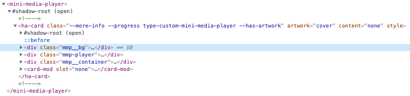
custom:mini-media-player
post
vertical-stack, horizontal-stack
main post
How to fix the “margin-top” problem for a hidden conditional card
Stack inside “hui-element” card
Removing internal borders & margins inside vertical-stack
how to add an icon to a card’s title
grid
how to add an icon to a card’s title
custom:stack-in-card
main post
example of customizing a width in a horizontal stack
styling a header
how to add an icon to a card’s title
prevent clipping of a tooltip of history-graph card & a dropdown list of an input_select
See next part below →