pex81
February 6, 2021, 2:07pm
1379
Hi, can I change state color ?
          - type: picture-elements
            image: /local/images/computer/synology_ds1515.png
            elements:
              - type: state-icon
                entity: sensor.nas_drive_1_status
                style:
                  top: 30%
                  left: 25%
                  '--paper-item-icon-color': var(--my-icon-color)
              - type: state-icon
                entity: sensor.nas_drive_2_status
                style:
                  top: 30%
                  left: 37%
I try this code but nothing:
          style: |
            ha-card {
              --my-icon-color: {% if is_state('sensor.nas_drive_1_status', 'normal') %} green {% else %} red {% endif %}
            }
KTibow
February 6, 2021, 2:40pm
1380
You can just use state_filter for that without card_mod.
pex81
February 6, 2021, 3:04pm
1381
Thanks, but state_filter not set color.
pex81
February 6, 2021, 3:38pm
1383
thanks all the same but i solved with this code using condition
          - type: picture-elements
            image: /local/images/computer/synology_ds1515.png
            elements:
            # Synology Drive 1 Status
              - type: conditional
                conditions:
                  - entity: sensor.nas_drive_1_status
                    state: "normal"
                elements:
                  - type: state-icon
                    entity: sensor.nas_drive_1_status
                    style:
                      top: 30%
                      left: 25%
                      "--paper-item-icon-color": greenyellow
              - type: conditional
                conditions:
                  - entity: sensor.nas_drive_1_status
                    state_not: "normal"
                elements:
                  - type: state-icon
                    entity: sensor.nas_drive_1_status
                    style:
                      top: 30%
                      left: 25%
                      "--paper-item-icon-color": red```
nathagt
February 6, 2021, 8:06pm
1384
First post here. Having some trouble applying custom color to my icons on the simple-thermostat card using card-mod. I’m using the raw editor and I know card mod is installed correctly because I’m able to change colors on an entities card just fine. Below is what I have for the thermostat. I used inspector in Edge/Chrome to see where the color is coming from and I’m thinking it might be because it is inherited from shadow-root? I just don’t know why. I have no theme applied. I’ve tried a lot of different ways of changing the color including rgb(), typing it, or using the #hex . No matter what I do the auto color will not change from springgreen. I’m sure it’s something simple I am missing. Can anyone suggest a fix?
- type: 'custom:simple-thermostat'
  entity: climate.thermostat
  sensors:
    - entity: sensor.thermostat_humidity
      name: Humidity
  control:
    hvac:
      heat:
        name: false
        icon: 'mdi:fire'
      cool:
        name: false
        icon: 'mdi:snowflake-variant'
      heat_cool:
        name: false
        icon: 'mdi:cached'
    style: |
      ha-card.mode-item.active.off {
        background: red;
      }
      ha-card.mode-item.active.heat_cool {
        background: #efbd07;
      }
I am not sure if I am getting your point.
style:
  element-card:
    $:
      another-thing:
        $: |
I am not sure what do you mean by “element-card”, but this code works:
type: entities
title: 'Common: color icon'
style:
  hui-text-entity-row:
    $:
      hui-generic-entity-row:
        $:
          state-badge:
            $:
              ha-icon:
                $: |
                  ha-svg-icon {
                    color: red;
                  }
entities:
  - entity: sun.sun
  - entity: sun.sun
KTibow
February 6, 2021, 9:02pm
1386
Try setting --heat_cool-color with !important to ha-card instead. You might need to use mod-card.
KTibow
February 6, 2021, 9:02pm
1387
I guess the old syntax was fixed, too.
Well, at least using one more syntax gives us more flexibility!
just a thought, but would it all be possible have the overview posts separated into a Community Guide of sorts. No discussions there, those are done here, simply all posts like @Ildar_Gabdullin did for the various cards and stylings.
Right now, we need to go back and forth in this thread to find these (or save them locally, as I did…). I think it would be very beneficial to all of us to have them on display permanently.
With the separated/dedicated community guide, checking how to style a badge, or a font-size for Entities card would be a breeze.
4 Likes
123
February 8, 2021, 5:10pm
1391
I would appreciate guidance for suppressing the display of the entire toggle button in an Entities card.
I’ve tried enough things to confirm I don’t have a good grasp of the core concepts (i.e. seems straighforward in theory but not in practice). For example, I tried this but it doesn’t work:
type: entities
entities:
  - entity: input_boolean.test
show_header_toggle: false
style:
  ha-entity-toggle:
    $: |
      ha-switch {
        display: none !important;
      }
The toggle button is within a shadow-root and, based on my limitation understanding, that implies more complexity in how to define the item I wish to act on.
1 Like
Viking
February 8, 2021, 6:57pm
1392
The doc says:I recommend using HACS to install and keep track of plugins .”
Hi.
I’ve searched for a few days but cant seem to figure out how it actually works.
I have 2 icons, which actually should show a debug boolean state (removed to simplify) but I just want to change the color depending on on/off state and the only way to do it seems to be card-mod.
elements:
  - icon: 'mdi:android-debug-bridge'
    title: Debug
    type: icon
    style:
      '--mdc-icon-size': 40px
      color: 'rgba(255, 0, 0, 0.6)'
      background-color: 'rgba(3, 169, 244, 0.6)'
      border-radius: 50%
      top: 35%
      left: 40%
      padding: 10px 10px 10px 10px
  - icon: 'mdi:android-debug-bridge'
    title: Debug
    type: icon
    style: |
      hui-icon-element {
        color: blue;
      }
image: /
type: picture-elements
But I’m unable to make the second icon use any of the attributes of the first icon.
<hui-icon-element class="element" style="--mdc-icon-size:40px; color: rgba(255, 0, 0, 0.6); background-color: rgba(3, 169, 244, 0.6); border-radius: 50%; top: 35%; left: 40%; padding: 10px;"></hui-icon-element>
Any help apreciated
Uh, Maybe I can hepl here!
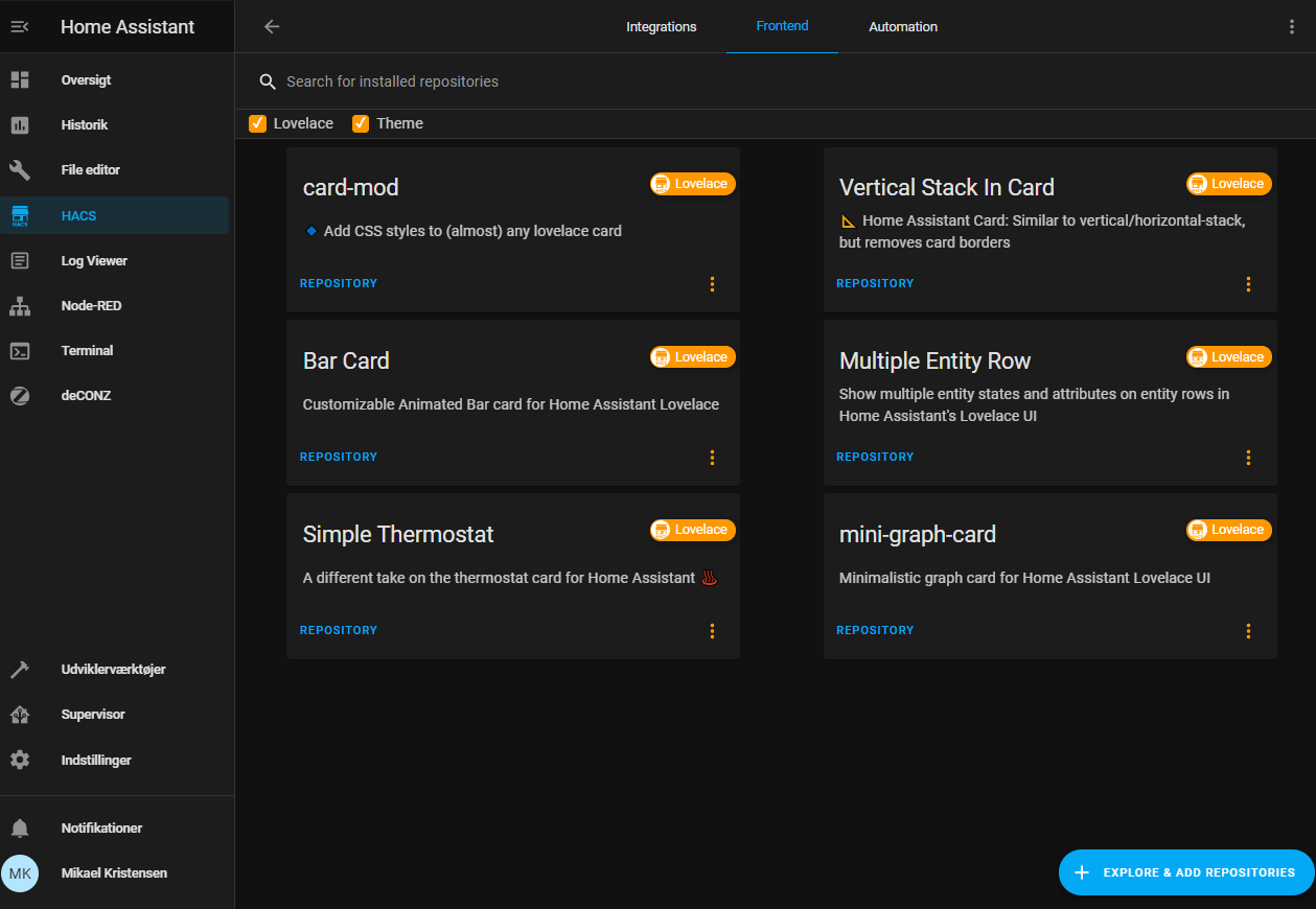
I just made it work:
In Hacs, under Frontend, press “+ EXPLORE & ADD REPOSITURIES” and search for card-mod. Think thats how I made it work!
Here all my posts which may be useful:
NOTE: Do not forget to add a "card_mod:" keyword before "style:" (new in card-mod 3). important note to create optimized code. In most examples here a code is NOT optimized - just to describe a DOM navigation.
Entity card post rotating icon (by @dolodobendan )disabled tap_action
Entities card (including some special row elements - button , section , divider )post using standard vars for some domains
font-size for Entities card post
Entities card with attributes post
Slider entity inside Entities card main post popup baloon issue hide the popup baloon
"hui-input-number-entity-row" - entity row for "input_number"main post input_number rows look less different from other entity rows - part 1 , part 2
input_select row main post input_select rows look less different from other entity rows - part 1 , part 2 How to add secondary_info: last-changed
input-text row post input_text rows look less different from other entity rows - part 1 , part 2
input_datetime row part 1 part 2 input_datetime rows look less different from other entity rows - part 1 , part 2
Conditional row inside Entities card post
Toggle row inside Entities card colored checkbox how to disable a toggle button how to disable a toggle button - inside auto-entities moving toggle to the left super narrow version
Hiding checkboxes inside Entities card for some entity row for all entity rows
Animations for Entities card post
“Chip” buttons post card-mod theme for chip buttons changing styles for a particular button in a footer dependently on a state changing an icon
Cover entity row main post disable a cover control conditionally “narrowed” look
Light entity row how to show lights with using only “active” & “inactive” colors
How to manage a row’s height decrease height increase height
How to shift rows to the right post
How to center weblinks & commands post
“Empty slot” for Entities card post
Circular progress indicator post
Glance card main post changing margin Allocate items in a compact manner
entity-filter style rows dynamically
Footer / Header post
custom:multiple-entity-row main post displaying "last-changed" or any other labels for items distribute items evenly animated icons dynamic icons
custom:fold-entity-row main post How to enable / disable a “fold / unfold” control for fold-entity-row RTL fix for a section row
custom:template-entity-row main post t-e-r inside a conditional row
custom:numberbox-card post
custom:multiline-text-input-card post
custom:text-divider-row post
Tile card colored icon & background on hover remove background from an icon dynamically set icon adding a button custom icons for features long states input_select: one-line look
Heading post change icons
Thermostat custom icons for features
custom:bar-card animation 2 text lines displaying an image instead of an icon centered title hide the whole bar-card if all bars are hidden replacing a value adding a prefix RTL fix for vertical bars
Gauge disabled tap_action colored needle adding an additional label “mirrored” gauge
markdown scrollbar scrollbar for some text markdown with images post 1 , post 2 , post 3 colorize only some text external js for “hr” element styling an icon on hover (original idea of @Spartacus )header
Picture Glance card post changing an icon by card-mod distributing icons
Sensor card with a graph post
History-graph card styling prevent clipping when using inside stack-in-card added scrollbar custom line colors custom timeline colors how to set a 0 lower bound for Y-axis styling a tooltip how to add an icon to a card’s title how to set a height
statistics-graph card post grouping / aligning labels custom line colors replacing a label how to set a 0 lower bound for Y-axis
custom:mini-graph-card main post animation - blinking name, resized & rotating icon how to display an additional info on the card how to display additional text items (prefixes & suffixes) solid (non-semitransparent) fill move a graph for the 2nd sensor to the bottom how to set a color for the last bar place 2 sensors’ states on the left side displaying states as a part of the legend displaying a UoM under the state displaying a UoM before a state displaying a state & extrema data on the same line using card-mod to compare mini-graph-card & history-graph non-elegant & unstable way to show labels for X-axis fixing an issue with a card inside state-switch imitating statistics card how to nicely align legend’s elements compact view when used in horizontal stack or grid styling Y-axis labels’ background how to change graph’s color dynamically styling points
custom:apexcharts RTL fix
Weather Card post
Styling a card inside ‘custom:config-template-card’ post
Styling a card inside ‘custom:decluttering-card’ + passing a style as a variable post 1 post 2
Badges (before 2024.8) important - fix to restore a possibility to style badges after 2024.8 Badges: different styling Badges: conditional show/hide Badges: hidden name Square badges Dynamic icon Show either an icon or a value Manually added UoM Replacing a state Replacing a UoM Gradient colors for a badge dependingly on a value (by @parautenbach )
Badges (2024.8) badges themselves badges themselves (mod-card) by @arganto one , two , three
custom:badge-card post after 2024.8
Picture Elements card main post conditional elements rotated background image “selection area” 3 ways to change an element dynamically on-hover effect for elements example: show a charging process
Logbook card main post styling images by using external js-module Logbook in a Panel mode styling a scrollbar (style is unstable)
Media Player card post
custom:mini-media-player post
vertical-stack, horizontal-stack main post How to fix the “margin-top” problem for a hidden conditional card Stack inside “hui-element” card Removing internal borders & margins inside vertical-stack Line-breaks in horizontal stack How to add an icon to a card’s title Adding tap-action for stack-in-card
grid how to add an icon to a card’s title customizing a grid in sections
custom:stack-in-card main post example of customizing a width in a horizontal stack styling a header how to add an icon to a card’s title prevent clipping of a tooltip of history-graph card & a dropdown list of an input_select
See next part below →
193 Likes
123
February 8, 2021, 10:56pm
1398
Thank you! I think I now understand why the many things I have tried all failed to work.
If the Entities card contains multiple entities, is there a way to make the style apply to all of them? Or does it have to be repeated for each one separately?


 Thank you!